Large category icons should all be colorful
Open, Needs TriagePublic

Description

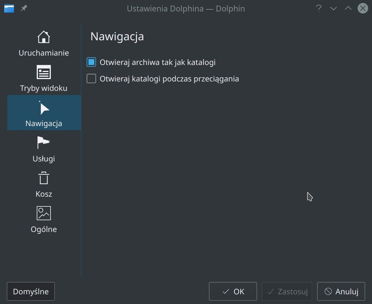
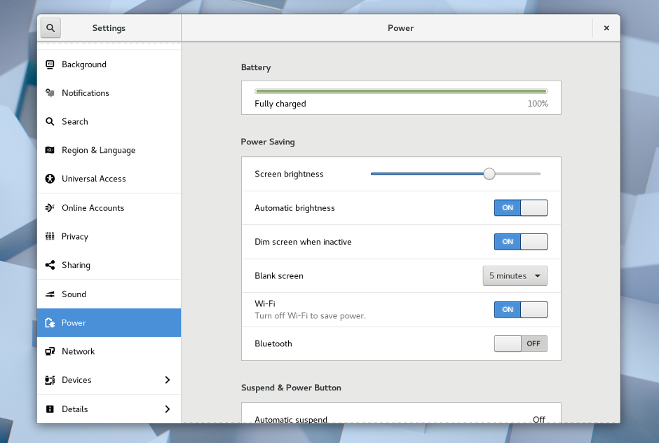
Right now we use a common pattern through settings windows in Plasma and KDE apps, where on the left side, there is a vertical list of icons with text underneath them. Each one depicts a category and switches to that category when clicked on.

These icons look great when they're colorful, but not-so-great when they're monochrome, or when there is a mix of colorful and monochrome icons. For example:

Bad: Mixture of monochrome and colorful icons

Bad: All monochrome icons

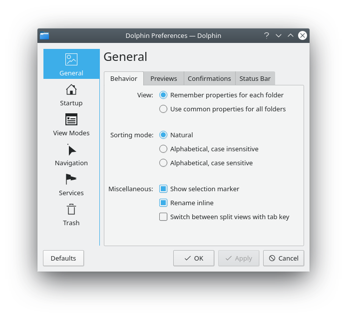
Good: all colorful icons

This task will track all the individual bugs and patches to make all icons colorful throughout Plasma and in all KDE apps. It will require some patches for Breeze to add missing colorful icons, and some patches to Plasma and apps to make them use those icons.

TODO

Remaining action items in Plasma:

Remaining action items in core apps:

No doubt many more...

Related Objects

There are a very large number of changes, so older changes are hidden. Show Older Changes

Here's a first pass on Dolphin after D17623 landed:

The lack of a good trash can icon is tracked with https://bugs.kde.org/show_bug.cgi?id=399613.

GB_2 added a subscriber: GB_2.Jan 5 2019, 11:55 PM

Why not use the current trash icon in the meantime and for preparation?

Go for colorful icons the question for an icon designer would be

  • configure icons are NO action icons, so how should they be called.
  • how should the configure sidebar look like in KDE. Which icon size and which layout.

For icon name l would prefer preferences-appname-xxx like the icons used in syse.

System Settings modules that need color icons

  • Appearance
    • Workspace Theme
      • Cursor Theme
  • Workspace
    • Desktop Behavior
      • Activities
    • Startup and Shutdown
      • Desktop Session Login/Logout
  • Personalization
    • Account Details
      • User Manager
    • Regional Settings
      • Spell Check

For icon name l would prefer preferences-appname-xxx like the icons used in syse.

I agree. This makes me wonder, what is the difference between preferences-desktop and preferences-system? Some things like window management are considered part of the system and some things like sound settings are considered part of the desktop.

ndavis added a comment.EditedJan 6 2019, 12:13 AM
In T10165#172087, @GB_2 wrote:

It's similar to the current monochrome icon it uses, but it's very meaningless. preferences-other is usually used when we want to stuff a bunch of miscellaneous/less important settings into an extra category. It's also used as an icon for hamburger menus when the size is less than 32px. I don't think that is appropriate either because the 32px icon is completely different from the monochrome icons.

Just two issues and I think I could submit the patch for Dolphin:

Hello,
I did register to share my personal opinion regarding monochrome icons. I'ts my first post, so I feel like I should introduce myself first. I am developing mobile applications for Android. I am not an UX designer but I do work with designers and I help them make decisions how something should look on Android platform.

Now back to subject,
Monochrome icons will work better with different color themes (dark and light window backgrounds) as it will be easier to prepare both variants of the icons (or just apply tint programmactically). Theme developers will need to check how theme looks only on single icon for entire system. I can imagine issues when colorful icon will blend with background if both are too dark. On screenshot posted by Nathaniel, blue directory icon when selected wouldn't contrast as much as other icons because of it's color is similar to selection background, with monochrome it is consistent:

Everything looks better if it's consistent across the views in the application. For instance in Dolphin, toolbox under menubar has monochrome icons, which look great, when clicking menubar the context menu is displayed with monochrome icons too. In current version of Dolphin I am using 17.12.3, when I do enter Dolphin settings I do have monochrome category icons too.

I think monochrome icons in such places like menus look more modern than colorful equivalents, which in comparison are unequal in quality and can bring other issues. Some other desktops, like Gnome 3 or Unity 8 (qt based, now developed by ubports) do use monochrome icons for categories in system settings also. This looks in my opinion most aesthetic, but I might be influenced by mobile world, where menus have monochrome icons everywhere. ;)

edit: I did not know if I should post a link, so instead I'll upload images as reference.
qt based Unity 8:


gnome 3:

Thanks for sharing your thoughts, @dariuszdeoniziak! The Breeze theme deliberately uses color for non-action-icons that are larger than 22x22px. The fact that this is currently inconsistent (or non-existent, in Dolphin's case) is a bug, not a design decision we are changing. :) These icons were always supposed to be colorful; we've just never had enough icons before to do it. Happily, one of the reasons why KDE software has such great theming support is so that people with different aesthetic preferences can get satisfaction! You are welcome to find and use (or create) an all-monochrome icon theme, or ship one such theme with your Android apps if you find those to look better.

However I do share your concern with adequate contrast and readability against dark backgrounds. We aspire to do a good job here with our colorful icons, but sometimes we miss the mark, and for that, filing a bug on http://bugs.kde.org against the Breeze | Icons component is a good idea.

Beyond that, if you have an interest in design or aesthetics with the Breeze theme, I encourage you to bring it up in the VDG IRC/Telegram room. See https://community.kde.org/Get_Involved/design

Thanks for fast response @ngraham. After reading styleguide from the link you sent regarding colors and icons it makes sense to me, especially "monochrome icons should be avoided for icons larger than 22px" in docs, and as you wrote above. ;)

In Kate or Krita however, category icons are much smaller, half is monochrome and other half is colorful, both softwares use treeview to show categories (but again I am using outdated versions from Kubuntu 18.04).

I guess further discussion is already part of this task: https://phabricator.kde.org/T10413 so I have nothing to add here, all fine for me. ;)

Thanks for great work on KDE. Also thanks for invitation, I will surely join irc channel from time to time!

@dariuszdeoniziak I agree that monochrome icons for preference categories could look great, but it would take a lot more effort to get it right. It's much easier to make readable color icons and preferences are one of the hardest categories to design (try differentiating Look and Feel themes, Plasma themes, Qt Widget themes and GTK themes in monochrome). Most of the existing preference icons have no monochrome version, so a lot of icons would need to be created as well. We can get a similarly good looking result by consistently using color icons designed for Breeze and Breeze Dark.

ngraham renamed this task from Category icons should all be colorful to Large category icons should all be colorful.Jun 10 2019, 6:08 PM

I just want to point out how much better these sidebars look now.

Old:

New:

ngraham moved this task from To Do to Work in Progress on the Plasma board.Sep 27 2019, 3:20 PM
ngraham updated the task description. (Show Details)Sep 27 2019, 6:03 PM
ngraham updated the task description. (Show Details)Sep 27 2019, 6:09 PM
ngraham updated the task description. (Show Details)Sep 27 2019, 7:21 PM
ngraham updated the task description. (Show Details)Sep 27 2019, 7:42 PM
ngraham updated the task description. (Show Details)Sep 27 2019, 7:45 PM
ngraham updated the task description. (Show Details)Sep 27 2019, 8:04 PM
ngraham updated the task description. (Show Details)
ngraham updated the task description. (Show Details)Sep 27 2019, 8:11 PM
ngraham updated the task description. (Show Details)Sep 27 2019, 8:29 PM
ngraham updated the task description. (Show Details)Sep 27 2019, 9:00 PM
ngraham updated the task description. (Show Details)Sep 27 2019, 9:21 PM
ngraham updated the task description. (Show Details)Sep 27 2019, 9:25 PM
ngraham updated the task description. (Show Details)Sep 27 2019, 9:29 PM
ngraham updated the task description. (Show Details)Sep 27 2019, 10:14 PM
ngraham updated the task description. (Show Details)Sep 27 2019, 10:23 PM
ngraham updated the task description. (Show Details)Sep 28 2019, 1:13 AM
ngraham updated the task description. (Show Details)Sep 28 2019, 1:21 AM
ngraham updated the task description. (Show Details)Sep 30 2019, 4:19 PM
ngraham updated the task description. (Show Details)Sep 30 2019, 4:21 PM
ngraham added a project: Goal: Consistency.
ngraham moved this task from Reported to Apps Implementation on the Goal: Consistency board.
ngraham updated the task description. (Show Details)Sep 30 2019, 7:06 PM

Hello, I think we should add some modules in the Systemsettings (Night Color, Touchpad, Graphical Tablet, Printers...) and some other application (Kdenlive, Lokalize, Marble,...) too!

ngraham updated the task description. (Show Details)Sep 28 2020, 6:51 PM
ngraham updated the task description. (Show Details)Nov 14 2021, 10:18 PM
ngraham updated the task description. (Show Details)Nov 14 2021, 10:22 PM
This comment was removed by rokejulianlockhart.

I am confident that instead of this, the more simple iconography should be utilized. My grandmother has a seriously difficult time trying to understand the colourful iconography, whereas the doesn't when it is at 16 pixels (but then it is unpleasantly small) and the colourful iconography is able to adhere to the currently utilized .colors file, whereas colourful iconography is not.

Summarily, for the sake of consistency, customisability, and accessibility, I wholeheartedly disagree.