Improve Consistency across the Board
Open, Needs TriagePublic

Tokens
"Like" token, awarded by rokejulianlockhart."Love" token, awarded by The-Feren-OS-Dev."Love" token, awarded by markuss."Like" token, awarded by emmetoneill."Like" token, awarded by fbampaloukas."Like" token, awarded by feverfew.
Assigned To
Authored By
niccolove, Jun 13 2019

Description

Description

Being KDE highly based on onboarding of volunteers, each with different ideas and "scratching their own itches", there is often a lack of organization and consistency between the ecosystem as a whole. With lack of consistency I mean code redundancy, implementing the same tool multiple times. This can be seen in multiple places, both within the design of the apps, and within the KDE apps ecosystem. The first example is music applications: currently, KDE features four different music applications: amarok, juk, elisa and vvave. Or video players, there are three of them: dragon, kaffeine, kmplayer. Between these applications, elements are often used inconsistently: tabs is a good example of inconsistent behaviour (they are implemented with different behaviours in falkon, konsole, dolphin, kate and in panels). Another example is applications with list of pages on the left: systemsettings and discover both uses Kirigami-style sidebars, kontact uses a toolbar and kmymoney has a even different implementation, and so on. These are just a couple of examples but, when seen as a whole, the KDE apps often show a lack of consistency and way too much redundancy. This creates multiple problems: the user cannot recognize and learn patterns through KDE apps (the user learns Falkon tabs, but cannot use that knowledge for Konsole ones), and the developer cannot fix a bug for all applications (fixing a bug about Falkon tabs, or improving its look, will not fix it for Konsole), thus fragmentating and slowing down the development process.

Inconsistency in System Settings has been recently addressed, and the result is awesome. But inconsistency problems were not limited only to that applications, as they can easily be found in many others.

What it will take

I will list some problem that I found. Please consider that the list is made by examples and that it will probably grow over time. It should be taken as an example to fully understand the scope of the problem.

Inconsistency in app elements:

  • Sidebar: some apps want to show a sidebar with many different pages that can be navigated through tabs. This can happen in Dolphin when panels are dropped together by the user and, in fact, the basic concept seem to be a panel with multiple tabs. Calligra has a different implementation: it uses a single panel (with the possibility to move it around) and square tabs inside it, that cannot be collapsed. Okular has a even different implementation, as it uses square tabs which can be collapsed with no panel at all. Ktorrent uses another one, with collapsable tabs as buttons with text. Kate also uses this approach, but the buttons can also be moved using the context menu. Gwenview uses tabs under the content without any panel. Skrooge uses by default multiple panels.

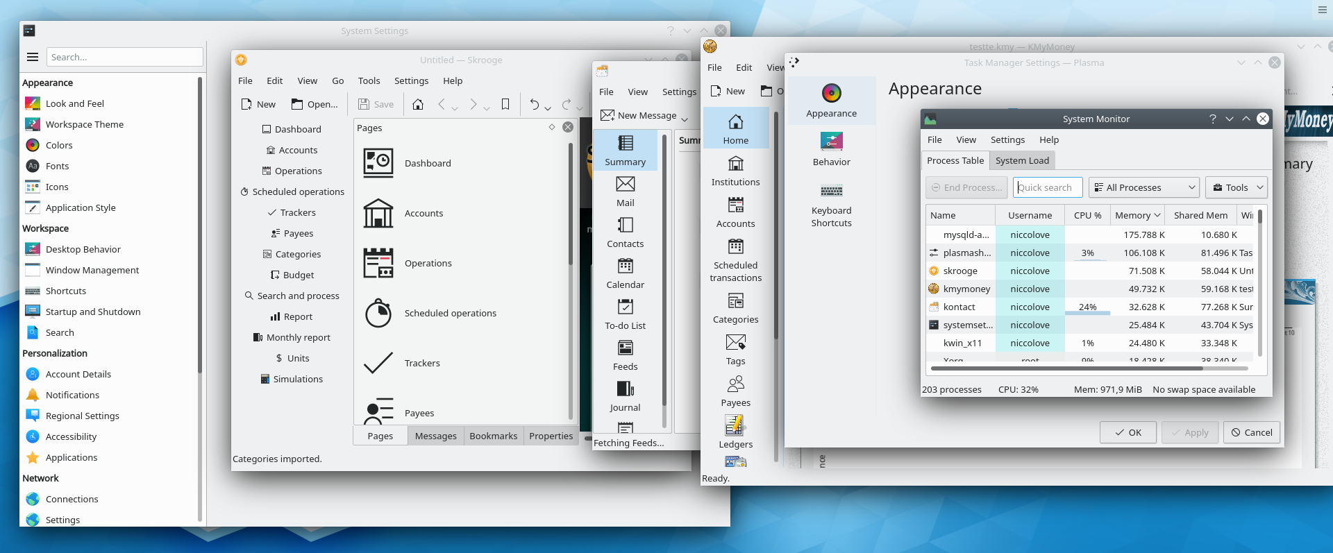
  • Another scenario is where a sidebar is used to help the user navigate through the pages of the application. A possible implementation, used by System Settings and Discover, is the kirigami list-like sidebar. A different implementation can be found in many configuration popups, such as system settings modules, where they appear on the left as rectangles with big icons. Another implementation can be seen in Kontact and Ktorrent, where a simple toolbar with button is used. Another one is kmymoney's, with rectangle on the left. Skrooge also uses rectangles but they are inside a panel, and there's the possibility to add a toolbar to do the same thing. Ksysguard is even different, featuring tabs on the top of the content. See T11153.

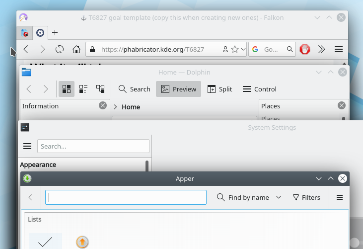
  • There's another inconsistency between the use of a menu vs the use of an hamburger button. Falkon prefer to use the latter, and Dolphin also does adding the text "Control". System Settings also features one, but it's on the left without any text. Apper puts it in the right with a separator. On the other hand, most KDE apps prefer to use a menu by default, such as Kate, Gwenview, Okular, Ark, Konsole and many others. It's not clear when an application should or should not use an hamburger button, and when it does, its location is inconsistent. -- work in progress: https://invent.kde.org/frameworks/kconfigwidgets/-/merge_requests/25

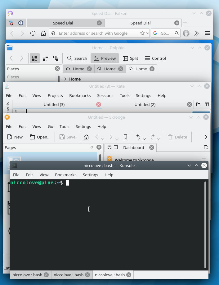
  • Tabs are also highly inconsistent. Falkon uses breeze-like tabs on the top with whitespace, a close button and a plus button on the right of all tabs to open a new one. Konsole puts tabs on the bottom and removes the whitespace and the plus button. Dolphin puts them on top of the content (instead of on top of the window) still without a button way to open new tabs. Kate uses a totally different one, which in no way resemble other applications, and uses lots of whitespace. On the right of the tabs there are buttons to search tabs and to split view (which is instead in the toolbar in Dolphin). Tabs are on the bottom again when putting panels together. Skrooge uses a button to add new tabs, but it's right aligned and uses a different icon.

  • Dolphin, Partition Manager, and may other applications, use panels that can be closed and moved around, and locked altogether. They are used by many other applications, but in Calligra they are named "dockers" and you also have a button to detach them, one to collapse them, and one to lock a single one. Skrooge does not use a name, but only provides buttons to close and detach them, thus removing any way to lock them. KmPlot removes the option to close a panel. In other applications, panels are not used when you would expect them to be: Gwenview's sidebar feels like panels but they can't be moved around and detached; Ktorrent's groupview could also easily be a panel; and so on. Also, some apps such as Dolphin, Partition Manager and Calligra show panels (/dockers?) in their menu, while some others such as KolourPaint and Skrooge do not. Finally, locking panels is inconsistent: in Dolphin you have to right-click the content, in Calligra there's a button, in Skrooge and Kolourpaint there's simply no way.
  • It's not clear which apps should use a splashscreen while loading. Skrooge, Kmymoney, Krita, Karbon and Digikam all do that, while many other do not. Whether an app should have its own splashscreen or rely on the DE loading indicator should be made consistent.
  • Generally, Kirigami apps and QWidgets apps feel different in many aspects. Dolphin (example) has panels and toolbars that can be moved around, while Discover is quite locked in place with a list of pages on the left and a single button on the topleft. Kirigami apps do not use the global menu, while most QWidgets apps do. Kirigami uses its own popups appearing from the bottom that takes the whole width, while QWidgets apps uses simple popup windows. There are so many others, these are just a couple of examples.
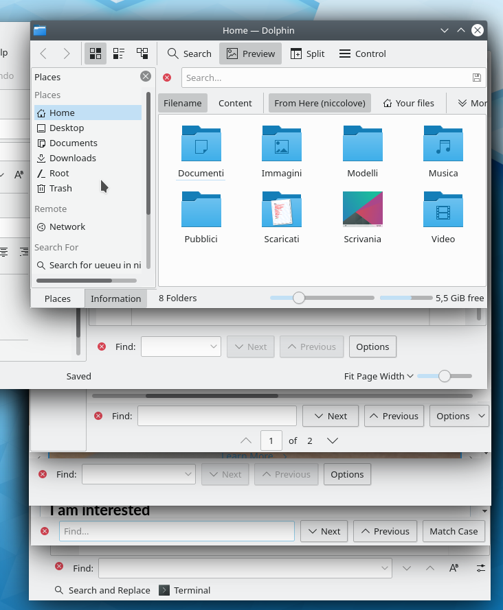
  • The search widget is also different in different applications. In Kate it appears on the bottom, giving you the options to move up, down, match case sensitive and "switch to power search" in icons. On Falkon it also appears in the bottom, but it gives you buttons with text to move up and down, fails to show an icon for the match case sensitive button, and adds a "find..." label in the text input. Konqueror also uses buttons, but puts "Options" instead of match case sensitive. This is similiar to Okular, which also adds a dropdown indicator to "Options". Calligra removes the dropdown button from Option, and also changes the possible options. Dolphin instead puts the bar on the top. Kmail opens a popup.

  • Thank to @cblack: how loading is represented is inconsistent between applications. There's not really any consistency at all, excluding Kirigami applications. Dolphin blanks the view while loading a directory, Kate also remains blank, but sets the cursor to a loading animation, Kirigami applications use a spinning view-refresh icon in their list views when loading (see: Discover and its tendencies to load indefinitely), KMail uses plain loading bars wherever it feels like it, Systemsettings5 freezes the view and sets the cursor to a loading animation, KDE Help uses freezes the view and shows a message in the bottom left corner, the icon selection dialog used in places such as editing application entries freezes the view, shows a loading bar, and sets the cursor to loading.
  • Scrollbars are inconsistent between apps, see T9126
  • As @davidhurka notices, apps are inconsistent regarding automatic scrolling (that scrolling that happens when you drag something to the edges of a scrollable view).
ApplicationScroll AppearanceRequired Action
OkularN pixels per frame, 60 fpsDrag the magnifier or draw a selection rectangle more than 5 pixels beyond the edges, distance determines N
OkularSmooth, with decelerating speedDrag an annotation against the edges
OkularN pixels per frame, 33 fps or soActivate auto scrolling with Shift + Down
KMail Folder ViewN Items per stepDrag a folder or message on the first/last item in the view and hold, dontknowwhat determines N
Konsole1 line per stepDraw a selection beyond the edges, distance determines speed. If view edges are screen edges, already starts near the view edges
Falkon (and many other text views)Very fastDraw a selection near the edges, distance determines speed
DolphinSmoothDrag an item or draw a selection near the edges, distance determines speed. “Near” can be pretty far for the bottom edge, which often annoys me.
  • KDE products are highly inconsistent regarding their websites / homepages, both because of their always different location and look. Even the division in categories of apps are inconsistent: games use games.kde.org/game.php?game=*, kde use edu.kde.org/*, kontact use kontact.kde.org/components/* , and so on. Lots of applications do not belong to the category they should be in, lots of application should have a website, and lots of applications have their website link broken.
Website locationApplications that use it
Only kde.org/applications/*/org.kde.*Cervisa, Cuttlefish, KAppTemplate, KCachegrind, KDiff3, KImageMapEditor, Kompare, Plasma Engine Explorer, Plasmoid Viewer, Parley, Rocs, Bomber, Grantier, Kajongg, Kapman, KBlocks, KGoldrunner, Kigo, KJumpingCube, Naval Battle, Knights, Kolf, Konquest, KReversi, KSirk, KSnakeDuel, KSpaceDuel, Potato Guy (uh), Kubrick, LSkat, Palapeli, KColorChooser, KGraphViewer, KRuler, Skanlite, KGet, KRDC, KTorrent, PIM Data Exporter, SieveEditor, Dragon Player, K3b, Kaffeine, KMix, Plasma Camera, KEuroCalc, KHelpCenter, Apper, Discover, KSysGuard, KDE Partition Manager, Yakuake, Ark, Filelight, KBackup, KFind, Kleopatra, KMag, KMouseTool, KMouth, KTeaTime, Spectacle
External website: *.orgKDevelop, GCompris, Digikam, Kolourpaint, Kphotoalbum, Krita, Falkon, Kdenlive, Kexi, Kmymoney, Skrooge, Tellico, Kate, krusader, Plasma Mobile
Specific link to games.kde.org/game.php?game=*KAtomic, KBlackbox, Kbounce, KBreakout, KDiamond, KFourInLine, Kiriki, Klickety, KLines, KMahjongg, KNetwalk, KPat, KShisen, KSudoku
Page in edu.kde.org/*Artikulate, Blinken, Cantor, Kalgebra, Kalzium, Kanagram, KBruch, KGeography, Khangman, Kig, Kiten, Klettres, KmPlot, Kstars, Ktouch, Kturtle, Kwordquiz, Step
Page in kontact.kde.org/components/*Akregator, KMail, KAddressBook, Kontact, Korganizer, Knotes
Page in calligra.org/*Flow, Plan, Calligra Sheets, Stage, Words
Page in utils.kde.org/projects/*KDiskFree, KDE Wallet Manager, Kcalc, KCharSelect, KGpg, Ktimer, Sweeper
Subdomain: *.kde.orgUmbrello, Labplot, Marble, Minuet, Okular, Choqok, Konversation, Amarok, Juk, Konsole, Zanshin, KDE Neon
PhabricatorHeaptrack, Massif-visualizer
UserbaseLokalize, KBibTeX, SymbolEditor, Gwenview, KXStitch, Kopete, Kamoso, Dolphin, KRename, Kronometer, Okteta, RSIBreak
Community WikiElisa, KDEConnect
Page on kde.org/*Plasma
Link to cgit (?)Kollision, Picmi
Link to sourceforge (?)KWave, Kile, Smb4K
Link to kde.org (???)Kdesvn, Kirigami Gallery, Kmines, KSquares, Banji, KMPlayer, ISO Image Writer, Info Center, Ksystemlog, Muon package manager, Kfloppy
Generic link to games.kde.org (???)Bovo, Killbots
Redirect to digikamShowfoto (???)
Redirect to kateKwrite (???)
Redirect to page itself (???)Konqueror
Page on astrojar.org.uk (???)Kalarm

Inconsistency in Plasma:

  • Hover in plasma panels: all widgets implement a different hover effect. The task manager makes the hovered app blue, application launcher makes the icon a bit lighter, while most other widgets do nothing. This is very inconsistent, and the hover effect should be managed the same way for all widgets, like the focus effect is (the blue line on the top).
  • There is a very strong inconsistency in plasma icons in panels. Some icons are colorful in both small and big panels, some are always monochrome and some change depending on panel size. The result is mixing colorful and monochrome icons in a very non-pleasant way.

Redundancy in app ecosystem:

  • Latte dock and plasma panel (both KDE projects) features clearly overlap. Latte dock is able to support way more features and its development is much more active. On the other hand, plasma panels seem to be more stable and less resource-hungry. KDE should only have one way of having panels and should provide most of Latte features by default. Right now, many options the user might like (such as center aligning widgets or making a panel transparent when not touching any app) are supported by Latte, but do not come by default in plasma.
  • Plotting applications: KmPlot, LabPlot and KAlgebra overlap in the feature of plotting functions - KAlgebra and KmPlot especially should probably be the same applications, as they provide very similiar features, but both apps lack features of the other one.
  • KRunner, the search widget, and the application launcher are also very similiar in their functionality, and they are expected to behave the same way. They do not, as KRunner has many more features that are not available in the other two, such as spelling and calcolator (and many, many others). This is a problem, as it makes the user have to use different search methods based on what he wants to search, when all the features could be implemented in all methods.
  • KPhotoAlbum, Gwenview and Pix all have the job to manage and show pictures. KDE would benefit widely from having a single app with all the features of those three, and it would fragmentate development less.
  • Falkon and Konqueror are both KDE Browsers. Konqueror has features that Falkon might make use of, such as being able to see files (such as PDF, text and pictures) directly in the application. Konqueror also needs a lot of love Falkon has, such as Falkon's adress bar being also able to search the web. It's also worth noting that KDE seem to consider both applications so little that it ships Firefox by default in its own distros (Kubuntu / Neon), which is understandable when you consider that both apps are lacking KDE's own features such as Browser Integration, but it looks like KDE does not consider its own applications.
  • Music applications. Currently, KDE has four of them: Amarok, Elisa, JuK and Elisa. This fragmentation is terrible for the development of a good application, and it also fragment the user base. Focusing on a single application would speed up development and attract more users.
  • Video applications have a similiar situation, with Kaffeine, Dragon Player and KmPlayer. The fragmentation of these apps seems to be actively hurting their development, and it's no wonder that they are not shipped in KDE own distros, preferring VLC. Again, this hurts KDE brand as provider of quality apps.
  • Apper and Discover are also highly overlapping in features, and one of them (Apper?) should probably be discontinued.
  • Dolphin, Krusader and Index are all file managers. Krusader is quite similiar to Dolphin with split view, but it provides more options that Dolphin could use. Having a single app instead of three would help its development.
  • KDE features three simple text editors: Kwrite, Kate and Nota. Again, KDE should avoid this redundancy and only develop one of them.
  • KNotes, Nanonote, the notes widget and buho are all notetaking applications. They all have slighly different features, and they would probably benefit from joining together in a single application.
  • Kvantum. Ehm. I know there's few people within the KDE devs that like it, but users do use it. It can often be seen in the unofficial Telegram chat for Plasma, and it's pretty much everywhere in r/unixporn. In fact, kvantum made Plasma the second most popular DE in r/unixporn, which is great news for Plasma promo and brand. People use it, and that's because it offers options that KDE itself do not provide. Having multiple ways to configure plasma instead of a single, default, one fragmentates themes: if you look at KDE store, there's a section for Kvantum themes, which cannot be installed normally from System Settings. KDE should offer enough features to theme creators to make it so that this fragmentation does not happen, and avoiding users using hacky third-party apps to get that features.
  • Finally, Konsole vs Station and Kontact vs Union, Skrooge vs Kmymoney are some other small redundancies.

Very inconsistent apps:

  • Gwenview uses a file viewer that's inconsistent with anything else, as it uses a different colorscheme (grayish?) and is totally different from Dolphin, Krusader and Konqueror. This is a major consistency problem for this application.

  • Latte dock is highly inconsistent in its look, as it uses elements that are not from Breeze at all (such as an on/off switch). Again, this is a major consistency problem. (see http://tipsonubuntu.com/wp-content/uploads/2017/05/latte-settings.jpg)
  • Okular's annotation panel is absolutely inconsistent with Breeze. A new one, using toolbars, is in development.
  • Kdenlive seem to not be using the default colorscheme, using Breeze Dark where the default is Breeze.

Inconsistency in KDE internal ecosystem:

  • Gitlab vs Bugzilla vs Phabricator: currently it's very hard to keep track of development of applications, as there's a very strong redundancy in KDE internal software to manage it. To resolve this, the switch to gitlab would probably be encuraged.
  • IRC vs Matrix vs Mailing lists vs Telegram: it's also very hard to keep track of communication, as there are many different chats. There are bridges, but sometimes they work slowly, and sometimes chats are only in a certain platform (such as promovideo being only on matrix). This redundancy makes organization difficult as it makes people miss important pieces of information.

How we know we succeeded

  • A decrease in the number of KDE apps, but a strong increase in the quality of the remaining ones.
  • Less bugs, and easier to fix (fixing a bug for app X should improve all applications using the same elements)
  • Users enjoing more the applications, as they understand better how to use them (learning it one time will suffice for all)
  • Users tweaking more applications, for they know better how to use the technologies we give them (such as, if okular sidebar will become panels with tabs like in Skrooge, users moving around the panels to find their optimal location)

Relevant links

I am willing to put work into this

  • Niccolo' Venerandi (@niccolove): providing patches, testing apps, finding inconsistencies & smiling
  • Nate Graham (@ngraham): submitting patches, coordinating activities, & smiling (😄)
  • Noah Davis (@ndavis): patches
  • Filip Fila (@filipf ): research, patches

I am interested

Related Objects

StatusAssignedTask
OpenNone
Openniccolove
Resolvedngraham
Openngraham
Openngraham
OpenNone
Resolvedngraham
Openniccolove
Resolvedngraham
OpenNone
OpenNone
OpenNone
OpenNone
Wontfixvkrause
OpenNone
OpenNone
Openognarb
OpenNone
Resolvedngraham
Resolvedngraham
Resolvedngraham
OpenNone
Openndavis
Resolvedngraham
OpenNone
OpenNone
There are a very large number of changes, so older changes are hidden. Show Older Changes
ndavis updated the task description. (Show Details)Jul 15 2019, 9:51 PM
ndavis added a subscriber: ndavis.
cblack updated the task description. (Show Details)Jul 15 2019, 10:03 PM

I'm willing to do work on this, but I'd like to say that I think there is room for some variety.

SySe sidebar works well for SySe because KCMs don't need a lot of horizontal space (most of the time) and there are a lot of items. It might not work so well for an app's configuration window because there are usually only a few categories and using a SySe-like sidebar can waste a lot of horizontal space while using up the same amount of vertical space.

Kate/KDevelop's tree sidebar could be replaced with a SySe-like sidebar or vice versa:


I think the SySe sidebar looks nicer. A tree is only needed when there is the potential to have so many items under a single category that it becomes cumbersome to scroll past the section without closing the section (e.g., file browsing).

lydia added a subscriber: lydia.Jul 19 2019, 10:28 AM

Would it be ok to shorten the title to Consistency since redundancy is not our goal? :P

niccolove renamed this task from Consistency & Redundancy to Consistency.Jul 19 2019, 10:48 AM

Would it be ok to shorten the title to Consistency since redundancy is not our goal? :P

Ahah, sure. Redundancy here was meant to be the bad thing, where we have different apps to do the same thing. I choose a confusing name :-)

I'm willing to do work on this, but I'd like to say that I think there is room for some variety.

Yeah, you always need variety! After all, different things needs different solutions. What consistency means to me is that those "different" solutions are implemented with elements that are the same, or feel the same. When you have to use different elements, such as

  • Sidebar 1: big icons, text under icons, few elements (configuration popup)
  • Sidebar 2: small icons, text on the right, lots of elements (system settings)

What I mean by "feel the same" is: implementing a single element (just one sidebar) that change from 1 to 2 depending on the situation (window height). Such sidebar could switch to style 1 if the window is tall enough, or collapse to style 2 if the window heigh cannot contain all elements. If you add a little animation for collapse-expand, the users will feel like it's only one element that's used consistently throughout apps and that changes based on the situation. In this way you have both consistency and variety.

A similiar example might be the use of a second-level sidebar: System Settings use it, but only if there is enough horizontal space. In this way, it never feels like you have two distinct elements "single level sidebar" and "double level sidebar", you feel like it's a single "sidebar" element that's consistent in apps. What's inconsistent, is the fact that Discover never uses a double level sidebar, even when there's space (plus, Discover uses arrows, and in SySe the back arrow is in a separated element on top, while in Discover it isn't).

Now, of course we should keep in mind the cost of implement something. This "unified sidebar" might give a better impression of consistency, but it would be probably very hard to implement, and since it's only a couple of variants that are easily justified from a user point of view, there's no need to actually do something like that. It was just an example.

A tree is only needed when there is the potential to have so many items under a single category that it becomes cumbersome to scroll past the section without closing the section (e.g., file browsing).

That's true; it's also possible to use second-level system settings sidebar to implement namespaces (only "Application" and "Editor Component" in the first level, and when you click on one the second level appears). Thank you for showing yet another inconsistent sidebar, by the way.

Regarding Gwenview's use of a dark color scheme: this is consistent with different image viewers and editors. If you want to increase visual consistency, it should be with other image applications, not general purpose file browsers.

Regarding Gwenview's use of a dark color scheme: this is consistent with different image viewers and editors. If you want to increase visual consistency, it should be with other image applications, not general purpose file browsers.

I do not understand why it should use dark color scheme when browsing files. When you do so, you would expect it to behave like any other file manager / displayer, right?

I don't know how you use gwenview, but I only use it to browse images, so YMMV.
Let's consider two different things I regularly do with image files:

Use-case 1 - importing images from the camera's SD-card:
I mount the drive, and dolphin is automatically opened. From the appropriate folder, I then select all image files in the time-range I'm interested in and copy the images to a new sub-folder in my image collection.
Dolphin is a great app for this, because its detail view allows me to easily find the files I'm looking for.

Use-case 2 - selecting images in a folder
After going through imported images in gwenview and weeding out the bad ones, I get an overview of the remaining images by switching from viewer mode to browser mode.
In the browser mode, it's easy to fix up images with incorrect rotation.

The difference between both use-cases is my state of mind: in use-case 1 I think about files and file-operations, while in use-case 2 I think about images and image-operations.

I suspect this thread of the discussion is going to expose the fact that some people really hate the fact that a lot of modern graphics software renders itself with a dark UI by default, while others love it. :)

I want to add another example of inconsistency: Automatic scrolling (that scrolling that happens when you drag something to the edges of a scrollable view.)

I started thinking about this when I tried to unify the 3 automatic scrolling implementations in Okular’s PageView.

But other applications have even more behaviours, which are inconsistent on the UI level:

ApplicationScroll AppearanceRequired Action
OkularN pixels per frame, 60 fpsDrag the magnifier or draw a selection rectangle more than 5 pixels beyond the edges, distance determines N
OkularSmooth, with decelerating speedDrag an annotation against the edges
OkularN pixels per frame, 33 fps or soActivate auto scrolling with Shift + Down
KMail Folder ViewN Items per stepDrag a folder or message on the first/last item in the view and hold, dontknowwhat determines N
Konsole1 line per stepDraw a selection beyond the edges, distance determines speed. If view edges are screen edges, already starts near the view edges
Falkon (and many other text views)Very fastDraw a selection near the edges, distance determines speed
DolphinSmoothDrag an item or draw a selection near the edges, distance determines speed. “Near” can be pretty far for the bottom edge, which often annoys me.

Different implementations also use different framerates. Selection auto scrolling in Okular uses 60 fps (recently changed from 10 fps). KHTMLView uses 50 fps. Shift + Down auto scrolling in Okular uses several different framerates like 40 fps, 33 fps, 10 fps,...

The bad thing in Okular is that the framerate never fits that of the display. The 60 fps are in reality 62.5 fps, causing 5 lags per second on a 60 fps display. And several displays these days aren’t 60 fps but 75 fps, 90 fps, 144 fps, etc.
The good thing in Okular is that it is easily controllable, because you always have to drag something beyond the edges.

I would like:

  • Some kind of visual indication for auto scrolling when you drag near the edges, so you don’t auto scroll unintendedly. (This often lets me loose files or E-Mails in some folders where they don’t belong.)
  • Smooth auto scrolling (pixel-wise) in all item views or graphic views. (In strongly line-oriented views like KTextEditor or Konsole, line-wise scrolling makes sense to me.) Smooth means that it somehow respects the framerate of the display.

One way to achive this could be to make a subclass of QScrollArea, which handles auto scrolling. Then all views use this as a parent class.

  • Plotting applications: KmPlot, LabPlot and KAlgebra overlap in the feature of plotting functions - KAlgebra and KmPlot especially should probably be the same applications, as they provide very similiar features, but both apps lack features of the other one.

+1 for unifying them somehow, also include KST.

Once, KST was a killer application for real time plotting, but that feature was removed some years ago (because “no one will ever need that”). Today, there are many plotting applications out there, nearly all of them of very bad quality. Once I tried to write a list of those plotting applications.

Apparently, everyone is writing an own application today, to plot the own microcontroller output. Almost no one of them is an UI expert. Result: Every application has a very specific feature set, not suitable for other people.

(That way I learned C++ and Qt; I needed an application with more plotting performance than all others available on the web. Works for me, but just one more really bad application.)

I suspect this thread of the discussion is going to expose the fact that some people really hate the fact that a lot of modern graphics software renders itself with a dark UI by default, while others love it. :)

That's something I did not know about :-)

Okay, I've though about it and I'd like to know what you think of my conclusions. What I first noticed that, in fact, Gwenview is not the first application with that sort of behaviour, and that there are others which went more unnoticed, but that are not consistent with the color scheme by default. Examples I could think of are:

  • Konsole: although it uses Breeze by default (like gwenview, actually), the console itself uses a Breeze Dark color by default. This makes sense: when you open up a terminal, you expect it to be black. Windows, macOS, everybody uses black consoles. This is similiar to gwenview situation: using a dark colour is not consistent with other KDE apps, but is consistent with competitor apps.
  • Kate comes by default with Breeze, and is consistent by default. I include it because Kate, unlike most applications, includes in the "settings" menu an option to quickly change the app's color scheme. This setting in fact overrides the system color scheme when set. (The usage is a bit confusing, because on my system after changing global color scheme Kate still shows the old one, but use the new one, except for titlebar).
  • Kdenlive come by default with Breeze Dark, which again might be due its content creating/view nature. Kdenlive still includes, like Kate, an option in the "settings" menu to change / override system color scheme.

I can understand that single application such as Gwenview, Konsole and Kdenlive might want to use a special color scheme by default. But that should be

  • Done consistently with *some* color scheme
  • Not a hard-coded gray color
  • User-customizable
  • Consistent within the app itself

Kdenlive does it, in my opinion, perfectly: it uses Breeze Dark, which is not hardcoded, lets the user change back to Breeze or any colorscheme, and is consistent throughout the application (everything is Breeze Dark). Konsole still cover most points, as the background colour is customizable (e.g.: I can switch to solarized dark), but it's not consistent through the application, as the background is done using Breeze Dark although the titlebar and menu is still light. Gwenview is not a good implementation, for it badly cover those points: the shade of gray is customizable, but its not possible to set any other color. That gray does not follow a clear colorscheme by default and it's only used as a background, with everything else still using Breeze (light).

What I would propose then is to switch everything to what Kdenlive does: Konsole, Kdenlive and Gwenview (and any other application that requires dark by default) can use Breeze Dark as a default color scheme (not only for some elements, but for the application as a whole), with a quick option in the menubar to change that into Breeze / anything else. I would use Kate and Kdenlive "Choose color scheme" option as-is, but I would also add a "( ) Follow global color scheme" on the top, so that it's possible to understand when the application should or should not follow the global color scheme.

In this way everyone should be happy: it's dark by default, it's consistent, it's easy to change back to Breeze if you don't like it. In fact, as far as I understood it, GNOME does this: their console comes with a dark colour scheme by default, as a whole, meaning the titlebar is also dark. It's quickly possible to change the colorscheme of terminal only.

This is GNOME default colorscheme:

This is what I propose as KDE default, AKA doing the same thing kdenlive ALREADY does to konsole + gwenview:

With the option of changing back to Breeze in "settings" menu, like Kate and Kdenlive do. Finally, the option to change colorscheme to a single app, and doing that by default, would look really good IMO with latest latte-dock, which can get the colorscheme of current app - meaning that the panel would turn black if I open konsole, and get back to white when I open Dolphin.

  • Konsole: although it uses Breeze by default (like gwenview, actually), the console itself uses a Breeze Dark color by default. This makes sense: when you open up a terminal, you expect it to be black. Windows, macOS, everybody uses black consoles.

Just some slight corrections here:

  • The Windows PowerShell terminal uses a blue background; it's only the old legacy command prompt that's black.
  • The macOS terminal app actually follows the system theme automatically by default. For example, if you use a light theme, you get a white background in your terminal unless you change it. Before the light vs dark theme feature was introduced, the macOS terminal always used a light color scheme by default.

What I would propose then is to switch everything to what Kdenlive does: Konsole, Kdenlive and Gwenview (and any other application that requires dark by default) can use Breeze Dark as a default color scheme (not only for some elements, but for the application as a whole), with a quick option in the menubar to change that into Breeze / anything else. I would use Kate and Kdenlive "Choose color scheme" option as-is, but I would also add a "( ) Follow global color scheme" on the top, so that it's possible to understand when the application should or should not follow the global color scheme.

Agreed, and there's actually a patch to start implementing this: https://phabricator.kde.org/D15645. After that, we just need to turn the menu on for all the apps, I believe. It's a standard widget.

I can understand that single application such as Gwenview, Konsole and Kdenlive might want to use a special color scheme by default. But that should be

  • Done consistently with *some* color scheme
  • Not a hard-coded gray color
  • User-customizable
  • Consistent within the app itself

That's quite a reasonable request.

Kdenlive does it, in my opinion, perfectly: it uses Breeze Dark, which is not hardcoded, lets the user change back to Breeze or any colorscheme, and is consistent throughout the application (everything is Breeze Dark).
[...]
What I would propose then is to switch everything to what Kdenlive does: Konsole, Kdenlive and Gwenview (and any other application that requires dark by default) can use Breeze Dark as a default color scheme (not only for some elements, but for the application as a whole), with a quick option in the menubar to change that into Breeze / anything else. I would use Kate and Kdenlive "Choose color scheme" option as-is, but I would also add a "( ) Follow global color scheme" on the top, so that it's possible to understand when the application should or should not follow the global color scheme.

That seems like a good approach. I think I'll investigate how KPhotoAlbum can adopt this approach as well.

In this way everyone should be happy: it's dark by default, it's consistent, it's easy to change back to Breeze if you don't like it. In fact, as far as I understood it, GNOME does this: their console comes with a dark colour scheme by default, as a whole, meaning the titlebar is also dark. It's quickly possible to change the colorscheme of terminal only.

You got me thinking: would it be feasible to support this on a system settings level? I mean, if 5 apps implement the Kdenlive approach that means 5 apps have a hardcoded default (secondary) colorscheme. I an app could just request a dark/secondary/low-contrast/whatever colorscheme from the system, then the user only needs to change their preference in one place...

niccolove updated the task description. (Show Details)Jul 25 2019, 1:19 PM
ognarb added a subscriber: ognarb.Jul 27 2019, 1:15 PM

I saw that you mention the websites. There is a plan to redesign all the websites with the Aether theme: T10827.

But I don't think having one website per apps is not a good idea. I would deprecate some of them: for example edu.kde.org, utils.kde.org and games.kde.org in favor of kde.org/applications and some community wiki page. Maintaining all these websites is a lot of works, and most of them are severely outdated. For major projects, it still makes sense to have a website, but otherwise displaying the AppStream info in kde.org/applications is good enough.

+1

I saw that you mention the websites. There is a plan to redesign all the websites with the Aether theme: T10827.

But I don't think having one website per apps is not a good idea. I would deprecate some of them: for example edu.kde.org, utils.kde.org and games.kde.org in favor of kde.org/applications and some community wiki page. Maintaining all these websites is a lot of works, and most of them are severely outdated. For major projects, it still makes sense to have a website, but otherwise displaying the AppStream info in kde.org/applications is good enough.

I also agree. I think current situation is really sub-optimal.

lydia added a comment.Aug 3 2019, 4:02 PM

Are we ready here? If so please move it to the ready for voting column.

lydia updated the task description. (Show Details)Aug 3 2019, 4:16 PM
lydia added a comment.Aug 13 2019, 8:49 PM

Quick reminder that there are two days left before the voting starts. Please make any changes you still want to make soon.

paulb updated the task description. (Show Details)Aug 13 2019, 9:12 PM
paulb added a subscriber: paulb.Aug 13 2019, 9:31 PM

Hey @niccolove, I think the title of your goal could probably be better understood if it were a bit more explicit. I can suggest: Improve Consistency across the Board

niccolove renamed this task from Consistency to Improve Consistency across the Board.Aug 14 2019, 5:26 AM

I'm currently on vacation. Please make any change you consider necessary.

filipf updated the task description. (Show Details)Aug 22 2019, 9:28 PM
filipf added a subscriber: filipf.
lydia added a comment.Aug 24 2019, 3:39 PM

Vote invite were sent to everyone subscribed to the KDE community mailing list and everyone with a developer account. Any contributor who didn't receive one please subscribe to the mailing list to not miss future announcements and send me a quick email (lydia@kde.org) and I'll send you a vote invite.

emmetoneill added a subscriber: emmetoneill.

[spam comment removed by sysadmin]

You think sending your minions to insult me and then disabling my account will solve the issue? what will you do next? Disable registration so no one points out your hypocrisy? Which overlord made the decision to disable my account and for what?

Well, commenting on every single task is quite consistent, at least :P
But I have done you nothing :)

ndavis added a comment.EditedSep 8 2019, 12:36 PM

Regarding hamburger menus, I think Falkon/new Dolphin style is the best implementation because it gives the user the option to use the traditional menu or the hamburger menu. This is better for accessibility because people who rely on accelerators can enable a traditional menu and it ensures that the menu options will appear in the global or titlebar menu.

lydia added a comment.Sep 9 2019, 8:18 AM

Congratulations! This goal was selected as one of the three that we will concentrate on now.

Here's my 2 cents:

I think toolbars themselves are also inconsistent. Some icons will be followed by text, while some will not, and some icon-only buttons are also mixed with icon+text buttons. you can see, for example, here and here how that mixing happens.

Taking two other DEs as reference, their toolbars are usually only icons, icons with text, or just text, all with minimal mixing. The result is a uniform, consistent look, which makes them look really pleasing to the eyes. Examples: Gnome, MacOS.

In case of icon-only toolbars, tooltips on mouse over or a button press could give a description of the button's purpose. Having intuitive buttons for each action would be the ideal, though, as you'd be able to ditch the text, keep the toolbars compact, and free up space for more actions.

ndavis added a comment.EditedSep 10 2019, 2:24 PM

Here's my 2 cents:

I think toolbars themselves are also inconsistent. Some icons will be followed by text, while some will not, and some icon-only buttons are also mixed with icon+text buttons. you can see, for example, here and here how that mixing happens.

Taking two other DEs as reference, their toolbars are usually only icons, icons with text, or just text, all with minimal mixing. The result is a uniform, consistent look, which makes them look really pleasing to the eyes. Examples: Gnome, MacOS.

In case of icon-only toolbars, tooltips on mouse over or a button press could give a description of the button's purpose. Having intuitive buttons for each action would be the ideal, though, as you'd be able to ditch the text, keep the toolbars compact, and free up space for more actions.

In general, we use labels for everything that isn't a common control. Common controls are things like forward, back, undo, redo, etc. If a label isn't used, the function of the button needs to be pretty obvious.

I think it's more important to be consistent in logic than uniform in appearance. There is a lot of overlap between the two, but there are cases where aiming for a uniform appearance leads to inflexible designs that make some UIs less usable.

onvitaik added a comment.EditedSep 10 2019, 10:43 PM

In general, we use labels for everything that isn't a common control. Common controls are things like forward, back, undo, redo, etc. If a label isn't used, the function of the button needs to be pretty obvious.

I think it's more important to be consistent in logic than uniform in appearance. There is a lot of overlap between the two, but there are cases where aiming for a uniform appearance leads to inflexible designs that make some UIs less usable.

Being consistent in logic is fine within their contexts. This is a toolbar, a place filled with buttons, not just any other area where we only see a couple of buttons side-by-side. This visual inconsistency can really hurt an application's looks, and perhaps even drive away users because, for better of for worse, a lot of them care about appearance (it can and will impact their experience). Depending on how you interpret it, a lot of toolbars don't follow the KDE HIG too ( 1 | 2 ):

Don’t change the button style from the default, which is text beside icons.
Combining icons and text can be used to identify data and actions in a user interface. Examples include toolbar actions, file and folder displays in a file manager, application listings, and notifications. The layout should be consistent.

I feel like I might be hitting the same note a lot, but macOS and Gnome are capable of handling the uniform appearance just fine. I couldn't find a proper guideline for gnome, but it seems to follow a very similar pattern to macOS, which we have:

Prefer icons over text in toolbar items. In a customizable toolbar, labels appear beneath toolbar items when the user chooses to display them. Seeing control text above label text is repetitive.

Having used macOS for a couple of months, I never found the visual consistency to be a problem or lead to less usable UIs, though I can only speak for myself here.

This bug might be relevant to this goal: Kimpanel icon size is different from system tray icons.

Not sure if there's a better way to associate Bugzilla bugs to Phabricator...

niccolove moved this task from Reported to Meta on the Goal: Consistency board.Oct 1 2019, 7:12 PM

Music applications. Currently, KDE has four of them: Amarok, Elisa, JuK and Elisa.

That confuses me. I read that Amarok is unmaintained (well, it is still using Qt4 and KDElibs...), JuK is more a music management application than a music player.

What’s the difference between Elisa and Elisa? / What is the 4th application you wanted to list?

Ah, sorry for that mistake. The fourth one is Vvave. Amarok declared was unmaintained after me writing this task (although I got a mail from the developer claiming that the porting to qt5 is 'almost done'). Regarding juk as a music management, I have to look more into it.

pgomes added a subscriber: pgomes.Apr 13 2020, 9:15 AM

Ah, sorry for that mistake. The fourth one is Vvave. Amarok declared was unmaintained after me writing this task (although I got a mail from the developer claiming that the porting to qt5 is 'almost done'). Regarding juk as a music management, I have to look more into it.

Hi, I am one of the maintainer of Amarok and it's QT5 port is ready to be released. We're discussing internally when and how.

ervin removed a subscriber: ervin.Apr 22 2020, 8:42 PM

I just noticed something, the lack of consistent spacial navigation direction in the older widget store windows, having the content on the left and the sidebar on the right. I know there's new kcm's that have a vertical focused organization layout.

felixernst updated the task description. (Show Details)Oct 5 2020, 4:59 PM

About consistency of tabs accross applications, GNOME developers wrote new tab widgets from the ground up to replace all the different tabs they have accross their own applications:

Reinventing tabs
https://blogs.gnome.org/alexm/2021/03/13/reinventing-tabs/

Yeah, the tabs in GNOME are fabulous and I wish someday Kirigami could gain a similar functionality. It could be really helpful for Okular Mobile, Angelfish, ...