Details
Details
- Reviewers
broulik ndavis - Group Reviewers
Plasma VDG - Commits
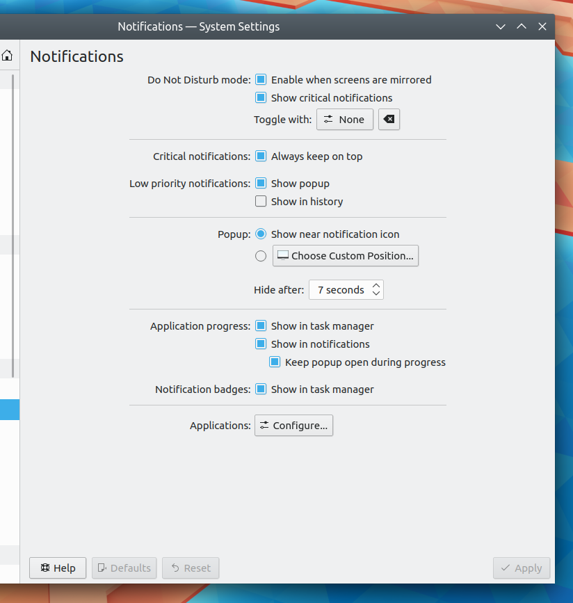
- R119:f70092e5bc75: [KCMs/Notifications] Tweak layout and strings to have a bit more visual…
Diff Detail
Diff Detail
- Repository
- R119 Plasma Desktop
- Lint
Automatic diff as part of commit; lint not applicable. - Unit
Automatic diff as part of commit; unit tests not applicable.
Comment Actions
Also while looking at this, I started to think the checkbox for critical notifications maybe doesn't even need to exist. We probably shouldn't make it easy to shoot yourself in the foot by disabling the display of critical notifications. They're critical for a reason, after all!
Comment Actions
by disabling the display of critical notifications.
It doesn't disable them. Merely keeps them behind full screen windows. I think the option is fine as it is. (You know, if we had some kuserfeedback data to prove that nobody disables this option... :p)
Comment Actions
Is it intentional that "Hide after" is aligned with the checkboxes above? I'm not convinced this part is an improvement. Same with the indented "Toggle with" although that was there to begin with.
+1 to the rest of these changes.
Comment Actions
The indentation here was done to be consistent with the other one, but the reason why they're indented is to make it clear that they're a part of the logical group of controls that's "introduced" by the first left label in the formlayout section. Ideally every section has only a single one of these labels that stands in as a sort of pseudo-header for the whole section. I'm not super happy with the two groups in this layout that have two left labels, but I couldn't figure out a way to get rid of them without removing options.
Comment Actions
Within that context, I see why it makes sense to indent "Toggle with", but I still don't think it makes sense to indent "Hide after"/"Hide popup after". The label above is "Popup position" and "Hide popup after" is not related to the popup position.
Comment Actions
Would it make more sense if it was like this?
Popup: (o) Show near notification icon
       ( ) [Choose custom Position...]
       Hide after: [5 seconds ^v]