Notification area improvements
Closed, ResolvedPublic

Description

This feedback was given multiple times, that somehow notifications in top panel doesn't blend very well..

From e.g Distrowatch review:

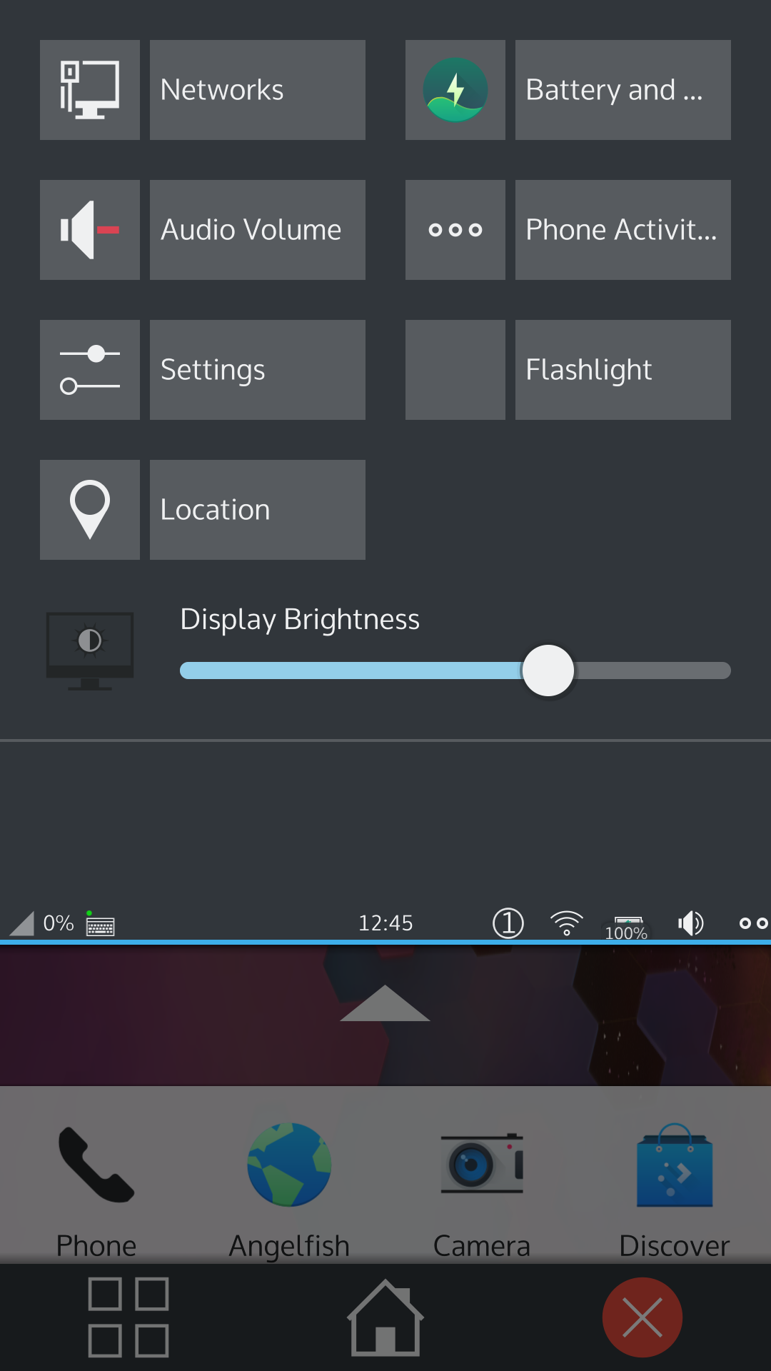
Two aspects of the Plasma interface I feel deserve more attention. The notification and settings area is especially well organized, I think. Pulling down the status bar shows us a grid of settings modules and we can tap one to bring up configuration options for items such as our wi-fi network, location, power saving and volume control. I think the settings are clearly labelled and well organized. The notifications I found to be a bit jumbled together. The notices were printed with small text and I found they were too close together.

Related Objects

StatusAssignedTask
ResolvedNone
Resolvedbshah
bshah created this task.Feb 19 2018, 9:20 AM

As visible in screenshot, now notifications don't appear at all.. just notification count next to WiFi icon.

Since Plasma 5.16 notifications on the desktop are amazing. We should reuse as much from there as possible.

I'm not sure how feasible it is to reuse the popup code given notifications on mobile behave quite a bit different, e.g they usually don't time out and are closed by swiping them away.

If we can't reuse the visible desktop bits we should at least base our implementation on the new libnotificationmanager

bshah closed this task as Resolved.Mar 30 2020, 4:39 AM
bshah claimed this task.

In newer design, the top bar design is improved, and we are using desktop notifications. Let's close this for now, if there's more bugs, let's report it as a separate task.