Create a KDE-Eco logo/badge
Closed, ResolvedPublic

Description

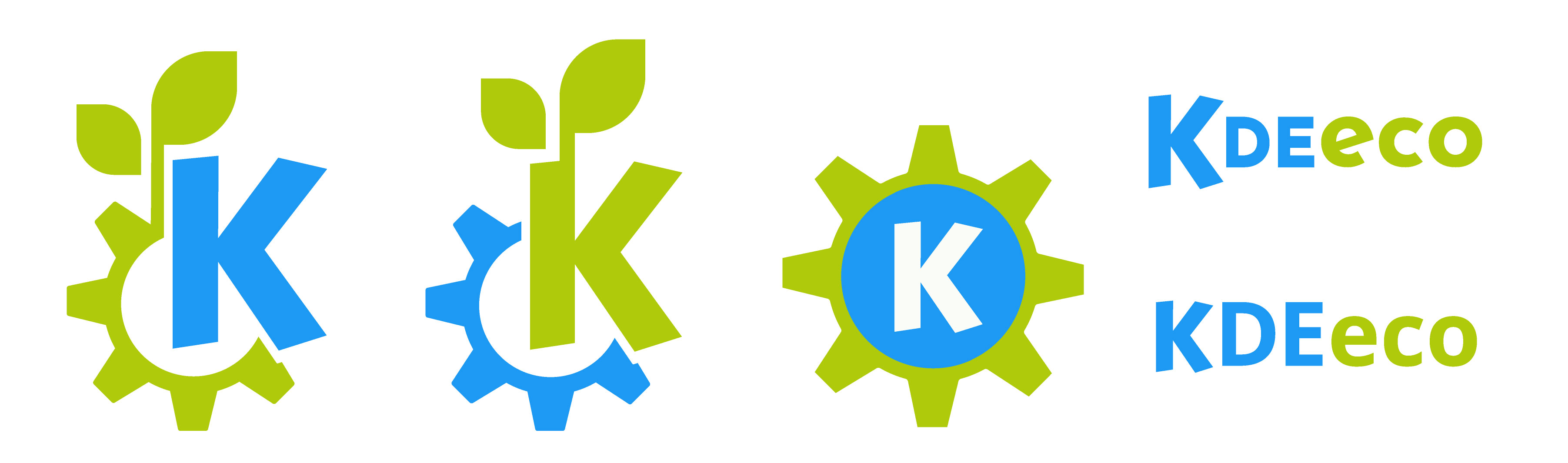
Call to create a KDE-Eco logo and related badge:

  • Logo: to go on the eco.kde.org website and related publications.
  • Badge: to be put on the websites of KDE/FOSS projects supporting the energy efficiency initiative. Important: the badge should not be confused with an eco-label.

Concept for the logo/badge: technology and environment. One proposal: the K-Gear logo sprouting leaves.

joseph created this task.Aug 16 2021, 11:01 AM
joseph triaged this task as High priority.
joseph renamed this task from Create of an efficiency logo/badge to Create an efficiency logo/badge.
joseph renamed this task from Create an efficiency logo/badge to Create a KDE-Eco logo/badge.

Re badge: in our team meeting we decided that a website badge should be linked to concrete information (e.g., XML file such as https://invent.kde.org/cschumac/blue-angel-application/-/blob/master/applications/kmail/de-uz-215-eng-annex-7-kmail.xml) and not just a sign or gesture of support.

lana added a subscriber: lana.Oct 28 2021, 7:23 AM

Hi all, these are my suggestions for a KDE eco logo.

paulb added a comment.EditedOct 28 2021, 12:41 PM

I like 1 and 4 (letters with big "K").

Can the green be a bit more vibrant? Maybe something like this:

And can we have the SVGs, please?

paulb added a comment.Oct 28 2021, 5:31 PM

It doesn't matter. I just traced @lana 's:

I like the 4th version with the KDEeco string. It might not fit for all occasions because of its width, but it has a nice vibe, elegant and a bit of understatement. The first one is also good. I think the K should definitely be blue. The original green seems to fit a bit better than the luscious green, but it also doesn't feel perfect yet in my view.

paulb added a comment.Oct 28 2021, 9:40 PM

The fourth is nice, yes, but the problem with a text only badge is that it will not translate to all languages. Languages with non-Roman alphabets will be especially difficult to translate it to.

Meanwhile, the KDE symbol with a tree growing out of it: Immediately easy to understand.

lana added a comment.Oct 29 2021, 5:48 AM

this would be my suggestion


but I attached some experimental stuff too

and I think this can be used when the name needs to be read

paulb added a comment.Oct 29 2021, 7:57 AM

Image 1, logo 2 has a nice combo of colours. I do like the bold colour combinations of image 2, logo 4 too, and would bang on about how "bold" (as opposed to "understated") is what you should be looking for in a campaign like this. But, image 1, picture 2 is works, so...

As for the written logo, as I said, I like it, but the image of the KDE gear sprouting a plant is visual shorthand for "environmentally friendly" that transcends language, thus making it easier to understand more universally.

Maybe there is an elegant way of combining the best of both worlds and have some lettering curving round the bottom of the gear. If that lettering were "eco.kde.org", i.e. the address of the project's landing page, then we would have three advantages rolled into one:

  1. the visual representation of KDE as environmentally friendly
  2. the words "eco" and "kde" just in case
  3. and a pointer to the web page

I am not sure it would work visually, though.

lana added a comment.Oct 29 2021, 12:53 PM

I would not go for this one because there is too much happening, the more minimalistic the more memorable it will be

So I would keep it like this for purposes where the name needs to be mentioned. I think eco and the colors are interntionally recognized enough but that might just be my impression.

For the domain your idea is actually working as long as it can be displayed big enough


lana added a comment.Oct 29 2021, 1:12 PM

final SVGs

paulb closed this task as Resolved.Jan 4 2022, 4:11 PM