Some apps have inconsistent spacement in the titles and other elements such as search bars. Maybe using a single style that applies to all of KDE apps (the same concept of a CSS class selector) might fix this.
Some apps have inconsistent spacement in the titles and other elements such as search bars. Maybe using a single style that applies to all of KDE apps (the same concept of a CSS class selector) might fix this.
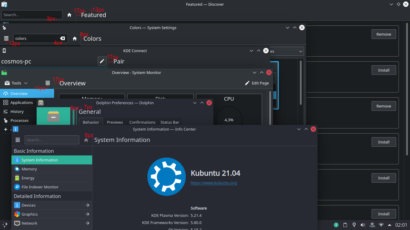
Did some investigation here.
Discover, System Settings, and KInfoCenter are using Kirigami.AbstractApplicationHeader for their sidebar headers.
AbstractApplicationHeader has margins on all four sides that are equal to 0 by default, and a height value that is auto-generated from the contents.
In System Settings/KInfoCenter (internally they are the same app), we are forcing the height to be the height of the adjacent view--which is sometimes provided by a QML KCM component, and sometimes provided by a QWidgets KCM. An absurd amount of work has been done to get the headers of those two to have the same height, so the System Settings sidebar header is manually setting itself to the same height.
In Discover, we are not overriding the height. This is why Discover's sidebar is a bit shorter, with smaller effective top and bottom margins.
Discover and System Monitor use a standard Kirigami.ToolBarPageHeader which has a 17px left margin. This value was chosen to make the title vertically align with the left edge of cards items inside the view. The screenshot depicts it succeeding at this, in fact.
Dolphin's settings window uses a KPageDialog which has totally different margins for everything and is not relevant here because it does not use a header style; the title is floating randomly in the view itself. This is something I'd eventually like to change,but it wuild require a whole huge effort to do it properly. Let's forget about it for now.
System Settings uses that same padding for its KCM titles because it was trying to emulate that style. However now that the KCM titles are in a visible header bar, that no longer makes sense.
Of the current suggestions, the last one certainly is ideal – although not mutually exclusive of the previous suggestions – because the more that is automatic, the superior that the toolkit is. Obviously this is not inferent advocation for removal of the ability to override, but merely that it should not be necessary unless designing custom appearance of software. Consistency is the ultimate goal.