Suggested fixes for small visual issues in Kirigami. Idea of which is to slowly go through everything and make tiny tweaks to see if we can make overall design even better.
MORE TO COME!
Suggested fixes for small visual issues in Kirigami. Idea of which is to slowly go through everything and make tiny tweaks to see if we can make overall design even better.
MORE TO COME!
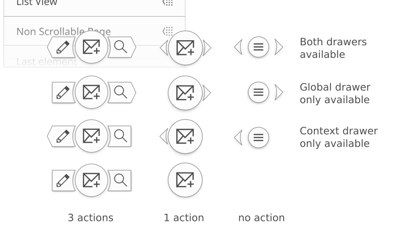
If possible it would be good to have the icons scaled by an integer (x2, x4 etc) because Breeze takes advantage of pixel perfection.
Possible solution: maybe the primary one could be 22x22px ( x1 normal dpi/desktop, x2 hidpi/mobile) and the secondary ones 16x16px (1x normal dpi/desktop, x2 hidpi/mobile) ?
I like all the changes except the ">" symbol, I think that the one from Breeze is better, it just needs some size and alignment adjustments like the text labels.
Awesome work Jens.