The notification stream is not as important to the user than other app streams. Show it therefore at the end of the list.
Rearranging the separator also fixes a small spacing issue with the first item always being smaller in vertical size than the other ones.
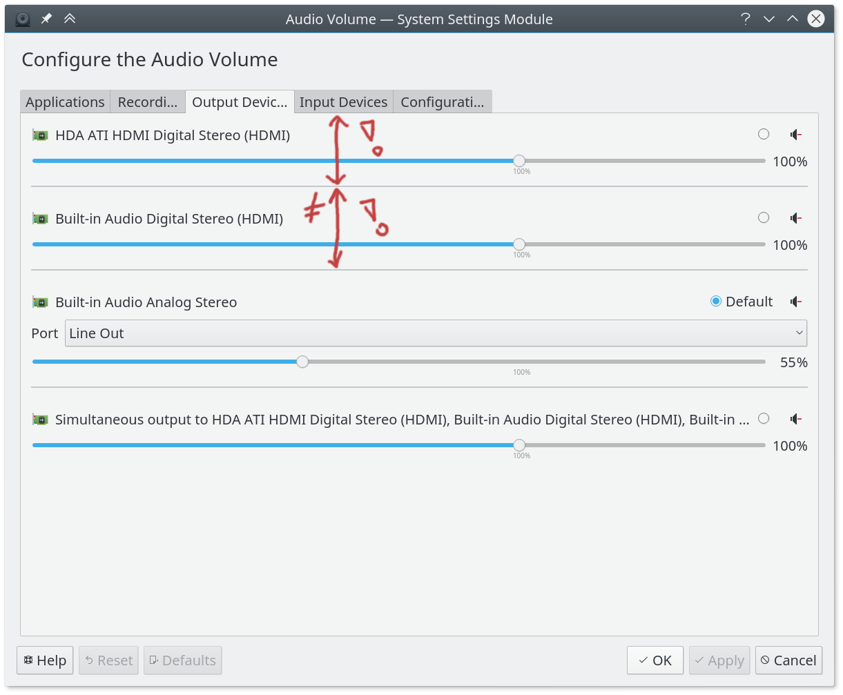
master:
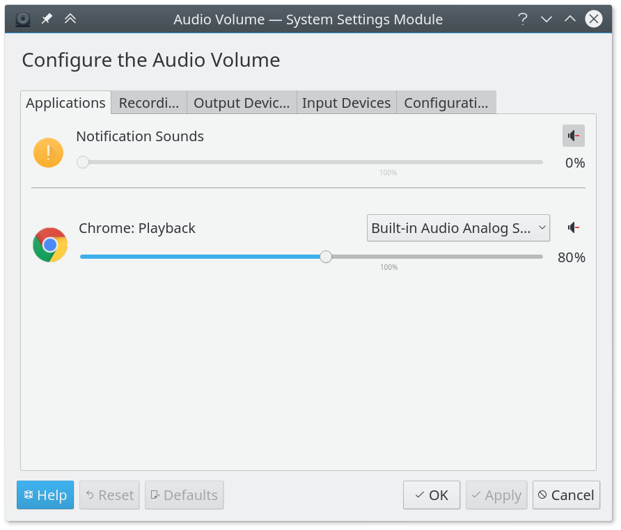
patched: