An Avatar component displays an avatar.
Details
Details
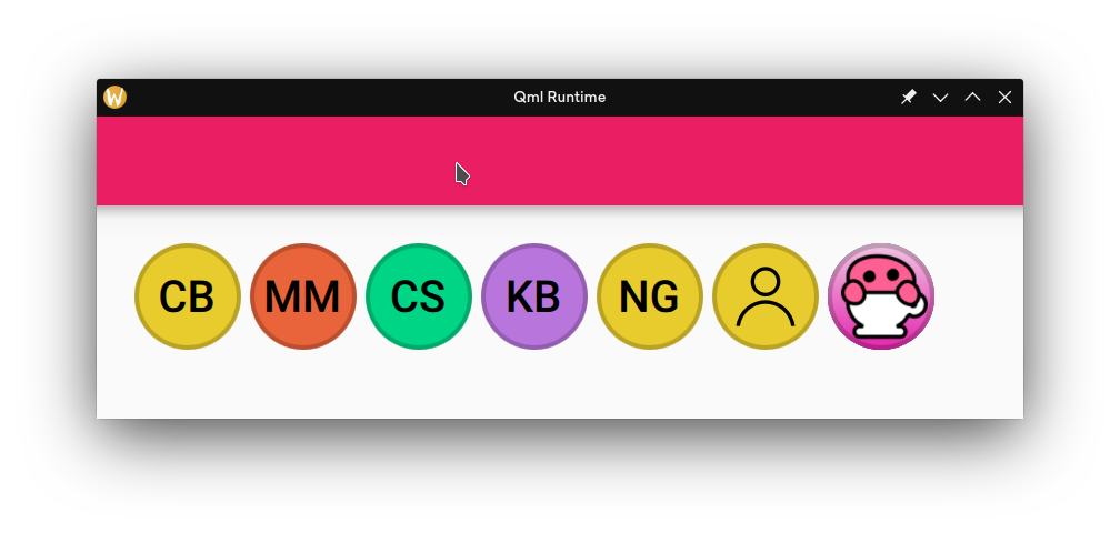
Row {
    spacing: Kirigami.Units.smallSpacing
    Kirigami.Avatar {
        name: "Carson Black"
    }
    Kirigami.Avatar {
        name: "Marco Martin"
    }
    Kirigami.Avatar {
        name: "Carl Schwan"
    }
    Kirigami.Avatar {
        name: "Kai Uwe Broulik"
    }
    Kirigami.Avatar {
        name: "Nate Graham"
    }
    Kirigami.Avatar {
        name: "Roman Gilg"
        initialsMode: Kirigami.Avatar.InitialsMode.UseIcon
    }
    Kirigami.Avatar {
        name: "David Redondo"
        source: "/home/jpontaoski/Pictures/Barista/barista.svg.png"
    }
}
Diff Detail
Diff Detail
- Repository
- R169 Kirigami
- Branch
- cblack/avatar (branched from master)
- Lint
No Linters Available - Unit
No Unit Test Coverage - Build Status
Buildable 26964 Build 26982: arc lint + arc unit
Comment Actions
Cool stuff. The commit message needs to be expanded to explain where and how this will be used, and also needs to list key implentation feats (initials, colors).
I believe we use avatars in launcher menus, the user menu, and lock, login, logout (3L) screens. The 3L have no action involved with the avatar so there's no need to buttonify it in any way for that use case. Visually they're fine as is. Launcher menus and the kcm are obviously different. But the main question is actually what do we intend to do with not using Kirigami on the desktop? That makes this component only usable in kcms?
Comment Actions
AFAIK we can use Kirigami in Plasma things where it makes sense and doesn't overlap a Plasma thing (e.g. don't use Kirigami.Heading instead of PlasmaExtras.Heading.
Comment Actions
+1 overall.
I notice that this algorithm will return "KB" for Kai Uwe Broulik and HC for Hugo Pereira da Costa. Is that right? Names are hard.
Comment Actions
Cool thing. Makes me think of Nintendo Mii, and their open source counterpart, bloke (which is not really used anywhere, but whatever).
Also, can we have name resolution algorithm extracted elsewhere, in a more re-usable section of code? Like NameUtils or something.
Btw, I gotta research on how Telegram or any other popular product does it.
Comment Actions
I would like this class to be splitted in Templates/controls, so different styles could make it look slightly sifferent (or anyways easier for the app developer to make one that looks just slightly different)
the root component should be a Control, with image/icon/initials in contentItem and background collor/border in background
the one in templates would not have a background the one in controls would instantiate the one in templates and give it one.
| src/avatar.cpp | ||
|---|---|---|
| 35 | would be nice to be somewhat theme-able, maybe with the controls/templates split | |
| src/controls/Avatar.qml | ||
| 16 | should be a Control, with some stuff moved into background and some into contentItem | |
| 29 | this is not really necessary, if one doesn't wasnt the initials, doesn't set a name. | |
| 53 | enum values should be written and explained here | |
| 110 | we now have a much more efficient component for that: ShadowedImage, which should be used instead | |
| 116 | this looks like something that should be themeable | |
| src/kirigamiplugin.cpp | ||
| 259 | I don't like this, as even tough is called "private" is really public api as there isn't really any way to make a c++ type not accessible. | |
| src/kirigamiplugin.cpp | ||
|---|---|---|
| 259 | the string manipulation used for generating initials isn't particularly feasible to do in javascript; especially the stuff that prods QChars | |
| src/controls/Avatar.qml | ||
|---|---|---|
| 53 |  Unfortunately; splitting into a template throws documentation out of the window; which is why I didn't use one initially. I don't really like writing documentation if it's not going to be seen. | |