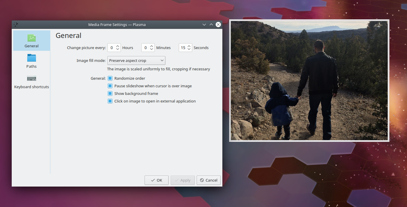
This patch modernizes the Media Frame's user interface by doing the following:
- Port to QQC2
- Port to Kirigami FormLayout style
- Adopt a more granular interface for choosing the slideshow interval
- Update some labels
BUG: 390571
FIXED-IN: 5.16.0
| filipf |
| VDG | |
| Plasma |
This patch modernizes the Media Frame's user interface by doing the following:
BUG: 390571
FIXED-IN: 5.16.0
Tested all features; everything still works
| Automatic diff as part of commit; lint not applicable. |
| Automatic diff as part of commit; unit tests not applicable. |
Tested it, works well, looks good. What I really like about this are the extended time options and better wording of the options.
I added some minor comments in the code, mostly just related to my understanding of the code, not any issues.
And while we're at this, could we also think about a different icon for the General category? We use different icons for "General" all across different configuration settings so it might not be bad to agree on one that we will use consistently. I guess I have a problem with this specific one used here because I associate it with "No preview available" :P
| applets/mediaframe/package/contents/ui/ConfigGeneral.qml | ||
|---|---|---|
| 60 | Do we need this? It ends up looking the same for me without it. | |
| 71 | And do we need to set this? I removed Layout.minimumWidth and width for all the spinboxes, everything looks the same and the numbers fit in nicely. | |
| 72 | Ditto. | |
| 114–182 | QQC2 Combobox seems to be behaving well here. What I did in my task manager port was add (or keep?) Layout.fillWidth; true to all of the comboboxes. But because the first RowLayout is quite wide it would look odd here so perhaps it's better to leave it as it is, right? | |
We kinda sorta have a convention to use the app/widget's own icon for its "general" category, so I think this makes sense.
The widget probably needs a better icon though than just this generic image mimetype.