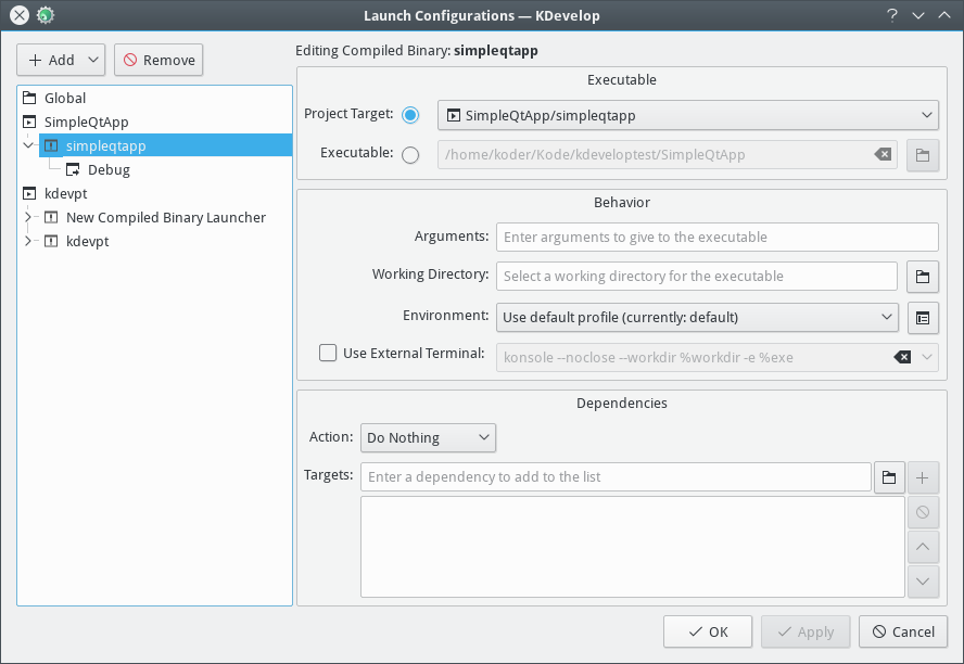
Old text "Add New..." and "Remove Selected" were not following standard
naming of such buttons in KDevelop, also could result in longer translations
making the row minimum width quite large.
The "..." also indicates another dialog usually, not just a popup list.
Instead a popup indicator arrow is now used as in similar places.
These Add/Remove buttons usually are also below or to the right of the
object, not above. But moving below the list made the whole dialog
look more strange, so not done here, needs a bigger overhaul of the
whole dialog.