The language selector is a bit too low on desktop:

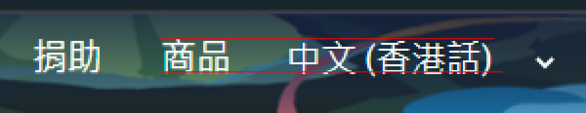
Some style change suggestions:
- Remove margin-top: 0.58em; from #lang-switcher-widget
- Add height: 50px; to #lang-switcher select
- Rationale: The navbar links have padding-top/padding-bottom of 15px and line-height of 20px, which adds up to 50px. The text in the select element will then align in the same way as the other links.
- For mobile (@media (max-width: 1000px)):
- Add height: 40px; to #lang-switcher select
- Rationale: The navbar links have padding-top/padding-bottom of 10px for max-width: 1000px instead.
- Add display: block; to span.#lang-switcher and add width: 100%; to #lang-switcher select
- Rationale: This extends the language selector to full width like the other navbar links.
- Replace margin-left: 0.5rem; of #lang-switcher select with padding-left: 15px
- Rationale: The navbar links have padding-left of 15px, so this aligns the text the same way as the other navbar links.
- Add height: 40px; to #lang-switcher select
