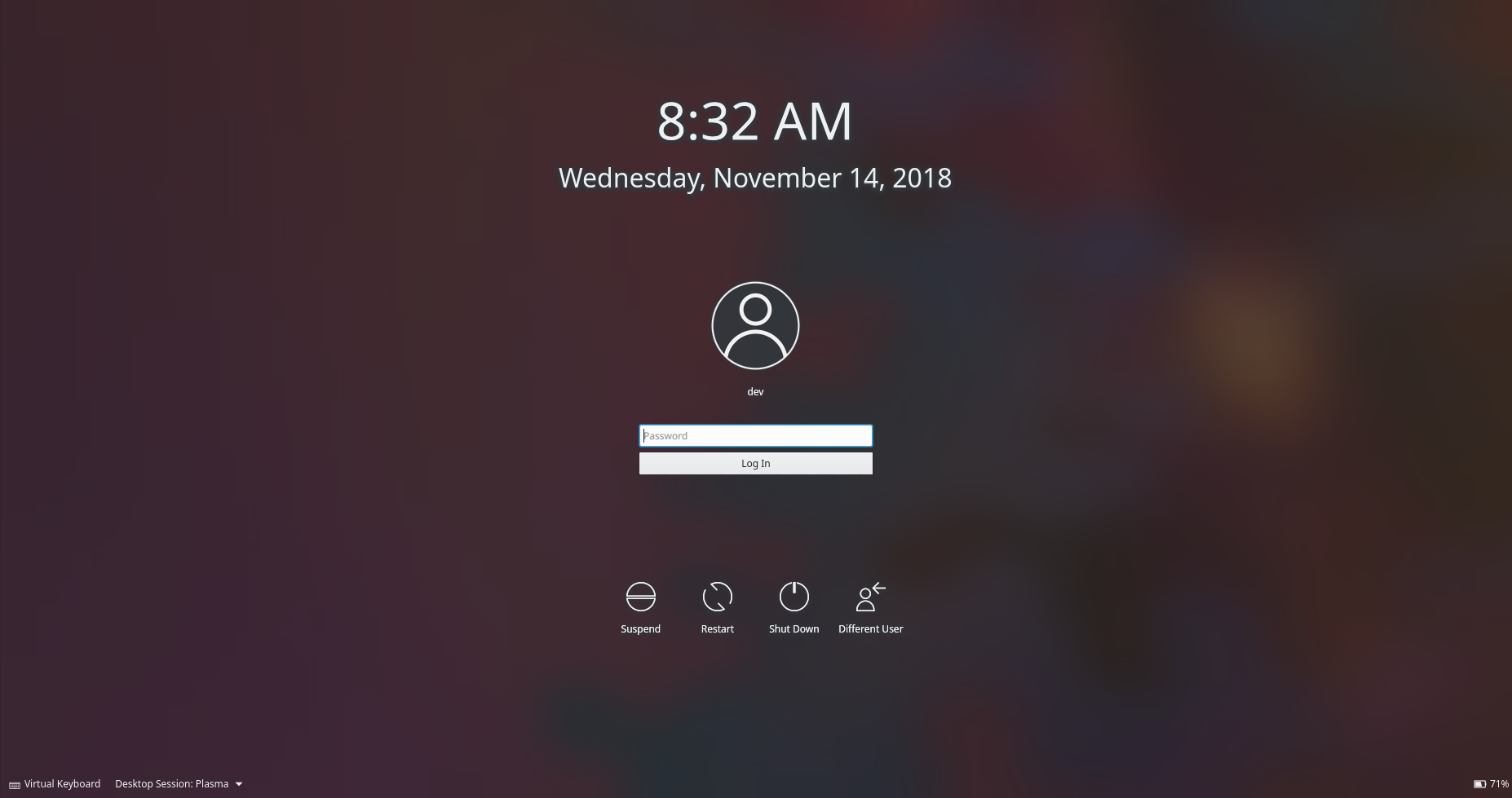
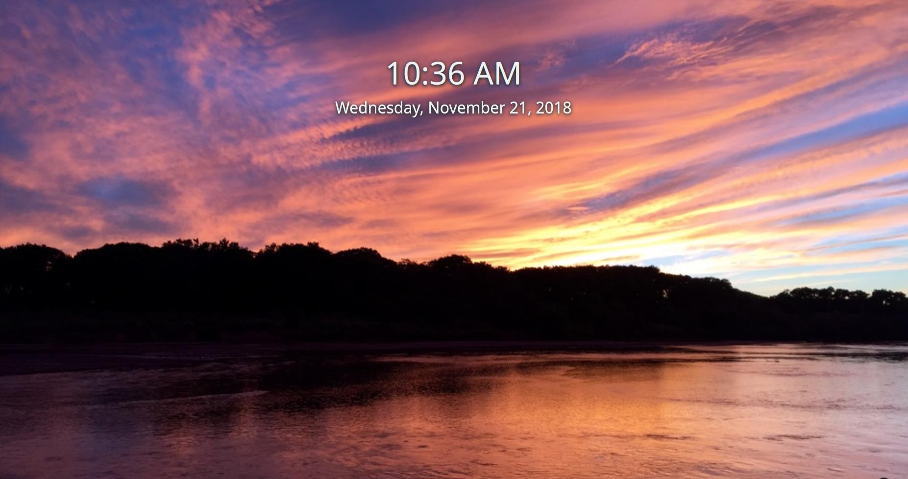
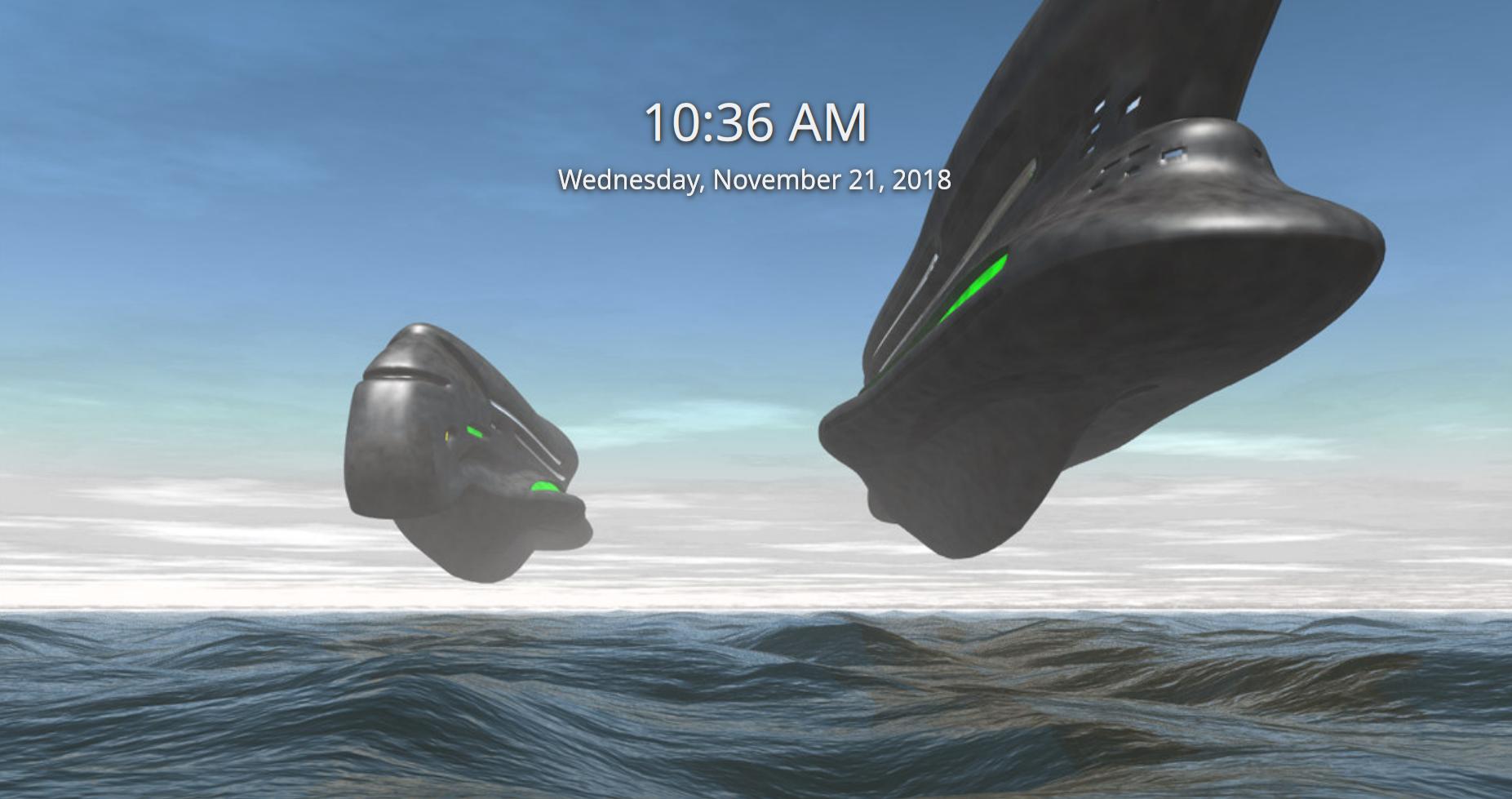
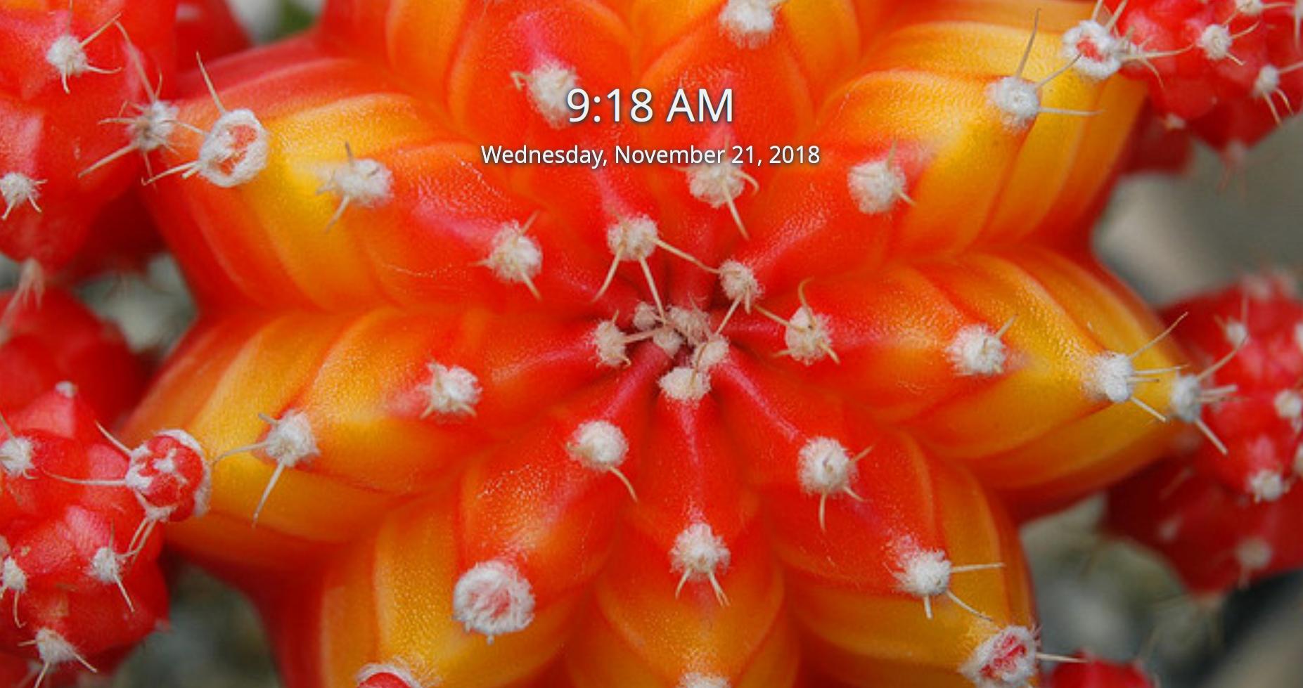
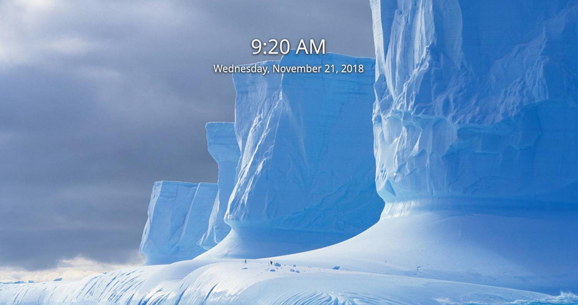
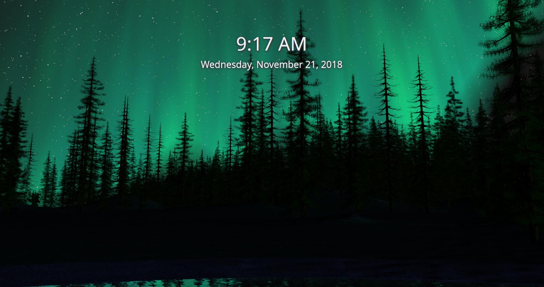
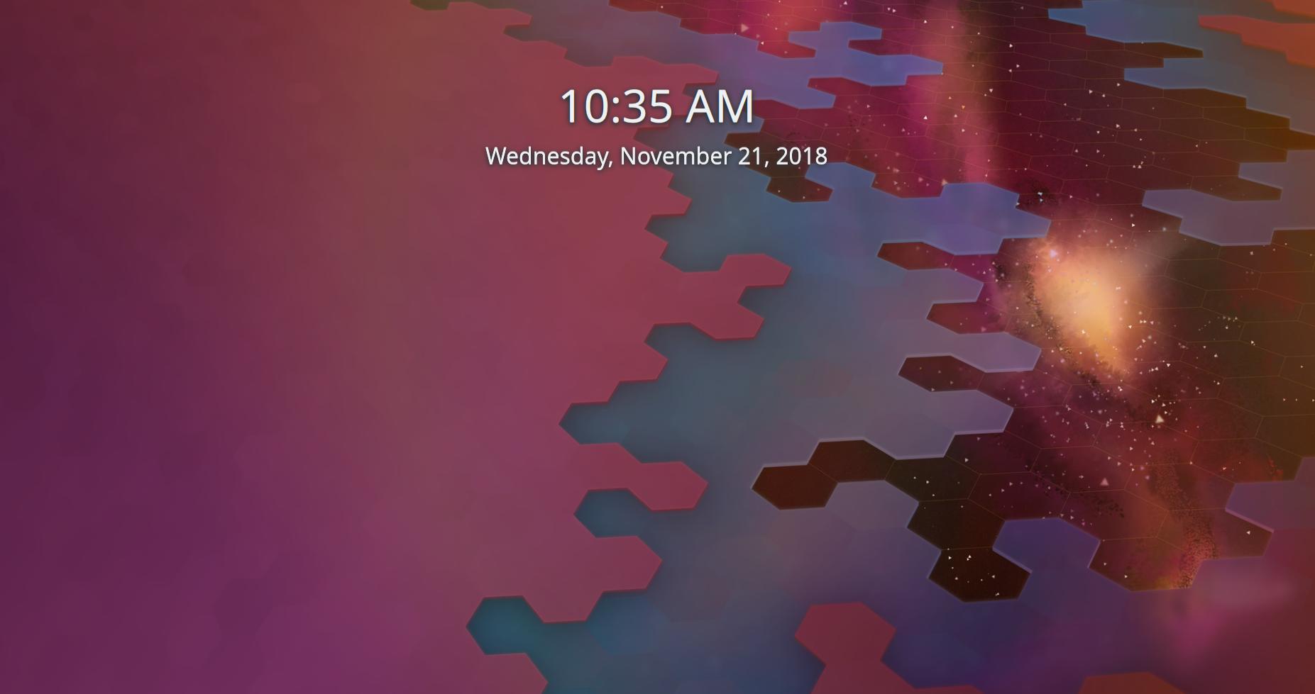
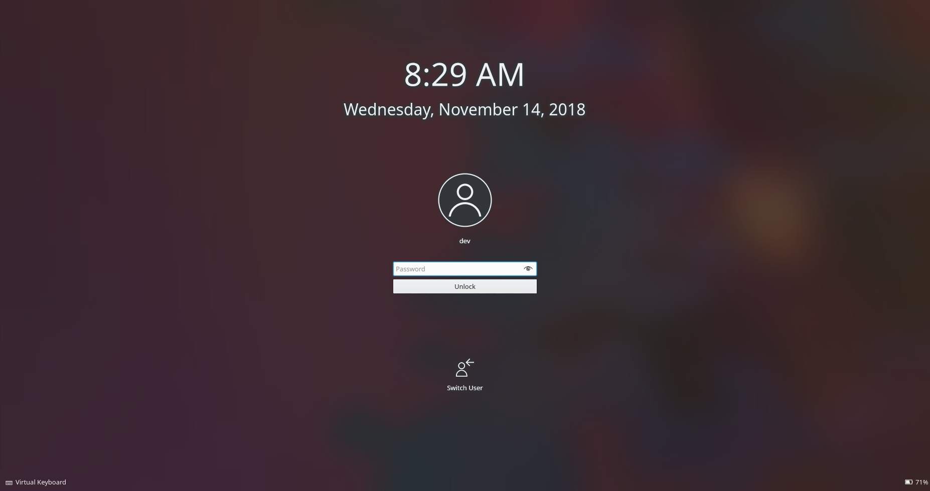
[Login and Lock screens] Improve UI elements' contrast a bit
Summary:
As requested in D16031, tweak the login and lock screens in only fairly non-controversial ways:
- Add a dark background behind the user avatar and a shadow behind the username
- Tweak the clock shadow to make it a tiny bit stronger
- Reduce clock shadow redundancy by moving it into the Clock item and out of the clients
- Don't use hardcoded shadow colors anymore
With the existing UI, these are very subtle changes that should barely be visible.
This diff does NOT include the following changes from D16031:
- Blur-less login screen
- New icons for the buttons
- Horizontal bar on the bottom to hold the buttons for the virtual keyboard, session chooser, and battery status
Test Plan:
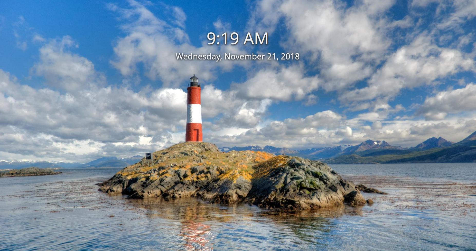
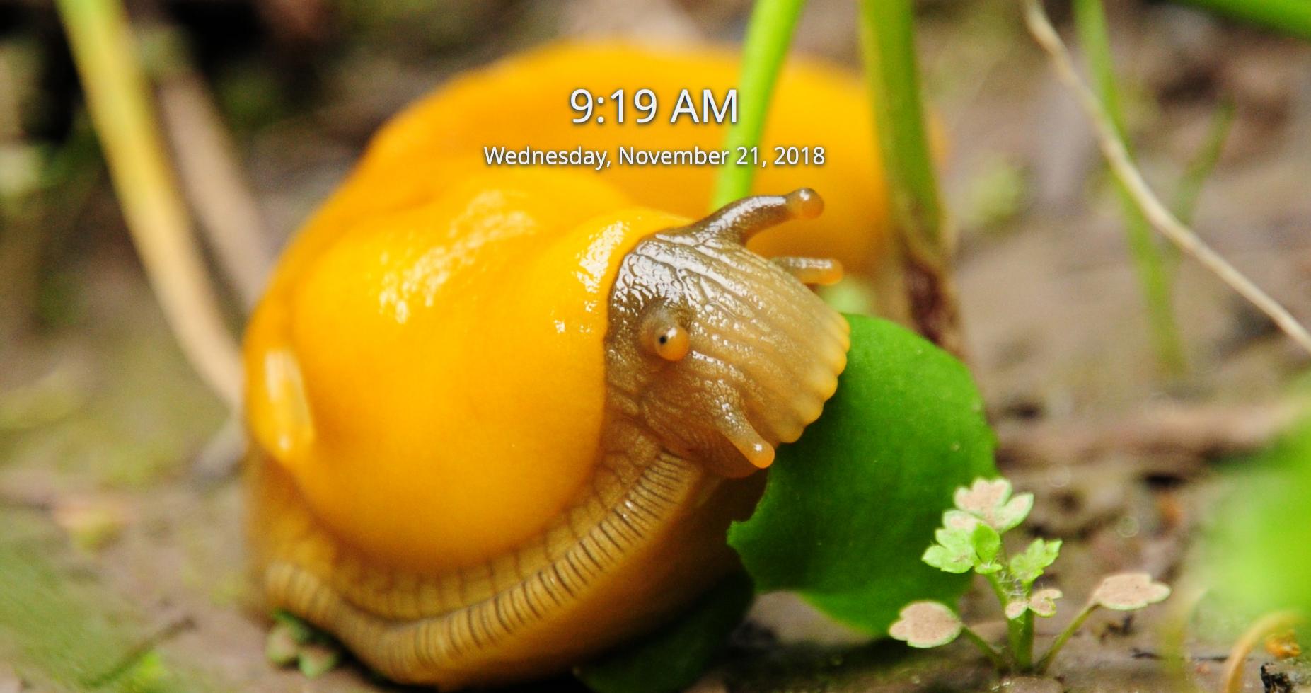
Login screen:
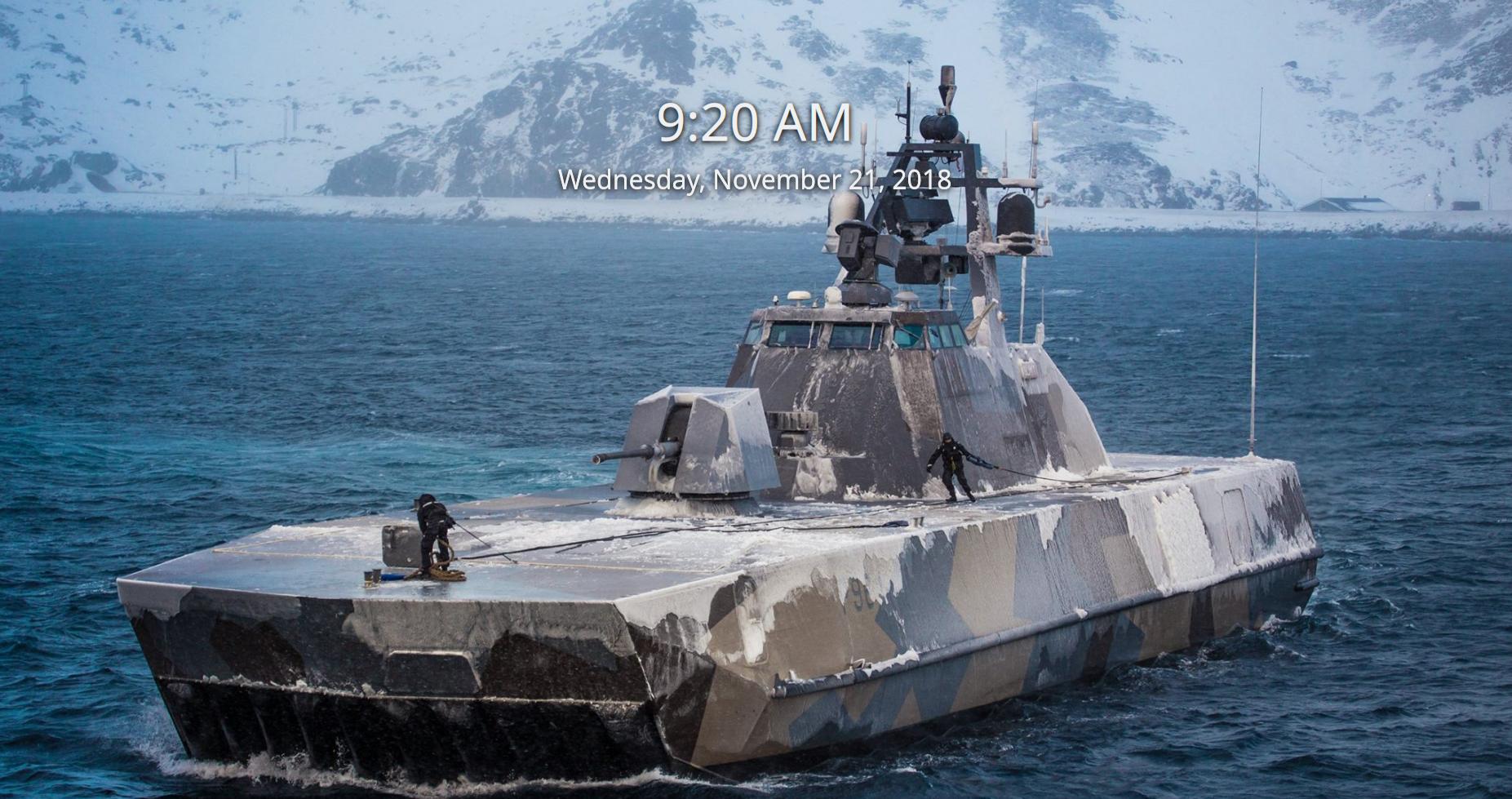
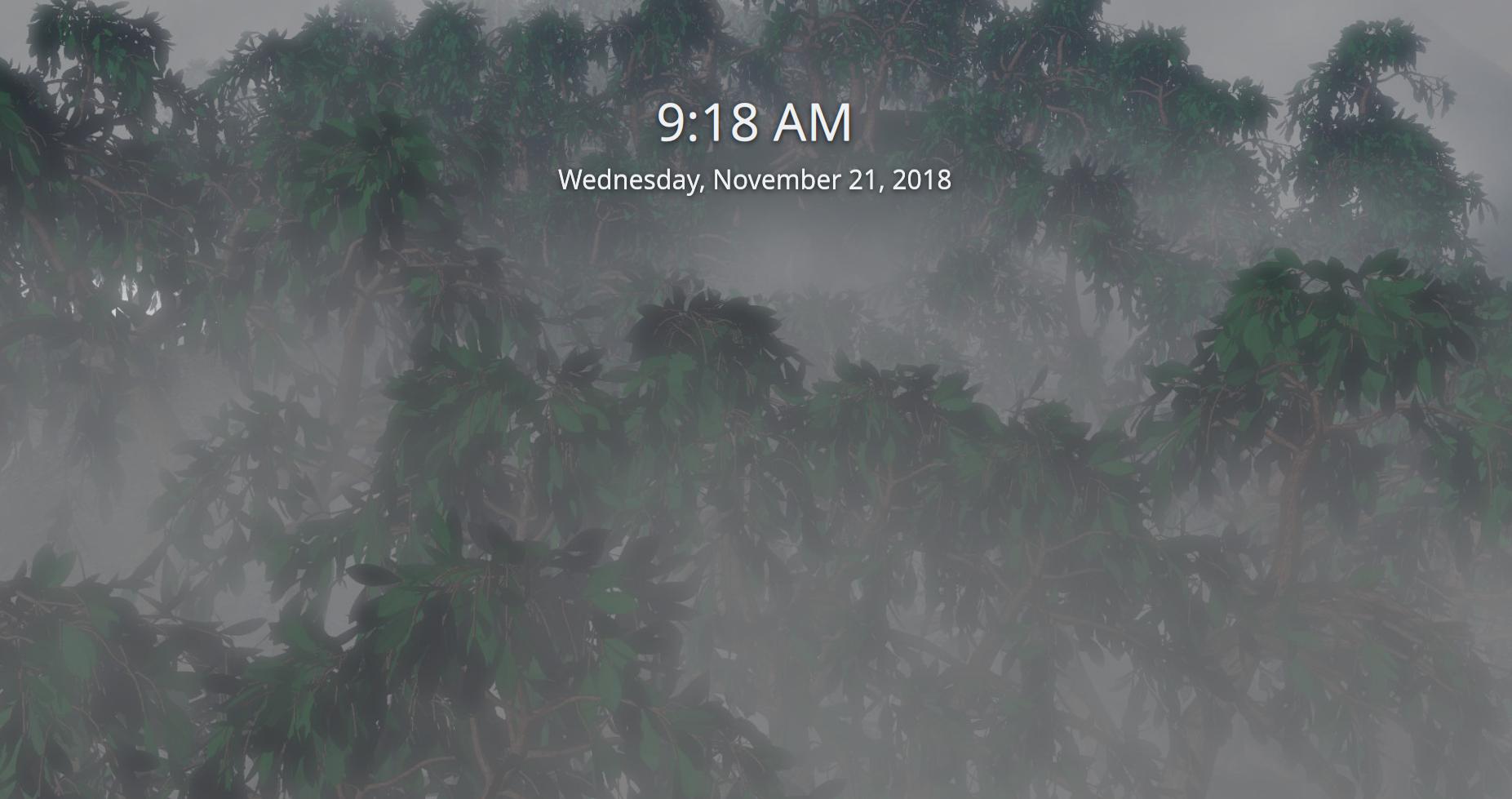
Lock screen:


Reviewers: davidedmundson, VDG, Plasma
Reviewed By: davidedmundson, Plasma
Subscribers: mart, rooty, plasma-devel
Tags: Plasma
Differential Revision: https://phabricator.kde.org/D16879