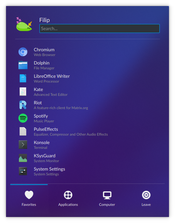
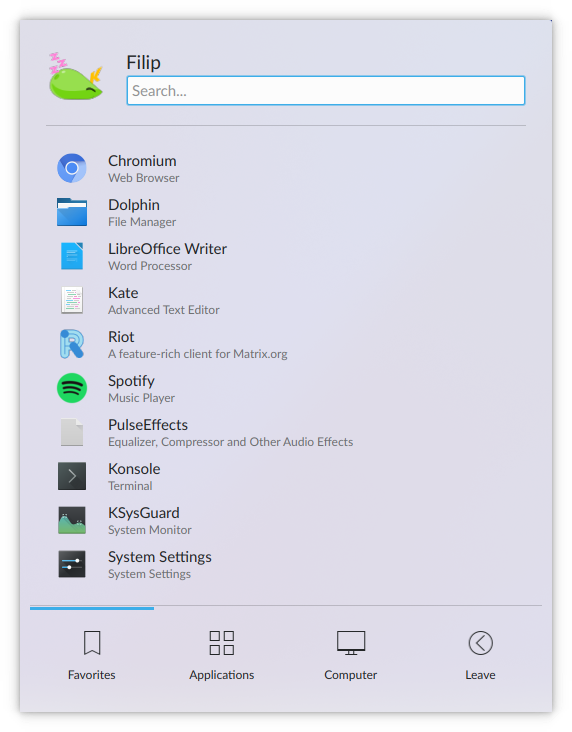
The somewhat complex code for separator color in Kickoff creates issues with transparent themes. Separators can become barely visible, defeating the purpose of adding them. Relying on text color on the other hand is a safe bet to ensure visibility.
Details
Details
- Reviewers
ngraham - Group Reviewers
VDG - Commits
- R119:935f33387437: [Kickoff] Use simpler code for separator color
Before:

After:
Breeze and Breeze Dark look the same as before:

Diff Detail
Diff Detail
- Repository
- R119 Plasma Desktop
- Lint
Automatic diff as part of commit; lint not applicable. - Unit
Automatic diff as part of commit; unit tests not applicable.
Comment Actions
Yeah, much saner. Nice! I recall copy-pasting this code from elsewhere so you might wanna have look-see to check whether there are other uses of this that can be simplified as well.
Comment Actions
I think it was taken from Kirigami's separator. I probably shouldn't mess with its color since it might be fine tuned to match the borders of other QQC2 elements etc. or might also be fine tuned to match Breeze menu border colors.
From a practical POV not even Kvantum can make QML windows transparent so there wouldn't be the same problem with the Kirigami separator as here.