Added desktop behaviour to on demand pattern
Details
Details
- Reviewers
colomar mart - Group Reviewers
Kirigami - Commits
- R985:cd89b5e7e196: HIG entry for On-demand pattern and swipe list item
Diff Detail
Diff Detail
- Repository
- R985 KDE Human Interface Guidelines
- Branch
- swipe
- Lint
No Linters Available - Unit
No Unit Test Coverage
| source/patterns/command/ondemand.rst | ||
|---|---|---|
| 12 | maybe add a dolphin screenshot as well with the + on hover? (or folderview) | |
Comment Actions
- Refactored on demand pattern, moved swipe list item specific details to the components page
Comment Actions
- Merge branch 'master' into swipe
- added a screenshot for a desktop swipelistitem, small formating change
- Added png file
| source/patterns/command/ondemand.rst | ||
|---|---|---|
| 12 | There is a dolphin screenshot with the hover in the desktop section, (line 48+) | |
Comment Actions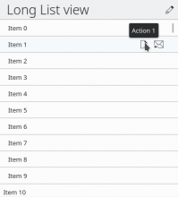
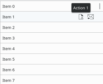
Mobile, listview:
 (added a thing to indicate touch, no idea if it maskes sense)
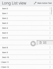
Desktop, Grid view:

ok for the text, the screenshots would need update:
both of them at the moment are desktop, which is ok (i would add the mouse cursor)
and one mobile is needed, provided here:
Desktop, listview:

Mobile, listview:

Desktop, Grid view:

We will need to design something for mobile gridview as well i guess as it would be widely used as well i guess (eg photo gallery)
but that's for a next iteration :)
Comment Actions
See inline comments. Otherwise it looks good!
| source/patterns/command/ondemand.rst | ||
|---|---|---|
| 27 ↗ | (On Diff #33609) | Since this is a command pattern, shouldn't this link to command patterns instead of navigation patterns? |
| 57 ↗ | (On Diff #33609) | I'd add a screenshot of the swipelistitem here as well |
| 59 ↗ | (On Diff #33609) | swip -> swipe |
| source/patterns/command/ondemand.rst | ||
|---|---|---|
| 27 ↗ | (On Diff #33609) | My intention was to suggest switching to a navigation pattern like "Master-Detail" or "Column-based navigation", so each item has its own content page where more actions could easily be displayed. What kind of command pattern would you suggest could replace the 3+ actions? |
| source/patterns/command/ondemand.rst | ||
|---|---|---|
| 27 ↗ | (On Diff #33609) | Ah okay, now I understand what you mean. I don't think that becomes clear through that wording, however. In any case, it's the command pattern that is directly affected by the number of actions. It is true that the command patterns that work well for for more than three actions usually necessitate a deeper hierarchy, but that is then the next step. The first decision is which command pattern to choose, and that can be for example a context drawer or controls within content. So I'd still suggest to change it to a link to command patterns. Once the designer has chosen a suitable command pattern, then they have to figure out which navigation pattern best suits that. |
Comment Actions
Currently we have a screenshot of the nouseover in Dolphin in here, but screenshots for swipeListItem only in the corresponding page. That gives preference to the Dolphin pattern because lazy people will implement what they see first. Therefore there should either be screenshots for both options here, or no screenshots at all.
Comment Actions
More concrete suggestion: Move the Dolphin screenshot to the top, next to the mobile screenshot.