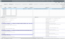
Right now the diff viewer looks odd while working with diffs from SVN or GIT.
I can say that Kompare whole purpose is to compare these type of files and not others,
so setting it to be LTR (as in KTextEditor) seems to be quite reasonable.
Details
Details
- Reviewers
- None
Diff Detail
Diff Detail
- Repository
- R454 Kompare
- Branch
- master
- Lint
No Linters Available - Unit
No Unit Test Coverage
Comment Actions

Before:
Moving the scrollbar to left will show the actual content, but hide the line numbering:

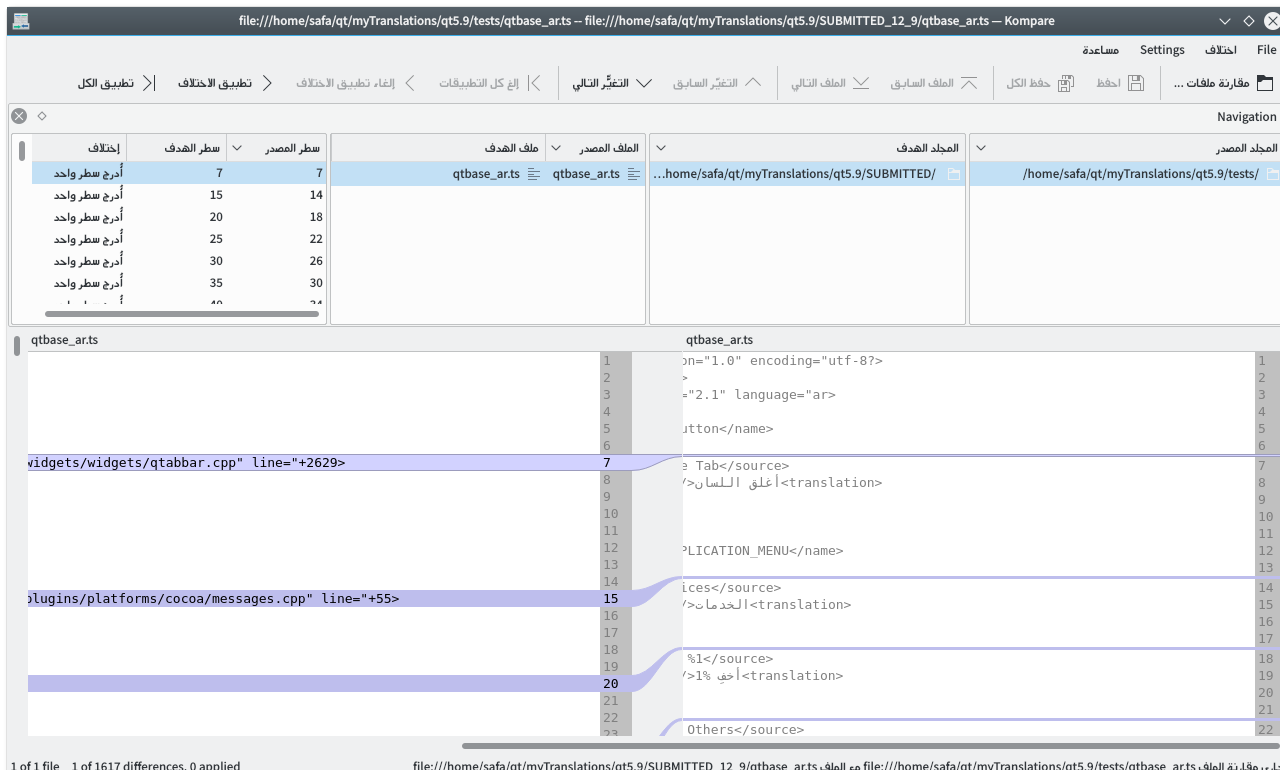
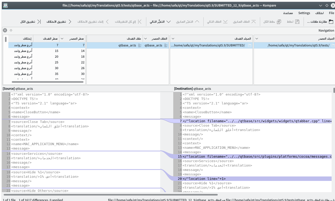
After (Notice the modefied label, which is added to make the separation clear):
| komparepart/komparelistview.cpp | ||
|---|---|---|
| 89 | Not too sure about those but rest of patch looks fine | |
| komparepart/komparelistview.cpp | ||
|---|---|---|
| 89 | Yes I know that they don't relate to this somehow, but it was needed since we are just mirroring one part of the application, while the top list widgets aren't mirrored, and that will make it a bit strange and confusing to see source on right for the list views, and on left in the diff view. Maybe both should be mirrored, so that we don't make things confusing? | |