Description


| Status | Assigned | Task | ||
|---|---|---|---|---|
| Resolved | jlskuz | T5082 Timeline Refactoring | ||
| Resolved | jlskuz | T5174 Timeline UI and interactions | ||
| Resolved | jlskuz | T6868 Icons for advanced trimming tools. |

HI,
I've sketched a simple proposal for the icon set for the trimming operations. I followed the style that Kdenlive already has. I based the icon set on the arrow already in use for Inserting clip zone in the timeline. The proposal includes the grid for generating the set. I also include examples of how the icon set looks using three different desktop themes, their posible location and drop down on the toolbar, and finally a first sketch for the timeline selectors.
With your feedback, I can adjust the set, finish it and send it to you the final svg file for inclusion in the interface.
I will license the icons as CC-BY-SA 4.0 so that can be freely used in the project.
Hi,
Thank you for sharing this.
As for the icons themselves, they look fine to me. Your take on rolling is a bit unconventional, but I think it conveys the right meaning, what do you guys think?
As for what you designed for the timeline: we actually need two different things:
- One is an indicator that visually shows which clip is being edited (and which end of this clip we are actually touching, if not both as in the case of rolling). In that case, adding arrows to show what editing mode we are in might be superfluous, what do you think ? On the other hand, the proposal looks neat. (However note that there is only one kind of rolling, so only one indicator needed).
- The other one is the mouse cursor itself. It could look similar to the icons, however in that case I don't think it should use the same color theme (a multi-color cursor is weird)
For the indicators and cursors, we probably need to differentiate between trimming and rippling. Premiere does it by color (red for trim, yellow for ripple, as in the picture Farid posted), and I don't know how other editors do this.
However, I wonder if we could run into troubles (patents…) if we simply copy this color scheme as is…
HI,
Thanks for the feedback alcinos.
I integrated the icon to the toolbar in a light and a dark theme.
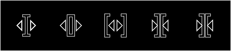
I also added the mouse cursors for each of the trimming operations.
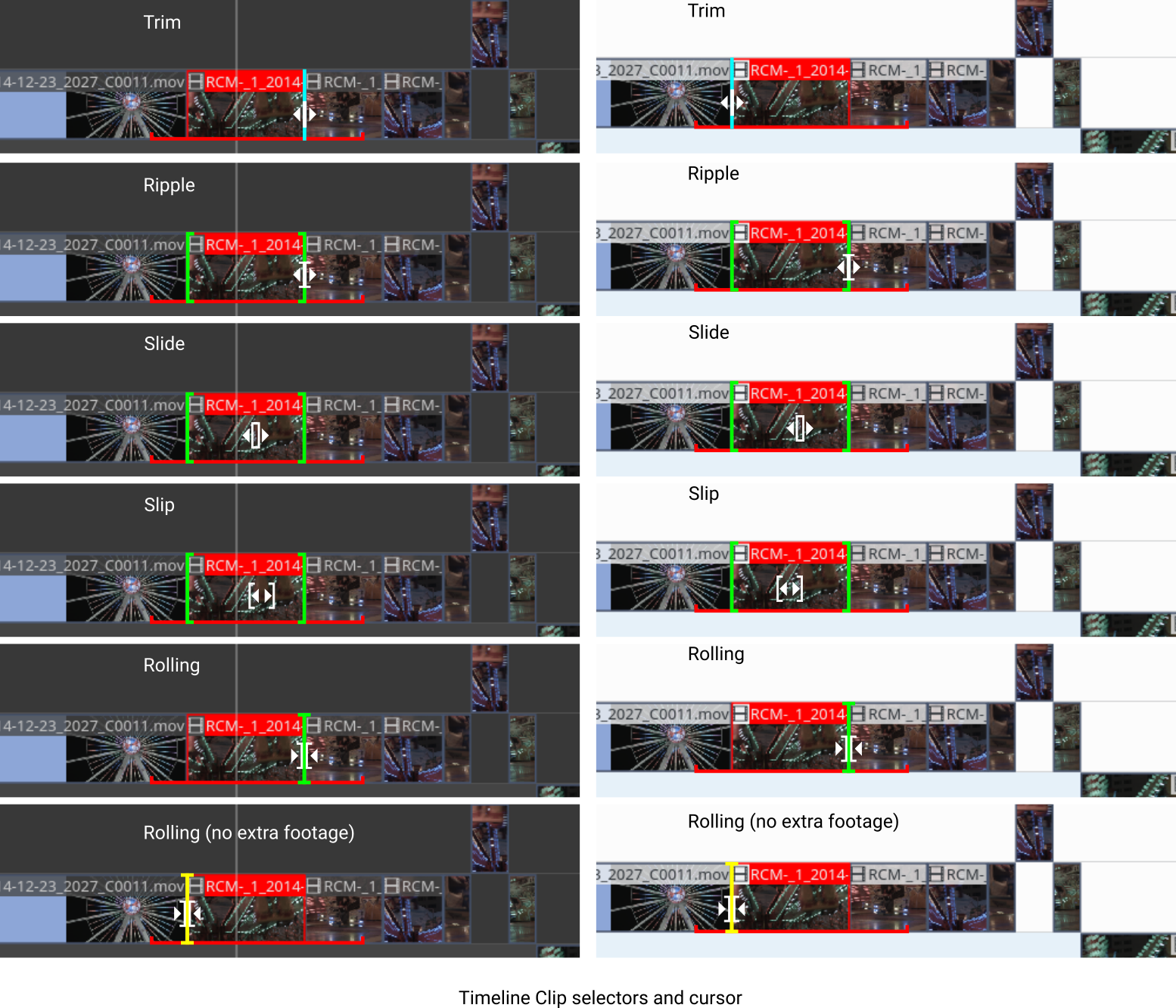
I did again the indicators, removed the arrows, and thinned the actual in and out indicators. After further consideration, they looked too thick for me. I changed the colour of the indicators to green, because in the current interface once a clip is selected in red and green provides the strongest contrast to red.
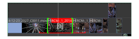
I've observed something very interesting in the interface of Davinci Resolve NLE. It adds a rectangle to indicate the hidden-actual length of the clip been rippled, slide, slipped, or slide. This informs visually the user the limits for the trimming operations on the footage. I think adding something like that would be a nice idea for the UX in kdenlive. Using the red colour, already indicating the selected clip, I added a ⎵ on the bottom of the clip to indicate the total available length of the clip.
To illustrate how this would work I add to simple animated gifs. The Slide gif is not exactly as the operation but it shows that in that case the bottom indicator stays while the clip slides with the in and out green indicators. That is the opposite case by slip, the green indicators stay and the bottom indicator shows the amount of slipping.
trimming and rippling
I don't understand the difference between trimming and what we already have by selecting a clip and moving one end (in or out) and changing the length of the clip. There is no ripple because that change doesn't have an effect on the rest of the timeline. For that reason I didn't add cursor or indicators for trimming.
... troubles (patents…) if we simply copy this color scheme as is…
I propose to use green and yellow, green to go and yellow to attention. As said Kdenlive already uses red to indicate the selected clip.
Differently from Premiere, FCP and Davinci Resolve use the red colour to indicate that there no extra footage to do the roll. I used that concept in this proposal, by adding a yellow indicator to inform there is no extra footage for the rolling operation. In the other cases as we already have an indicator that shows the limits of the footage, that wouldn't be necessary.
- List Item
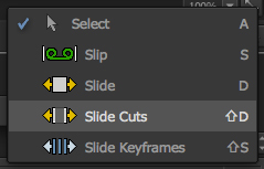
Integration in the toolbar

- List Item
Mouse Cursors
- List Item
Indicators on the timeline

- List Item
Gifs to show the function of the bottom red indicator.

Cheers.
Ohh I forgot to add the link for the Davinci Resolve example of trimming.
https://www.premiumbeat.com/blog/dynamic-trim-tool-resolve/
As far as I've gathered Avid don't use colour to indicate trimming operations and Lightworks uses red and blue to indicate in and out over a light green timeline.
Wow, this looks great, thanks for the effort you put into this.
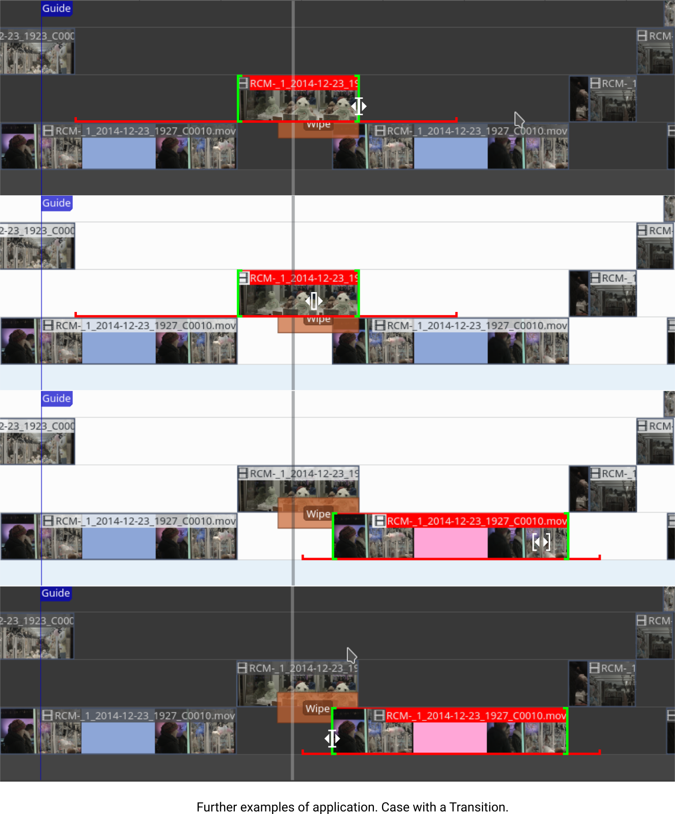
I like the red indicator to show how much footage there is, but I am slightly concerned that it might be occluded by transitions (transitions clip are overlapping on two consecutive tracks)
Your yellow indicators (meaning no more footage) seem useful in all cases, including rolling.
For rolling, the footage indicator should show the area where rolling is possible (this is the intersection of available footage of both clips). That means that your last picture on rolling is slightly wrong (yellow indicator but not at the end of the red area)
About ripple vs trim : trim is what is currently implemented in kdenlive, you can resize a clip and it doesn't affect any other clip.
Ripple is different, because is moves other clips to cope with your resize (if you shorten your clip, it will make sure no blank space appear)
So mouse cursor and clip indicator would look the same (as it is basically a resize operation), but we would need to seen really quickly which mode you're in. That's why I was mentioning the color code used by premiere. Maybe we could have something similar for the cursor colors?
As for cursors, I like the shape, but I think it would be better with plain colors. For trimming, I think we would need left and right trimming cursors.
If anyone has anything to say, please step forward!
Cheers
ripple vs trim For trimming, I think we would need left and right trimming cursors.
I've added an indicator the the edge of the clip. It is cyan to differentiate of the or the ones used for advance trimming operations (ripple, slip, etc )
I also created a cursor for that that is different for the ripple. I think with one cursor is enough. This one is also a simplified version of the ripple cursor.
All indicators and cursors for advance trimming ops use a combination of arrow and bracket-like elements whereas trimming uses a combination of arrow and a simple centred bar.
What do you think?
I change colours to one plain fill colour without stroke.
I am slightly concerned that it might be occluded by transition
See the application of the footage indicator in clips with a transition. I did the example with the top clip and the bottom clip selected.
For rolling, the footage indicator should show the area where rolling is possible
You're right. I do an example of this application later during the week or the weekend.
@andreaska
of course any help is appreciated. I'll be glad to discuss any suggestion you have on creating a specific colour scheme for the indicators and cursors.
Files:
- Icons and cursors
- Application with a transition
- Application on the timeline
HI,
Just in case that something happens here it is the original svg of the proposal. It is just the design without the application examples.
@drnn1076 We are now (finally!) going to work on the advanced trimming tools and it would be nice if we can use your icons. Unfortunately we can't use custom mouse cursors as QML doesn't allow it. For the icons it would be nice if you can make sure that they fit to the breeze HIG (https://develop.kde.org/hig/style/icons/) and open a merge request for breeze at https://invent.kde.org/frameworks/breeze-icons (add me @jlskuz as a reviewer)
If you have any questions or need help feel free to ask! Best would be to do it on the new gitlab issue https://invent.kde.org/multimedia/kdenlive/-/issues/1069 or the dev telegram / matrix group
Hi @jlskuz , yes, of course you can use the icons I designed. I'll check out the HIG guidelines and see how I can request the git merge (I don't know how to do this).
I would then only finish off the icons to comply to the HIG and remove the mouse cursor.
A few initial questions.
Should I just add the black and white version?
What format should I send them? as the original vector based SVG?
What about the Indicators on the timeline, should I include them?
Cheers.