Some thoughts on how to evolve the Splash screen to a Welcome screen.
Some examples of welcome screens:
Krita

Blender

Some thoughts on how to evolve the Splash screen to a Welcome screen.
Some examples of welcome screens:
Krita
Blender
@alcinos, @vpinon and @mardelle do you find this interesting/feasible development-wise?
@massimostella and @thediveo what do you think?
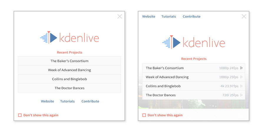
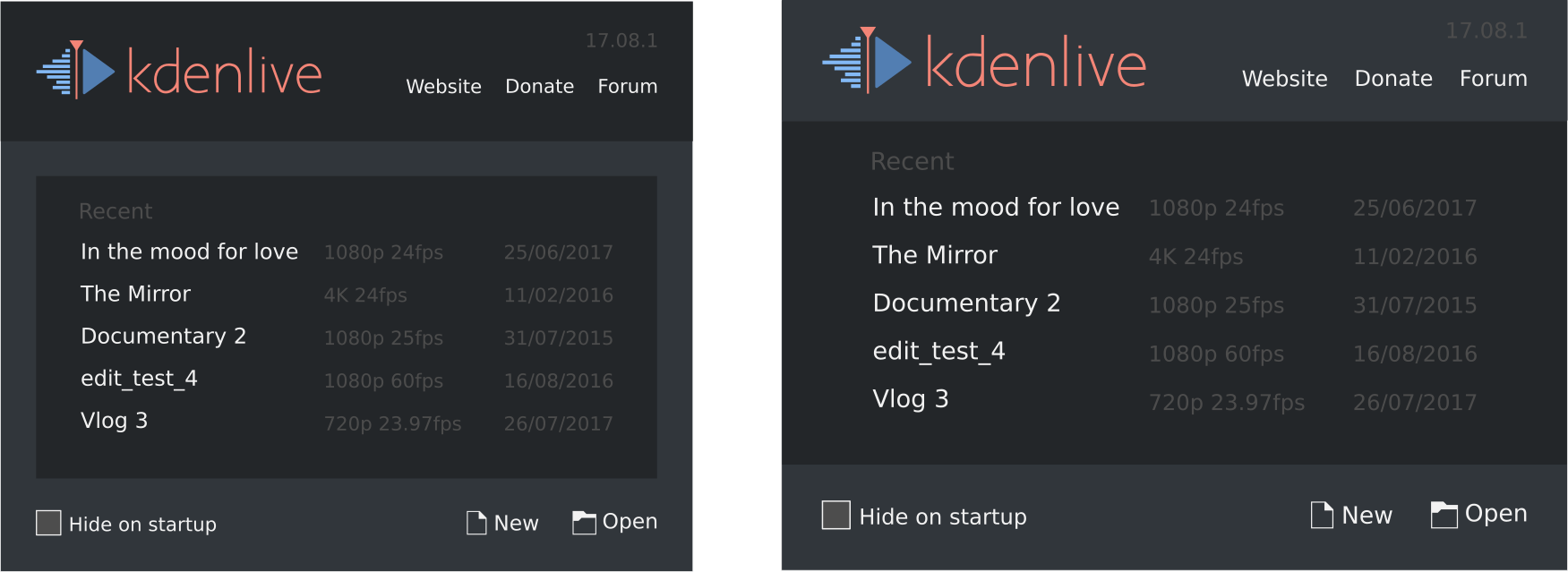
Really like the look of Blender's welcome dialog, but also appreciate Krita's 'Hide after startup' checkbox. For users who like to launch the editor and start dragging their files in right away it's super helpful being able to easily disable it.
I've had a bit of a play around a mock-up just to jog some ideas, maybe I'm overdoin' it with all the white though. (Could also have a 'Create Project' button)
Just out of interest, here's what some other video editing programs are doing with their welcome screens:

DaVinci's is quite large and visual. You can see thumbnails of projects and scrub through them by hovering over with the mouse.
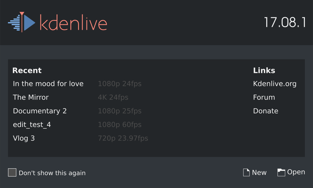
Here is a patch of the current status (based on master). Probably no time to work on that this week-end, if someone wants to take over.
Image used (in data/pics)
Current issues:
Maybe we should add a empty project button ? Essentially, that would just closes the splash, since on startup kdenlive is on an empty project. But it may be comforting for some users.
Wow @alcinos that was quick \o/
Based on your suggestions I gave it a try.
One thing I find important is that it should respect the theme... so a dark theme should have a dark welcome screen. Also I tried to follow the guidelines of Breeze. I will ask the VDG people to help us out with suggestions.
PS
@benjaminnelan thanks for the help :D
Few thoughts :
Other wise buttons are nice!
If we put a border I think it is fine.

As for the separation of link and recent projects, we'll try to think of something.
Look awesome.
Move the recent and links header outside of the black rectangle?
You can add a new tab right to recent where you have the new dialogue in the black box.
A tutorial and explain the ui link in links would be nice.
Here is another version closer to the original proposal of @benjaminnelan contemplating @alcinos suggestion.
I added a proposal to show the date the project was last modified and also to show the versions of the base libs in the header.
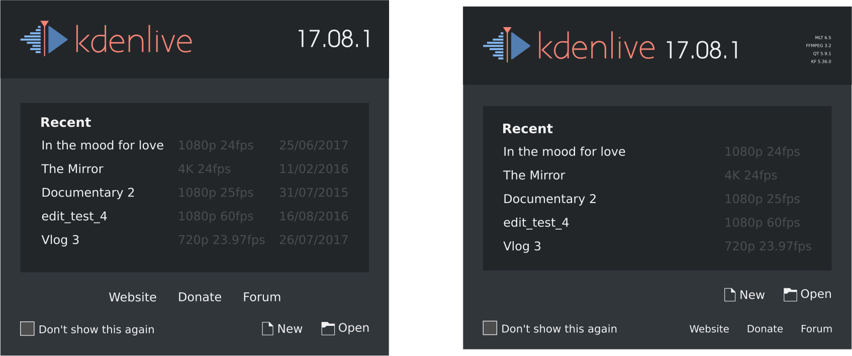
Can you check how it would look like you have recent, new and open in one line. And on bottom the links like in the right pictures.
I would prefer the left kdenlive header. It's a start screen not a app info panel.
Hide after startup like in krita is shorter. Maybe checkbox hide would be enough. Translations are most of the time longer than english.
Woah, loving the ideas here! That sketch is cool @alcinos !
Nice! Really digging the dark theme - definitely should match the theme the user is using!
Seeing it with buttons, I like the left-side one as far as button placement, but at the same time I think having them directly below the list makes more sense as they're closely related to the action of opening a recent project.
So maybe it's a matter of moving the links above? Sort of, "This is Kdenlive, here's some resources for Kdenlive, create/open your project."
(Thanks for the handy SVG btw @afarid )

Also, I don't know if this is what @andreaska meant by "recent, new and open on one line" but I decided to play around with that too.
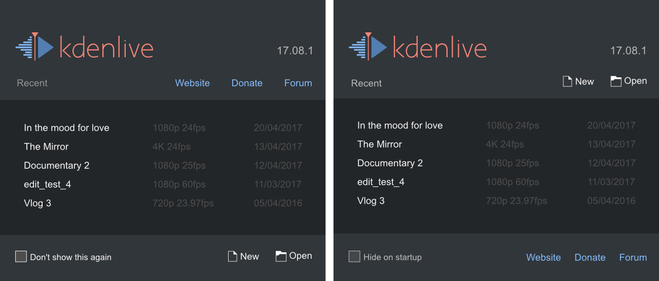
However, I think most people expect dialog buttons to be bottom-right, so the new and open buttons probably work better at the bottom of the window.
One more
@andreaska and @benjaminnelan what do you say?
I reduced the logo size and did various spacing adjustments.
Last mockup is really good. I would use white for recent but for show on startup gray.
Version number white?
Every interation is a big improvement
About the links. I like them. Why you dont have a donate section on the webpage? Something like a tutorial page where you link at the start screen would be nice. However. Donate should be there or support where you have a website like libreoffice https://donate.libreoffice.org/ support via money or time.
Had a go at @afarid 's design (in progress)
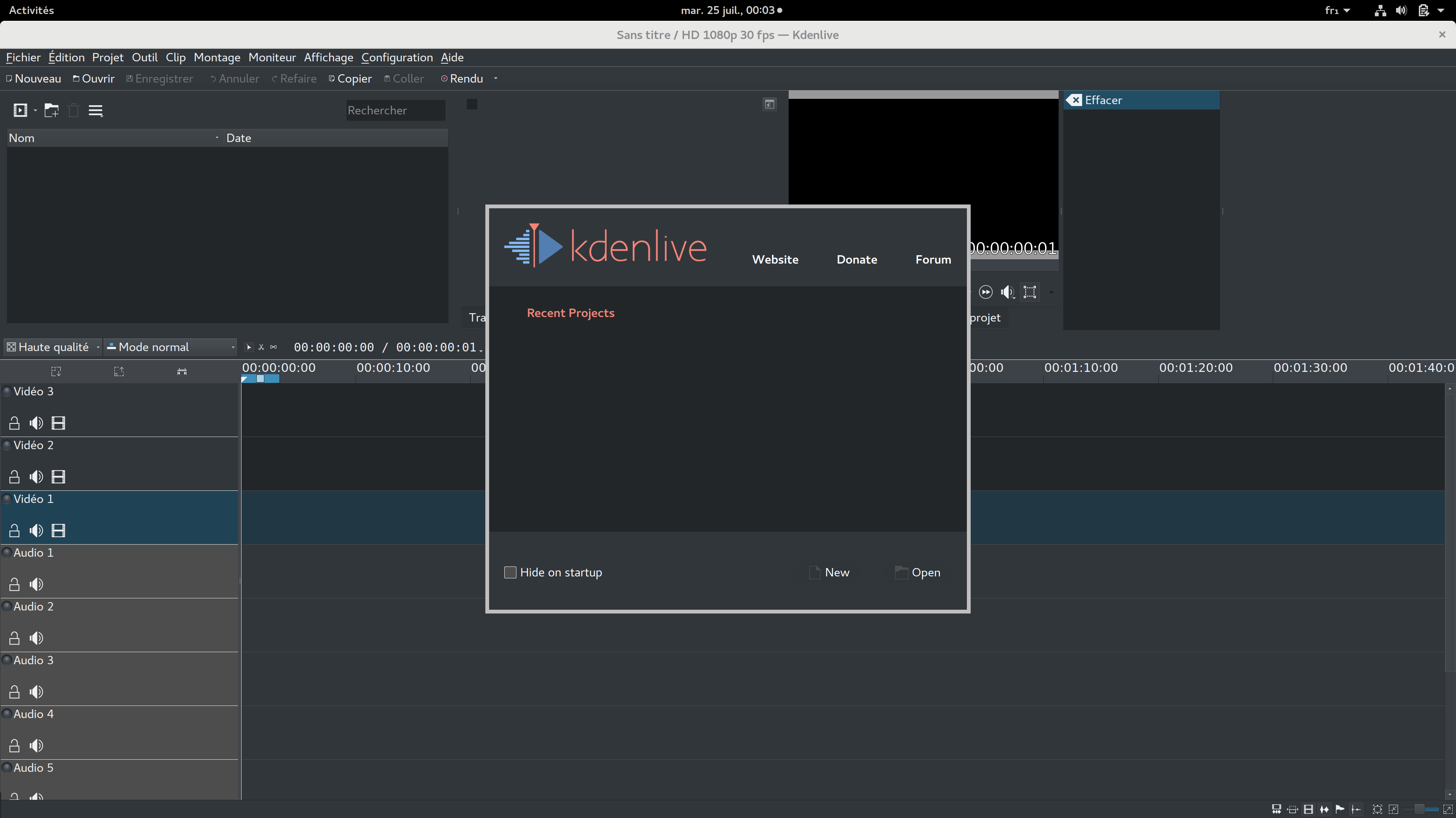
Here is patch:
@mardelle : what is your trick for white icons again ?
For themed icons, I used a ToolButton with the iconName property. If I remember, that's what did the trick. From TrackHead.qml:
ToolButton {
id: muteButton
iconName: isMute ? 'kdenlive-hide-audio' : 'kdenlive-show-audio'
iconSource: isMute ? 'qrc:///pics/kdenlive-hide-audio.svgz' : 'qrc:///pics/kdenlive-show-audio.svgz'
onClicked: controller.setTrackProperty(trackId, "hide", isMute ? isHidden ? '1' : '0' : isHidden ? '3' : '2')
tooltip: isMute? i18n('Unmute') : i18n('Mute')
}
i think that a Splashscreen need to be displayed immediately .. seems that when an user double click the executable nothings happens (this is very visible on windows porting).. and maybe user launch 2 times kdenlive.

