[RFC] Make Kirigami's headings smaller and set default top/left margins
Open, Needs TriagePublic

Description

Kirigami's headings are really prominent and stand out in their current state as their font size is rather huge.
Furthermore, some headings are very far to the left and others to the top, making them appear to be placed widly.

Therefore I suggest to shrink it down a little bit and additionally to add a default top and left margin, which should benefit the overall appearance.

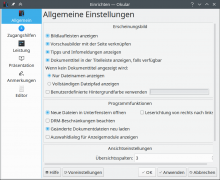
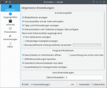
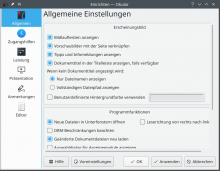
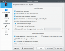
Here are some quickly made mock ups, which surely leave room for improvements:

Scaling 1.0: Font size 26, Noto Sans

BeforeAfter

Scaling 1.5: Font Size 28, Noto Sans

BeforeAfter
alexde created this task.Feb 1 2020, 12:07 PM
alexde updated the task description. (Show Details)
alexde renamed this task from [RFC] Make Kirigami's headings smaller and align them to left edge of the content to [RFC] Make Kirigami's headings smaller and set default top/left margins.Feb 1 2020, 12:18 PM
alexde updated the task description. (Show Details)
alexde added projects: Kirigami, VDG.

Looks much better imo, even the text seems to be vertically centered

mmustac added a subscriber: mmustac.

Finally ! So much better.

GB_2 added a subscriber: GB_2.Feb 1 2020, 3:31 PM

Incredible!

Yeah the current maximum size is a little humongous. The mockup versions look much better IMO. I support this.

Technically speaking, this would entail adjusting the Level 1 size of the Heading component in Kirigami and PlasmaExtras, as well as the KTitleWidget in KWidgetsAddons. Margins might need tweaking in individual apps or the frameworks they're using.

@mart would you be okay with this?

ndavis added a subscriber: ndavis.Feb 1 2020, 7:01 PM
This comment was removed by ndavis.
ndavis added a comment.Feb 1 2020, 7:09 PM

+1 to this. It's a bit hard for me to get a proper perspective from the screenshots though since you appear to be using fractional scaling.

alexde added a comment.EditedFeb 1 2020, 7:22 PM

+1 to this. It's a bit hard for me to get a proper perspective from the screenshots though since you appear to be using fractional scaling.

Yes, I use a fractional scaling of 1.5 but haven't considered that this could influence the appeareance very much. Though, I can add or replace the screenshots later with those taken with an integer scaling.

ndavis added a comment.Feb 1 2020, 7:49 PM

+1 to this. It's a bit hard for me to get a proper perspective from the screenshots though since you appear to be using fractional scaling.

Yes, I use a fractional scaling of 1.5 but haven't considered that this could influence the appeareance very much. Though, I can add or replace the screenshots later with those taken with an integer scaling.

Fractional scaling does influence things like alignment for widget components that aren't anti-aliased. Things that are anti-aliased can look a bit fuzzy on the edges.

The problem here is that it's harder to shrink the image down to exactly how it would look on my screen when you use fractional scaling.

alexde updated the task description. (Show Details)Feb 1 2020, 8:07 PM
alexde updated the task description. (Show Details)
alexde updated the task description. (Show Details)Feb 1 2020, 8:13 PM
alexde updated the task description. (Show Details)Feb 1 2020, 8:16 PM
alexde updated the task description. (Show Details)Feb 1 2020, 8:19 PM

There's something off with the 1.0 scaling discover screenshots, the search bar is squashed and there seems to be extra vertical padding in the heading text

Level 1 headings are enormous even at 1x scaling.

I think the original point is valid.