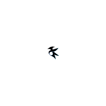
New Kate icon
Closed, ResolvedPublic

Description

Kate has a new icon. To get it to show up at all, I renamed it at the moment in kate.git from kate to kate-editor.

Is there a better way to avoid that any icon theme out there still uses a "non-matching" old one?

For breeze: would it be acceptable to submit the current one?

Sources see https://invent.kde.org/kde/kate/tree/master/kate/icons

Related Objects

StatusAssignedTask
OpenNone
Resolvedcullmann
cullmann created this task.Jan 25 2020, 9:24 PM
cullmann triaged this task as Wishlist priority.
ndavis added a subscriber: ndavis.EditedJan 25 2020, 10:24 PM

Kate has a new icon. To get it to show up at all, I renamed it at the moment in kate.git from kate to kate-editor.
Is there a better way to avoid that any icon theme out there still uses a "non-matching" old one?

The alternative would be to ask theme authors to use the new logo in an announcement. Renaming the icon is more surefire than just asking people to update their icon themes, but anyone can just make a kate-editor.svg symlink to the old icon. Some icon themes that prioritize consistency over app branding (such as Papirus) are likely to do that. I'd suggest doing both so that theme authors who pay attention don't need to wait for bug reports in order to find out.

Consider using org.kde.kate or org.kde.kate-editor. It's not very important since Kate is pretty well known, but you're changing the icon name anyway and it's an extra step to prevent name conflicts.

For it to go into breeze-icons, it will need an outline or a background to prevent it from blending into highlights.

Kate has a new icon. To get it to show up at all, I renamed it at the moment in kate.git from kate to kate-editor.
Is there a better way to avoid that any icon theme out there still uses a "non-matching" old one?

The alternative would be to ask theme authors to use the new logo in an announcement. Renaming the icon is more surefire than just asking people to update their icon themes, but anyone can just make a kate-editor.svg symlink to the old icon. Some icon themes that prioritize consistency over app branding (such as Papirus) are likely to do that. I'd suggest doing both so that theme authors who pay attention don't need to wait for bug reports in order to find out.

Ok, you are right.
That rename was short-sighted, should have just done that locally only for testing.
I will revert that now, was anyways only a few days in master.

Consider using org.kde.kate or org.kde.kate-editor. It's not very important since Kate is pretty well known, but you're changing the icon name anyway and it's an extra step to prevent name conflicts.

See above, will just undo my name change.

For it to go into breeze-icons, it will need an outline or a background to prevent it from blending into highlights.

Ok, the icon was design to be able to e.g. fit nicely into a circular background.

Should I try to ping Tyson to give this some try?
For the outline alternative, what needs to be done there explicitly? I could ask Tyson for such a variant, too.

Or is there somebody else that can be asked for that, given that Tyson normally hasn't that much spare time.

;) I missed to see that Tyson has some Phabricator account, I just CC him.

tysontan added a comment.EditedJan 26 2020, 6:15 PM

Thanks for pinging me.

From what's been discussed here and elsewhere, I think I should prepare the following stuff:

  1. +Notepad base
  2. Light grayscale
  3. Dark grayscale
  4. Solid white
  5. Solid black

It has been my concern from the very beginning that the new bird icon, although giving an identity to the project, doesn't communicate about what the app does. It brings a discoverability issue to KDE Plasma Desktop Environment as a whole, where people cannot find the default text-editor by looking at the icons.

I think it would be more appropriate for Kate to use the bird-only icon to represent the project itself, and possibly the standalone release of the app like in Windows Store.

Is there an ideal time window you want this to be done? It's true that I'm being completely distracted and stressed by happenings in real life, and I'm not looking forward to use Inkscape so much...XD Oh well it's less than a day's work if I push myself a bit.

Thanks for pinging me.

From what's been discussed here and elsewhere, I think I should prepare the following stuff:

  1. +Notepad base
  2. Light grayscale
  3. Dark grayscale
  4. Solid white
  5. Solid black

I think that would be cool.

It has been my concern from the very beginning that the new bird icon, although giving an identity to the project, doesn't communicate about what the app does. It brings a discoverability issue to KDE Plasma Desktop Environment as a whole, where people cannot find the default text-editor by looking at the icons.

I think it would be more appropriate for Kate to use the bird-only icon to represent the project itself, and possibly the standalone release of the app like in Windows Store.

I think there is no real problem in discoverability.
The menu clearly states what the application does and in the task bar it will be even better detectable what is running, as at the moment at least on my system 3-4 editors have close to the same icon.
(beside the cool ones like Atom/VsCode/Sublime/...)

Is there an ideal time window you want this to be done? It's true that I'm being completely distracted and stressed by happenings in real life, and I'm not looking forward to use Inkscape so much...XD Oh well it's less than a day's work if I push myself a bit.

I am not sure what is needed first to have this icon in breeze.
Perhaps @ndavis can give a pointer here.

I think there is no real problem in discoverability.
The menu clearly states what the application does and in the task bar it will be even better detectable what is running, as at the moment at least on my system 3-4 editors have close to the same icon.
(beside the cool ones like Atom/VsCode/Sublime/...)

By "the menu" I assume you mean Kickoff/Application Launcher? Keep in mind that not all menus show GenericName or Comment under the application name by default and Kickoff is likely to be replaced in the future. Atom, VS Code and Sublime also have more marketing outside of our largest community of users.

I acknowledge the possibility of Kate being hard to discover for people who are not familiar with it, but I don't currently have any strong opinions on this subject.

I am not sure what is needed first to have this icon in breeze.
Perhaps @ndavis can give a pointer here.

I think the bird part of the icon doesn't really need any changes, it's just visibility against solid blue highlights that is a problem. If you can solve that with a nice, breeze-like background (https://hig.kde.org/style/icons/index.html), it should be fine. We only require a 48px version of the icon. 16/22/32px versions are optional.

A 48px Breeze application icon typically has the following:

  • Breeze-like colors: https://hig.kde.org/style/color/default.html
    • Unfortunately, there aren't enough official colors, so you'll have to go by what you think looks good or similar in its qualities to other Breeze colors.
  • Gradients
    • Flat colors should be avoided, but aren't forbidden
  • 4px of margin on the top and bottom
    • Side margins are optional
  • A 45 degree shadow gradient coming off of anything with a higher elevation than the background
  • A solid 1px high shadow on the bottom
  • The background should not blend in with Breeze system colorscheme background colors (#fcfcfc, #eff0f1, #232629, #31363b, #3daee9)

There are no hard requirements for the type of background shape you can choose.

I've prepared a Breeze styled new Kate icon, and a high-contrast black new Kate icon. I hope they work:
https://www.dropbox.com/sh/kuxesqk27ml20x4/AABGAfpQdLQN8NuqAFx1Dx_Ga?dl=0

Source files:


Original version:

Breeze version:
3000px


48px

32px

22px

16px

High contrast version:
3000px


48px

32px

22px

16px

Magnificent!!!!!!!!

Do you wanna submit a patch to breeze-icons?

tysontan added a comment.EditedJan 28 2020, 5:53 PM

I updated the black versions so they don't have the possible blue edge artifact:
Source:


3000px

48px

32px

22px

16px

Do you wanna submit a patch to breeze-icons?

I'd love to, but I really don't know anything about submitting a patch and what it does though!

And please forgive me for the hiccups! It was my first time using Inkscape to create new stuff.

I think this is really very nice!
Thanks again Tyson for all the work you put into this!
For the Breeze submission, I can try to handle that for you, if somebody gives me the right pointers ;=)

I think this is really very nice!
Thanks again Tyson for all the work you put into this!
For the Breeze submission, I can try to handle that for you, if somebody gives me the right pointers ;=)

Basically you'd replace the existing kate icon in the apps/48 folder in the breeze-icons repo with the new one. The only required size is 48px, but you can optionally add more in the other folders to optimize the display for various sizes. Most apps don't do this, but you can if assets are available.

One thing to note is that we can't have both monochrome and colorful versions of the same icon at the same size. For action icons, we use the monochrome style for the 16px, 22px, and 24px versions, and colorful style for all larger sizes. However for apps we generally want to use the colorful version for all sizes in the interests of branding and consistency, so I would recommend only including colorful versions in the patch.

hopefully things should be semi-obvious, but if not, there are always people in the VDG room who can help you.

Further reading:

I tried to create some review request here:

https://phabricator.kde.org/D27044

To be save, I archived the original SVGs here, too: https://invent.kde.org/kde/kate/tree/master/kate/icons

cullmann closed this task as Resolved.Jan 30 2020, 8:53 PM
cullmann claimed this task.

Thanks Tyson for the Breeze variant.

Is now imported in https://phabricator.kde.org/D27044

+ Thanks again to all people that helped out;=)

staniek added a subscriber: staniek.EditedFeb 9 2021, 8:58 PM

Hi
Call this late opinion, but I got the Kate icon with a recent openSUSE update. It has unclear silhouette (because the blue dot is dominant) and visually conflicts with lots of other "blue-dot" icons. Example: Chromium, and Bluefish and skype and telegram. Can we do better? E.g. do something also supporting lower resolutions that show more clear silhouette?

Attached a screenshot.