Redesign kde.org homepage
Closed, ResolvedPublic

Description

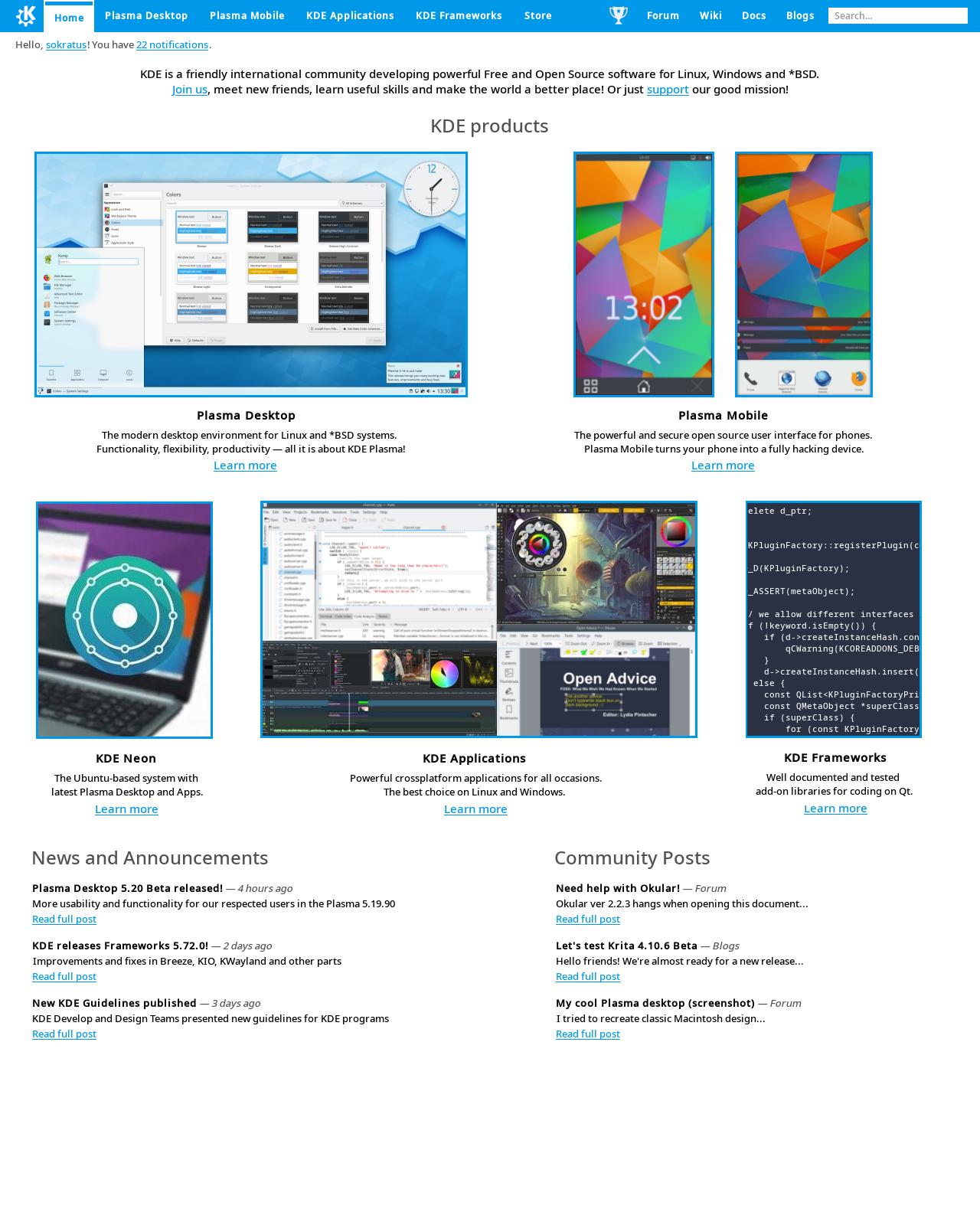
I showed the website to 10 non linux users and after reading the home page, they still don't know that KDE is and that we create. We should improve it.

Current state

Improvements

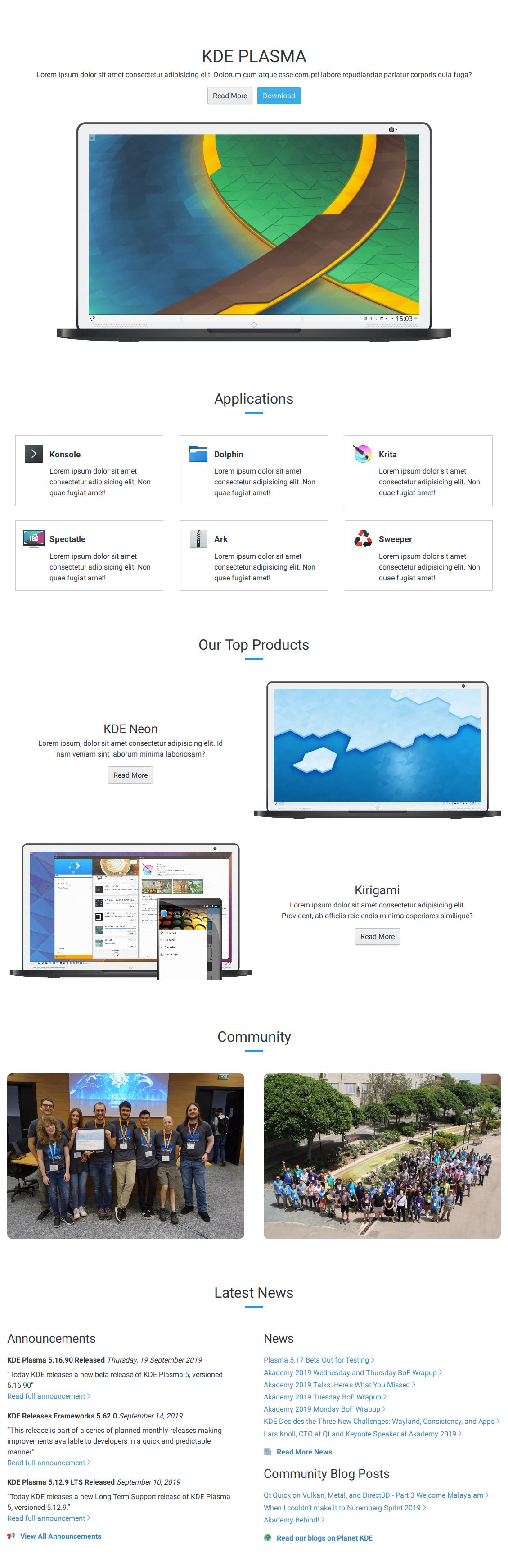
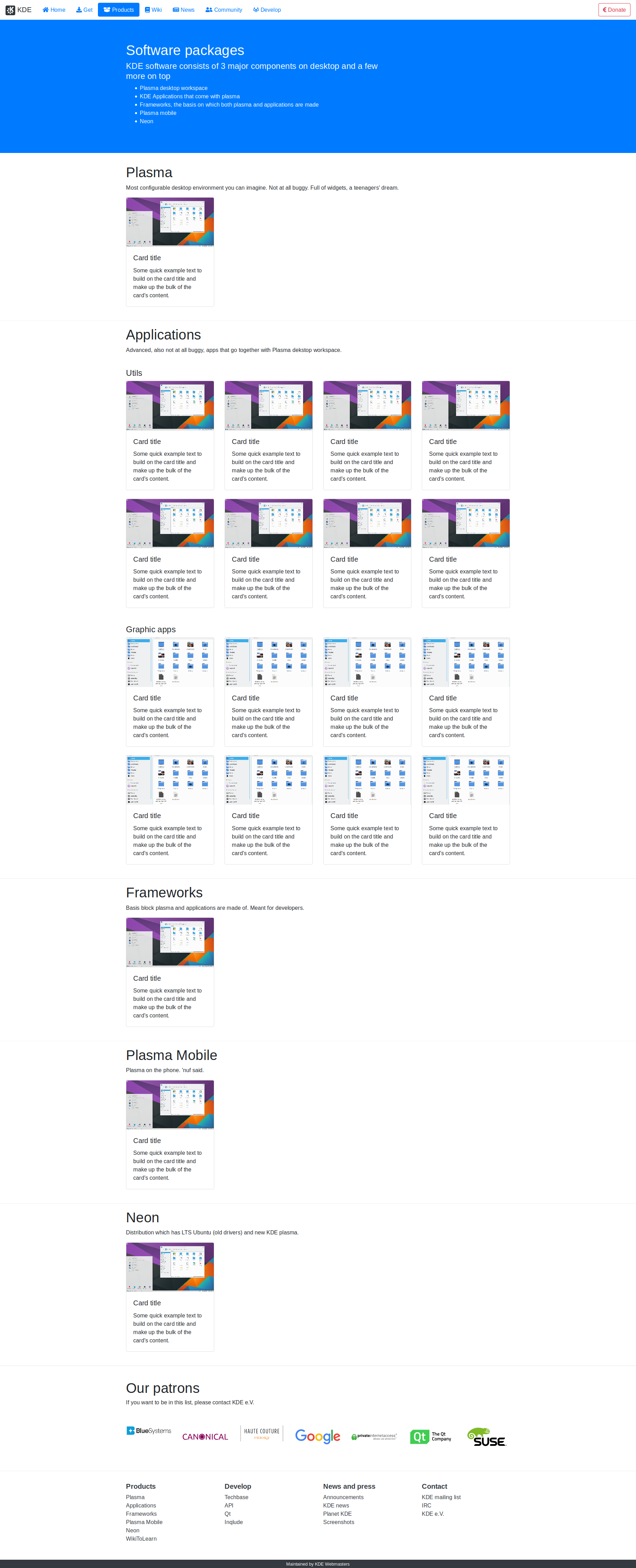
Remove the carousel and instead create 6 sections:

  • Introduction
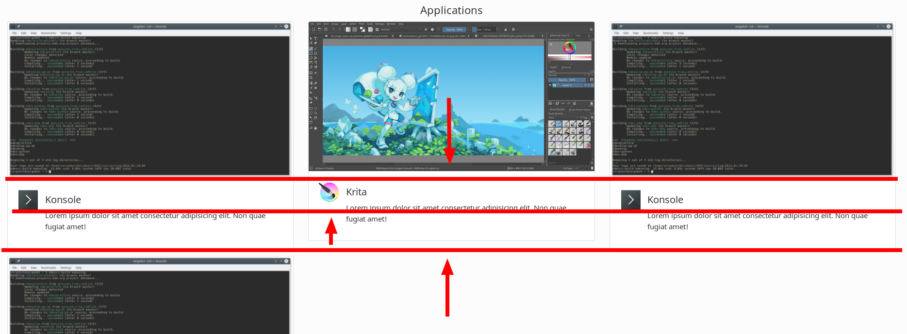
  • Plasma desktop: screenshot of Plasma, link to k.o/plasma-dektop
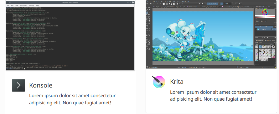
  • KDE Applications: text about our applications and link to k.o/applications
  • More products (link to k.o/products k.o/product/frameworks,plasma mobile.)
  • Community: Akademy photo, we are an international and diverse team of Free Software enthusiasts
  • News
ognarb created this task.Sep 17 2019, 8:15 PM
lydia added a subscriber: lydia.Sep 17 2019, 8:19 PM

❤ for having people that are not us look at it

There seems to be an overlap with this task: https://phabricator.kde.org/T6842

Is there a good way to merge them, to avoid repeating the same stuff in two places?

@ognarb Are you going to set up a repo at https://invent.kde.org/websites? I need to push somewhere.

@vladimirmikulic The best is that you push to a new project https://invent.kde.org/projects/new. And after that give me the link to repo, so that I can test ;).

@vladimirmikulic Thanks for this amazing work, I really like it. This is a huge improvement to the current layout.

One improvement I could suggest is that each section has links to more information. e.g the community section links to the get involved page, our top product section links to the products page, the applications section links to the applications page, ...

For the navbar, the patron section and the footer, I would prefer to not change it yet. It's already hard enough to synchronize most of the website to a unified style. Let's not make our life more difficult by introducing a new design direction. But changing it in subtle way is possible, and we now only need to make the change to two places. Hooray :P

And for the patron we can't really change anything to this section without consulting all the patrons before hand and getting the approval of all of them.

@voidfragment One problem with your mockup is that it doesn't have any pictures. People don't like reading too much text and Plasma and the KDE apps are beautiful we should show it.

I'm adding VDG for more comments :p

Thanks for this amazing work, I really like it.

I am glad to hear that :)

One improvement I could suggest is that each section has links to more information. e.g the community section...

Got it, I will refactor it.

For the navbar, the patron section and the footer, I would prefer to not change it yet. It's already hard enough to synchronize most of the website to a unified style.

When I think about it, you are right, KDE websites should be unified as much as possible. There is a lot of old KDE websites...

And for the patron we can't really change anything to this section without consulting all the patrons before hand and getting the approval of all of them.

I didn't know that, so for now, the patrons section remains the same.

voidfragment added a comment.EditedSep 27 2019, 11:36 AM

@ognarb

One problem with your mockup is that it doesn't have any pictures

Pictures are appropriate on a pages of concrete products: Plasma Desktop, Plasma Mobile, etc, also only after text block which describes product's content. On the main page of general project better don't use pictures like screenshots. Pictures dominance to the detriment of the text information is an anti-pattern of current web design because of which visitors for a long time can't understand where they are and what is this site about.

@voidfragment

Pictures dominance to the detriment of the text information is an anti-pattern of current web design because of which visitors for a long time can't understand where they are and what is this site about.

Well I don't think so. Usually you can sum up "feature X" or "project X" by just a few words. Without pictures, the homepage is just boring and people tend to leave it without reading.
Look at elementary.io - this website looks soo much better than any of the KDE websites!
A picture says more than thousands words :)

Hmm, I guess I know how to do it better

mglb added a subscriber: mglb.Sep 27 2019, 2:24 PM

@vladimirmikulic can you put screenshot here?

mglb added a comment.Sep 27 2019, 3:20 PM

Thank you. Looks good!

Few comments:

  • What do you think about giving each section different background? It would separate them and make clipped images (like kirigami one) look better.
  • Rectangular frames in "applications" section do not match the design. Everything else is borderless, and rectangles (laptop, photos) are rounded.
  • Missing introduction/few words about KDE. KDE != KDE Plasma
  • There's "KDE Plasma" and then "Our Top Products" - KDE Plasma is a product (i think most popular one :) ).

Also: I know it is image from current site, but the laptop frame really needs redesign. At least the color (it is almost the same as panel color). What about something slimbook-like?

@mglb

What do you think about giving each section different background? It would separate them and make clipped images (like kirigami one) look better.

The current look of the website is much nicer with white colour as the background :)

Rectangular frames in "applications" section do not match the design. Everything else is borderless, and rectangles (laptop, photos) are rounded.

I need to make a few decisions about it, but I'll fix it don't worry.

Missing introduction/few words about KDE. KDE != KDE Plasma

Placeholder!!!

There's "KDE Plasma" and then "Our Top Products" - KDE Plasma is a product (i think most popular one :)

Placeholder again, not the final version...

Also: I know it is image from current site, but the laptop frame really needs redesign. At least the color (it is almost the same as panel color). What about something slimbook-like?

Looks fine to me, but we'll see what others have to say :)

My updated variant:

ghost34 added a subscriber: ghost34.EditedSep 30 2019, 7:09 AM

It's beautiful, but not perfect.
As a guest, i see "Read more" buttons near different products, but i'm not interested to read it because it's hard to understand what it is.
Also i think it's kool to giving a different backgrounds to each selections, as @mglb said.

Flaws:

KDE neon:
Too many images of laptops. I think the laptop should be used only near the KDE neon, because it's a distribution and it can be easily installed on PC or laptop.

Kirigami:
It's very difficult to understand what it's Kirigami if watch on image, i see just a laptop and a phone.
I really liked one of the libhandy example, i can to understand that this thing is adapts the interface depending on size just looking at the image.

ghost34 added a comment.EditedSep 30 2019, 11:35 AM

Is it possible to use the same cards style M127 in https://kde.org/applications? It needs to be discussed in T10968?

In T11714#203147, @KonqiDragon wrote:

It's beautiful, but not perfect.
As a guest, i see "Read more" buttons near different products, but i'm not interested to read it because it's hard to understand what it is.
Also i think it's kool to giving a different backgrounds to each selections, as @mglb said.

I think it makes only sense to have different backgrounds color, if there is a meaning behind it. For plasma desktop they were some distinct section with each a different wallpaper. In this case, I see less a need for it.

Flaws:

KDE neon:
Too many images of laptops. I think the laptop should be used only near the KDE neon, because it's a distribution and it can be easily installed on PC or laptop.

The image of laptop help the visitor to understand that plasma is something you put in your computer. If we had just a screenshot, then we would have other problems, like explaining that plasma is not an application for windows. But we shouldn't overuse the laptop.

Kirigami:
It's very difficult to understand what it's Kirigami if watch on image, i see just a laptop and a phone.
I really liked one of the libhandy example, i can to understand that this thing is adapts the interface depending on size just looking at the image.

I think just the image and some good description could do the job for the homepage. We don't need to explain the technical details here, but then we could put more information in the Kirigami page https://kde.org/products/kirigami/. If you have concrete idea how to improve the Kirigami page, you can create a new task and a mockup ;).

@ognarb I couldn't agree more :)

mglb added a comment.Sep 30 2019, 8:29 PM
In T11714#203147, @KonqiDragon wrote:

It's beautiful, but not perfect.
As a guest, i see "Read more" buttons near different products, but i'm not interested to read it because it's hard to understand what it is.
Also i think it's kool to giving a different backgrounds to each selections, as @mglb said.

I think it makes only sense to have different backgrounds color, if there is a meaning behind it. For plasma desktop they were some distinct section with each a different wallpaper. In this case, I see less a need for it.

In this case each section is about totally different thing (Plasma desktop, applications, kirigami, neon). Everything with one style without clear boundaries feels like all this information is about one product.

Right now it can look like the applications are part/feature of KDE Plasma (they are not). This is something that runs on laptop and has applications - perhaps operating system or something like this (no)? And there are some cool products for this KDE Plasma (not really strictly for it), like KDE Neon, which is an... operating system - so what is plasma?

@mglb You didn't read my previous reply. As I said this is not the final version, the text is a placeholder, don't you all see lorem ipsum???

mglb added a comment.Sep 30 2019, 8:47 PM

@mglb You didn't read my previous reply. As I said this is not the final version, the text is a placeholder, don't you all see lorem ipsum???

I did, my intention was to show how visual section separation (e.g. with background color) could prevent this scenario even in a mockup.

ognarb added a comment.EditedOct 1 2019, 1:57 PM

I played a bit with the application list and I tried including a screenshot of the apps. See https://kde.carlschwan.eu

One problem is that some screenshots contains white border

I played a bit with the application list and I tried including a screenshot of the apps. See https://kde.carlschwan.eu

One problem is that some screenshots contains white border

Screenshots is good but blury, i don't like that icons, outline and icons aren't the same height. Nothing happens if you click on this card, i think it must ships you to app homepage krita.org, konsole.kde.org.

Hello @KonqiDragon, this is just a mockup and not the final product. And I wanted to propose something a bit different about how we display the application list in the homepage, and before fighting with the CSS I wanted to see if it's a good direction.

<rant>
I also saw you are creating a lot of tasks and proposing a lot of ideas, it's good and I really appreciate that they are other interested in making our website great.
But please keep in mind that the workforce around the website is very limited and using word like must, need is not the correct way to go forward.

I'm quite busy with my studies, my part-time job and my life so it would be great if when I'm contributing to project in my free time, I don't receive mails with some orders in them.

In the future, it would be great if you could stop using an imperative mood when commenting on some tasks. Since English is not your native tongue (me neither), I recommend you checking some verbs like could, should and would, they are often used to do polite request, proposing advice or proposing help. ;)
</rant>

@ognarb I agree, we should display applications in the homepage differently. Your mockup is great(better than mine), I could implement it in the applications section instead of the current one.
I would also crop them, make consistent spacing and link them to corresponding pages as @KonqiDragon already ordered :)
What do you think?

I worked a bit more on the homepage today. Implementing the application grid with screenshots will be a bit difficult (since all screenshots have a different format). So I will keep the same layout as in kde.org/applications for the moment.

I'm also thinking about putting the community at the top with a small explanation about what is kde.

I still need to add the top product section, but here is the current progress https://kde.carlschwan.eu/ ;)

@ognarb @vladimirmikulic That latest version looks really great!!

I wanted to ask you - is this the final layout of the website? Meaning, you won't be changing the position of the sections, or adding/removing sections?

I'm asking because I would like to work with you on the website copy, so you don't have to use dummy text. Instead, we would agree on the actual text that will be on the website once it's published.

We can already reuse a lot of the text that's in the current press kit, for example. But some of it will probably have to be written from scratch.

What is the best way to collaborate on this? Thanks in advance for your advice :)

I worked a bit more on the homepage today. Implementing the application grid with screenshots will be a bit difficult (since all screenshots have a different format). So I will keep the same layout as in kde.org/applications for the moment.

I'm also thinking about putting the community at the top with a small explanation about what is kde.

I still need to add the top product section, but here is the current progress https://kde.carlschwan.eu/ ;)

I really like that mockup, it looks more kool.

@skadinna Well, I am not a lead dev here so I can't really say if this is "final" :)

ognarb added a comment.EditedOct 26 2019, 7:57 AM

@skadinna Help with the text is very much appreciated. I will probably add one or two more sections about Plasma mobile and Kirigami/Framework or a section linking to k.o/products, so it's not final yet.

I think the easiest solution for collaborating is using share.kde.org shared document. So I created with the current content https://share.kde.org/s/7ziBK8kDix6Hs6c

Edit: made the share link editable

paulb added a subscriber: paulb.Oct 30 2019, 10:34 AM

I will probably add one or two more sections about Plasma mobile and Kirigami/Framework or a section linking to k.o/products, so it's not final yet.

Good idea.

As it stands, the current text is good: short and to the point. Adding a short description of frameworks to this isn't going to hurt.

I do have a couple of suggestions regarding the graphics:

  1. Most visitors are not going to be all that interested in who makes the software, but more in the software itself. This means that I would not recommend that the first image be that of the Akademy. This should probably be at the end of the page.
  2. For everything in this list:

Use KDE to surf the web; keep in touch with colleagues, friends and family; manage your files, enjoy music and videos; and get creative and productive at work.

There should be a clear, interesting-looking screesnhot to help illustrate what you are talking about and give some context. Let the visitor see what they are getting.

ognarb added a comment.Nov 6 2019, 6:01 PM

I will probably add one or two more sections about Plasma mobile and Kirigami/Framework or a section linking to k.o/products, so it's not final yet.

Good idea.

As it stands, the current text is good: short and to the point. Adding a short description of frameworks to this isn't going to hurt.

I reused lot of text from other parts of the website ;)

I do have a couple of suggestions regarding the graphics:

  1. Most visitors are not going to be all that interested in who makes the software, but more in the software itself. This means that I would not recommend that the first image be that of the Akademy. This should probably be at the end of the page.

You are right, but I would like to break the connection that KDE is Plasma, so I didn't want to have KDE as title and right under it a screenshot of Plasma. Maybe organizing the page like this could work better:

Title: KDE

Description: KDE is a community making Free Software blah blah

Subtitle Plasma

Screenshot Plasma

Subtitle Application

Description Application

6 random kde app

...

  1. For everything in this list:

Use KDE to surf the web; keep in touch with colleagues, friends and family; manage your files, enjoy music and videos; and get creative and productive at work.

There should be a clear, interesting-looking screesnhot to help illustrate what you are talking about and give some context. Let the visitor see what they are getting.

Ok will do :)

paulb added a comment.Nov 7 2019, 8:27 AM

You are right, but I would like to break the connection that KDE is Plasma

Yes, this is a good move.

Description: KDE is a community making Free Software blah blah

As mentioned above, most people are going to be focused on getting software. In every paragraph of a body of text, if the paragraph is properly constructed, there is a key sentence that contains the essence of the paragraph. The key sentence is usually (but not always) the first sentence. As we want to satisfy the visitors' expectations that they are in the right place and this is where they can get their software fix from, I suggest you make that clear in your key sentence:

KDE makes Free Software for you. KDE is the community that creates the acclaimed <link>Plasma desktop</link>, <link>hundreds of high quality apps</link> for your computer and mobile phone, and tools and <link>frameworks</link> that help you build your own.

[Whatever else you want to say about the community... if you need to]

For consideration - one more design.
Text is childish attempt at humor and for sure needs changes, but at least it is not "lorem ipsum".

Using bootstrap4 and fontawesome.

Small change to my prototype: https://kde.carlschwan.eu/index-new

Why do you suggest to Install KDE Software and link sends me to install another OS? I think this link should be in the place with Plasma introducing.

Application:
Minimalistic cards style looks more better, it's takes less space and you don't need to srolls down for a long time.


If you hate cards style, you can take an example from the Apple site, it also takes up less space and looks kool. You could to add the "See all applications" button at the bottom.

In T11714#215106, @KonqiDragon wrote:

Small change to my prototype: https://kde.carlschwan.eu/index-new

Why do you suggest to Install KDE Software and link sends me to install another OS? I think this link should be in the place with Plasma introducing.

Application:
Minimalistic cards style looks more better, it's takes less space and you don't need to srolls down for a long time.

But you can't see the content inside the window

If you hate cards style, you can take an example from the Apple site, it also takes up less space and looks kool. You could to add the "See all applications" button at the bottom.

I will try this design and it will make it more consistent with kde.org/plasma-desktop

ognarb moved this task from incoming to kde.org redesign on the Websites board.Jan 18 2020, 10:27 PM
ognarb closed this task as Resolved.Apr 22 2020, 8:46 AM