Buttons look in Breeze window title bar
Open, Needs TriagePublic

Description

(discussion started here)
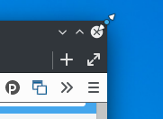
What:

  • reduce the size of the button icons
  • extend the clickable area of the buttons
  • change the background color of the button when hovering
  • add more distance between the buttons
  • (maybe make the close button more red when hovering like in the mockup)

Why:

  • the title bar would look narrower (many users don't like our title bar and prefer GNOME's headerbar in my opinion also because it looks too large)
  • increased usability because the clickable area of the buttons is increased


^ if needed I can provide the SVG source of this mockup to try to implement it as a 1:1 copy

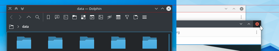
At the moment it seems to me that some pixels near the borders are used to resize the window, if so of course the green area below shouldn't trigger the buttons hovering but just let the user resize the window:

Related Objects

StatusAssignedTask
OpenNone
Resolvedngraham
OpenNone
alex-l created this task.Jun 12 2019, 5:22 PM
ngraham added subscribers: VDG, Breeze, KWin.
ngraham added a subscriber: ngraham.

One thing to note is that currently the window resize areas are invisible and drawn outside the window's bounds, so this won't actually impair that use case at all.

One thing to note is that currently the window resize areas are invisible and drawn outside the window's bounds, so this won't actually impair that use case at all.

I thought so because the center of the cursor seems a bit inside the window:

One thing to note is that currently the window resize areas are invisible and drawn outside the window's bounds, so this won't actually impair that use case at all.

It's border dependent.

ndavis added a subscriber: ndavis.Jun 12 2019, 6:37 PM

We also need multiple fixed button sizes instead of having a single QPainter definition for each button that is scaled up and down. The way we do it right now leads to blurry button symbols at some non-default sizes.