Changeset View
Changeset View
Standalone View
Standalone View
cuttlefish/package/contents/ui/Tools.qml
| Show All 14 Lines | |||||
| 15 | * You should have received a copy of the GNU General Public License * | 15 | * You should have received a copy of the GNU General Public License * | ||
| 16 | * along with this program; if not, write to the * | 16 | * along with this program; if not, write to the * | ||
| 17 | * Free Software Foundation, Inc., * | 17 | * Free Software Foundation, Inc., * | ||
| 18 | * 51 Franklin Street, Fifth Floor, Boston, MA 02110-1301 USA . * | 18 | * 51 Franklin Street, Fifth Floor, Boston, MA 02110-1301 USA . * | ||
| 19 | * * | 19 | * * | ||
| 20 | ***************************************************************************/ | 20 | ***************************************************************************/ | ||
| 21 | 21 | | |||
| 22 | import QtQuick 2.2 | 22 | import QtQuick 2.2 | ||
| 23 | import QtQuick.Controls 2.0 | 23 | import QtQuick.Controls 2.5 | ||
ngraham: `import QtQuick.Controls 2.5 as QQC2` (See T10862) | |||||
| 24 | import QtQuick.Layouts 1.0 | 24 | import QtQuick.Layouts 1.0 | ||
| 25 | 25 | | |||
| 26 | import org.kde.plasma.core 2.0 as PlasmaCore | 26 | import org.kde.kirigami 2.8 as Kirigami | ||
| 27 | import org.kde.plasma.components 2.0 as PlasmaComponents | | |||
| 28 | 27 | | |||
| 29 | PlasmaComponents.ToolBar { | 28 | Item { | ||
| 29 | width: parent.width | ||||
| 30 | RowLayout { | ||||
The fake toolbar created here feels too short. I would make it taller by a few pixels so there's more room above and below the controls. ngraham: The fake toolbar created here feels too short. I would make it taller by a few pixels so… | |||||
Now it's a bit too tall, and the margins above and below the search field still don't match the left margins: 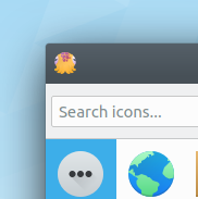 ngraham: Now it's a bit too tall, and the margins above and below the search field still don't match the… | |||||
| 31 | anchors.verticalCenter: parent.verticalCenter | ||||
| 32 | spacing: Kirigami.Units.largeSpacing | ||||
| 30 | 33 | | |||
| 31 | Rectangle { | 34 | Item { | ||
| 32 | color: theme.backgroundColor | 35 | width: Kirigami.Units.largeSpacing | ||
| 33 | height: units.gridUnit / 20 | | |||
| 34 | width: preview.width | | |||
| 35 | anchors { | | |||
| 36 | right: parent.right | | |||
| 37 | top: parent.bottom | | |||
| 38 | } | | |||
| 39 | } | 36 | } | ||
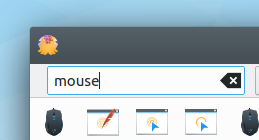
| 40 | tools: RowLayout { | 37 | Kirigami.SearchField { | ||
ngraham: There's a bunch of unnecessary extra space to the left:
{F7318225, size=full} | |||||
| 41 | | ||||
| 42 | spacing: units.gridUnit / 2 | | |||
| 43 | | ||||
| 44 | PlasmaComponents.TextField { | | |||
| 45 | id: filterInput | 38 | id: filterInput | ||
ngraham: Set the same thing for the right margin too | |||||
ngraham: Not done yet | |||||
| 46 | Layout.fillWidth: true | 39 | Layout.fillWidth: true | ||
| 47 | onTextChanged: typingtimer.restart() | 40 | onTextChanged: typingtimer.restart() | ||
| 48 | focus: true | 41 | focus: true | ||
| 42 | placeholderText: i18n("Search icons...") | ||||
ngrahamUnsubmitted Don't need to override the default placeholder text when using Kirigami.SearchField ngraham: Don't need to override the default placeholder text when using `Kirigami.SearchField` | |||||
ngrahamUnsubmitted Not done yet. ngraham: Not done yet. | |||||
| 49 | 43 | | |||
| 50 | Timer { | 44 | Timer { | ||
| 51 | id: typingtimer | 45 | id: typingtimer | ||
| 52 | running: false | 46 | running: false | ||
| 53 | repeat: false | 47 | repeat: false | ||
| 54 | interval: 100 | 48 | interval: 100 | ||
| 55 | onTriggered: { | 49 | onTriggered: { | ||
| 56 | iconModel.filter = filterInput.text | 50 | iconModel.filter = filterInput.text | ||
| Show All 14 Lines | |||||
| 71 | } | 65 | } | ||
| 72 | 66 | | |||
| 73 | Slider { | 67 | Slider { | ||
| 74 | id: sizeslider | 68 | id: sizeslider | ||
| 75 | Layout.preferredWidth: preview.width - units.gridUnit * 2 | 69 | Layout.preferredWidth: preview.width - units.gridUnit * 2 | ||
| 76 | 70 | | |||
| 77 | to: 6.0 | 71 | to: 6.0 | ||
| 78 | stepSize: 1.0 | 72 | stepSize: 1.0 | ||
| 79 | snapMode: Slider.AlwaysSnap | 73 | snapMode: Slider.SnapAlways | ||
| 80 | value: 4.0 | 74 | value: 4.0 | ||
| 81 | 75 | | |||
| 82 | onValueChanged: { | 76 | onValueChanged: { | ||
| 83 | sizetimer.restart() | 77 | sizetimer.restart() | ||
| 84 | pixelSizeInput.text = indexToSize(sizeslider.value) | 78 | pixelSizeInput.text = indexToSize(sizeslider.value) | ||
| 85 | } | 79 | } | ||
| 86 | 80 | | |||
| 87 | Timer { | 81 | Timer { | ||
| 88 | id: sizetimer | 82 | id: sizetimer | ||
| 89 | running: false | 83 | running: false | ||
| 90 | repeat: false | 84 | repeat: false | ||
| 91 | interval: 200 | 85 | interval: 200 | ||
| 92 | onTriggered: iconSize = indexToSize(sizeslider.value) | 86 | onTriggered: iconSize = indexToSize(sizeslider.value) | ||
| 93 | } | 87 | } | ||
| 94 | 88 | | |||
| 95 | Component.onCompleted: { | 89 | Component.onCompleted: { | ||
| 96 | pixelSizeInput.text = indexToSize(sizeslider.value); | 90 | pixelSizeInput.text = indexToSize(sizeslider.value); | ||
| 97 | } | 91 | } | ||
| 98 | } | 92 | } | ||
| 99 | 93 | | |||
| 100 | PlasmaComponents.TextField { | 94 | TextField { | ||
Let's just use a label for this. There's no value to letting people enter arbitrary numbers here. ngraham: Let's just use a label for this. There's no value to letting people enter arbitrary numbers… | |||||
| 101 | id: pixelSizeInput | 95 | id: pixelSizeInput | ||
| 102 | 96 | | |||
| 103 | Layout.preferredWidth: units.gridUnit * 3 | 97 | Layout.preferredWidth: units.gridUnit * 3 | ||
| 104 | 98 | | |||
| 105 | onTextChanged: { | 99 | onTextChanged: { | ||
| 106 | if (pixelSizeInput.activeFocus) { | 100 | if (pixelSizeInput.activeFocus) { | ||
| 107 | pxSizetimer.restart() | 101 | pxSizetimer.restart() | ||
| 108 | } | 102 | } | ||
| 109 | } | 103 | } | ||
| 110 | 104 | | |||
| 111 | Timer { | 105 | Timer { | ||
| 112 | id: pxSizetimer | 106 | id: pxSizetimer | ||
| 113 | running: false | 107 | running: false | ||
| 114 | repeat: false | 108 | repeat: false | ||
| 115 | interval: 100 | 109 | interval: 100 | ||
| 116 | onTriggered: iconSize = pixelSizeInput.text | 110 | onTriggered: iconSize = pixelSizeInput.text | ||
| 117 | } | 111 | } | ||
| 118 | } | 112 | } | ||
| 119 | 113 | | |||
| 120 | PlasmaComponents.CheckBox { | 114 | CheckBox { | ||
GB_2: "Color scheme" | |||||
| 121 | id: colorContextCheckbox | | |||
| 122 | text: i18n("Inverted") | | |||
| 123 | onCheckedChanged: darkScheme = checked | | |||
| 124 | } | | |||
| 125 | | ||||
| 126 | PlasmaComponents.CheckBox { | | |||
| 127 | id: plasmaThemeCheckbox | 115 | id: plasmaThemeCheckbox | ||
| 128 | text: i18n("Monochrome") | 116 | text: i18n("Monochrome") | ||
| 129 | checked: true | 117 | checked: true | ||
| 130 | onCheckedChanged: cuttlefish.usesPlasmaTheme = checked | 118 | onCheckedChanged: cuttlefish.usesPlasmaTheme = checked | ||
| 131 | } | 119 | } | ||
ngraham: System Colorscheme -> System Color Scheme | |||||
| 132 | 120 | } | |||
| 133 | Item { | 121 | Rectangle { | ||
ngraham: You could potentially use a Kirigami.Separator for this | |||||
| 134 | Layout.preferredWidth: preview.width | 122 | opacity: 0.2 | ||
| 123 | color: Kirigami.Theme.textColor | ||||
| 124 | height: 1 | ||||
Is any of this custom styling actually necessary given Kirigami.Separator's default appearance? ngraham: Is any of this custom styling actually necessary given `Kirigami.Separator`'s default… | |||||
| 125 | anchors { | ||||
| 126 | left: parent.left | ||||
| 127 | right: parent.right | ||||
| 128 | bottom: parent.bottom | ||||
| 135 | } | 129 | } | ||
| 136 | } | 130 | } | ||
| 137 | } | 131 | } | ||
| 138 | 132 | | |||
import QtQuick.Controls 2.5 as QQC2 (See T10862)