A better writing expierence
Closed, ResolvedPublic

Description

Because I'm not a fan of the current writing experience I experimented with improving it:
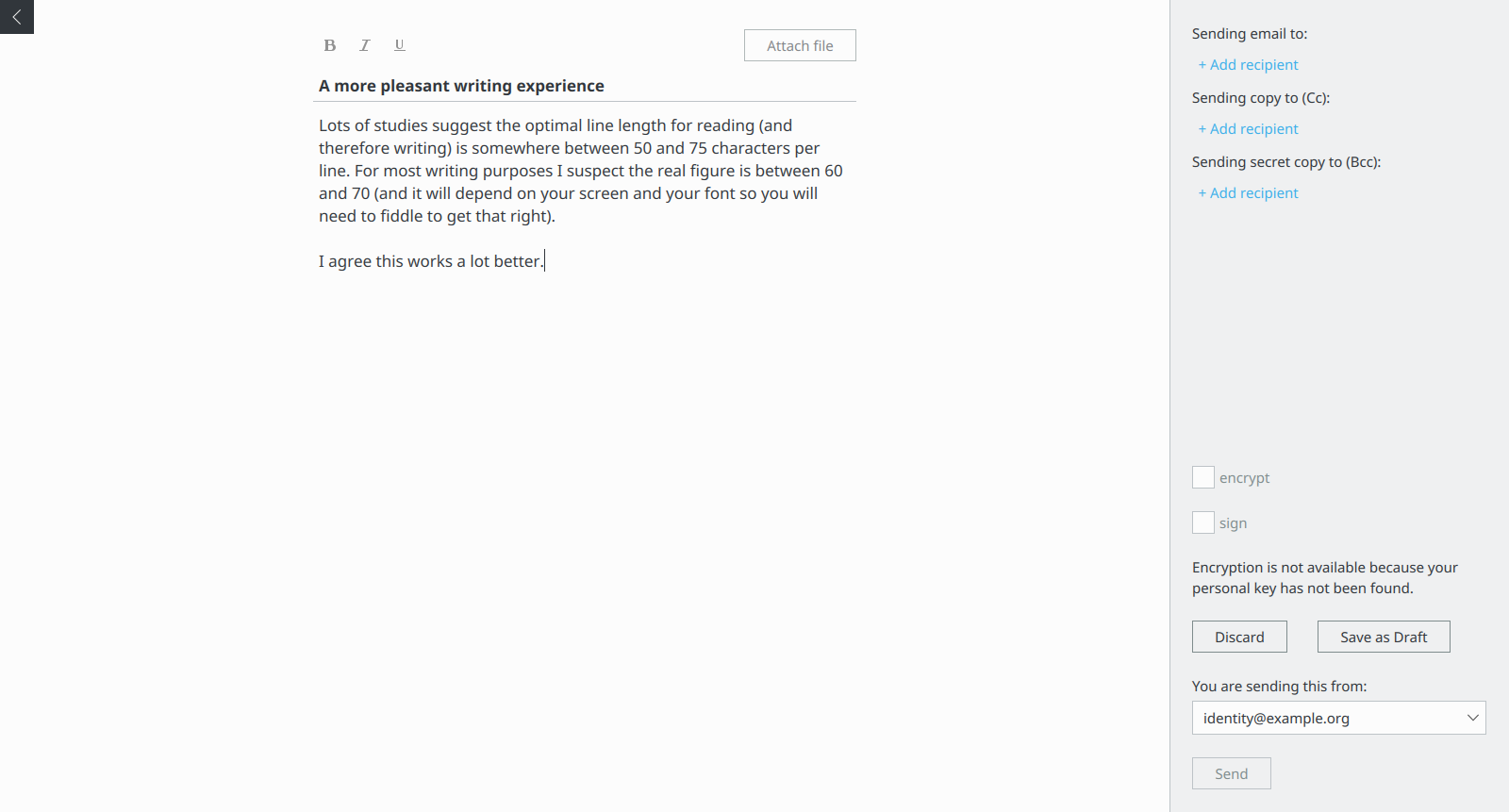
What I did:

  • Increased the font size to largeFontSize (1.2 * regular)
  • Limit the editor with to roughly 70 characters
  • "merged" subject and text
    • I know we initially separated the two on purpose, but I'm quite happy with the result, and am not too worried about the "problems" this creates of the formatting only applying to the text and the attachments belonging to the content.
  • white background instead of grey
    • the only problem with that is that it becomes non obvious where the textbox is if there is no text yet. Could be helped with a default text just like in the subject.
  • Reduced the opacity of all buttons unless they are hovered or have focus.

Related Objects

cmollekopf triaged this task as Normal priority.
cmollekopf updated the task description. (Show Details)

I like the general direction. It gives a very clean first impression.

Some issues:

affordance

There is no indication that is is possible to write something under the subject line.
I am afraid some users will try to fit their whole email in the subject field.
Then again, once the press "Enter" it should all become clear.
Some placeholder text for the body could solve this issue.

minor inconsistency

Once you are in the body ediror, and there is no text,
I would expect "backspace" to get me back to the subject line
(because "Enter" brought me to the body editor)

waste of screen space:

This is probably my biggest concern with this design.
The margins become really big when the window is full size.
What was your reason for having the maximum width fixed?

attachment placement

that's something we might want to look at.
It's not wrong. But we might be able to do better.

All in all this is awesome. It just needs some polishing.

I like the general direction. It gives a very clean first impression.

Some issues:

  1. affordance There is no indication that is is possible to write something under the subject line. I am afraid some users will try to fit their whole email in the subject field. Then again, once the press "Enter" it should all become clear. Some placeholder text for the body could solve this issue.

I agree some sort of placeholder should at least be there.

  1. minor inconsistency Once you are in the body ediror, and there is no text, I would expect "backspace" to get me back to the subject line (because "Enter" brought me to the body editor)

That's not what I would expect from how e.g. forms behave.
But we could try it I suppose (I don't have a strong opinion on it either way).

  1. waste of screen space: This is probably my biggest concern with this design. The margins become really big when the window is full size. What was your reason for having the maximum width fixed?

One of the problems in the current design is that the editor gets very wide,
but you end up writing text on the left side only. This may be especially bad for me with a wide screen
and applications in fullscreen mode most of the time, but I think it applies in general.

The other point is that there are two kinds of people. The ones that manually line break text, and the ones that don't. Manual line-breaking is not great, because it will break if the line length was chosen too long by the author, resulting in the viewer reflowing the lines that are too long, ending up in "choppy" text (you get a mix of long and very short lines). If you don't break it manually writing becomes a pain, because long lines are a pain to read. There is a lot of anecdotal information on the internet suggesting a good width to be anywhere between 60 - 80 characters, so I aimed for 70.

So the reason is that the editor now is fixed width (aiming for roughly 70 characters), and everything else therefore is whitespace.
This also results in the editor being somewhat centered instead of being stuck to the left,
which I think is important because we don't use windows. If you e.g. look at what Apple does,
when creating a new editor, then they just pop-up a new window with a reasonable width for writing,
horizontally centered on the screen, yielding a similar result.

Also, I like the calm look for writing.

  1. attachment placement that's something we might want to look at. It's not wrong. But we might be able to do better.

Sounds good. I'm also wondering how well the toolbar placement works out if it grows some,
and how much it will conflict with the otherwise very clean look we have now.

All in all this is awesome. It just needs some polishing.

Cool =) Then I think I'll just merge this so we can take it from there.

cmollekopf moved this task from Backlog to 0.8 on the Kube board.Jun 16 2019, 10:09 AM
cmollekopf edited projects, added Kube (0.8); removed Kube.
cmollekopf lowered the priority of this task from Normal to Low.
cmollekopf closed this task as Resolved.Aug 29 2019, 9:31 AM
cmollekopf claimed this task.