User Details
- User Since
- Jul 12 2020, 2:01 AM (204 w, 4 d)
- Availability
- Available
Jan 15 2022
Is anyone already forking the 22px icons into 24px? If it's to go ahead with the decision to use the latter for Plasma 6 then I could help out but what are the specs.
Nov 10 2020
Probably the most perfected I'll reach. Note the use of Manuel's Breeze styling and a matching footer to other plasmoids.
Nov 9 2020

Oct 14 2020
Yes. I and Manuel have been debating separator lines and without them it looks cleaner indeed.
Oct 13 2020
Most likely yes but not for a long time, basic work on fingerprint support and initial gui is being worked on still.
Based on Manuel's highlight effects and color scheme:

Oct 10 2020
It looks delicious. Like the original iMac, I almost want to lick the screen.
Oct 2 2020
Here's an idea, have the standard Breeze colors showing up on the kcm next to all other color schemes installed, and have copies of said standard Breeze with the accent tweaks but hidden, only shown as a button the color of the accent above the list in the kcm.
Hey @manueljlin can you send me your latest mock up on Telegram?
Oct 1 2020

Updated.
Updating right now.
Yeah, I'll have to do those too.
Sep 28 2020
This is my take on Manuel's mockup. I only changed a few things but kept the same color scheme.
oh ok
I've been using 4px radius for everything.
Sep 4 2020
I'm still focusing on the desktop wallpaper hence the lack of log in and lock screen mock ups.
Sep 3 2020
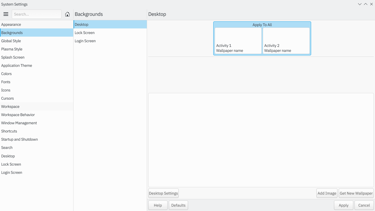
Check my latest mock up. There's a visual highlight of the selected screen, apply all, activity 1 and 2. Current is apply to all, hence why the highlight selection surrounds all. This can be easily rearranged for mobile mode too.
Sep 2 2020
My mockups? Yeah, I forgot to color the selected workspace/activity/monitor element.
This is one way of solving the bundle of configurations into a more modular set. Add a other settings shortcut button that leads to where the once different bundled options are now.
Sep 1 2020
New one, seems more in line with Background change only.
Last one is my latest and favorite, note: I changed Appearance to User Interface, seems more acceptable.
Aug 30 2020
Aug 24 2020
I'll still be around the telegram vdg group until the end of September though.
I have no idea where to start and my life will be hectic for the next few months I'll be away from computers for a really long time.
I have zero knowledge of qt/kde related coding. Sorry.
Aug 23 2020
And I don't know what per app developers can do. I don't know how far just changing Qstyle will do to applications with no other change. I'm only drawing stuff, don't have a clue about the coding involved in this project.
Much of what the mock ups do is make things more in line with what Breeze evolved has in mind. Given that the new Breeze style is still under discussion and Konsole is a visually simple application there's not much to do.
Solarized, dark and light, already comes in most terminal emulators for quite a few years so it's a known color scheme, regardless of desktop environment. I like solarized but it's only two tone so it might be too simple for users who have a harder time finding stuff in the window.
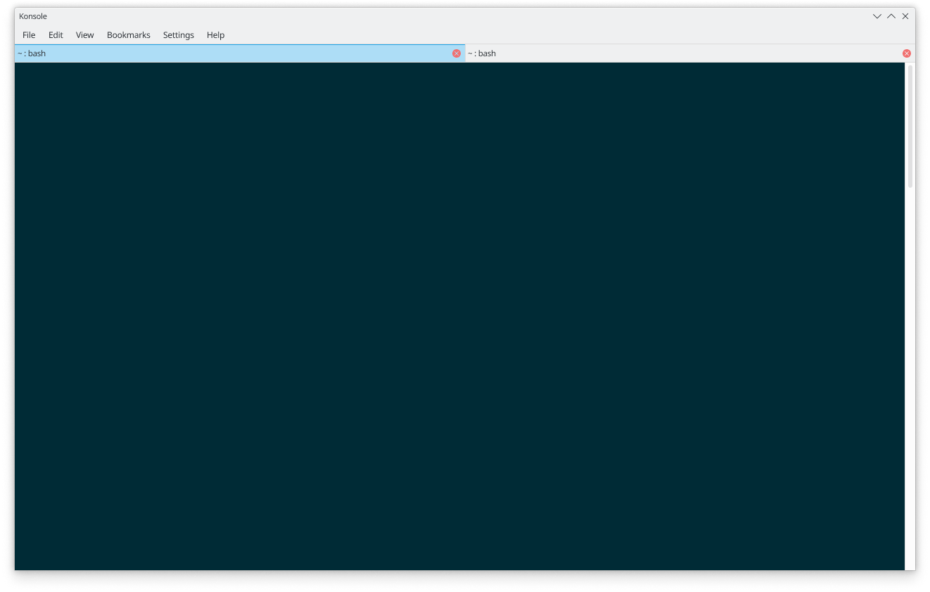
I got the current konsole image off of the internet. I'm on GNOME Shell right now.
Oh Sorry
Looks amazing. The plus symbol could be a bit higher but the rest looks like they're 99% done.
Aug 20 2020
+1 for Darker Flow in 5.20.
Aug 13 2020
I'm only a fan of rounded corners on the upper border of windows, make it an environment variable. Windows content looks off, maybe not now but when menubars and toolbars have a different color (in future updates) to the content area itself it'll make for an unbalanced design, another solution is adding a bottom border with the desired corners, in the color of the toolbars too. It would look good. So far it seems like some button elements will have a skeu look, and the UI itself will closely follow most of ocean blues design. I'm not entirely sure but it seems it's what most like. It seems like skeu elements could be making a mild comeback in other systems.
Jul 30 2020
Maybe if the tabs and buttons were a bit closer to Poki's mock ups, particularly the white and gray shading.
Jul 28 2020
Also, If trends are to follow, it's quite possible skeuomorphic design might make a slight comeback with Apple, and we all know whatever they do the industry copies. Andy Bett's Breeze with skeuo accent like cblack or pontaoski would look sleek.
@cblack Reminds me a lot of the Adementary theme. I quite like yours.
Wait, do I get a vote? I think not.
I vote for the bluer standard of Manuel.
Andy's Breeze would certainly be easier to get to as it only deviates somewhat from current Breeze and with a dash of more color and vibrancy from Pontaoski's set it would look really good. However, it would be more space inefficient when scaled down to smaller mobile sized displays.
Jul 22 2020
Jul 21 2020
Application style unified. No gtk2.
Jul 20 2020
Jul 19 2020
I'm making a Widget Factory Mock up, not sure how effective that is but I'll do it anyway. The Headerbar should be the same height as the standard toolbar in Qt apps.
Jul 18 2020
Jul 17 2020
It moves to a tabbed system whenever there's too much information for a pleasant scroll system. Clicking on a tab causes the information to pop up in a half display section and scrolling within that section makes it full display. Scrolling back up shows once again the background (the Distro or App intro).
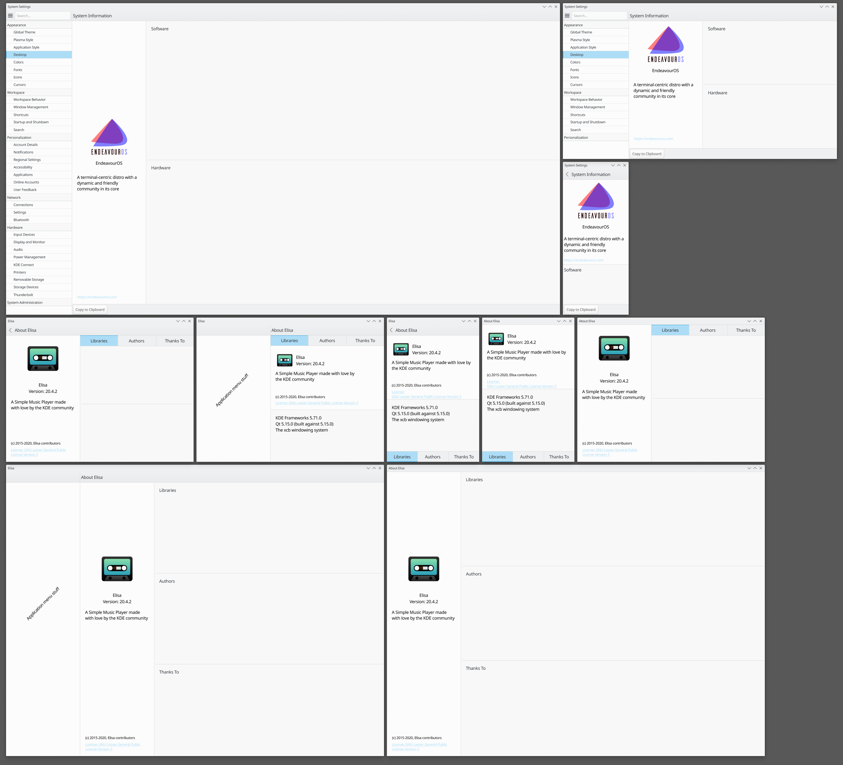
all those pictures are meant to show the same design throughout the legacy window (KAboutDialog) and newer page base (kirigami).
And truth be told, from initial to current mock up it hasn't changed much actually.
This is all meant to converge the interface of KAboutDialog and Kirigami.AboutPage so I need to mess with both navigational and content organization.
@davidre It's purely scroll oriented.
Yeah, the more I go through mock ups and learn about proper space use and practicality the more I think my initial design is not good but not terrible.
Jul 16 2020
Would it be ok if tabs moved down on mobile to be closer to hand placement and were kept on top for tablet and bigger displays?
I just noticed with the existence of other toolbars around the page content it might make the addition of an extra bar, the tab bar, too space inefficient. As tab bars will be using the entire available space I need to update the initial mock ups above and find a solution for cohesiveness with other toolbars, especially if they have to be present in ever smaller displays like on a mobile.
Jul 15 2020
Or anything directly in the zone of the active coding, like the konsole and code browser, to retain its active and focused status.
Maybe have a couple of panels take precedent like the project tab in use and anything vertical of the zone, breaking off any lateral distraction.
Better? It is using the active but unfocused color. It leads me to a question, how is what known to be active and focused, on my crappy mock up is seems rather arbitrary.
Yeah... Maybe use the lighter hover blue from other mock ups in sections that aren't focused on, like if I'm using the left panel I expect the UI to focus on the panels interface and not have the screaming deep blue in other sections. It's 3am so I'll sketch it up tomorrow and see how it turns out.
Jul 14 2020
Updated. check images on description.
Yeah, I've been intrigued as what to do with it. Since this mock up is a straight rip off of @manueljlin I didn't give it much thought but now that I'm setting which styles are for what and where I need to update them.
Excellent.
What about fading tab bars with the same layout as the current mock up but only shows when cursor is over the area?
What about this? I'm not too sure about the pillow casing but it could work (the colors are random, blue on blue is random)
Edit: Will update tab style to use full area.
okay, I'll note that up.
If full tab space is the go to option then it's good I haven't done a lot of tabs yet, otherwise, it would be a pain to go back and get them all updated.