- Fix transparency of home icon in go.svgz
Feed Advanced Search
Dec 1 2018
Dec 1 2018
pstefan updated the diff for D15999: Add icons with added background to system.svgz.
pstefan updated the diff for D15999: Add icons with added background to system.svgz.
- Fix stylesheet in go.svgz
pstefan added a comment to D15999: Add icons with added background to system.svgz.
pstefan added a comment to D15999: Add icons with added background to system.svgz.
pstefan added a comment to D15999: Add icons with added background to system.svgz.
Nov 30 2018
Nov 30 2018
pstefan updated the diff for D15999: Add icons with added background to system.svgz.
- Remove hardcoded background color; Switch background to "ColorScheme-ViewBackground"
- Reintroduce the outline border on top of the background. Opacity set to 0.3
- Removed superfluous entries in the style properties
pstefan added a comment to D15999: Add icons with added background to system.svgz.
Nov 8 2018
Nov 8 2018
pstefan updated the diff for D15999: Add icons with added background to system.svgz.
- Hardcoded background color
Nov 5 2018
Nov 5 2018
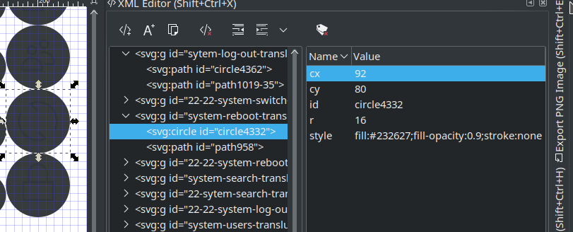
pstefan updated the diff for D15999: Add icons with added background to system.svgz.
- Fixed z order
pstefan updated the diff for D15999: Add icons with added background to system.svgz.
- Added missing class attributes
Nov 4 2018
Nov 4 2018
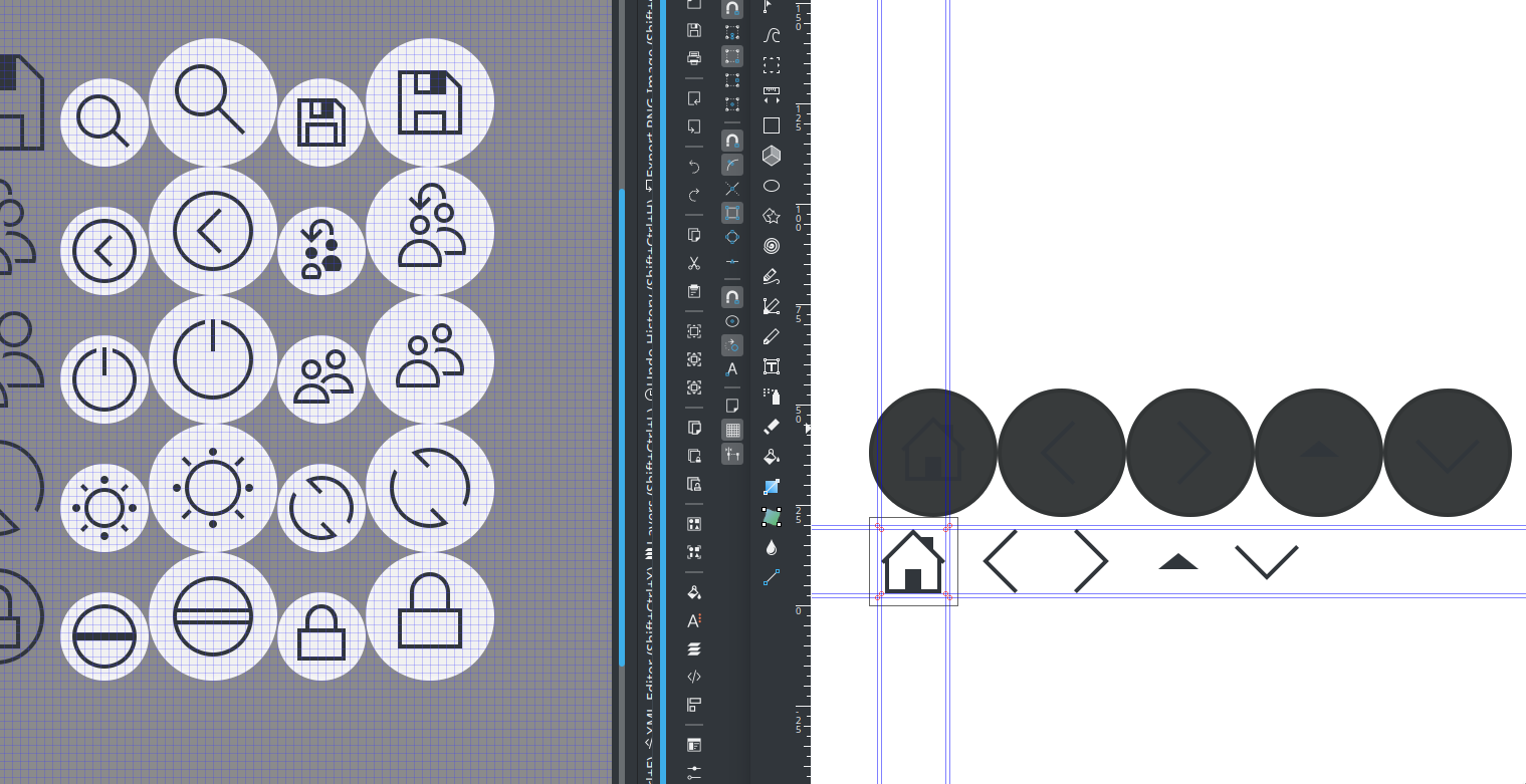
pstefan updated the summary of D15999: Add icons with added background to system.svgz.
pstefan updated the diff for D15999: Add icons with added background to system.svgz.
- Sized down icons somewhat
- Added "*-translucent" option of the icons in go.svgz (go-home, go-previous, etc). 32px only for now
- Made background darker
- Removed outer circle
- Merge branch 'master' of git://anongit.kde.org/plasma-framework
Oct 8 2018
Oct 8 2018
pstefan added a comment to D15999: Add icons with added background to system.svgz.
pstefan added a comment to D15999: Add icons with added background to system.svgz.

pstefan added a comment to T9658: Rethink blur-by-default for Breeze SDDM login screen theme for Plasma 5.15.
RE: D16031 I think the background circle for the avatar should either be dropped or flush with the white border.
pstefan added a comment to D16031: [SDDM theme] remove blur and increase UI contrast so that it's not required.
As other have pointed out the shadows for the buttons and username look out of place. Do they use the same radius/spread as those of the clock?
Oct 7 2018
Oct 7 2018
pstefan updated the diff for D15999: Add icons with added background to system.svgz.
Fix z-layering issue for the "-translucent" icons.
pstefan updated the summary of D15999: Add icons with added background to system.svgz.
pstefan requested review of D15999: Add icons with added background to system.svgz.
Oct 1 2018
Oct 1 2018
Thank you for the changes!
Sep 30 2018
Sep 30 2018
pstefan requested changes to D15853: Change drive-harddisk to more adaptable style.
In the monochrome icons (size 16px and 22px) you forgot to add the stylesheet. Without it, the monochrome icons won't be able to adapt to a changing color scheme.
You will have to run the scripts "apply-stylesheet.sh" and "currentColorFillFix.sh" –from here– with your files as arguments. You will need the program "xmlstarlet" as dependency.
Or, if these scripts do not work correctly, you'll have to do it by hand. I will take icons-dark/devices/16/drive-harddisk.svg as an example.
You'd need to copy line 2-9 from the old file to the new file. You would also need to change the fill to "fill:currentColor", and then add the "class="ColorScheme-Text" ". But if you are lucky the script will work and you won't need to do a thing :)
pstefan added a comment to T9658: Rethink blur-by-default for Breeze SDDM login screen theme for Plasma 5.15.
Any update on the icon front, re: different background color? Right now my stylesheet class attribute in the icons is "ColorScheme-ViewBackground", which is a light color in the normal breeze color scheme. My thinking was that it would use the breeze dark color scheme on the login screen. Is that assumption correct or do I need to change that?
Sep 20 2018
Sep 20 2018
pstefan added a comment to D15618: Add plus symbol to document-new.svg.
Should be fixed now!
pstefan updated the diff for D15618: Add plus symbol to document-new.svg.
Add missing sizes
pstefan requested review of D15618: Add plus symbol to document-new.svg.
Sep 15 2018
Sep 15 2018
Long outdated and irrelevant
Aug 21 2018
Aug 21 2018
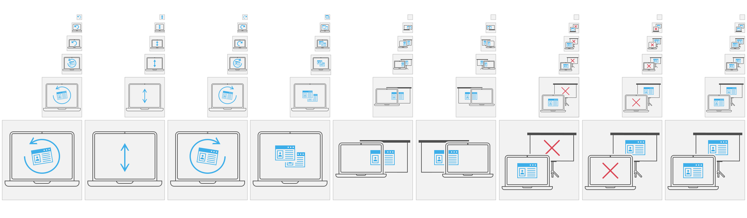
pstefan updated the diff for D14971: Combine display OSD icon files and move to plasma icon theme.
- changed osd-sbs-right to osd-sbs-sright
pstefan updated the diff for D14971: Combine display OSD icon files and move to plasma icon theme.
- Modes OSD files out of video.svgz into osd.svgz. Removed the 64-64- prefix.
pstefan updated the diff for D14971: Combine display OSD icon files and move to plasma icon theme.
- Reverse name change
pstefan updated the diff for D14971: Combine display OSD icon files and move to plasma icon theme.
- Moved all OSD icons into video.svgz and renamed some of them.
Moved to D14971
pstefan retitled D14971: Combine display OSD icon files and move to plasma icon theme from Combine display OSD icon files and mobe to plasma icon theme to Combine display OSD icon files and move to plasma icon theme.
pstefan added reviewers for D14971: Combine display OSD icon files and move to plasma icon theme: ngraham, VDG.
pstefan requested review of D14971: Combine display OSD icon files and move to plasma icon theme.
Aug 14 2018
Aug 14 2018
pstefan added a comment to D10937: Retouching of Screen Layout Selection OSD Icons.
Sure, I can do that, but I'd like to get feedback on the final form first :)
pstefan added a comment to D10937: Retouching of Screen Layout Selection OSD Icons.
Sorry folks for the endless period of no activity. After some talking with ngraham I removed the laptop metaphor for a much more general standalone display. Also the projection screen was swapped out.
May 10 2018
May 10 2018
pstefan added a comment to D10937: Retouching of Screen Layout Selection OSD Icons.
May 9 2018
May 9 2018
pstefan added a comment to D10937: Retouching of Screen Layout Selection OSD Icons.
Hello again,
Apr 5 2018
Apr 5 2018
pstefan updated the diff for D10937: Retouching of Screen Layout Selection OSD Icons.
Apr 4 2018
Apr 4 2018
pstefan added a comment to D10937: Retouching of Screen Layout Selection OSD Icons.
I am glad you like them :)
pstefan added a comment to D10937: Retouching of Screen Layout Selection OSD Icons.
Latest revision:
I moved the window a bit up while maintaining the alignment, as requested. I had to remove the stand of the projector screen tho. Originally I "cheated" and moved the stand off-center to make it still visible. However, with the "header" of the projector screen shown, it was easily apparent that the stand wasn't centered anymore.
Mar 16 2018
Mar 16 2018
pstefan added a comment to D10937: Retouching of Screen Layout Selection OSD Icons.
pstefan added a comment to D10937: Retouching of Screen Layout Selection OSD Icons.
An update:

Mar 5 2018
Mar 5 2018
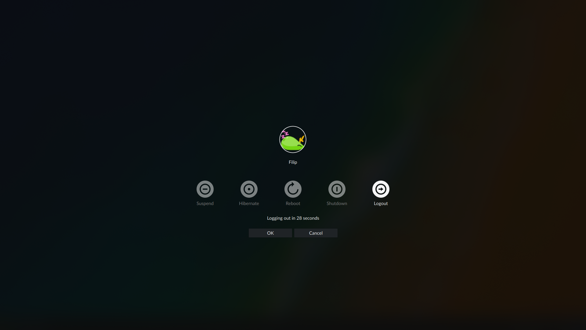
pstefan updated the summary of D11057: Add a custom default avatar to the sddm-breeze theme..
pstefan requested review of D11057: Add a custom default avatar to the sddm-breeze theme..
Mar 2 2018
Mar 2 2018
pstefan added a comment to D10937: Retouching of Screen Layout Selection OSD Icons.
Mar 1 2018
Mar 1 2018
pstefan updated the summary of D10937: Retouching of Screen Layout Selection OSD Icons.
pstefan added a comment to D10937: Retouching of Screen Layout Selection OSD Icons.
Some different versions. Personally, I think the first or last version is best, however, the last would probably only work in conjunction to the other icons and not as stand alones.
pstefan added a comment to D10937: Retouching of Screen Layout Selection OSD Icons.
pstefan requested review of D10937: Retouching of Screen Layout Selection OSD Icons.
Aug 28 2016
Aug 28 2016
Aug 11 2016
Aug 11 2016
pstefan added a comment to M58: From Grub to Shutdown, strict version.
I need this icon please
Aug 10 2016
Aug 10 2016
pstefan added a comment to M58: From Grub to Shutdown, strict version.
What am I showing when the user doesn't have a face set?
Aug 4 2016
Aug 4 2016
pstefan updated images of M58: From Grub to Shutdown, strict version.
pstefan updated images of M58: From Grub to Shutdown, strict version.
pstefan updated image descriptions of M58: From Grub to Shutdown, strict version.
pstefan updated images of M58: From Grub to Shutdown, strict version.
pstefan added a comment to T3364: Lockscreen.
I updated the mockup(s) to include metrics. Everything has basically the same metrics as shown in image 8 to 14 except some elements are added or removed depending on which screen we are talking about. Almost everything you mentioned should be answered in the description of image 8-14. The only thing missing is the OSD, which does not change.
pstefan updated images of M58: From Grub to Shutdown, strict version.
pstefan added a comment to M58: From Grub to Shutdown, strict version.
If there's a username box, what does the User Search button do?
That was a bug in the mockup. Well spotted! I added new mockups detailing the metrics of each part.
pstefan updated images of M58: From Grub to Shutdown, strict version.
pstefan closed mock M62: SDDM and Lock Screen Metrics.
pstefan updated images of M62: SDDM and Lock Screen Metrics.
pstefan updated the description for M62: SDDM and Lock Screen Metrics.
Jul 14 2016
Jul 14 2016
pstefan added a comment to M53: Discover .
Showing something fancy at the top of the drawer is kind of a pattern in Kirigami, inspired by the drawer in Android. It doesn't have to just show the logo, though. If you have a better idea, shoot :)
Jul 7 2016
Jul 7 2016
pstefan added an inline comment to M53: Discover .
In general I am not a fan of all the blue separator lines used. I think we should only use them as a highlight effects, to draw the attention of the user towards it. Using it too often and it become just meaningless noise. I think we can use a different, more neutral color for the same effect or often even get rid of them e.g. the Details view in picture 7 between "Kate" and the subtext.
Jun 28 2016
Jun 28 2016
Overall I like the mockup very much. It has some very good idea.
Some comments and suggestions below:
Jun 18 2016
Jun 18 2016
Jan 31 2016
Jan 31 2016
pstefan updated the task description for T1432: Finish wikipage regarding unified boot and login experience.
pstefan updated the task description for T1432: Finish wikipage regarding unified boot and login experience.
pstefan renamed T1433: Make a list with questions about branding from Make a list about questions about branding to Make a list with questions about branding.
pstefan changed the status of T578: [Cleanup] Harmonize the colors in the plasma-breeze icons. from Resolved to Invalid.
pstefan moved T1430: [CERN Sprint]Make a list of missing features for discussion with developers from Backlog/Planned to Requ. CERN Sprint on the Breeze board.
pstefan moved T1429: [CERN Sprint] Drafts/Sketches for KCMs from Backlog/Planned to Requ. CERN Sprint on the Breeze board.
pstefan moved T578: [Cleanup] Harmonize the colors in the plasma-breeze icons. from Work in Progress to Done on the Breeze board.
Aug 18 2015
Aug 18 2015
pstefan moved T578: [Cleanup] Harmonize the colors in the plasma-breeze icons. from Backlog/Planned to Work in Progress on the Breeze board.
Aug 17 2015
Aug 17 2015
Looks good to me :)
Aug 15 2015
Aug 15 2015
pstefan updated the task description for T573: Find a way for Breeze windeco to guarantee contrast between different windows.
pstefan updated the task description for T573: Find a way for Breeze windeco to guarantee contrast between different windows.