Falkon - VDG feedback
Open, Needs TriagePublic

Description

Hi,

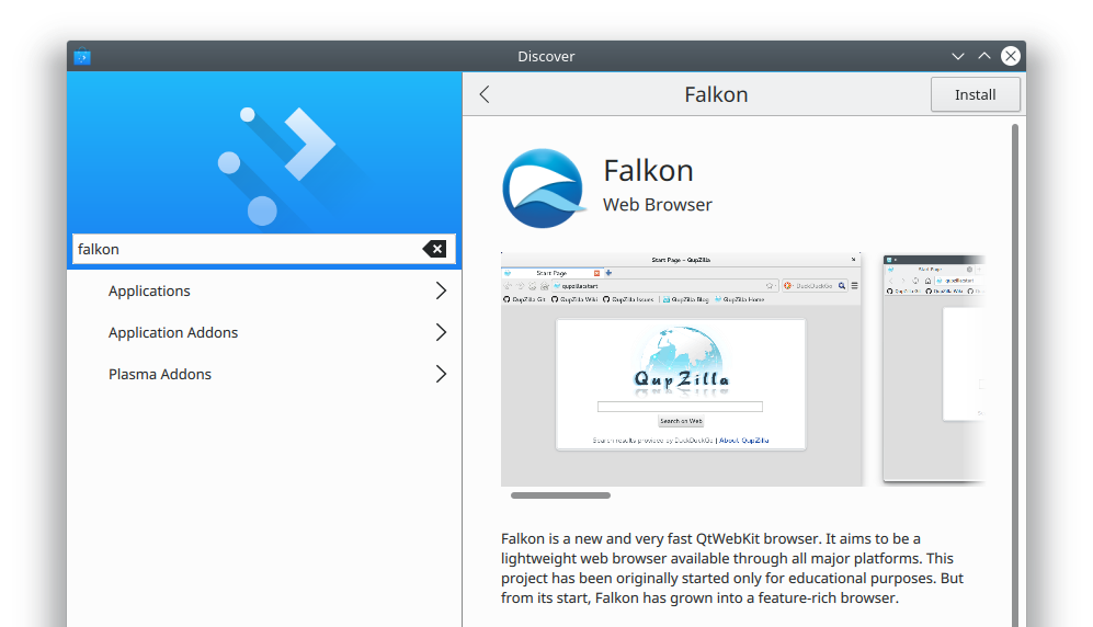
during the Konqueror BoF on Akademy, we decided to replace the current web browser Konqueror which is no longer really maintained with the QWebEngine based QupZilla (which is renamed now to Falkon).

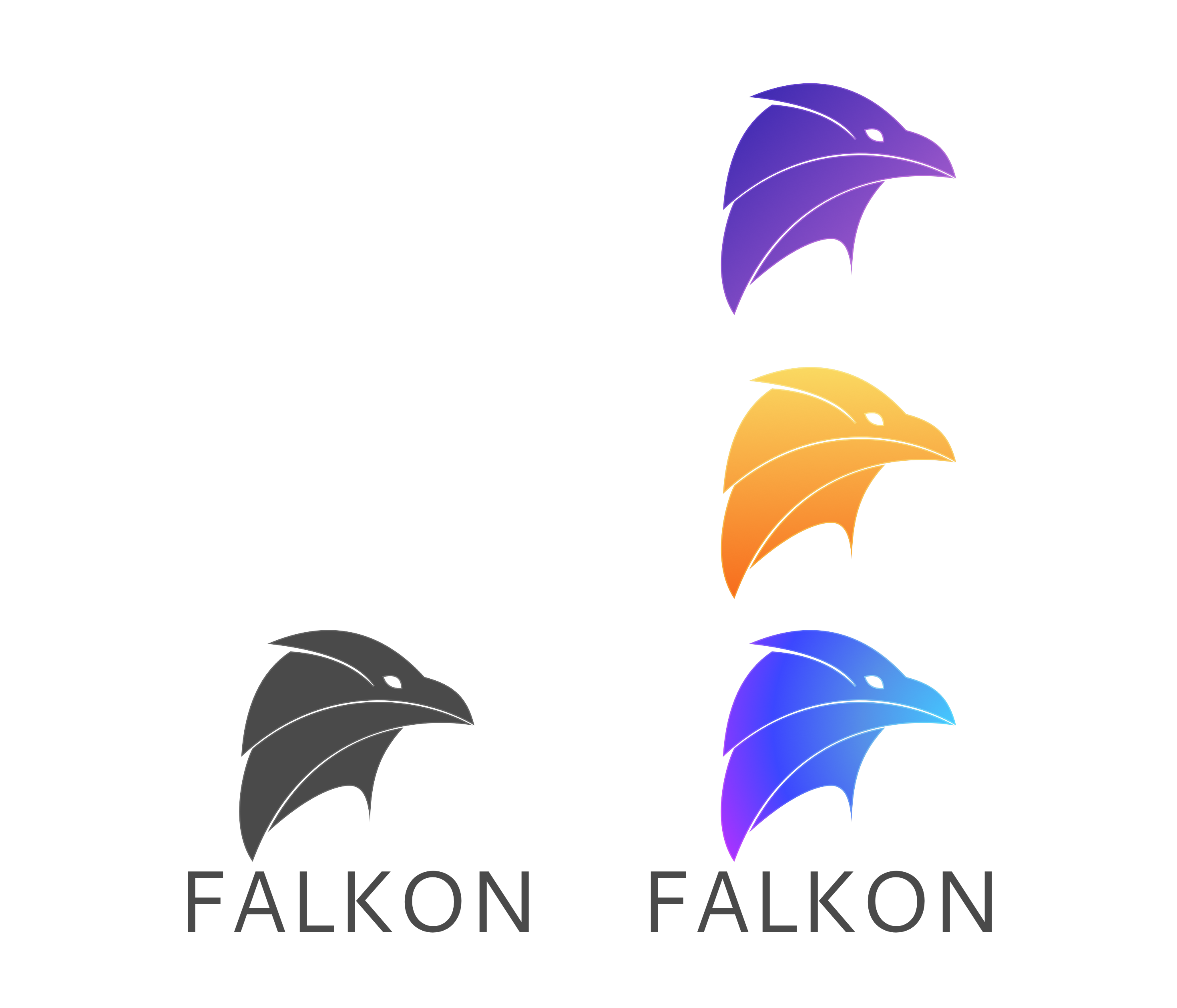
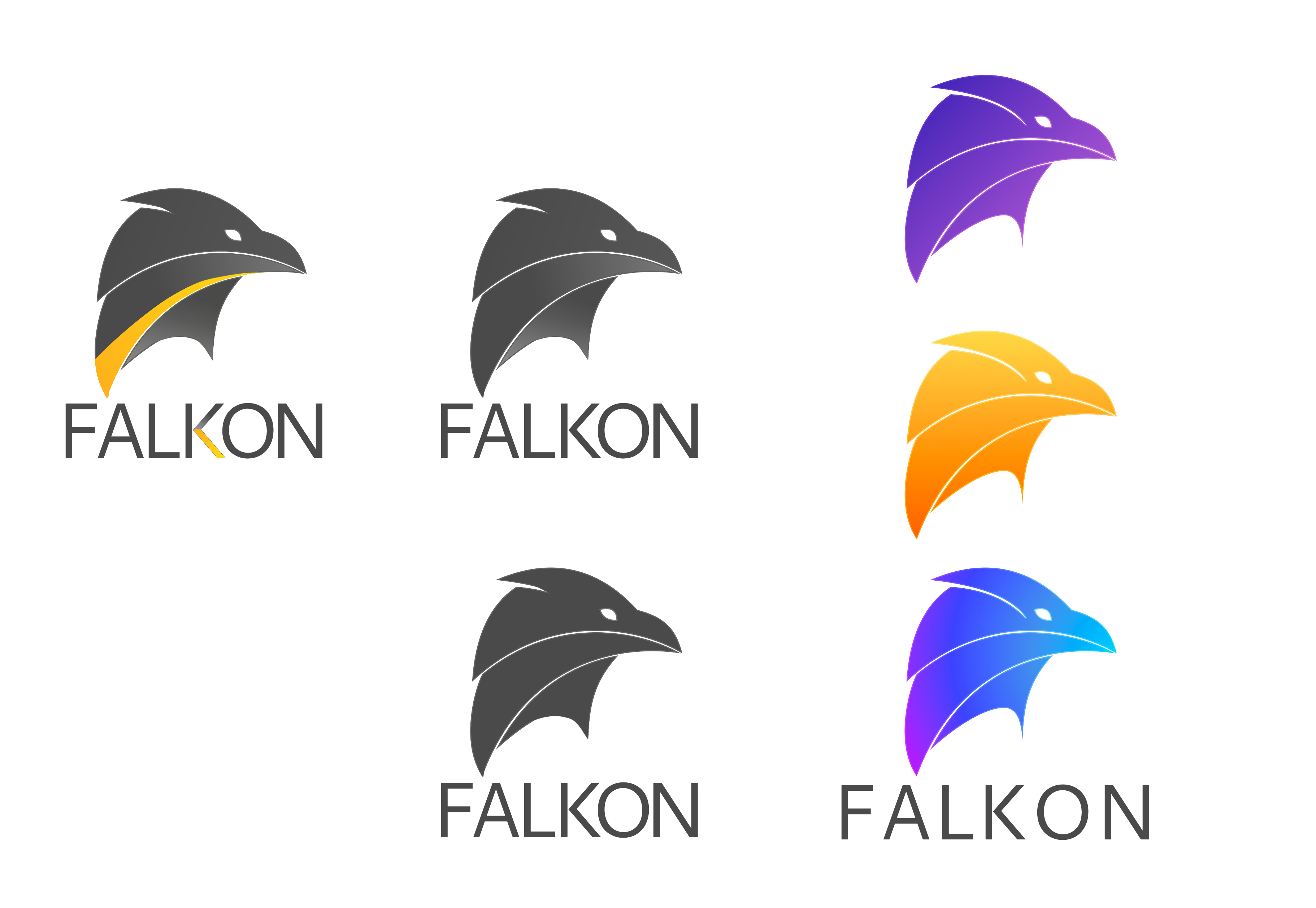
We would be interested in feedback of the VDG, be it design, icons, ....

There are a very large number of changes, so older changes are hidden. Show Older Changes
drosca added a comment.EditedAug 27 2017, 9:25 AM

Apart from the basic icon, there are also few images that also have the name in them:

https://phabricator.kde.org/source/falkon/browse/master/src/lib/data/icons/other/about.png
https://phabricator.kde.org/source/falkon/browse/master/src/lib/data/icons/other/startpage.png

This and the icon needs to be done for a first Falkon release.

Also, I'm open to changes in UI/UX anywhere, so any ideas are welcome (particularly Preferences are a mess).

Thanks!

Hoi, any feedback on this?

abetts added a subscriber: abetts.Jan 26 2018, 11:12 PM

I am interested in this, I would like to help. Maybe @andreask can also help. Can you please detail what icons are needed? For example, application icon, navigation icons, menu icons, etc.

drosca added a comment.EditedJan 27 2018, 4:11 PM

Everything that needs to be changed contains app icon in some form. While the current icon is generic, it can stay as it is, but if possible it would be great to create new icon too (maybe with bird - falcon?).

Then there is this:
https://phabricator.kde.org/source/falkon/browse/master/src/lib/data/html/broken-page.svg - displayed in speed dial when page loading fails
https://phabricator.kde.org/source/falkon/browse/master/src/lib/data/icons/exeicons/page48.png - html file format icon for Windows
https://phabricator.kde.org/source/falkon/browse/master/src/lib/data/icons/other/about.png - logo that is displayed in About dialog and falkon:about page
https://phabricator.kde.org/source/falkon/browse/master/src/lib/data/icons/other/startpage.png - logo that is displayed at start page falkon:startpage

Here's something else: the screenshots displayed in Software Center apps (like KDE Discover) all show the old Qupzilla name, not Falkon:

Relevant source file: https://cgit.kde.org/falkon.git/tree/linux/appdata/org.kde.falkon.appdata.xml#n84

Screenshot of the problem:

Also, it seems inappropriate to display a screenshot from GNOME as the first one, given that this is a Qt app that you would typically use in KDE Plasma.

@ngraham Good point, that needs to be changed too. Create new screenshots and host them on KDE servers (as other KDE apps?) + rewrite the description which is actually incorrect even for QupZilla.

I can help with the application logo. @andreask Would you be able to help with the app control icons?

Ok, here is a first draft for an application icon.

I like it, but two things:

It is Falkon, with K :)
Can you maybe try using a little darker color?

nice may you can use more collours not only one gradient when you look most icons have more colors.

nice may you can use more collours not only one gradient when you look most icons have more colors.

I can do that!

The eye shape makes him look kind of mean to me. Might not be the best tone to convey. Tough is good, but not mean.

Hey Andy, thanks for the quick work! Of course the k has to be in there, and I agree on the eye. Maybe a bit more open and friendly. The beak is tough enough to fight off malware. :-)

Ok, so I changed the eye to be more rounded, a little more inviting. I changed the C to a K. Then titled the image more upwards so as to show a view and not like the falcon was soaring. With the colors, keep in mind that all of these can be changed and altered. Most logos have a monochrome version as well. Also, I am not sure what is meant with making it darker. Do you mean adding more black to the icon? Or making the colors closer to their darker level? I also added some color variations that you can see.

That bottom-right one is fantastic! Just lovely. I may be a bit biased because that's my favorite color. :)

Yes, I meant to use a slightly darker blue. I am not a fan of the purple-blue gradient in the bottom variant, in that way I like the other two variants as the difference between the colors is smaller. So if you can please make a variant with blue gradient I think that will be all from me. Thanks!

I would add a second color e.g. for the beak and for the eye. maybe you can add the earth from the application-internet icon into the plumage

James added a subscriber: James.Jan 29 2018, 1:07 PM

Thanks for jumping in on this everyone! It's good to see movement here as Falkon needs these important changes to further move into the KDE fold.

Wow, I love this second iteration, Andy! Thanks so much for your work. <3

januz added a subscriber: januz.Jan 29 2018, 10:56 PM

This is looking really cool! Here are some suggestions. (@abetts I took the liberty of painting over your work, hope you don't mind :) )

1- Made the lower-right part a little thicker, also making the curve a bit flatter
2- Made the upper cut smaller so it doesn't come so close to the eye (and the upper part can have a lower amount of detail for contrast)
3- Pulled the characters closer together
4- Added a couple ideas for color and gradients

In T6859#125345, @januz wrote:

This is looking really cool! Here are some suggestions. (@abetts I took the liberty of painting over your work, hope you don't mind :) )

1- Made the lower-right part a little thicker, also making the curve a bit flatter
2- Made the upper cut smaller so it doesn't come so close to the eye (and the upper part can have a lower amount of detail for contrast)
3- Pulled the characters closer together
4- Added a couple ideas for color and gradients

I really like the variations! I like the one with the yellow highlight and the connecting highlight in the name. Love it! I would even add another highlight at the top to accentuate!

Outstanding. FWIW like the commenter above I really like the 2-tone black and yellow one (who says everything in KDE-Land HAS to be blue? :) I also like the blue one as well, and would even encourage that one to utilize two colors as well.

januz added a comment.Jan 30 2018, 1:15 AM

I really like the variations! I like the one with the yellow highlight and the connecting highlight in the name. Love it! I would even add another highlight at the top to accentuate!

Cool idea, another small highlight at the top could work really well and balance it better.

My proposal

Nice maybe the background a bit lighter

Lighter version

Cool should look good in the panel with the lighter background.

Maybe check the gradient of the eye or the beak with the available icons

Americans should love any of these icons, what with our seemingly genetic attraction to stern eagles.

For different sizes the slight gradient should be gone and replaced by more simple lines.

Cool should look good in the panel with the lighter background.

Maybe check the gradient of the eye or the beak with the available icons

The second proposal is great too! I love it!

I think we need to define early what image we want to use so that we can focus the work. Can the owner of this task make a choice?

Combining them would be perfect IMHO: @abetts' icon, but put into a round shape like @vikingredwolf's.

drosca added a comment.EditedJan 30 2018, 3:09 PM

From all the proposals, I like the gray with yellow stripe the most. But I see a problem for this particular color combination as it is mostly gray, so it will be invisible on dark background (dark themes or even Breeze default titlebar), so maybe try to add some bright(er) background?

dcahal added a subscriber: dcahal.Jan 30 2018, 7:09 PM

I second @ngraham's suggestion. @abetts' design with blue-to-purple gradient is very sleek. The font is a good fit as well. That logo with a round icon seems the way to go.

VikingRedWolf, really good to see you joining in here!

Thank you, @zimmerman. I am glad to be invited and collaborate if I can :)

James added a comment.Feb 8 2018, 4:54 PM

From all the proposals, I like the gray with yellow stripe the most. But I see a problem for this particular color combination as it is mostly gray, so it will be invisible on dark background (dark themes or even Breeze default titlebar), so maybe try to add some bright(er) background?

Can we get a final (hopefully) mock-up the the Dev is suggesting? It would be good to wrap this task up in a timely fashion :)

abetts added a comment.Feb 8 2018, 4:56 PM

Yes! @januz I think you have the best results here. Would you want to take this on and create the final product?

januz added a comment.Feb 8 2018, 6:42 PM

Hey sure! I'll try to work something out this evening. @abetts BTW, could you post the svg file for your logo? it would easier to work with that, instead of painting over with krita

abetts added a comment.Feb 8 2018, 6:45 PM

Yes, I will upload later today.

januz added a comment.Feb 9 2018, 10:06 PM

In the end, I traced over it with inkscape :) I couldn't figure out what type you were using so I just used noto (we can change it later).
Here's some ideas using the blue-purple gradient and others.

In T6859#127415, @januz wrote:

In the end, I traced over it with inkscape :) I couldn't figure out what type you were using so I just used noto (we can change it later).
Here's some ideas using the blue-purple gradient and others.

Sorry about that Diego. I will upload tonight if it is still necessary. I was just too busy last night. Those variations look great! I like that they go beyond the circle too. I like a combination of the purple/blue background and the yello/white figure. If possible. Can you also create a monochrome version? Just in case we need those taskbar-style icons.

Here you go!

Sure thing, here's all the variations with the proper type:

I'm not too good with icons so these might not work too well at smaller sizes. Maybe @andreask or someone else should take a look at them and prepare small size versions.

Here's the SVG:

abetts added a comment.EditedFeb 11 2018, 12:42 AM

{F5704233}I took the liberty to edit a couple of them and make a final color selection.

Quite lovely! I kinda think the full-color version might look better without the green highlights, and with a bit more blue in the background. But I'll butt out now as you guys are the visual pros here!

Is it a requirement for the letters to be all uppercase? That moves visual focus away from the logo... On @januz mockups, the project name is in harmony with the logo.

Also, I agree with @ngraham in that 4th color feels out of place; personally, can't stop looking at @januz 's variants 😍

Keep in mind that in most instances, the label is not going to be used. This is just so that we can make sure we have a complete design and don't scramble for a label when we are asked about the design. I selected these because of 2 things. In any logo design, we need monochrome variants so that we can use them as buttons, or even on printed work. The label is an addition to make sure we address that design aspect. But in the desktop, it will appear like any other icon with a label at the bottom. Nothing fancy there. Then the colored one, that is generally used for the application itself or anything that is promoted online, like an app store. So, don't stress too much over those. Are we ready to move forward with the design and create the various sizes? Any details we need to address?

I understand what you mean, but my comments to colors and the label still apply (a nice-looking store / desktop icon and a pretty label in "About" menu would be nice to have).

@abetts I'm ready! Can you please create the icon files and these three images, so I can use it for release?
https://phabricator.kde.org/source/falkon/browse/master/src/lib/data/html/broken-page.svg - displayed in speed dial when page loading fails
https://phabricator.kde.org/source/falkon/browse/master/src/lib/data/icons/other/about.png - logo that is displayed in About dialog and falkon:about page
https://phabricator.kde.org/source/falkon/browse/master/src/lib/data/icons/other/startpage.png - logo that is displayed at start page falkon:startpage

There are also few mac/windows specific images, but those can be done later. I'd like to make a (Linux) release before the end of February, so there's not much time left to make some changes. Of course, if you want to still make some changes, it can be done later after the release.

Thanks everyone!

Sounds good! I can do it. I should have time this weekend. Does that work for you?

Sounds good! I can do it. I should have time this weekend. Does that work for you?

Sure, that would be perfect.

James added a comment.Feb 14 2018, 6:01 PM

Awesome news!! Looking forward to the 1st official release for Falkon under the KDE umbrella. I big, heart-felt thanks to everyone who helped get this task done.

Guys, what sizes do you need for the icons?

I think only one special size is needed - 16px favicon with less details + all other sizes with full details.

The link to all the assets and icons is here:

FalkonIcons

drosca added a comment.EditedFeb 23 2018, 10:30 AM

@abetts Thanks! Can you also please make the version with text bellow and on the right? Only one file (SVG) for each is enough.

Yes, I can!

The extra icons are uploaded to the same location as before. Done!

I think this loading indicator needs to be Breezified.

@andreask Do you think we could use a proper Breeze spinner?

cullmann reassigned this task from cullmann to drosca.Aug 16 2018, 7:31 PM

Any comments on the last question by @abetts or are we done here?

The breeze one is really boring. I would use the one in the Screenshot

The breeze one is really boring. I would use the one in the Screenshot

I don't disagree, but this would be an argument for moving the better one upstream into Breeze, not doing our own thing in Falkon. If Falkon has a better spinner than Breeze does, then everyone should benefit from it, not just Falkon users! :)

Maybe time for a different phab ticket here?

I am using the latest version and I really think that the background in the icon is too light. Like check the other apps (Dolphin, Firefox, KSysGuard, System Settings, etc). They don't use such light colors. Maybe with a bigger version it's fine, but the smaller (much more important and used version) is not.

ndavis added a subscriber: ndavis.Jan 4 2019, 12:02 AM
GB_2 added a subscriber: GB_2.Jan 4 2019, 12:18 PM
paulm added a subscriber: paulm.Dec 31 2021, 4:26 PM

This was a proposal for a browser rebrand that I posted on the Mozilla Wiki about a decade ago but I don't think many people saw it and too many were emotionally attached to the fox. Just also posting it here in case you wanted to use it. I knocked it up in MS Paint in about 10 minutes, so it's just for the concept and obviously not a polished final design or anything. Could change the colours if orange was too Firefox-like.

I have no idea why there are so many web browsers out there and not one has decided to use the name "Spider". It's a far more obvious and intuitive choice for the user to browse the web with a spider than foxes or falcons or whatever the Chrome 666 thing is supposed to be!

If there has to be a "k" in there perhaps a browser could be called "Araknid".