Hover buttons, or no hover buttons?
Closed, InvalidPublic

Description

The problem

We are inconsistent about how, when, and where we use inline hover-only buttons on list and grid items:

  • In some places, inline buttons are shown on hover (the clipboard widget; grid delegates in KCMs, the wallpaper chooser, and the GHNS window)
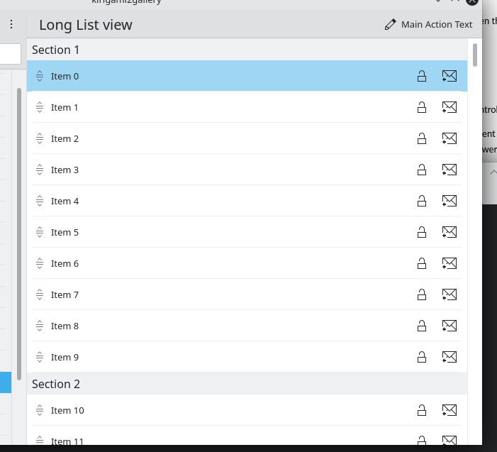
  • In other places, inline buttons are always visible (Kirigami Card; Kirigami SwipeListItem; PlasmaExtras.ExpandableListItem; custom list items in the Baloo and Background Services KCMs, and Elisa's settings window; old QWidgets list views present in the KRunner and KWin Scripts KCMs; the notifications applet)
  • In some places, the buttons' actions are of secondary importance ("show preview" in various appearance KCMs; "show in folder" in wallpaper chooser; "show barcode" in clipboard applet)
  • In other places, the buttons' actions provide primary functionality ("connect/disconnect" in network applet; "lock/unlock" in Vaults applet; "delete" in clipboard applet)

Discussion

Each approach presents its own drawbacks:

Problems with inline hover-only buttons:

  • Hover-only buttons present significant discoverability problems:
    • Important primary actions that are hover-only are de-emphasized and easy to miss.
    • In views with only one or two items, the user may not think to hover over those items and therefore will not discover the hidden buttons at all.
    • Grid items with rich, complicated backgrounds can cause the buttons to visually disappear. This is especially true when the grid item's background itself depicts UI elements, as in several System Settings KCMs (Plasma Theme, Widget Theme, Window Decorations, Colors).
  • Hover does not work at all on touch, so a separate UI is required. Simply making the buttons always visible on mobile does not work because this can cause content areas to be permanently covered with buttons. Being visible only when selected also does not generically work as some list and grid items do not have a distinct selection state or perform an action immediately upon being clicked/touched/selected. Also it is also not possible to perfectly separate device classes. A laptop with a touchscreen needs to have a usable touch UI, for example, even though it is not a mobile device or even a tablet.
  • Appearing on hover really only works for buttons and is not suitable for complex controls; in the Baloo KCM for example, having the list items' comboboxes only appear on hover feels like it would be really weird, which means the button next to each combobox also has to be always visible, or else the combobox would change location on hover!

Problems with inline always-visible buttons:

  • Always-visible buttons in lists with many items presents a vertical column of identical icons going down the right side, which looks visually heavy and rather ugly.
  • Grid items need to be made larger in order to accommodate an area where always-visible buttons can live without permanently covering up content. This may cause them to present an information-sparse view that requires a lot of scrolling.
  • Because the buttons are always visible, unless the list or grid item is huge, they must generally be icons-only, because text takes up entirely too much space, especially in grid items. This imposes significant limitations on the icons that can be used, because icons-only buttons need to have perfect iconography or else users generally do not manage to figure out what they do.
  • If any always-visible inline buttons in list items must have text for some reason, they are highly likely to cause the list item's own text to be elided.
  • less-important secondary actions are unnecessarily emphasized, contributing to the "heavy UI" effect.

Preliminary conclusions

We actually don't use inline hover buttons in as many places as I thought we did. It's mostly just the clipboard applet plus grid delegates in System Settings, GHNS, and the wallpaper chooser view.

Hover-only buttons are unusable on Plasma Mobile and with any touchscreen devices, and not compatible with complex controls in list items, so we need to come up with a non-hover solution for those anyway.

It may make sense to use hover-only buttons for actions that are only of secondary importance and are not needed at all on touchscreen interfaces--however this will be hard to integrate with other icons which are primary, and will not solve the problem of having ugly columns of icons in list views.

If our goal is consistency, we can't use hover anywhere because it can't accommodate all possible use cases, while always-visible inline buttons can.

Moving everything that currently has a hover-based UI to an always-visible-inline-button UI will not be a huge amount of technical work. The issues will be coming up with adequate designs that do not consume too much space or look super ugly, and figuring out how to avoid excessively upsetting people who really like hover buttons. :)

ngraham created this task.Mar 1 2021, 9:13 PM
ngraham added subscribers: mart, cblack, ndavis and 2 others.
tfella added a subscriber: tfella.Mar 1 2021, 9:20 PM

As an additional data point, we do occasionally get bug reports no matter which path we take. For example, someone reported in https://bugs.kde.org/show_bug.cgi?id=428624 that they and the users they support were having trouble finding the hover actions in various System Tray applets. After I made them always-visible (including text for the primary action) a new frameworks releases ago, we got a complaint in https://bugs.kde.org/show_bug.cgi?id=433281 from someone else saying the opposite: that the always-visible icons-and-text buttons are distracting and elide text in the list item.

To my mind both complaints feel valid. So it's a tricky situation.

abetts added a comment.Mar 1 2021, 9:40 PM

My feelings are that we should move to non-hovered controls. Here are some reasons that I find valuable:

  1. It solves the issue of appearing/disappearing UI controls. I think this makes it easier for users to find what they are looking for. The target action is acquired faster and that makes it so the user doesn't have to wait on the system to make a decision.
  1. It solves the issue of wanting to use multiple UI layers to cram UI controls into the system. Because of limited screen real estate and wanting to keep a pretty UI present, having controls always visible can stop designers from looking to add layers of interaction using hover. This forces designers to break up and prioritize UI controls to present them in digestible way.
  1. It removes uncertainty of how designers should expose controls to the user. I think making a decision just makes everyone happier.
  1. It solves a visual design issue where the UI keeps getting elements to denote that they are in hover state thus always calling for attention to elements that might not be important to the user. For example, view fields, window frames, header labels, checkboxes, etc. AKA noisy UI.
  1. It constraints our designers to use better iconography or typography to adapt to a UI with a selection of prioritized controls. Given that controls are now always visible, they will need to adapt to be more effective.

This can also bring some constraints for designers. For example:

  1. Our UIs might need to either cut back on controls or make elements on the screen larger to accommodate controls.
  1. Some elements on our desktop might expose too many items that were previously hidden behind a hover layer for additional controls.

Seeing the pluses and minuses of this idea make me think that we should adopt non-hover. As with everything, this might take a moment for our users to accept and our contributors to adapt to. However, I believe, in the end, we are closer to achieving a more simple UI that is powerful when needed.

Kirigami SwipeListItem

It's worth mentioning that this changes behaviour on mobile. It does from always visible to swipe to view.

We can make other things switch too. Having the grid KCMs have the secondary actions on press-and-hold for example.

If our goal is consistency

Having different patterns for different things can still be consistent, as long as it is properly defined and followed.
As you note there are cases where it is a primary action with no alternative, and cases where it is merely a shortcut.

Kirigami SwipeListItem

It's worth mentioning that this changes behaviour on mobile. It does from always visible to swipe to view.

That's true. However as I said, "mobile" doesn't cover the case of a convertible laptop or even a regular laptop with a touchscreen. It's worth mentioning that because those users get the desktop version of this component, it only works for them because the desktop version got rid of hover.

mart added a comment.Mar 2 2021, 12:30 PM

As i said previously I was and still am very against the commit which changed kirigami listviews and i'm still considering to revert it.
The result looks very cluttered and not any more explanatory than before, as you have giant label-less columns of icons all the same. it makes something very ugly and very confusing for no advantage whatsoever.

the gallery example is admittedly an edge case, but it's very symptomatic

Now, one could say that this shows some deeper ui problem.. but really, if you need to have inline actions in a list, the alternatives are very few. either you just renouce to actionscompletely, or always show them, or make them visible on hover, or like mobile the slide mechanism, or bury them under a menu, either opened by right mouse button or by a button present on every item (i would already be more in favor to the latter every time there is more than one action, as would still cause clutter but a bit less, and actions could gain labels, and i wouldn't really get the omg one click more argument)

https://bugs.kde.org/show_bug.cgi?id=433281 is describing pretty much that, and is to be taken seriously.

The argument that in some cases adding more whitespace helps, and we definitely should in many places is certainly good, but i don't think it's universal.
I don't think things like items in systray applets could always just be made bigger to accomodate, i don't see wireless connections or klipper items to become big multi line items, i don't think it would decrease significantly the perceived amount of complexity and the tradeoff between how many items to show at once and how much whitespace to use is acceptable up to a certain point. It's like spice, there is too little, just right, and too much :)

It is true that often our apps and desktop shell parts show too many actions knobs and levers by default, though lately i've seen the tendency to just make things worse if anything. Examples may be always visible icons in systray applets and the new kickoff redesign, which may be better, but the first impact is a lot more densely populated than before.
the main thing there is really needed a lot more discipline to keep featuritis at bay, everything else is just a band aid.

One thing that i like about hover actions is that while keeping the aspect clean, the action appearing on hover is a little notification that says that there is something there, and makes less likely to be ignored in the blind spot (because the brain is shit in noticing static details, but very good picking up changes and things that move)

It's true that hurts discoverability when the system is not interacted with, and some people are less likely to go "explore" the ui, bbut not all actions are created equal.
For example, on a list view (or grid as well) every action that is not the "clicking on the list item itself" should really be some secondary/advanced feature, and some actions are important enough to be always visible.

On the networkmanager applet, connect/disconnect: yup, very important and in that case always showing it makes sense, perhaps also mount/unmount in the device manager.. but already more debatable.

on klipper applet, always showing all those 4 icons? eeew. there is only one very impoerant action there, which is clicking on the item itself so gets on the clipboard, all the others are nice to have, useful.... but should be generating a barcode as important as the primary action? hell no. but it's an awesome feature, ever if super rarely used, and would be just stupid to remove it, as would be having for each item a big multiline "card" with a full toolbar in it.

This is a typical example where consistency for consistency sake is more hurting than anything else, as wants to treat things that don't have the same importance as they were all on the same lever, which they aren't.

ognarb added a subscriber: ognarb.Mar 2 2021, 1:37 PM

I do agree with all the points of @mart. By having more buttons visible at the same time, it makes our interface 'heavier', something Plasma is often criticized for. We should keep things visually simple and also make sure we understand the difference of priority of each type of action. In the KCM grid proposal, what struck me the most, is that by making the customize buttons more visually important to the users, we also make the preview of the theme less important. Realistically 95% of the users won't click on the customize color scheme options, if they want to change their color scheme they just want to see a good preview and then click on it. For these users, the bigger the preview is, the better it is to get an idea of it.

For the touch supports problem, I think we should find a better solution. Either by making use of Kirigami.Settings.isTablet, so that we can detect users of tablet and only then displays all the buttons. Another idea would be to more often use a SwipeListItem, that was designed exactly for that use case. We should also make sure that buttons are also visible on keyboard focus (currently it doesn't seem to be the case in the grid kcms)

mart added a comment.Mar 2 2021, 3:10 PM

i do agree that keyboard navigation should always work even on hover only controls (so make all the buttons appear also on focus)

It seems like we essentially have two options: abandon hover, or abandon consistency.

mart added a comment.Mar 5 2021, 11:22 AM

one way i would see it working without hover and in some/most cases is if we pay attention to have always at most one visible action and put everything on a menu: most of those actions really aren't that important to warrant to be always reachable with one click only

Because hover-only buttons are not discoverable enough I think we need some visible hint that something changes when they are hovered. The exception to this are actions which we are explicitly fine with if they are never found by the user which would make me question their existence in the first place.

So unless we decide to put the actions that act on an item outside the list entirely (which also hurts discoverability) we will have some sort of visual hint on the item. Such a hint would make it visually close to @mart's comment of "put[ting] everything on a menu".

One big disadvantage of "put everything on a menu" is that they become cumbersome to activate. This isn't a problem if users only want to act on single items but there are workflows like deleting many items from a list that can be done way faster with hover-only buttons. They allow you to click the same location again and again to remove successive items.

One way I see that gets us most of the advantages of both worlds is to have the buttons appear on "selection". The task description says that that "does not generically work" but I am not so sure that is true.

some list and grid items do not have a distinct selection state

They don't need a selection state. They can just toggle between showing and not showing extra buttons on click. This way we could more generously show labels for them which is another thing that is only available through hover. This would be similar to what @mart said about keyboard controls: "make all the buttons appear also on focus".

some perform an action immediately upon being clicked/touched/selected

If an item has buttons on it but immediately does a different action when clicking right next to them, that seems like a troublesome UI to me anyway but I didn't find an example of something problematic happening immediately on click so maybe I am missing something here. (I don't consider copying on Klipper/clipboard problematic.)

So one solution I currently see is: No more hover-only buttons. Add an icon/visual hint to items that have buttons available. When clicked on, toggle button visibility (they can now be labeled). If the action is really important, always show the button (without label). If an item would perform a problematic action on the first click, put that action into a button. Live with selectable items being ellided by their buttons when selected or have these use a menu button.

So I have resisted commenting on this topic any more while I sort out my own thoughts, and I think we are in a messy unfortunate situation where we have to take things on a case-by-case basis. In other words, we have to abandon consistency.

The problem is that we are bounded by two rather restrictive visual conditions (putting aside functional considerations):

  1. We cannot always use hover (or a process for manually showing the hidden controls, as @felixernst proposes) for all inline list item controls; it simply doesn't work in some cases, such as complicated tall list items with comboboxes, or where some items have different buttons. The UX would be maddening. Some examples can be found in the Baloo KCM and the Clock applet's Timezones settings page.
  2. Long lists of skinny list items start to look really, really bad with always-visible buttons, especially when there is more than one button, and when they are using the raised pushbutton style rather than the flat toolbutton style (though the raised style can work fine for hover buttons IMO). Some examples can be found in the Shortcuts KCM and the Clipboard applet.

So we find ourselves in the case where hover can oscillate between the extremes of "very desirable" for long lists of skinny items to "totally unsuitable" for short lists of tall items. And then there are the ambiguous cases of medium-sized lists of medium-sized items.

I just don't think there will end up being a way to enforce a hard-and-fast rule here. I don't see any possible path to always using hover even on the desktop (and we already know we can't use it for mobile or tablet modes). The only possible route I can see for using always always-visible UI controls is if we commit to our list items never being super skinny, and limiting either the number of items, or the number of items visible at once (AKA requiring that the user scroll more). I know there are a lot of KDE developers and users who are fairly attached to their skinny list items and would not like this. :)

So I think we just have to take these on a case-by-case basis.