Unify list item removal
Closed, ResolvedPublic

Description

Implementation

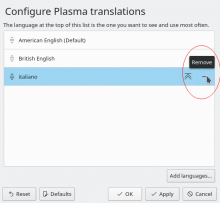
Use SwipeListItem with inline remove action that has the icon edit-delete and the tooltip text "Remove".

Notes

In various KCMs we have a list where items can be added/removed. The presentation, wording and icons for this are not consistent. Some have the remove action inline by using a swipelistitem, some have a remove button below the listview. Some have the label "Remove", others "Remove X", some "Delete X". Some have an X as icon, some a minus, some a trashcan.

Virtual Desktops:

Activities:

Translations:

Baloo:

Online accounts:

Users:

Connections:

Bluetooth

nicolasfella added a project: VDG.
ognarb awarded a token.Mar 3 2020, 1:25 PM
davidre added a subscriber: davidre.Mar 3 2020, 1:26 PM

I think inlne is the way to go for remove. It's an action pertaining to the specific and item. Also selecting an item and then clicking the remove button is more cumbersome

ndavis added a subscriber: ndavis.Mar 3 2020, 2:17 PM

I agree, inline is better. Hover to show will be a problem for touch users, so we'll need to make the controls remain visible after selecting an item.

abetts added a subscriber: abetts.Mar 3 2020, 4:24 PM

It seems that the most common iteration is using the minus sign when the buttons are outside of the list itself and use some kind of remove button for those items that have things inline
I guess it depends if we are talking about removal from the system versus removal from the list. They are not intrinsically the same thing. However, I tend to favor using a minus sign in most places
I don't think the trashcan icon is probably as appropriate just because we don't always delete.

ndavis added a comment.EditedMar 4 2020, 1:54 AM

Trashcan for when deleting sends the deleted entry to something like a trashcan is a pretty straight forward choice.

Looking at various icon websites (e.g., icons8.com, flaticon.com, iconfinder.com), it seems some other theme authors can't make up their minds about what kind of symbol to use for remove actions in their icon themes either.

  • x and - are the most popular types of remove symbol
    • Every icon theme on my system (e.g., Papirus, Adwaita, Tango, Oxygen, Elementary, Breeze) uses - for list-remove(-symbolic)
  • x and trashcan are the most popular types of delete symbol
    • Adwaita and Oxygen use x for edit-delete(-symbolic) and Papirus puts an x inside of a trashcan

Picking between x or - for standard remove actions is tricky.

  • I doubt most users will intuitively understand any kind of subtle difference in meaning between x and -, but I don't have data.
  • Do most users intuitively understand the difference between a red trashcan (used for permanent deletion) and a normal trashcan (used for move to trash)? I think probably not, but I have no data.
  • x is fairly universal
    • If you're not paying close attention or have dyslexia, I could see it being harder to discern the difference between a + and an x when they're used together, especially as emblems in the bottom right corners of action icons
    • x can become overloaded. There have been plenty of situations where I wasn't sure if an x button on a website would remove an item or close something.
  • - looks strange by itself. It kind of needs to be used as the opposite of +.

Ideas that might work:

  • Use trashcans when working with files, maybe use x when permanently deleting a file
  • Use x for delete/remove and avoid putting it next to +
  • Use - for deselect/remove from selection in contexts where + is used to select/add to selection
    • A checkbox might be a good alternative to using +/-
ngraham added a subscriber: ngraham.Mar 4 2020, 4:02 PM

We currently use a trashcan item for inline buttons in our grid views. Discover uses trashcan icons for the inline buttons in its list items. We also use trashcans for panel editing. However the virtual desktops KCM uses a red X.

I'm starting to think we should just standardize on the trash can rather than coming up with some kind of heuristic (e.g. "trashcan is for deleting; X is for removal). Any distinctions we draw are likely to be lost on the average user.

ndavis added a comment.EditedMar 6 2020, 6:24 PM

We currently use a trashcan item for inline buttons in our grid views. Discover uses trashcan icons for the inline buttons in its list items. We also use trashcans for panel editing. However the virtual desktops KCM uses a red X.

I'm starting to think we should just standardize on the trash can rather than coming up with some kind of heuristic (e.g. "trashcan is for deleting; X is for removal). Any distinctions we draw are likely to be lost on the average user.

Right, that's a good point, but what do we do about bottom right corner icon emblems? We mostly use a red X for those and it's very difficult to make a legible miniature trashcan that makes sense in that situation. I realize this is a bit off topic, but it's closely linked. Whatever symbol we use for remove, we need to use it consistently.

And that's also a good point. I agree that the prospect of making a legible 4px trashcan seems unlikely, and that it would be odd if we use an X for removal in icons, but a trashcan for removal in list and grid items.

That raises the question though: if we're going to use an X in icons and in list and grid items, then where do we use the trashcan icon? Just the Move to Trash and Delete actions?

I still think we should differentiate remove and delete

I still think we should differentiate remove and delete

My worry is that the distinction will be lost on users, and we can't even do this at all for icons since there is only room for an X, not a trashcan.

ndavis added a comment.Mar 6 2020, 8:31 PM

And that's also a good point. I agree that the prospect of making a legible 4px trashcan seems unlikely, and that it would be odd if we use an X for removal in icons, but a trashcan for removal in list and grid items.

That raises the question though: if we're going to use an X in icons and in list and grid items, then where do we use the trashcan icon? Just the Move to Trash and Delete actions?

Maybe only when moving to the trash. The way we use the trash icon right now, I'm not sure it's really obvious when something is going to the trash or not.

GB_2 added a subscriber: GB_2.EditedApr 20 2020, 3:04 PM

IMO we should just use the trash can for "Move to Trash" and the red X for permanent deletion or removal. This makes it simple.

I kind of think we should just always use a trash can icon these days. What it will do is perfectly clear and we don't have to make a complicated rule.

FWIW if we can spare 5x5 pixels rather than 4x4 pixels for icon emblems, I think it's possible to make a legible trashcan:

Also it seems like the red trashcan is what spontaneously occurs to others too. See https://invent.kde.org/plasma/kwin/-/merge_requests/995

Has there been any conclusion here?

It seems that we have basically decided to use trash icons in the actual list items themselves. No consensus was reached in this task, but since then, people have been organically using the trash icon, and porting list item removal buttons to use it. So I guess we can consider that the de facto standard. See for example https://invent.kde.org/plasma/kwin/-/merge_requests/995.

GB_2 updated the task description. (Show Details)Jul 7 2021, 5:15 PM
cblack added a subscriber: cblack.Jul 7 2021, 5:25 PM

FWIW, I think using the trashcan as the universal list removal thing isn't a good idea, mostly because a trashcan has largely meant "you can put something in the trash" and importantly "you can take it out of the trash" again, that is, a trash can indicates deletion that is:

  1. reversible
  2. "deleted" items are put in a staging place that can be accessed by the user

Most instances of the trashcan used in a list item are either destructive, or reversible but not very apparent in how you recover an item from deletion.
This is inconsistent as to the meaning of the trash can icon as used by other OSes our users are familiar with, and to how we've been using it before we started slapping it on list items.

We should either

  1. use a different icon that truthfully indicates the non-trash-like nature of deletion (shredder, X, incinerator, whatever) instead of one that lies to the user about how a UI will behave

or

  1. revise the interaction of items using a trashcan in order to be consistent with the meaning that it implies
GB_2 added a comment.Jul 7 2021, 5:29 PM

FWIW, I think using the trashcan as the universal list removal thing isn't a good idea, mostly because a trashcan has largely meant "you can put something in the trash" and importantly "you can take it out of the trash" again, that is, a trash can indicates deletion that is:

  1. reversible
  2. "deleted" items are put in a staging place that can be accessed by the user

    Most instances of the trashcan used in a list item are either destructive, or reversible but not very apparent in how you recover an item from deletion. This is inconsistent as to the meaning of the trash can icon as used by other OSes our users are familiar with, and to how we've been using it before we started slapping it on list items.

    We should either
  3. use a different icon that truthfully indicates the non-trash-like nature of deletion (shredder, X, incinerator, whatever) instead of one that lies to the user about how a UI will behave or
  4. revise the interaction of items using a trashcan in order to be consistent with the meaning that it implies

That's why I think a black (because it's not really destructive) trash can for reversible removal and red X for permanent deletion would be a better idea.

cblack added a comment.Jul 7 2021, 5:30 PM

Using colour alone to indicate a difference between elements is inaccessible and obtuse to read.

GB_2 added a comment.Jul 7 2021, 5:32 PM

Using colour alone to indicate a difference between elements is inaccessible and obtuse to read.

What I said is not color only though.

cblack added a comment.Jul 7 2021, 5:33 PM

oop, my bad

Yeah currently we use a red trash can for irreversible-annoyingly-reversible deletion and a black one for reversible deletion. If we wanted to universally change the red trash can used here to a red something else, I wouldn't be against it.

Maybe a red flame lol

GB_2 added a comment.Jul 24 2021, 2:56 PM

FWIW we already have a red X we could use for permanent deletion, but now lists use red trash cans instead...
Right now the only thing distinguishing permanent and reversible deletion is the trash can color. Not good for accessibility.
Having only black trash can icons for reversible deletion and the red X for permanent deletion like I proposed would fix this.

ognarb added a subscriber: ognarb.EditedJul 24 2021, 5:57 PM

Whatever we decide we would need an implementation for KEditListWidget https://api.kde.org/frameworks/kwidgetsaddons/html/classKEditListWidget.html

Edit: quick look at the api it doesn't seems to be possible without breaking the API since it expose the QPushButtons :(

alex added a subscriber: alex.Mar 21 2022, 5:57 AM

In lots of KCMs we show this on-hover, do we have any consensus regarding that?

alex added a comment.Mar 21 2022, 6:02 AM

Whatever we decide we would need an implementation for KEditListWidget https://api.kde.org/frameworks/kwidgetsaddons/html/classKEditListWidget.html

This seems like an even more special case, because there we have controls already grouped. Also, we do not have "large" items, but just a compact text list.

ngraham closed this task as Resolved.Apr 3 2024, 7:05 PM
ngraham claimed this task.

Moved to https://invent.kde.org/teams/vdg/issues/-/issues/43, where I've summarized the rough conclusion here, and we can work on turning it into something actionable quickly.