Combine the UIs for Virtual Desktop and Activities
Open, Needs TriagePublic

Description

Activities are genuinely useful for some people, but I think most of our users don't understand why Activities exist when Virtual Desktops are something that many of them are already used to. I believe the separation between Activities and Virtual Desktops keeps Activities from becoming more popular. The fact that there are separate UIs for Activities and Virtual Desktops makes learning to use the former an inconvenience.

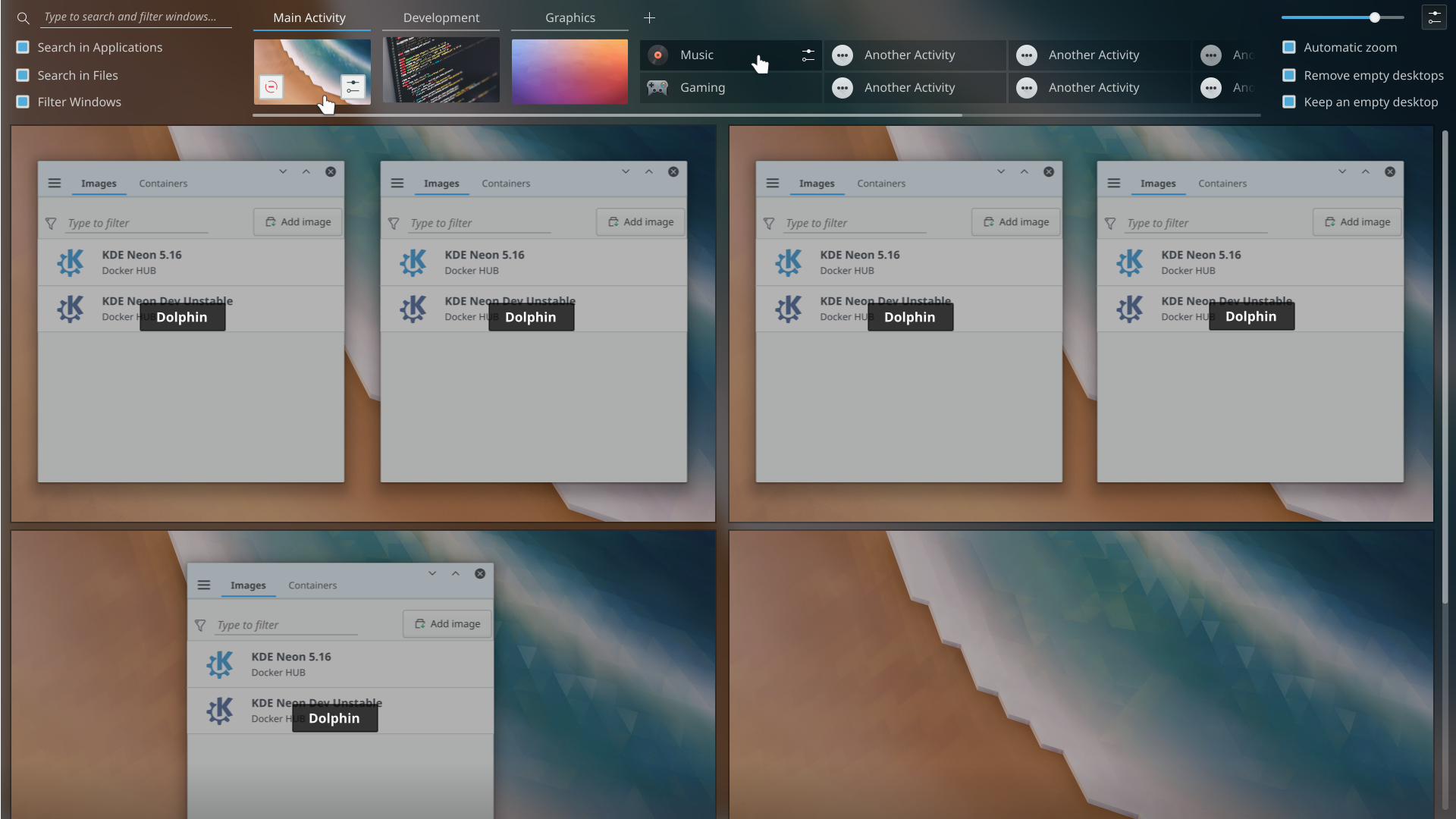
What if Activities were rows and VDs were columns in the Pager/Desktop Grid? Users can ignore the additional features that Activities provide if they want to, but because they're already using Activities, the barrier to trying out their features is lowered.

ndavis created this task.Nov 19 2019, 6:01 AM

Would that impair a setup that is already using VDs in a 2x2 grid? Asking for a friend :^)
Honestly though, what would happen on desktops that are using said grid? Would Activities be forced in my layout?

Would that impair a setup that is already using VDs in a 2x2 grid? Asking for a friend :^)
Honestly though, what would happen on desktops that are using said grid? Would Activities be forced in my layout?

Depends on how the conversion is implemented. Ideally, it shouldn't impact any users negatively. If it does impact some users negatively, then it should ideally be a minor annoyance that is easy to fix. People who want 3 dimensions of workspace (2D VDs + 1D Activities) may be disappointed, but I doubt anyone actually needs 3 dimensions of workspace. I can't tell you exactly how it will work because I am not yet familiar with the code for Virtual Desktops and Activities.

We discussed this inAt Akademy 2017 and that concern came up. What I recall us settling on was making activities into groups of virtual desktops. Each activity could have one or more desktops, with those desktops arranged in any row or grid.

alexde added a subscriber: alexde.EditedNov 19 2019, 9:15 PM

Do I understand it correctly, that Activities are in principle sets of desktop Widgets and backgrounds?

At least that is what I got from

My point of view is that I'd like to keep by 2D VDs and I am not sure if Activities really bring me any benefits personally as I don't use desktop widgets other than those in the panel.

We discussed this inAt Akademy 2017 and that concern came up. What I recall us settling on was making activities into groups of virtual desktops. Each activity could have one or more desktops, with those desktops arranged in any row or grid.

That sounds sane to me.

In principle Activities also have separate sets of favorites, widget settings, lists of recent documents and apps, app settings, etc. As far as I can tell, the idea is to make it like having a second user account, but with access to your files.

alex-l added a subscriber: alex-l.EditedMar 17 2020, 12:49 PM

If you need some inspiration:

The scrollbar in right top corner is for zoom: 4, 3, 2 or 1 row(s) of virtual desktops

If you need some inspiration:

Those look awesome!

alexde added a comment.EditedMar 17 2020, 6:36 PM

If you need some inspiration:

Those look awesome!

Indeed! :)

But personally I'm not a friend of the dimmed windows in the grid. I think there are better ways to highlight a selected or hovered one, like putting a glowing frame around it. Maybe this can be considered for future mockups if there's consensus?

alex-l added a comment.EditedMar 18 2020, 12:17 AM

I think there are better ways to highlight a selected or hovered one, like putting a glowing frame around it. Maybe this can be considered for future mockups if there's consensus?

Sorry, it's something I really like on current Present Windows effect

There are a lot of user complaints about it FWIW: https://bugs.kde.org/show_bug.cgi?id=385522

Sometimes it's good to hold firm on design choices, but it's also good to listen to feedback from the people for whom we are creating this software. Personally I don't feel very strongly about it one way or another but I do admit a bias in favor of listening to user feedback.

In my mockups there is already less dimming than in current implementation, I think that is already a good middle ground

alexde added a comment.EditedMar 18 2020, 4:25 PM

In my mockups there is already less dimming than in current implementation, I think that is already a good middle ground

Please bear in mind that the dimming may still be too strong for dark themes with a already dimmed screen.

Alright; if this effect becomes rewritten as I guess, it should be possible to introduce an option to satisfy everyone. ;) Thus, it's not necessary to focus on this specific effect now in the further course of the task. Sorry for the detour. :)

alex-l added a comment.EditedMar 18 2020, 11:05 PM

Please bear in mind that the dimming may still be too strong for dark themes with a already dimmed screen.

Alright; if this effect becomes rewritten as I guess, it should be possible to introduce an option to satisfy everyone. ;) Thus, it's not necessary to focus on this specific effect now in the further course of the task. Sorry for the detour. :)

Sorry I think there is no difference with dark themes.... the 20%-opacity black rectangle you see below just reduce the contrast between background and text widgets colors. What's matter is the difference between them... Even in a theme where it's intentionally lower a -20% of contrast can't really make a difference...

EDIT: I just checked and the current effect apply a 60% of black, three times more than my mockup. I think it's already a good improvement.

Mockup looks incredible. Add pinned apps for quick launching my favorites and this would be a perfect workflow.

In response to the original idea, I would prefer that not happen because it hurts one feature to benefit another. However with that said, the mockups posted by @alex-l are fantastic! These are great design concepts and does a very nice mix of Activities, Virtual Desktops and Present Windows and I would love to see something like this happen. I do worry that the Present Windows becomes a secondary value rather than the primary but its a great overall design concept.

I would like if this were combined with the structure of Parachute in some way so that Present Windows has priority but the other elements have integration as well.

As I just wrote here: https://phabricator.kde.org/T13582 most users don't know that restarting an Activity restores windows and applications' state (if they support XSMP protocol, most KDE apps do) just like the well-known session restoring after the login.

For Wayland there is the work-in-progress xdg-session-management protocol to replace XSMP and provide session restoring after login for the various Desktop Environment (and after restarting an Activity in Plasma).

Also at a certain point Plasma 6 will be released. I suggest to take the chance to do as following:

  1. Implement xdg-session-management in Plasma and KDE applications
  2. Ask to third party applications and framework to support it too, it's not something Plasma-specific, it's how they would provide session restoring in Wayland DEs like GNOME
  3. Develop a Kwin effect (let's call it Overview for now) like the one in my mockup
  4. Release Plasma 6 with Activities renamed as Sessions and enable Overview by default (it could be activated by a button in the panel, a shortcut or a hot-corner), making it clear that restarting a Session will restore its windows and applications' state (my mockup should make it clear enough if Activities are renamed Sessions but there could be a tooltip on the stop button that says "stopping a session will close its applications and free resources but when restarting it they are restored and the state of some applications preserved"

Also there would be a good incentive to try Plasma 6 before release and report bugs if it provides something different for the user experience (without changing the current behavior too much, I'm just talking about an additional button in the panel that activates the new Overview effect).

davidedmundson added a subscriber: davidedmundson.EditedNov 18 2020, 2:16 PM

See thread: "Discussion for Virtual Desktops and Activities" on plasma-devel . https://mail.kde.org/pipermail/plasma-devel/2018-July/086889.html

There was definitely some support for something along this idea.

The proposal I made, was that:
Before:

  • A window belonging to N activities *and* M VDs.

After:

  • Windows would belong to N VDs.
  • Each VD would belong to one activity. To provide a sense of hierarchy.

I think that's sort of what you're saying, only with more focus on visual representation.

The one technical hurdle is that we can't do that and support the existing X11 specification for virtual desktops where the cardinality for VDs is either 1 or all, which means activities would regress. We could break following the spec, but that comes at a cost too.

See thread: "Discussion for Virtual Desktops and Activities" on plasma-devel . I can't find an archive link but I'm sure there is one.

There was definitely some support for something along this idea.

The proposal I made, was that:
Before:

  • A window belonging to N activities *and* M VDs.

    After:
  • Windows would belong to N VDs.
  • Each VD would belong to one activity. To provide a sense of hierarchy.

If this also mean each Activity would have a different number of VDs this makes me realize it is indeed needed for my concept, otherwise the option to "remove empty desktops minus one" wouldn't make sense.

The one technical hurdle is that we can't do that and support the existing X11 specification for virtual desktops where the cardinality for VDs is either 1 or all, which means activities would regress. We could break following the spec, but that comes at a cost too.

I don't know if it's possible but from a user point of view I think it could be acceptable if tools using X11 only "know" about desktops and windows in the current Activity. I imagine this is not possible because X.org server is responsible of this.

7hdk8g5b removed a subscriber: 7hdk8g5b.Nov 26 2020, 9:25 PM

I think it'd be nice to use KUserFeedback to see how many people actually use the activities

Hello,

Is this being followed up on the KDE Gitlab? I couldn't find it.

These are fantastic ideas to improve the workflow with VDs and Activities.

abetts added a subscriber: abetts.Oct 11 2021, 2:36 AM

Is this being followed up on the KDE Gitlab? I couldn't find it.

Not at this time because there is no code yet. It lives as an idea-only for now. However, it is our intention to address this in the future.

Please bear in mind that the dimming may still be too strong for dark themes with a already dimmed screen.

Alright; if this effect becomes rewritten as I guess, it should be possible to introduce an option to satisfy everyone. ;) Thus, it's not necessary to focus on this specific effect now in the further course of the task. Sorry for the detour. :)

Sorry I think there is no difference with dark themes.... the 20%-opacity black rectangle you see below just reduce the contrast between background and text widgets colors. What's matter is the difference between them... Even in a theme where it's intentionally lower a -20% of contrast can't really make a difference...

EDIT: I just checked and the current effect apply a 60% of black, three times more than my mockup. I think it's already a good improvement.

Sorry, slightly off topic, but how do you get the application tabs in the title bar as shown in the screenshot in that comment?? Many thanks

ndavis added a comment.EditedOct 17 2021, 12:47 PM

Sorry, slightly off topic, but how do you get the application tabs in the title bar as shown in the screenshot in that comment?? Many thanks

It's a mockup

Ah sorry, I hadn't realised that part was also a mockup. Thanks for the reply. This tabbing in the title bar is a lovely idea though...well if it does not create some other problem elsewhere.

This looks really cool. I hope this can make it at some point, since it would solve some of my issues with workflow that I have when using activities.

I wonder if this thread has been moved somewhere and if there is any work to move in that direction? It does feel like combining the UI would make Activity features more discoverable and those mokcups look great!