Update wikis version and theme
Closed, ResolvedPublic

Description

Hello all,

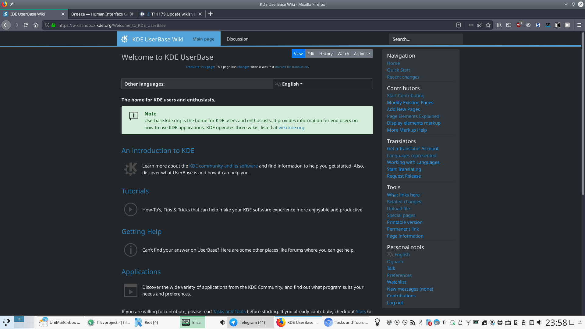
the wikis are currently ongoing an update from mediaWiki 2.26 to mediaWiki 2.31 (latest LTS version). A test instance with the new version is available at https://wikisandbox.kde.org (Related sysadmin task T11141)

All extensions (I hope) are now up-to-date, the theme is currently WIP.

Issues

  • Phabricator login doesn't work with existing accounts (probably because the account is already linked with another OAuth2 Phabricator connection). This will need testing.
  • the languages selector takes a lot of place for mobile and I tried to add a dropdown, but the dropdown button is not localized. Any suggestions? Edit: now display the current language
  • TopTenPages is now unmaintained and the latest version doesn't support php7.0, so the plugin is now disabled. Edit: Probably not important

Bugs fixed

  • Change password page disabled.
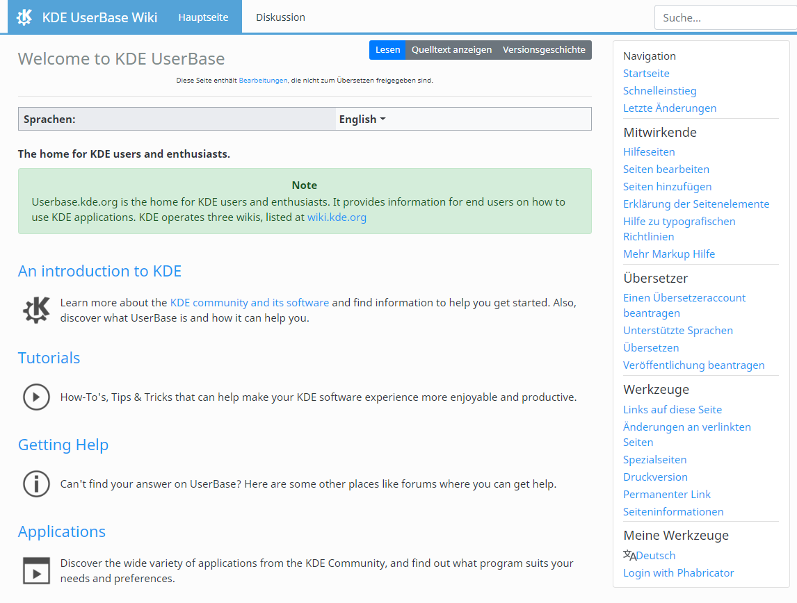
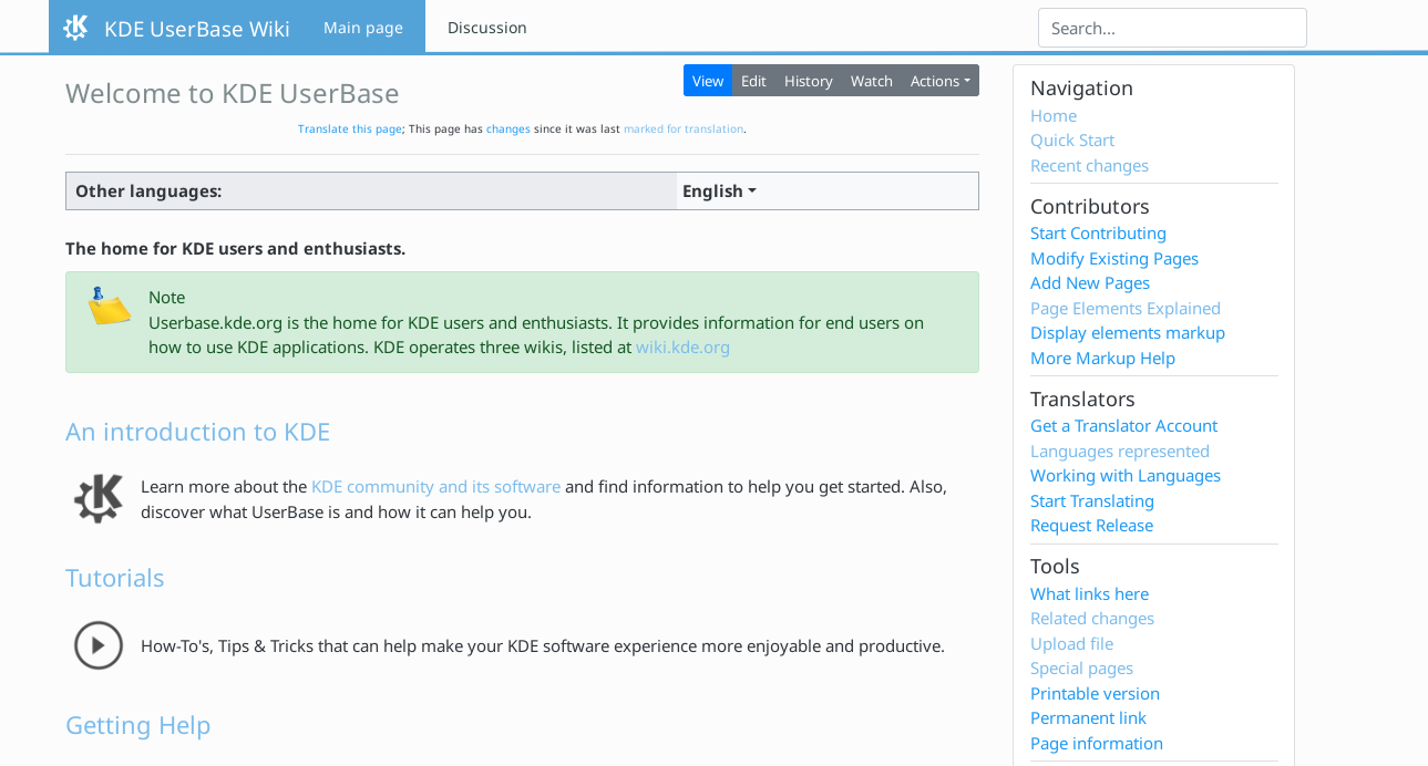
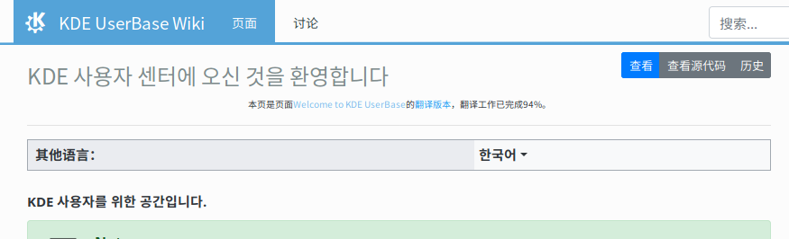
  • Responsive design
  • https://wikisandbox.kde.org/Stats works ๐ŸŽ‰
  • When uploading a new version of an image, the image is displayed directly, and we don't need to wait a week before the cache is invalided.

I would like to get some early feedback on the look and feel, and if you have a special workflow (e.g. DocBook export), please try to look if it's still working ;). It's also the right time, to let me know how issues that I need to be fixed.

  • Userbase
  • Community
  • Techbase

Cheers,

Carl

ognarb created this task.Jul 6 2019, 6:04 AM
ognarb updated the task description. (Show Details)
ognarb updated the task description. (Show Details)Jul 6 2019, 8:49 AM

It looks fine for me. Export works as expected. No issues found except for the above-mentioned ones.

Thanks for your work.

ognarb updated the task description. (Show Details)Jul 7 2019, 11:02 AM

Thanks one less thing to worry about ;)

mmustac added a subscriber: mmustac.Jul 8 2019, 2:28 PM

Can we propose some design changes ?
Like remove the icons from the "note" box and add some additional margin and padding to the list on the right side ?

ognarb added a comment.Jul 8 2019, 3:50 PM

Can we propose some design changes ?

Yes please ;) the more the better

Like remove the icons from the "note" box and add some additional margin and padding to the list on the right side ?

I added the padding, and I changed the layout of all the box to better reflect the KDE HIG (https://hig.kde.org/components/assistance/inline.html). I think using a better icon would be better than completely remove it.

ognarb updated the task description. (Show Details)Jul 8 2019, 3:52 PM

I think the dropdown menu for the language selection might be too hard to spot if an unknown language is displayed.

I am also not quite sure if the language selection in the sidebar should/can somehow be combined with the other one. As it stands it might be confusing that changing the language in the sidebar doesn't change the language of the displayed page.

ognarb added a comment.Jul 8 2019, 6:42 PM

I think the dropdown menu for the language selection might be too hard to spot if an unknown language is displayed.

I agree but then I get complain that the language selection takes too much place for small screen. But I added the same translation icon from the sidebar.

I am also not quite sure if the language selection in the sidebar should/can somehow be combined with the other one. As it stands it might be confusing that changing the language in the sidebar doesn't change the language of the displayed page.

Problem, the multiple language selection are provided by different plugins and it will be too much work to fork and maintain. :/

Great work! Two small things:

  1. I would suggest either removing the "Information" and "Note" titles in the boxes or to format them differently than the body text. Right now, there is no clear separation between the content and these words, which feels a bit akward.
  2. In my opinion the visited links look a bit too "washed out"/bright - there isn't a lot of contrast anymore. Maybe tone down the brightness a bit, or even make them darker than the unvisited links? (Probably something for our VDG group...)
ognarb added a comment.Jul 8 2019, 9:13 PM

Great work! Two small things:

  1. I would suggest either removing the "Information" and "Note" titles in the boxes or to format them differently than the body text. Right now, there is no clear separation between the content and these words, which feels a bit akward.


It is not enough?

  1. In my opinion the visited links look a bit too "washed out"/bright - there isn't a lot of contrast anymore. Maybe tone down the brightness a bit, or even make them darker than the unvisited links? (Probably something for our VDG group...)

Yes I agree and will change it :)

ognarb added a comment.EditedJul 8 2019, 9:56 PM

I made the visited link a bit darker. And added a dark mode ;)

Looks great overall!
I just want to nitpick that the top-right search bar doesn't align with the sidebar. Adding the class "mr-3" to the form and setting the .form-control width to 255px seems to have aligned them for me but that is maybe not the right solution.

The new design looks great!
The dark mode is certainly a nice addition, but I feel the "Note" Box feels a bit out of place there with its dark text on a light green background. I think the box would look nicer in dark mode if you used the same color palette as inline notifications in Plasma with the Breeze Dark theme. I'll try to find a screenshot as I'm on mobile right now.

Looks great overall!
I just want to nitpick that the top-right search bar doesn't align with the sidebar. Adding the class "mr-3" to the form and setting the .form-control width to 255px seems to have aligned them for me but that is maybe not the right solution.

I will try to align it, but your solution doesn't work for mobile, where we don't want to have the content without margin.

The new design looks great!
The dark mode is certainly a nice addition, but I feel the "Note" Box feels a bit out of place there with its dark text on a light green background. I think the box would look nicer in dark mode if you used the same color palette as inline notifications in Plasma with the Breeze Dark theme. I'll try to find a screenshot as I'm on mobile right now.

Thanks should be fixed now.

ognarb updated the task description. (Show Details)Jul 27 2019, 11:39 AM

The community wiki was updated. ๐ŸŽ‰

ognarb closed this task as Resolved.Aug 14 2019, 8:26 AM

All tree main wikis are now updated. ๐ŸŽ‰

Remains: rkward.kde.org and wiki.br.kde.org

rkawrd.kde.org will probably move to Jekyll and wiki.br.kde.org could be archived (There was no change for 5 years)

ognarb updated the task description. (Show Details)Aug 14 2019, 8:26 AM