Split from: https://phabricator.kde.org/D24621
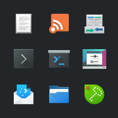
This is my proposition for new yakuake logo and icon. The logo mixes a
well known terminal symbol (>_) and letter "y".

| hein | |
| ndavis | |
| andrewfhou |
| VDG | |
| Yakuake |
Split from: https://phabricator.kde.org/D24621
This is my proposition for new yakuake logo and icon. The logo mixes a
well known terminal symbol (>_) and letter "y".
| Automatic diff as part of commit; lint not applicable. |
| Automatic diff as part of commit; unit tests not applicable. |
My vote is for A. I love it. It looks like a pull-down terminal just like the parent icon, re-uses the >_ iconography common to our terminal icons, but adds a flair that makes the > look like a Y, conjuring up the app's name. I think this is fantastic.
Adding @hein to the reviewers list, as he's the former maintainer.
A or C for me.
A looks more like how I imagine a "drop down terminal", but it's got a lot of margin below the bottom of it.
I tried seeing how it would look extended down to the bottom margin:

C looks more like a pull down projector screen, but that's not necessarily bad. It also doesn't quite reach the bottom.
I tried seeing how it would look extended down to the bottom margin:

VDG, Should we allow some types of icons to be vertically off center? If not that, should we allow some icons to not reach all the way to the top and bottom margins? There are already some icons like that, but that doesn't necessarily mean we should want that.
I don't think we should allow vertically off-center icons. The only reason to do this is to align the baselines of all icons, but that's only useful for horizontal rows of icons and looks bad with vertical columns of icons or anytime an icon is put within a container that is centered.
I recently fixed a bug report about non-centered icons that shows the problems arising from this: https://bugs.kde.org/show_bug.cgi?id=393550
Breaking nice-looking proportions just to fill vertical space is not good IMO. Making the bar a bit higher might make it look more reasonably. Your second proposition (icon C) looks nice though.
I agree with vertical alignment - I'll fix it.
Note that size is perceived differently on different shapes - compare e.g. square and circle - with the same logical sizes, circle looks smaller (Breeze has this problem).
The icon C is 48px wide (44px when counting only the screen), so 36px (38px with "handle" on the bottom) height makes its sizes visually similar to 40x40px square icons.
The same applies for alignment (see e.g. plasmadiscover.svg), but that shouldn't be a problem here.
I agree, the modified A didn't turn out that well.
Note that size is perceived differently on different shapes - compare e.g. square and circle - with the same logical sizes, circle looks smaller (Breeze has this problem).
The icon C is 48px wide (44px when counting only the screen), so 36px (38px with "handle" on the bottom) height makes its sizes visually similar to 40x40px square icons.The same applies for alignment (see e.g. plasmadiscover.svg), but that shouldn't be a problem here.
I'm aware of that. I know Material Design uses different sizes for circles, squares and rectangles for that reason. Unfortunately, switching to that system means we would need to change many icons. I believe the reason why we use the system we use is because of horizontal text alignment, but I think that matters more for monochrome icons than color icons. On the other hand, nothing actually lines up with text in a way that stands out as lining up particularly well whether you choose 10, 11 or 12pt Noto Sans.
Let's just keep this in mind when making new icons. At least when it doesn't stand out too much, i.e. we shouldn't make new square icons smaller than other square icons just to match circles, but also don't try to fill all available space when there is no need to.
I've aligned icons vertically. There are two new varians of "A":
A, A1:


A2, C:

I think I prefer C the most now that I've seen it next to other icons. It has a similar level of detail to other Breeze icons.
If you land this please update the summary before. No need to have all the variants in the commit message it should be about the actual change. Thanks :)