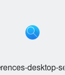
Add a new icon for usage with the system-settings "search" category,
which currently uses the baloo icon
Details
Details
- Reviewers
ngraham trickyricky26 bruns - Group Reviewers
VDG - Commits
- R266:40acd718572a: Add new preferences search icons
Diff Detail
Diff Detail
- Repository
- R266 Breeze Icons
- Lint
Automatic diff as part of commit; lint not applicable. - Unit
Automatic diff as part of commit; unit tests not applicable.

Comment Actions
Thats the "top level" icon, with "Krunner" and "File Search" (aka Baloo) below, correct?
Comment Actions
Nice. So after this, you'll change https://cgit.kde.org/systemsettings.git/tree/categories/settings-workspace-search.desktop#n7, right?
Comment Actions
On the technical side, we usually convert everything to paths, and even though I can't imagine Qt SVG Renderer would have a problem with circle, it might be better to convert the background to a path.
As for the design, I think this can be improved. My suggestion would basically be to use the magnifying glass from the Kfind icon, which IMO fits better with Breeze because of the thinner lines and the longer handle, which make the symbol feel more balanced.
Additionally, maybe you could try adding the Breeze-typical 45° shadow, which is usually used in these symbol-on-background icons, although it might not look right with the magnifying glass extending in the same direction.
Overall I think this will be a nice addition.
Comment Actions
I don't think this matters. Usually, it's strokes that need to be converted to paths because otherwise they appear jagged for whatever reason. I usually convert circles to paths, but that's mainly because circles often cause Inkscape to crash when undoing and redoing changes to them.
Comment Actions
New proposal

However, I am not a fan of the shadow. It is barely visbile anyways at such small sizes, and it looks weird with the handle
Comment Actions
All of our other icons that consist of a white symbol in a blur circle have the shadow, so it's probably best to at least be consistent. If we decided we don't like the shadow, we should remove them from all of these icons at once.
Comment Actions
I do think the new version looks better, more because of the nicer proportions of the magnifying glass than the shadow.
I think it's not optimal to add another symbol-on-single-color-circle icon, in addition to the bluetooth, user, accessibility etc. icons. It would be nice to have a more distinctive icon for this, but I don't have any concrete ideas for such a design. The previous icon for this was the magnifying glass on a file, but perhaps this isn't quite accurate here as the KCM deals with Baloo as well as krunner, which does more than only search for files.
In any case, I would try making the symbol have 1px thickness to match the other similar preferences icons, perhaps even copy the symbol directly from the old symbol-on-file icon.
Comment Actions
This is a scaled copy of the kfind magnifier glass. However, it was way too small to be directly usable imho
Comment Actions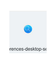
I thought this might look nicer, but it is too thin IMO.
What do you think of this? The symbol with 1px lines.
I thought this might look nicer, but it is too thin IMO.
In your current icon, the shadow is a bit off, the upper edge isn't quite 45° and it doesn't originate exactly from the circle. I can fix these tiny details if you like.
Comment Actions
I also think that this is too thin.
If you'd like to do the updates, please go ahead! You can do it much better than me I think
