T8349
BUG: 399307
I did not add drive-harddisk-home in this commit because it was simply too difficult to make an easily readable symbol for home on the 16px version.
Details
Details
- Reviewers
ngraham - Group Reviewers
VDG - Commits
- R266:67312861ffa3: Add root version of drive-harddisk

Diff Detail
Diff Detail
- Repository
- R266 Breeze Icons
- Lint
Automatic diff as part of commit; lint not applicable. - Unit
Automatic diff as part of commit; unit tests not applicable.
Comment Actions
Thank you! Two comments:
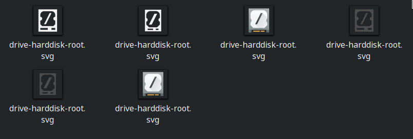
- I'm not sure using the negative color is appropriate here. That color is used for dangerous operations or error conditions, neither of which apply to the OS volume. It's true that you could potentially blow yourself up by messing with it, but I don't really think that fits. The current red icon for root was never appropriate in the first place IMHO. Either Icon Blue or just the regular Icon Grey color seem more appropriate to me.
- Could we experiment with using the Plasma logo instead of a slash? The idea of using a slash to represent the root disk will be immediately apparent to technical users, but will be lost on everyone else. The Plasma logo might be more easily comprehensible for everyone.
Comment Actions

I understand what you're saying, but throughout the Breeze theme, red is also used for root. If we used grey it would probably still be fine, but blue would stick out.
- Could we experiment with using the Plasma logo instead of a slash? The idea of using a slash to represent the root disk will be immediately apparent to technical users, but will be lost on everyone else. The Plasma logo might be more easily comprehensible for everyone.
I do agree that the forward slash isn't a great symbol for root for non-technical users, but it's very difficult to fit anything even slightly complex onto the 16 px icons without it becoming difficult to read. The Plasma logo works fine for 64px, but it's not very good at the smaller sizes.
This is my best attempt at getting the plasma logo to fit on the 16px icon:
Comment Actions
Hmm, you're right.
Maybe we could use a slash for the 16px version, and the plasma logo for the larger ones?
Comment Actions
That would cause confusion though. The meaning of a forward slash is completely different from the meaning of a plasma logo and the association between the two would only be apparent to us. Not only that, but there are already other icons that use the Plasma logo in a meaningless way (see the other 64px device icons).
Comment Actions
That's true. Okay, let's stay with a slash for now and just make it Icon Gray. In general I'd like to see us reduce our use of the red color for things that aren't actually destructive or errors, which I think will make it more meaningful for things that are.
Comment Actions
I did not add drive-harddisk-home in this commit because it was simply too difficult to make an easily readable symbol for home on the 16px version.
What about
~
or
$
?
Tilde would probably be the best, and you could exaggerate the waviness for the 16px version to make it legible.