make attendee list look decent
eventeditor layout adjustments to fit participants
I like the general direction. It gives a very clean first impression.
resize calendar selection box
remove references to obsolete display-state in event editor, close popup when…
ugly open-event-editor from eventview
delete event and close popup when delete button is pressed
display selected day in daychooser
add default eventConrller to eventeditor
some spacing for eventview
use eventeditor to edit events in weekview
use eventcontoller in EventEditor
one datechooser is enough
make event popup to be just the editor as we want a different smaller event…
move datechooser to the top, temporarily disable curretnDayView
make selected date more visible
I'd like to enable all personal calendars by default, and disable all shared calendars by default.
use inital date and time chooser
event popup: new state buttons
use textcolor on grey background
do not use anchors inside a Layout
No. That's fine.
Let's try the "generic account" route.
Wouldn't it make more sense to have a dedicated caldav/carddav only account instead?
improve positive button highlight
change icon color in maillist delegate
make moved icon row also look pretty when in trash mode
visualize important mails
I rearranged the icons to the right side. It looks okish. The star Icon is a custom one made by Jens and we only have a white version. We require a textcolor version for this to work though.
The breeze theme does not have one either.
more spacing for the mailView
more spacing between mail body and attachments
use template textarea instead of controls textarea so that we don't get strange…
adujst draftlist delegate accordingly
move draft scrollbar to the right
use original breeze icons for mark-as-read/unread
change calendar view metadata
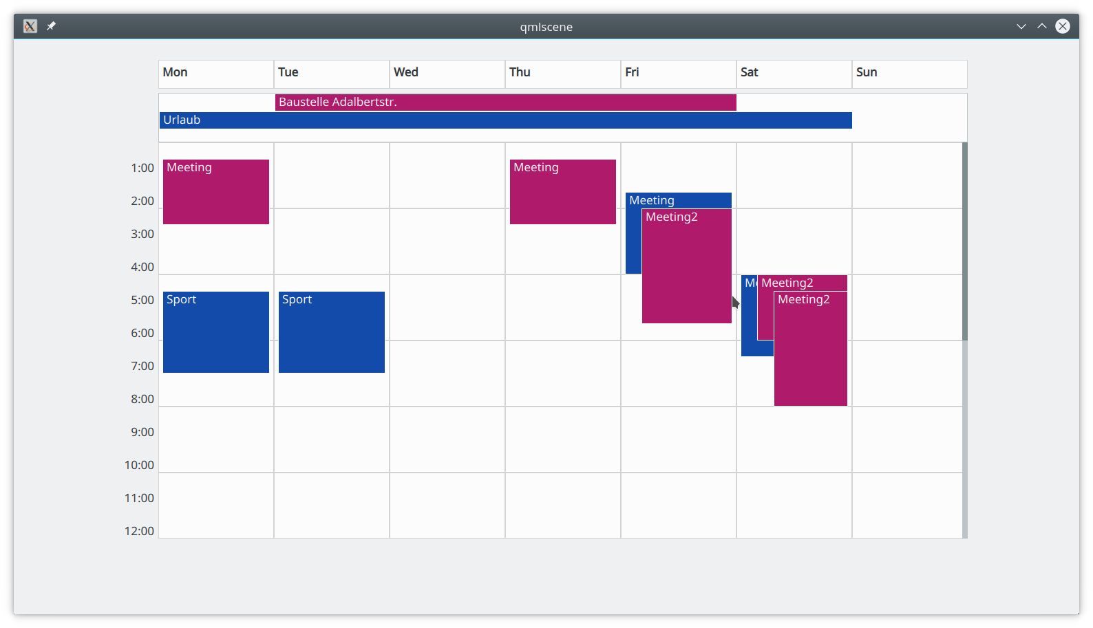
add overlapping event to testdata
make calendar view scale with window size
cleanup weekview sizes a bit
make events appear at the right time and have the right height
hide time chooser when daylong event
use daychooser and timechooser in eventview
inital calendar view layout
We simplified this on purpose for UX reasons. Most people will be covered with what we currently have.
Our idea to support these fringe cases is to offer a "expert imap account" in the UI where people who know what they are doing can configure whatever their setup requires.
cleanup contactcontroller
use kube listcontroller in person composer
use KubeListController in person page
make textfield background different from page background in people composer
calculate the relative position where the event drops
One issue with the weekview is that you will have to scroll most of the time to get an over view of all the events in the whole week.
Some from of week-agenda-view that you can access by zooming out or the other way around could solve this.
initial drag without drop for events
remove unnessesary dummy data from main.qml
For the chosen approach, we need:
We want to start with a weekview.
A basic UI is already implemented using dummy models:
actually load the contact when editing
add listcontrollers for phoneNumbers and emails to the contact controller
add some lines to the calendar so it is easier to spot the time
bring events forward when hovered
make the weekview scorllable
border for the daylong view
add white border to events so they don't blend when they overlap
add indention to overlaping events
initial calendar - week view
initial searchView layout as discussed in the paper prototyping session
move people & person page to view
clip send-by information in mailview
extract personpage from people
use positive button for new_contact