When you create the merge request:
- set the title to WIP: title of merge request to mark it as work in progress
- push the commits as you work so you have a backup, can see the results of the CI tests and possibly receive feedbacks
When you create the merge request:
Moved to KDE invent.
Moved to KDE invent.
aacid requested to write some autotest for the ToggleActionMenu before merging this. I'll merge master in this review and work on the autotests soon.
I compiled and it works. Looks good to me.
You need to merge master into this review or rebase because there is a merge conflict. I suggested you the modifications that were introduced in master (qAsConst) and few other changes.
It does not compile indeed. My fault in the review process, I missed the last commit. I have added the inline comments to fix the bug.
Might it be a hint that there are too many toolbars? I think only the part should have the annotation toolbar, so it is clear which is affected by the hide action.
To sum it up, if I understand correctly:
I also would like to get rid of DefaultLogic and just use ImplicitDefaultAction, but I am not sure if this creates problem when ToggleActionMenu is placed in a menu. Should it behave as a standard KActionMenu when in a menu? I think that when in a menu there is no meaning of "default action", because when clicked, the ToggleActionMenu should just open the submenu, right?
I have tried to analyze all the possible cases regarding ToggleActionMenu placed in a toolbar.
I did that for a few minutes now and figured out that the same happens with line width (arrow) as well, as long as you choose x.5 . Looks like the toolbar menus are saving double/float/long (whatever) in a different format from how the menu does:
Toolbar ="0\\,4"
Menu ="0.4"
The variant with the dot is working while double backslash comma is not (at least over here)
I hope this is helping.
Correct me if I'm wrong, but the current version (repos) doesn't have the annotation toolbar so I cannot use it to tweak settings.
Or am I missing something?
Thanks for testing this.
Semantically, the icon you used (something like tab-close) would be correct, but I think it looks too much like a destructive action, with it being red in a circle. Considering this only closes the toolbar, which you can open again at any time, I think this icon draws too much attention to itself.
Something like paint-none or a monochrome version of tab-close or paint-none, or even a icon like hide_table_row (we would have to make some symlinks for more semantically correct icon names) might be better suited for this.
Regarding unchecking the mouse mode actions when an annotation is selected. As for now I think this is extremely complex to implement. I suggest leaving it as is for now, and once Qt 5.14 is out we can use the new option that allows unchecking all actions in a QActionGroup. In this way we can keep the mouse mode action group and the annotations action group separated and still be able to uncheck all the actions in one or the other group.
Is the icon fine for the toolbar hide/close button? Do you have a better suggestion?
I think there's only one remaining thing I noticed, then I'm ready to give it a UI stamp of approval: the toolbar should have a close button on the far-right side (you can use an expanding spacer to position it there) so people don't have to go up to the menubar to close the toolbar once they're done using it.
Maybe in a KMessageWidget that goes across the top of the view, like other notes that are presented like this.
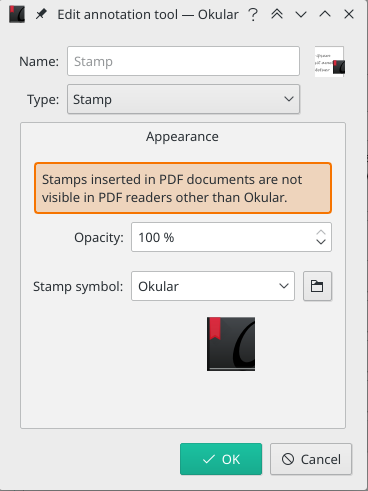
KMessageWidget does not have a mechanism to dismiss it forever. I think that showing it each time a user uses the stamp annotation is going to become annoying pretty soon. Maybe a message box that can be dismissed forever?
The icon is now rendered correctly in Okular and cuttlefish.
The toolbar is almost 100% ready from my side. What is left to do:
First, thanks for the excellent work on the new icons for Okular. I really like them.
I think this is ok. Two wishes:
- The toolbar button shows a checked state, when the fill color is se
As it is now that button already displays a rectangle with the currect color (or nothing if no fill color). That should be enough to show the user the current state. Having the button as it is now (InstantPopup) seems more usable to me.
Isn't this enough? (Maybe I never posted a screenshot with this displayed)
Edit: changed ToggleActionMenu to KSelectAction

I need some input on two things left to be done:
I have refactored and cleaned the code. There are two tricky TODO missing. It seems that also the icons are coming. I think we are almost there.
Here's another idea: would we make the buttons lose their text labels when there's not enough horizontal space to show everything. This would be more user-friendly than moving them onto an overflow menu. Kirigami offers this feature natively but we might need to hack it into Okular or KXMLGui.
I have tried with new layout of the annotation toolbar:
EDIT: text layout
With the latest push all the features of the toolbar are implemented. There are some horrible things in the code, but I will clean and refactor it.
I did test this today and it seems to be working correctly, at least in the use cases of Okular, i.e. for select annotation tools and for the annotation toolbar. Actually I am currently using in D15580 now (will push soon), given that ToolAction was not enough for what I needed ( I'll update my code accordingly if this revision is modified).
Final version of the new UI components: