Marco said it's technically impossible.
Feed Advanced Search
Jun 5 2018
Jun 5 2018
Jun 2 2018
Jun 2 2018
alex-l added a comment to T8760: Ideas for icon indicating move/slide/reveal actions.
May 29 2018
May 29 2018
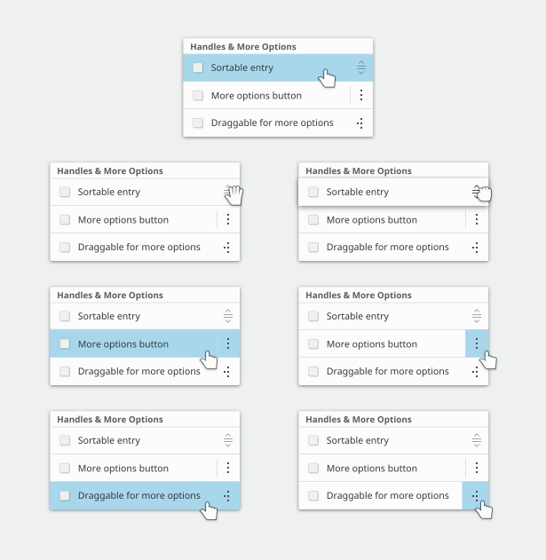
fix handle-right
fix handle-right
updated handles and overflow-menu
May 28 2018
May 28 2018
alex-l added a comment to D6280: Dolphin softer drop shadow for thumbnails.
Thank for this, can you please share screenshots with dark themes, at least Breeze Dark?
May 26 2018
May 26 2018
alex-l added a comment to D12756: [KDateTable] Use more appropriate and readable text colors for weekends and holidays.
Gray seems OK to me. And I confirm the bug with Saturday column.
alex-l updated the summary of D13137: Updated handles and overflow-menu-*.
alex-l requested review of D13137: Updated handles and overflow-menu-*.
May 24 2018
May 24 2018
alex-l added a comment to T8747: Put KDE's videos on the alternative video platform PeerTube.
Seems that this was posted by the private account of Allessandro Longo: https://peertube.nsa.ovh/accounts/1292/videos
May 23 2018
May 23 2018
alex-l updated subscribers of M127: Card layout and card content layout for Kirigami and Discover.
alex-l added a comment to M127: Card layout and card content layout for Kirigami and Discover.
having a vertical alignment between the icon and the stars breaks the fact that we only had 1 thing at the left on the vertical views. This adds clutter.
The reason is that the current layout makes cards narrow and long, so I tried a modular layout that can make cards longer or shorter according to page width. It would be better to have this in Kirigami so Discover just have to fill the cards.
May 22 2018
May 22 2018
alex-l added a comment to D12983: (icon view) Text width relative to icon size.
Very nice looking 👍🏻
alex-l added a comment to D13031: [ProcessModel] Center more column headings.
Please provide screenshots when tagging VDG
alex-l added a comment to D12992: New elisa icon.
^ I'm for this one without the quaver
May 21 2018
May 21 2018
alex-l added a comment to T7913: Make it really obvious where newly-installed apps can be found.
What about a blue dot on the launcher icon and a new tab in the launcher named "newly installed"? The dot will disappear when the user will open the newly installed tab.

alex-l added a comment to T8707: Window borders.
+1 for no-side borders by default. Also, titlebar and bottom border can have custom colors using KWin rules (for example if a distro ships Telegram it can ship in the same package a KWin rule to match colors), so consistency is not a issue there. The real issue is that apps draw widget near the side borders, so we just need to disable them by default. I use this settings since KDE4 and I have no issues with it.
May 20 2018
May 20 2018
alex-l added a comment to M127: Card layout and card content layout for Kirigami and Discover.
I did nothing, maybe you subscribed when I was editing the description and things messed up
alex-l added a comment to M127: Card layout and card content layout for Kirigami and Discover.
Yes, the app developer could elide text instead of increasing cards height: but I think it would be nice to have automatic different height managed by Kirigami and the app developer that want cards with fixed height takes care of card content in another way, i.e. eliding text.
alex-l updated image descriptions of M127: Card layout and card content layout for Kirigami and Discover.
alex-l added a comment to T8760: Ideas for icon indicating move/slide/reveal actions.
Do you mean a icon with the following points?
May 19 2018
May 19 2018
alex-l added a comment to D12960: Drag handle to reorder items in a ListView.
Possible interactions on hover (I used the third one and the fourth one when dragging):
alex-l added a comment to D12960: Drag handle to reorder items in a ListView.
I tried with arrows too, but I think the fifth one looks better... my second choice is the third one.
May 18 2018
May 18 2018
alex-l added a comment to D12960: Drag handle to reorder items in a ListView.
Cursors and hover:
alex-l added a comment to D12960: Drag handle to reorder items in a ListView.
alex-l added a comment to D12960: Drag handle to reorder items in a ListView.

May 15 2018
May 15 2018
alex-l added a comment to T8281: Make runcommand great again.
Also we decided against KNS because the resources are potentially dangerous and our users may install viruses like this.
May 9 2018
May 9 2018
This is a test notification, sent at Wed, May 9, 3:09 PM.
This is a test notification, sent at Wed, May 9, 3:09 PM.
This is a test notification, sent at Wed, May 9, 3:09 PM.
Feb 14 2018
Feb 14 2018
alex-l added a comment to D10494: update handle- icons for kirigami.
+1 for 3-dots icon.
Oct 16 2017
Oct 16 2017
This is a test notification, sent at Mon, Oct 16, 3:40 PM.
This is a test notification, sent at Mon, Oct 16, 3:40 PM.
Oct 14 2017
Oct 14 2017
alex-l added a comment to D8232: Add option to center shadow .
Absolutely +1, I was waiting for this option since Plasma 5 was launched. I suggest to make it default, I can't really get why the shadow should be on the right.
Sep 11 2017
Sep 11 2017
alex-l added a comment to T5439: Discuss todo/release/review process for HIG.
Pelican seems very good too
alex-l added a comment to T5439: Discuss todo/release/review process for HIG.
+1, in particular for Grav
Sep 8 2017
Sep 8 2017
alex-l updated the task description for T6843: Integration with FOSS online services.
Aug 23 2017
Aug 23 2017
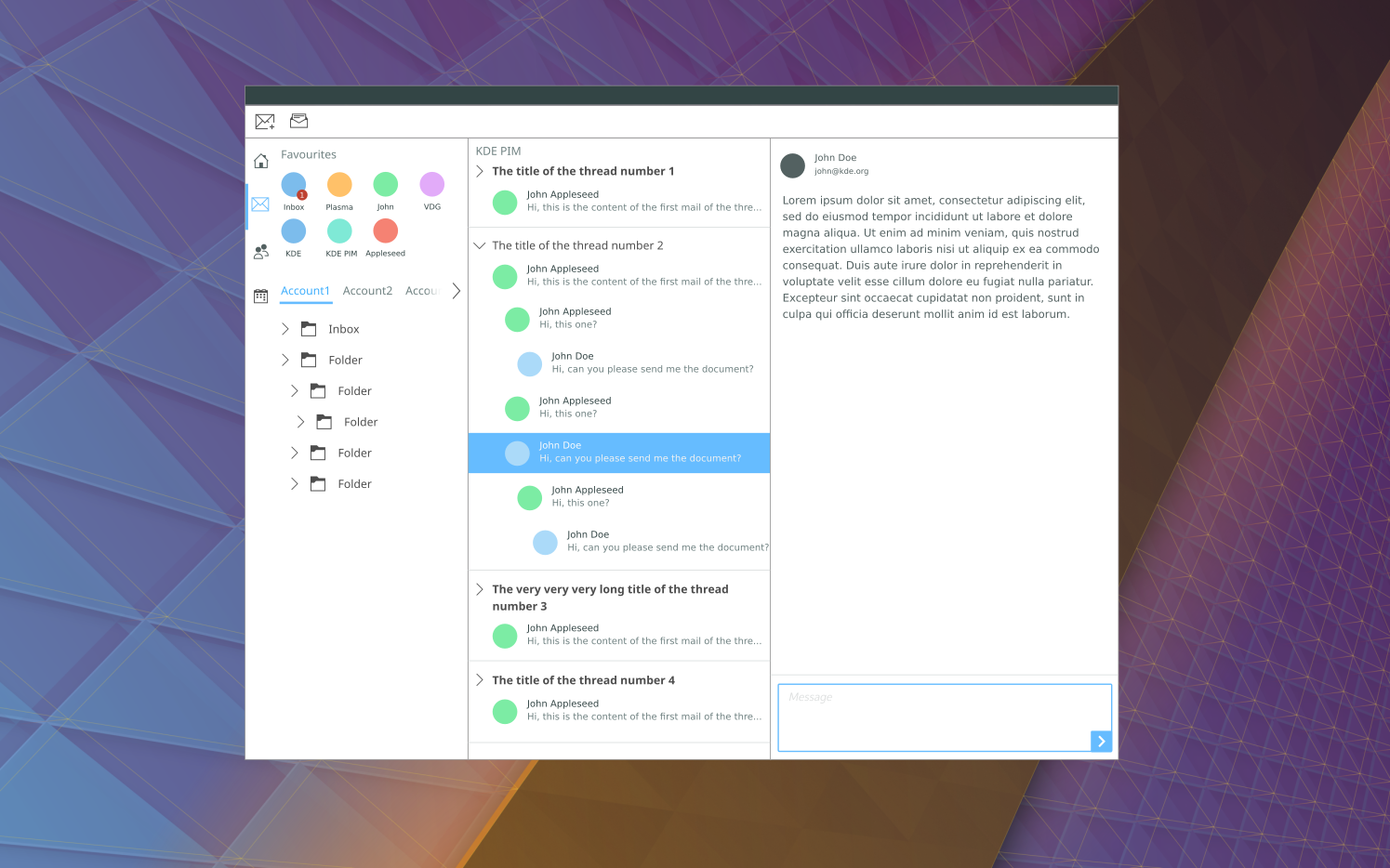
alex-l added a comment to T6854: Modernizing Kontact look.
@dvratil Hi, I did a quick mockup, it misses a lot of KMail widgets like the filter and buttons but I hope you get the ideas:
Aug 21 2017
Aug 21 2017
alex-l added a comment to M105: Katie.
What if we just make it a Nextcloud Notes client instead of reinventing the sync ehm the wheel? :)
May 4 2017
May 4 2017
This is a test notification, sent at Thu, May 4, 3:57 PM.
This is a test notification, sent at Thu, May 4, 3:57 PM.
Apr 28 2017
Apr 28 2017
alex-l added a comment to M90: Sensible icons for Plasma Activities (action icon).
I'm not sure of what to do. The current icon with 3 dots doesn't give any indication of what is supposed to do.
The risk a user confuse VDs with Activities exists but he should be able to understand the difference trying it.
I'm using the new icon and I like it but this is blocking me from pushing it to master.
Apr 13 2017
Apr 13 2017
alex-l added a comment to M96: Discover bottom bar.
In general I think we should add specs to Kirigami before, instead of directly in the app, to keep consistency across apps
alex-l added a comment to M96: Discover bottom bar.
Why not use Kirigami's FAB?
Apr 1 2017
Apr 1 2017
alex-l added a comment to M95: Kirigami: software center example.
@ivanthekdefan as I said this mockup is just to show the right navigation pattern in Kirigami. "Comments" tabs was intended for app reviews.
Mar 23 2017
Mar 23 2017
alex-l added a comment to M95: Kirigami: software center example.
@subdiff the search could be the FAB. I should do a complete mockup, because this one is just to stress the navigation.
Mar 21 2017
Mar 21 2017
alex-l added an inline comment to M95: Kirigami: software center example.
@subdiff yours are all good suggestions, I made the mockup really quickly to stress the right navigation pattern :-)
About "more" buttons, I think it would be good to find a solution and make it a guideline.
Same for categories controls: those are just placeholders, I think it would be nice something like elementary OS Software Center.
In general a minumum + maximum sizes would be a good addition to guidelines.
Mar 20 2017
Mar 20 2017
alex-l added a comment to M90: Sensible icons for Plasma Activities (action icon).
@ivan said me he like the #8, can I push it @andreaska?
Mar 19 2017
Mar 19 2017
This is a test notification, sent at Sun, Mar 19, 11:12 PM.
This is a test notification, sent at Sun, Mar 19, 11:12 PM.
This is a test notification, sent at Sun, Mar 19, 11:12 PM.
Mar 18 2017
Mar 18 2017
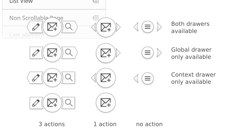
alex-l added a comment to M94: Kamoso + Kirigami.
@apol if the problem is having the UI ready to take pictures with one click, it could be started with recent shots + take picture pages both opened. Then if the user clicks on a recent shot the page on right will show it with options, like in the screenshot.
Then if the user wants to take a picture again he just have to click on "+" FAB in recent shots page.
It seems the most sensible approach to me...
alex-l added a comment to M92: Phabricator CSS changes.
alex-l added an inline comment to M93: Papercut-fix Suggestions Kirigami.
alex-l created M94: Kamoso + Kirigami.
alex-l added a comment to M91: Kamoso Mockup - early Kirigamification.
I honestly think that the "hack" of Kirigami guidelines went a bit too far: the global drawer is for global actions, and it was not intended to gather widgets like those.
In general:
Global drawers: global actions
Pages: every kind of items
Context drawer: actions on one or more items.
Mar 17 2017
Mar 17 2017
This is a test notification, sent at Fri, Mar 17, 5:51 PM.
This is a test notification, sent at Fri, Mar 17, 5:51 PM.
alex-l closed T5487: Investigate why new contents are not downloaded by apps like Dolphin as Resolved.
Mar 14 2017
Mar 14 2017
alex-l committed R266:121122fb9b12: Added MIME-type icon for Dockerfile as text-dockerfile (authored by alex-l).
Added MIME-type icon for Dockerfile as text-dockerfile
Feb 27 2017
Feb 27 2017
Feb 21 2017
Feb 21 2017
This is a test notification, sent at Tue, Feb 21, 12:09 PM.
This is a test notification, sent at Tue, Feb 21, 12:09 PM.
This is a test notification, sent at Tue, Feb 21, 12:09 PM.
This is a test notification, sent at Tue, Feb 21, 12:08 PM.
This is a test notification, sent at Tue, Feb 21, 12:08 PM.
This is a test notification, sent at Tue, Feb 21, 12:08 PM.
This is a test notification, sent at Tue, Feb 21, 12:05 PM.
This is a test notification, sent at Tue, Feb 21, 12:05 PM.
This is a test notification, sent at Tue, Feb 21, 12:05 PM.
This is a test notification, sent at Tue, Feb 21, 12:05 PM.
This is a test notification, sent at Tue, Feb 21, 12:05 PM.
This is a test notification, sent at Tue, Feb 21, 12:04 PM.
This is a test notification, sent at Tue, Feb 21, 12:02 PM.
This is a test notification, sent at Tue, Feb 21, 11:57 AM.
This is a test notification, sent at Tue, Feb 21, 11:57 AM.
This is a test notification, sent at Tue, Feb 21, 11:57 AM.
This is a test notification, sent at Tue, Feb 21, 11:56 AM.
This is a test notification, sent at Tue, Feb 21, 11:56 AM.
This is a test notification, sent at Tue, Feb 21, 11:55 AM.
alex-l added a comment to M90: Sensible icons for Plasma Activities (action icon).
@andreaska I'd go for #8, what do you think?
alex-l added a comment to D4633: WIP: Updated folder decrypted and encrypted icons.
I'd make the chess background full the folder's front.
alex-l added a comment to D4633: WIP: Updated folder decrypted and encrypted icons.
I'd make the chess background full the folder's front.
alex-l added a comment to D4625: Icons for Plasma Vault.
Are these for error messages or app icons? I'm wondering if they are in the right folders in Breeze-icons: icon to launch the app goes in /apps, icons for folders i.e. in Dolphin go in /places and icons for warnings in /status.
Jan 30 2017
Jan 30 2017
This is a test notification, sent at Mon, Jan 30, 11:53 AM.
This is a test notification, sent at Mon, Jan 30, 11:52 AM.
This is a test notification, sent at Mon, Jan 30, 11:52 AM.