Hmm, we already had a patch to do this: D16648: Open externally called files/directories in new tabs.
Feed Advanced Search
Feb 19 2019
Feb 19 2019
ngraham updated subscribers of D19150: Dolphin single instance tabbed navigation.
ngraham added a comment to D19134: Multiply radius by 0.5 in calculateBlurStdDev().
Sorry, we had discussed this with @zzag in the VDG room and I (perhaps erroneously?) left with the impression that this was set at its previous value to preserve a certain look-and-feel, and was therefore something we could change since we were adjusting that look-and-feel elsewhere. I did test it and didn't notice any visual regressions.
ngraham added a comment to D19153: [WIP] Add option to configure what happens if the Print key is pressed while Spectacle is already running.
OK cool, let's give that a try. I think it could work nicely.
ngraham added a comment to D19153: [WIP] Add option to configure what happens if the Print key is pressed while Spectacle is already running.
So like this?
ngraham committed R260:5ae28dadba06: Allow Gwenview to be able to open .kra (Krita) files (authored by ngraham).
Allow Gwenview to be able to open .kra (Krita) files
ngraham accepted D19154: [Kickoff] remove hint state.
Works for me. Probably a candidate for the Plasma/5.15 branch. @hein?
ngraham added a comment to D19121: Allow Gwenview to be able to open .kra (Krita) files.
Sweet, will add the dep in another patch.
ngraham added inline comments to D19162: Add KAboutData.
+1; Colors is the only KCM where we ship random stuff like this.
ngraham added a comment to D19148: Make shadow sizes linear.
I kind of agree. I like the new size for Medium, and I think the default should maybe be a bit smaller (halfway between the current medium and the current large) but I also don't see the great value in adding more sizes. I think we can probably accomplish the visual goals we have in mind by tweaking the existing sizes to be less power-of-two-ey.
ngraham moved T8400: Make buttons more consistent from Backlog/Planned to Sent to dev on the VDG board.
Calling this done as the current version uses modern APIs and more-or-less matches the mockups.
@GB_2 is porting this to use the new visual style.
ngraham added a comment to D19153: [WIP] Add option to configure what happens if the Print key is pressed while Spectacle is already running.
Are the Summary section and title accurate?
ngraham triaged T10273: Make KCMs consistent and apply the KDE HIG to them as much as possible as Normal priority.
ngraham updated the task description for T10325: 5.16 Login screen improvements.
ngraham renamed T10325: 5.16 Login screen improvements from 5.16 Login screen redesign to 5.16 Login screen improvements.
ngraham updated subscribers of D19011: Thunderbolt KCM and KDED module.
+1, I find these really annoying and want to turn them off.
Feb 18 2019
Feb 18 2019
Makes sense to do this while we're tweaking the appearance of the shadows for 5.16 anyway.
ngraham added a revision to T10325: 5.16 Login screen improvements: D19020: [breeze-icons] Revamp system.svgz.
ngraham updated the diff for D19121: Allow Gwenview to be able to open .kra (Krita) files.
Rebase on current master
ngraham committed R166:4c2cedbe25d3: Change default behavior to remembering the selected region until Spectacle is… (authored by davidre).
Change default behavior to remembering the selected region until Spectacle is…
ngraham updated the summary of D19130: Change default behavior to remembering the selected region until Spectacle is closed.
ngraham committed R242:608189862652: Bump the theme versions because icons changed, to invalidate old caches (authored by ngraham).
Bump the theme versions because icons changed, to invalidate old caches
ngraham added a comment to D19123: Added option to search for whole words only.
Every patch with UI changes needs screenshots in the Summary section--preferably before-and-after. :)
ngraham accepted D19074: [breeze-icons] Use new suspend, hibernate and switch user icons in Breeze icon theme.
I love it. Looks perfect to me now.
I love it. Looks perfect to me now.
ngraham added a comment to D19083: Fix crash during shutdown.
Looks good to me now!
ngraham added a comment to D19125: Change shadow color to 0,0,0 for KStyle.
Nah, I think that would begin to re-introduce the bug we're trying to solve (shadows not being visible in Breeze Dark).
ngraham committed R166:ce977bc0a3e6: Add option to remember rectangular region until next restart (authored by davidre).
Add option to remember rectangular region until next restart
ngraham added a comment to D19124: Change shadow color to 0,0,0.
Ah yes, gotta make the same change in kstyle/breeze.kcfg too. @ndavis can you do that?
Fantastic! Looks great, works great.
ngraham added a comment to D19074: [breeze-icons] Use new suspend, hibernate and switch user icons in Breeze icon theme.
Or they could all be a bit bigger, and the snowflake versions could simply take up a teensy bit more of the snowflake's top-right corner.
Works perfectly now for both mice and touchpads. This gets a "ship it!" from me!
ngraham accepted D19124: Change shadow color to 0,0,0.
I changed this from black to Shade Black as a compromise to get https://cgit.kde.org/breeze.git/commit/?id=9fb5d3abb18cde0ef63102cb06f1a936152ccaef done and I think we have to consider the experiment a failure. It results in various visual regressions and black is a better default.
ngraham added a comment to D19074: [breeze-icons] Use new suspend, hibernate and switch user icons in Breeze icon theme.
Just for the smaller versions.
ngraham added a comment to D19074: [breeze-icons] Use new suspend, hibernate and switch user icons in Breeze icon theme.
That could work, yeah. Give it a try!
ngraham added a comment to D19117: Add option to remember rectangular region until next restart.
One final request: add an 18px tall spacer between the checkboxes and the comboboxes, like how Dolphin does it: https://cgit.kde.org/dolphin.git/tree/src/settings/general/behaviorsettingspage.cpp#n61
ngraham added a comment to D19074: [breeze-icons] Use new suspend, hibernate and switch user icons in Breeze icon theme.
The Zs look a bit small in Kickoff and especially Kicker when using a non-high-DPI display:
ngraham added a comment to D18986: [breeze-icons] Add video camera icons.
Getting there! I'm not sure the shadow on the top handle works though.
Actually those concerns should be in the icon theme patch, never mind.
ngraham added a comment to D19020: [breeze-icons] Revamp system.svgz.
Oh and one more minor thing: the Zs look a bit small in Kickoff and especially Kicker when using a non-high-DPI display:
ngraham added a comment to D19020: [breeze-icons] Revamp system.svgz.
Almost perfect! I have one remaining visual nitpick:
Very nice! This fixes the bug and the code change looks sane. @hein are you good with this?
Clever! Works great.
ngraham updated the summary of D19107: Write valid UTF8 characters without escaping..
ngraham added a comment to D18986: [breeze-icons] Add video camera icons.

ngraham added a comment to D18986: [breeze-icons] Add video camera icons.
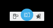
I will admit that the current head-on view is more attractive than the previous side view version. :) But I still worry about recognizability. Here's what the icon will look like in Kamoso, for example:
+1 shipit!
Merge branch 'Plasma/5.15'
ngraham requested changes to D19117: Add option to remember rectangular region until next restart.
Very nice feature! It works well in my testing. Code looks good too. I have only UI suggestions: in addition to the inline comments, I think the layout on the settings page needs work. Let's not abandon the FormLayout style here. I think your addition of a title on the page is good, but then let's keep the FormLayout style for the checkboxes and just change their left label to be "General".
ngraham added a comment to D18852: Add mime types for raw image formats to desktop file.
Just noticed this: should similar support be added into gvpart.desktop too?
ngraham added a comment to D19077: Redesign the theme preview window.
Very much against adding a scrollbar into the preview area. I think we can come up with a better solution.
ngraham updated the summary of D19121: Allow Gwenview to be able to open .kra (Krita) files.
ngraham added a comment to D18986: [breeze-icons] Add video camera icons.
ngraham committed R37:5997c73c7fa7: Be the top handler for .kra files by default (authored by ngraham).
Be the top handler for .kra files by default
ngraham added a comment to D19120: Be the top handler for .kra files by default.
Thanks @rempt! Would you like me to land this, or are you going to take care of it since you're more familiar with the branches?
ngraham updated the summary of D19120: Be the top handler for .kra files by default.
ngraham added a comment to D19120: Be the top handler for .kra files by default.
If accepted, it would be nice if this could get into the bugfix branch so that it can land in advance of the Gwenview patch, which is slated to go into KDE Applications 19.04.0. That way hopefully there will never be a situation where Gwenview temporarily becomes the default handler for .kra files.
ngraham updated the test plan for D19121: Allow Gwenview to be able to open .kra (Krita) files.