Oh the shame! I had forgotten to center it (and I do know how to)!
Feed Advanced Search
Jul 10 2020
Jul 10 2020
saligari added a comment to T11226: Icon request: QR code scanning.
Apr 25 2020
Apr 25 2020
saligari updated the diff for D29095: Change mouse icon to have better dark theme contrast.
Apr 24 2020
Apr 24 2020
saligari updated the diff for D29095: Change mouse icon to have better dark theme contrast.
My search on the internet told me LGTM stands for looks good to me.
I added a 32px with 3px margin
saligari updated the diff for D29095: Change mouse icon to have better dark theme contrast.
- a bit darker, with a more pronounced gradient effect
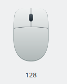
- here it is in 64px:
Apr 23 2020
Apr 23 2020
saligari updated the diff for D29095: Change mouse icon to have better dark theme contrast.
- corrected hard edges
- aaand that's it probably for me, I'm reasonably happy with this and I think I've learned quite a bit
- Here it is ^_^
saligari updated the diff for D29095: Change mouse icon to have better dark theme contrast.
- tried to change the shape into something more modern (though I quite like the old-ish look)
- changed the gradient as bruns said, can't say I see much difference
- removed the middle curve
saligari updated the diff for D29095: Change mouse icon to have better dark theme contrast.
Changed the icon, with ndavis' help, so that it better fits its 64px place.
Apr 22 2020
Apr 22 2020
saligari added a comment to D29095: Change mouse icon to have better dark theme contrast.
If on the other hand you really like the old mouse icon as well but just want it to work better for dark themes then another option might be to recolour the old icon to get better contrast out of it against the dark background.
saligari updated the diff for D29095: Change mouse icon to have better dark theme contrast.
Added a better border, it does look better like this.
saligari added a comment to D29095: Change mouse icon to have better dark theme contrast.
Maybe this is just me but the overall width to height ratio makes it seem that the closest "real" mice are quite dated as well.
saligari added a comment to D29095: Change mouse icon to have better dark theme contrast.
saligari updated the diff for D29095: Change mouse icon to have better dark theme contrast.
- Fixed margins
- added *some* perspective, I hope it looks better. I don't know if maybe I should add curvature
- used inkscape to optimize it
- I really have no idea on how to make it less boring
saligari added a comment to D29095: Change mouse icon to have better dark theme contrast.
saligari updated the test plan for D29098: Removed kde logo from sd and memory stick (/devices/64).
saligari updated the test plan for D29098: Removed kde logo from sd and memory stick (/devices/64).
saligari updated the diff for D29098: Removed kde logo from sd and memory stick (/devices/64).
cleaned them and svgcleaned them
saligari requested review of D29098: Removed kde logo from sd and memory stick (/devices/64).
saligari updated the diff for D29095: Change mouse icon to have better dark theme contrast.
Used svgcleaner to change the icon from 7.3KiB to 1.6KiB
saligari added a comment to D29095: Change mouse icon to have better dark theme contrast.
Running svgcleaner on this icon turns it from a 7.3 KiB monstrosity to 1.6 KiB beauty. However I don't know how to update this patch :(.
saligari requested review of D29095: Change mouse icon to have better dark theme contrast.
Apr 21 2020
Apr 21 2020
saligari added a comment to D29069: Falkon icon - Removing circle & adding outline.
Uploaded in 128x128 the old (left) and new (right) icon next to each other.
saligari updated the summary of D29069: Falkon icon - Removing circle & adding outline.
saligari requested review of D29069: Falkon icon - Removing circle & adding outline.