Jan Janssen <medhefgo@web.de>
Feed Advanced Search
Aug 16 2018
Aug 16 2018
medhefgo added a comment to D14883: Thread messages with same reference ID together.
medhefgo added a comment to D14883: Thread messages with same reference ID together.
I don't have commit rights. Note that the typo is copy pasted from the same comment from the subject cache part.
medhefgo requested review of D14883: Thread messages with same reference ID together.
Jun 17 2018
Jun 17 2018
medhefgo added a comment to T9036: Checkboxes in mixed-control layouts.
I am of the opinion that the startup page doesn't really need any changes since the checkboxes and the groupbox already provide a nice visual separation. But the label headers style certainly looks way better than the proposed formlayout and has the nice side effect of getting rid of that extra "Location:" label.
medhefgo added a comment to T9036: Checkboxes in mixed-control layouts.
Yes and no, I guess.
medhefgo added a comment to T9036: Checkboxes in mixed-control layouts.
@ngraham KWin's "Window Manager Settings" -> Actions (and some others) gives you an idea how it would look.
medhefgo added a comment to T9036: Checkboxes in mixed-control layouts.
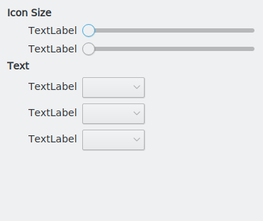
I'd like to suggest an alternative style, somewhat like what a lot of GTK apps do: Use bold heading labels and pad the widgets belonging to those. In fact, you could even just make breeze group boxes visually present itself like that without needing to adjust things for every application.

Jun 6 2018
Jun 6 2018
medhefgo added a comment to D12571: Modernize Settings window.
I think group boxes themselves are perfectly fine for the job. There is no need to force everything into form layouts. The correct step, imho, is to change the way breeze draws group boxes instead. It would fit the breeze style much more to draw them with bold left-aligned labels and no borders, but have padding for the content. Similar to how gnome does things. Here's a mockup: