In D26379#586767, @ngraham wrote:Would it make more sense if it was like this?
Popup: (o) Show near notification icon
       ( ) [Choose custom Position...]
       Hide after: [5 seconds ^v]
Feed Advanced Search
Jan 3 2020
Jan 3 2020
ndavis added a comment to D26379: [KCMs/Notifications] Tweak layout and strings to have a bit more visual grouping for the logical sections.
ndavis added a comment to D26379: [KCMs/Notifications] Tweak layout and strings to have a bit more visual grouping for the logical sections.
Within that context, I see why it makes sense to indent "Toggle with", but I still don't think it makes sense to indent "Hide after"/"Hide popup after". The label above is "Popup position" and "Hide popup after" is not related to the popup position.
ndavis added a comment to D26379: [KCMs/Notifications] Tweak layout and strings to have a bit more visual grouping for the logical sections.
Is it intentional that "Hide after" is aligned with the checkboxes above? I'm not convinced this part is an improvement. Same with the indented "Toggle with" although that was there to begin with.
Add 32px preferences-system
Jan 2 2020
Jan 2 2020
Jan 1 2020
Jan 1 2020
Apparently there were prior discussions that I forgot about because they weren't written down. The consensus seems to be that the font size and scaling should be set by default based on the physical DPI.
Dec 31 2019
Dec 31 2019
ndavis added a comment to D26304: [PageRow] Disable swipe forwards/backwards gesture by default.
ndavis added a comment to T11950: Reduce the pain of working on monochrome Breeze icons.
For the Inkscape optimized svg gradient problem: https://gitlab.com/inkscape/inbox/issues/1121
ndavis requested changes to D26326: Add application/x-audacity-project icon.
Just needs some optimization and copy the files to icons-dark, then it'll be good to go
ndavis added a comment to T12441: Consider using a vertical Icons-Only Task Manager populated with apps, and a thickened panel.
Yet another thing to consider:
Where should the hot corner for Present Windows go if we put the panel on the left?
- If we keep it on the top left, it'll get in the way when people want to use the menu.
- If we move it to the top right, it'll get in the way when people want to close a window.
- We'll have to move the window buttons to the left if we do this, just like Unity and my screenshot.
- If we move it to the bottom left, it's mostly out of the way, but it could get in the way when people go to minimize all windows. It's also a change just to accommodate another change.
- If we move it to the bottom right, it's also mostly out of the way, but I would not be surprised if many people (besides myself) put their mouse cursor there as a resting place. It's the only place on the screen where the mouse cursor is almost completely hidden.
ndavis added a comment to T12441: Consider using a vertical Icons-Only Task Manager populated with apps, and a thickened panel.
Here's how it looks on my system:
ndavis added a comment to T12441: Consider using a vertical Icons-Only Task Manager populated with apps, and a thickened panel.
We should also consider how well increasing the panel thickness will work for 1366x768 displays since those are extremely common. I had a display with that resolution on my last laptop and I know I used a side panel because the vertical space was always very limited. I don't remember if I increased the thickness of my panel, but I think I did so that the systray would switch to using 2 columns and give me more space for apps.
ndavis added a comment to T12441: Consider using a vertical Icons-Only Task Manager populated with apps, and a thickened panel.
What would really determine whether or not this is a good idea would be some usability testing, but I'm not sure how we would test something like this. It's a rather small difference that seems to be more a matter of preference and what one is used to. I'll try to see if I can get some people I know to switch to having the panel on the side and report back in a week, then maybe again after another week.
ndavis added a comment to T12441: Consider using a vertical Icons-Only Task Manager populated with apps, and a thickened panel.
I know all this is very off-topic, but I'll answer anyway. Just please don't add more off-topic questions to the task discussion. This isn't a forum for posting rants.
ndavis requested changes to D26313: Add application/vnd.apple.pkpass icon.
Nice work!
Dec 30 2019
Dec 30 2019
ndavis added a comment to D26234: [Applet] Unify 'raise maximum volume' and 'maximum volume'.
ndavis added a comment to D18000: [effects/slidingpopups] Tweak effect to make animation smoother and more consistent.
Visually, LGTM
ndavis added a comment to T12441: Consider using a vertical Icons-Only Task Manager populated with apps, and a thickened panel.
I'm a fan of the Unity layout and I like using a side panel. That's not a good justification for giving this a +1, but Unity was very well optimized for laptops (in UI design) and laptops are the most common type of PC these days.
ndavis committed R31:5bd591bb0f3b: Change frameRadius to use pen widths, add frameRadiusForNewPenWidth, add… (authored by ndavis).
Change frameRadius to use pen widths, add frameRadiusForNewPenWidth, add…
ndavis retitled D26225: Change frameRadius to use pen widths, add frameRadiusForNewPenWidth, add PenWidth::NoPen from Change frameRadius to use pen widths, add newPenWidthFrameRadius, add PenWidth::NoPen to Change frameRadius to use pen widths, add frameRadiusForNewPenWidth, add PenWidth::NoPen.
ndavis updated the diff for D26225: Change frameRadius to use pen widths, add frameRadiusForNewPenWidth, add PenWidth::NoPen.
- use frameRadiusForNewPenWidth
ndavis committed R31:ff333a478065: Fix QTime function deprecation warnings by switching to QElapsedTimer (authored by ndavis).
Fix QTime function deprecation warnings by switching to QElapsedTimer
Dec 29 2019
Dec 29 2019
ndavis updated the summary of D26268: Fix QTime function deprecation warnings by switching to QElapsedTimer.
ndavis added a comment to D26267: Replace deprecated QWeakPointer::data() with .toStrongRef().data().
ndavis committed R31:8a6f6851a49b: Fix QFontMetrics::width() deprecation warning by switching to boundingRect(). (authored by ndavis).
Fix QFontMetrics::width() deprecation warning by switching to boundingRect().
ndavis updated subscribers of D26270: Fix QFontMetrics::width() deprecation warning by switching to boundingRect().width().
ndavis updated subscribers of D26268: Fix QTime function deprecation warnings by switching to QElapsedTimer.
ndavis updated subscribers of D26267: Replace deprecated QWeakPointer::data() with .toStrongRef().data().
Thank you for pointing those out. I don't have a lot of experience, so this helps a lot.
ndavis committed R31:8c95c00f00f4: Fix QWidget::getContentsMargins() deprecation warning by switching to… (authored by ndavis).
Fix QWidget::getContentsMargins() deprecation warning by switching to…
ndavis committed R31:7556af0cfe6b: Fix QImage::byteCount() deprecation warning by switching to sizeInBytes() (authored by ndavis).
Fix QImage::byteCount() deprecation warning by switching to sizeInBytes()
ndavis requested review of D26268: Fix QTime function deprecation warnings by switching to QElapsedTimer.
ndavis committed R31:0d63cfafbc54: Fix QTreeView::sortByColumn() deprecation warning by specifying SortOrder (authored by ndavis).
Fix QTreeView::sortByColumn() deprecation warning by specifying SortOrder
ndavis requested review of D26267: Replace deprecated QWeakPointer::data() with .toStrongRef().data().
Change symbol pen width to 1.01
ndavis added a comment to D25889: Polish the reviews UI and presentation.
Review summary area:

ndavis added a comment to D25889: Polish the reviews UI and presentation.
Dec 28 2019
Dec 28 2019
ndavis updated the diff for D26225: Change frameRadius to use pen widths, add frameRadiusForNewPenWidth, add PenWidth::NoPen.
- Change newPenWidthFrameRadius to frameRadiusNewPenWidth
ndavis updated the diff for D26225: Change frameRadius to use pen widths, add frameRadiusForNewPenWidth, add PenWidth::NoPen.
Change comment formatting
ndavis retitled D26225: Change frameRadius to use pen widths, add frameRadiusForNewPenWidth, add PenWidth::NoPen from Add newFrameRadius, change frameRadius to use pen widths, add PenWidth::NoPen to Change frameRadius to use pen widths, add newPenWidthFrameRadius, add PenWidth::NoPen.
ndavis updated the diff for D26225: Change frameRadius to use pen widths, add frameRadiusForNewPenWidth, add PenWidth::NoPen.
- Change newFrameRadius to newPenWidthFrameRadius
ndavis committed R31:c16eb7a4614f: Add standard pen widths and replace hardcoded numbers (authored by ndavis).
Add standard pen widths and replace hardcoded numbers
ndavis updated the diff for D26217: Add standard pen widths and replace hardcoded numbers.
Change symbol pen width back to 1.1
ndavis added a comment to D25889: Polish the reviews UI and presentation.
Another thing to consider is whether or not the review section in Discover should be kept consistent with the reviews/comments in the new GHNS UI.
ndavis added a comment to D25889: Polish the reviews UI and presentation.
Dec 27 2019
Dec 27 2019
ndavis added inline comments to D26217: Add standard pen widths and replace hardcoded numbers.
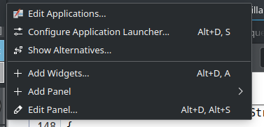
ndavis added a comment to D26238: Improve context menu.
In the plasma panel context menu, add widgets and edit panel are below the separator
ndavis added a comment to D26238: Improve context menu.
This seems inconsistent with the Plasma panel context menu:
ndavis added a comment to T12192: Redesign application launcher.
Should it be possible to configure the icon size for grid view?
ndavis updated the diff for D26217: Add standard pen widths and replace hardcoded numbers.
Change comment formatting
Dec 26 2019
Dec 26 2019
ndavis added inline comments to D26217: Add standard pen widths and replace hardcoded numbers.
ndavis updated the diff for D26225: Change frameRadius to use pen widths, add frameRadiusForNewPenWidth, add PenWidth::NoPen.
Add default value to frameRadius penWidth
ndavis added reviewers for D26217: Add standard pen widths and replace hardcoded numbers: hpereiradacosta, ngraham.
ndavis committed R31:9cd4be754750: Replace some hardcoded rectangle adjustments with strokedRect (authored by ndavis).
Replace some hardcoded rectangle adjustments with strokedRect
Dec 25 2019
Dec 25 2019
ndavis updated the summary of D26217: Add standard pen widths and replace hardcoded numbers.
ndavis requested review of D26217: Add standard pen widths and replace hardcoded numbers.
ndavis committed R31:2b7904e91b29: Remove duplicated code in overloaded strokedRect function (authored by ndavis).
Remove duplicated code in overloaded strokedRect function
Dec 23 2019
Dec 23 2019
ndavis added a comment to T12412: Tweak KColorSchemeEditor layout.
Those are pretty slick. What do the overflow menus contain?
Dec 22 2019
Dec 22 2019
ndavis added a comment to T12412: Tweak KColorSchemeEditor layout.
@manueljlin yes, that'll work nicely
ndavis added a comment to T12412: Tweak KColorSchemeEditor layout.
ndavis added a comment to T12412: Tweak KColorSchemeEditor layout.
Question to other designers:
Do you like the multi-dimentional colorpickers? Not sure what to call them, but I mean stuff like the color picking box seen in this mockup, in KColorChooser and the triangle+wheel you see in Krita.
ndavis added a comment to T12412: Tweak KColorSchemeEditor layout.
BTW, you accidentally used the HiDPI version for both versions
ndavis added a comment to T12412: Tweak KColorSchemeEditor layout.
What's in the popover's overflow menu?
ndavis updated the task description for T11713: Reorganize colorscheme colors and use them in a logical manner.
ndavis added a comment to T11713: Reorganize colorscheme colors and use them in a logical manner.
Dec 21 2019
Dec 21 2019
Make arrows pixel perfect
ndavis committed R31:288c3b85f16c: Revert "Revert "Reduce the indicator arrow size for press-and-hold menus in… (authored by ndavis).
Revert "Revert "Reduce the indicator arrow size for press-and-hold menus in…
ndavis accepted D26146: Delete icon.
ndavis added a comment to T12372: Elisa UI Redesign.

ndavis added a comment to T12372: Elisa UI Redesign.
It's not that the mockup is bad, it's that the current design isn't bad either. If the current design needs to be improved, it can be improved without throwing it away.
ndavis added a comment to T12372: Elisa UI Redesign.
I still think a redesign is completely unnecessary.
Dec 19 2019
Dec 19 2019
Add shadow rendering helper functions