I've had issues with the rounded corners on X11 as well. Certain windows don't appear to have transparent corners. The background of the rounded corners ends up being black or white.
Feed Advanced Search
Jun 23 2020
Jun 23 2020
kderich added a comment to T10891: Breeze theme evolution.
Feb 12 2020
Feb 12 2020
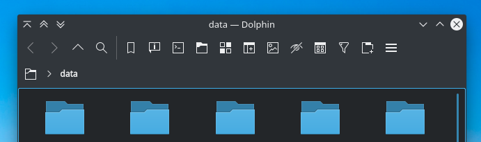
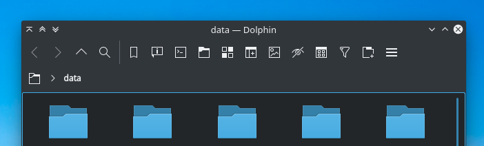
kderich added a comment to T12308: Dolphin UI redesign.
Jan 30 2020
Jan 30 2020
kderich added a comment to T12308: Dolphin UI redesign.
kderich added a comment to T12308: Dolphin UI redesign.
Regarding split views, I had a thought here. Back in the day, browsers used to show tabs below the navigation bar. This created a bit of an interesting UX issue. Eventually, the tabs moved *above* the navigation bar to make things more proper. I'm wondering if both the tab bar and split view should do the same thing in dolphin. With the default dolphin layout, there are only 2 buttons on the toolbar that are 'shared' between each part of a split view ('split' and 'menu'). The rest function independently based on which part of the view is focused.
kderich added a comment to T12372: Elisa UI Redesign.
The 'header bar' look on the top of the mockup is very nice. Regarding the 'playlists' feature you mentioned, why not integrate that on the left side? Have a 'Currently Playing' or similar option that shows the songs in the currently selected playlist and then a 'Playlists' option (like in the mockup) for choosing which playlist you want?
kderich added a comment to T12530: Open/Save UI redesign.
This looks excellent as well!
kderich added a comment to T10201: Window titlebars.
Some general thoughts:
kderich added a comment to T12308: Dolphin UI redesign.
So, I've not had much time to get involved here, due to a combination of serious medical issues and needing to find a job. However, I'd like to share my thoughts on some of these UI redesigns, starting with this one:
Jan 6 2020
Jan 6 2020
kderich added a comment to T12308: Dolphin UI redesign.
kderich added a comment to T12308: Dolphin UI redesign.
kderich added a comment to T12308: Dolphin UI redesign.
Jan 2 2020
Jan 2 2020
kderich added a comment to T10891: Breeze theme evolution.
Dec 16 2019
Dec 16 2019