In T14725#262862, @paulb wrote:Do you mind if we leave the title of the task at "Plasma 25th Anniversary Edition"? That is what we (as in the Promo team and devs) agreed we would call this release, and I would prefer we got used to just calling it that and there were no confusion in the Promo board.
Feed Advanced Search
Sep 3 2021
Sep 3 2021
GB_2 added a comment to T14725: Plasma 25th Anniversary Edition.
GB_2 added a comment to T14725: Plasma 25th Anniversary Edition.
GB_2 updated the task description for T14725: Plasma 25th Anniversary Edition.
GB_2 updated the task description for T14725: Plasma 25th Anniversary Edition.
GB_2 updated the task description for T14725: Plasma 25th Anniversary Edition.
GB_2 updated the task description for T14725: Plasma 25th Anniversary Edition.
GB_2 updated the task description for T14725: Plasma 25th Anniversary Edition.
GB_2 renamed T14725: Plasma 25th Anniversary Edition from Plasma 25th Anniversary Edition to Plasma 5.23/25th Anniversary Edition.
GB_2 renamed T14725: Plasma 25th Anniversary Edition from Plasma 25th Anniversary Edition to Plasma 5.23/25th Anniversary Edition.
Aug 2 2021
Aug 2 2021
GB_2 added a comment to T11227: Loading Look and Feel.
Yes, I just replaced the current spinner icon we have in the task manager now. It shows up when the window didn't appear yet.
Jul 31 2021
Jul 31 2021
GB_2 added a comment to T11227: Loading Look and Feel.
Here is my proposal for this topic.
Jul 24 2021
Jul 24 2021
GB_2 added a comment to T14211: Unify sidebar color in Kirigami apps.
Does not seem like a good idea to me. We should make an effort to help users distinguish the areas of the window more easily, like we already do with the titlebar and window content. Pretty much every platform has this separation. It's also more pleasing to the eye.
GB_2 added a comment to T12777: Unify list item removal.
FWIW we already have a red X we could use for permanent deletion, but now lists use red trash cans instead...
Right now the only thing distinguishing permanent and reversible deletion is the trash can color. Not good for accessibility.
Having only black trash can icons for reversible deletion and the red X for permanent deletion like I proposed would fix this.
Jul 7 2021
Jul 7 2021
GB_2 added a comment to T11930: Rethink Lock, Login and Logout Screen's Color Modularity.
If this hasn't already been fixed then we should just hardcode the colors, looks the best and should be easy to do.
GB_2 added a comment to T12777: Unify list item removal.
GB_2 added a comment to T12777: Unify list item removal.
GB_2 added a comment to T14537: Improve the consistency of the buttons placement in app headers.
There are two types of hamburger buttons: one which opens a sidebar on the left, so it makes sense to put them left, and the one that opens a menu for more actions and is often located in a toolbar. So we're kind of restricting ourselves to either always put hamburger menus left or differentiate these two types.
GB_2 updated the task description for T12777: Unify list item removal.
May 28 2020
May 28 2020
GB_2 added a comment to T10952: Drop EmojiOne and adopt Twemoji for emoticon substitution.
This may be useful: https://www.reddit.com/r/linux/comments/gs83sj/twemoji_confs
May 18 2020
May 18 2020
May 17 2020
May 17 2020
GB_2 added a comment to T13008: Figure out a good UI for the "show which settings have been changed" feature.
What if we put a checkable menu item inside the hamburger menu? It's not like this is a feature you need to access often. Then it also won't take up any space in the sidebar.
GB_2 updated the task description for T13075: Move all things in Plasma to PC3, and then to QQC2.
May 13 2020
May 13 2020
GB_2 added inline comments to D29709: Give all OverlaySheets consistent headers.
May 8 2020
May 8 2020
GB_2 added a comment to T9986: Delete "What's This" inline help functionality.
Almost every app has a help button or menu item that opens the documentation. Having tooltips and the help center is enough in my opinion, because the What's This text would otherwise be a duplicate of the documentation. I think good tooltips and good UI should be enough.
May 6 2020
May 6 2020
GB_2 added a comment to D29477: Change CommandAllKey to Meta.
I think it would be benefitial if we agree on this standard in T11520, the HIG or maybe XDG.
May 5 2020
May 5 2020
GB_2 added a comment to D29439: [RFC] Adjust color schemes for tools area/Breeze evolution.
Do we still want to ship the old Breeze Classic with Plasma or do we put it in kde-vdg-extras? I think there are quite a few people who like the mix of dark header and light content.
Apr 25 2020
Apr 25 2020
GB_2 added a comment to T12724: Default Wallpapers.
Let's use Flow Light :-)
Apr 23 2020
Apr 23 2020
Apr 22 2020
Apr 22 2020
GB_2 added a comment to T12724: Default Wallpapers.
I read all messages and it seems like these are the most popular wallpapers (in not particular order): Vera, Flow Light, Milky Way, Rainy Morning
In my opinion they all look good, although Milky Way is quite dark. It also looks a bit different from the traditional style and it's the only wallpaper with this style. I think it would make more sense to change the style with Plasma 6 (if at all).
Apr 20 2020
Apr 20 2020
GB_2 added a comment to D28744: Rewrite of the global shortcuts kcm.
Nitpick: put the "Add Application..." button on the left (T10384).
GB_2 added a comment to T12668: Discover UI redesign.
GB_2 added a comment to T12705: Consider displaying the current wallpaper's real name in the UI.
+1
GB_2 added a comment to T12724: Default Wallpapers.
I really like Grand Canyon, Vera, Rainy Morning. Kay would also be ok, but I don't like the colors. Crystalline looks rather dull, Beach is too similar to the current one, and the others are too dark or don't really have the Plasma 5 style.
GB_2 added a comment to D28842: Raise size of default fixed-width font from 9 to 10pt.
Thanks for this :-)
GB_2 added a comment to T12777: Unify list item removal.
IMO we should just use the trash can for "Move to Trash" and the red X for permanent deletion or removal. This makes it simple.
GB_2 added a comment to T12789: Unify list icon sizes.
I think smallMedium (or maybe medium) generally seems like a good size. Icons in lists don't need to be so big.
GB_2 added a comment to D23926: Move "Details" tab to second place in Properties dialog.
Ping :-)
GB_2 added a comment to D28461: In sidebar mode show if a module is in default state or not.
Apr 19 2020
Apr 19 2020
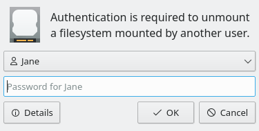
GB_2 added a comment to T8569: Redesign Policy Kit Authorization dialog.
GB_2 added a comment to T8569: Redesign Policy Kit Authorization dialog.
What do you think about this as a compromise?
GB_2 awarded D28985: [Kickoff] Disable tabBar's mouseArea when searching a Love token.
Apr 11 2020
Apr 11 2020
Mar 14 2020
Mar 14 2020
GB_2 added a comment to T8569: Redesign Policy Kit Authorization dialog.
I love the second last picture that shows the the desktop (without the dialog title bar).
Feb 2 2020
Feb 2 2020
Feb 1 2020
Feb 1 2020
GB_2 added a comment to T12631: [RFC] Make Kirigami's headings smaller and set default top/left margins.
Incredible!
Jan 13 2020
Jan 13 2020
Jan 11 2020
Jan 11 2020
GB_2 added a comment to T12488: Use a different repo for the new version of the Breeze widget style and come up with a name for it.
Maybe simply "Breeze Evolution"?
Jan 10 2020
Jan 10 2020
GB_2 committed R242:629db2f3b55b: Add edit mode menu item to desktop widget context menu (authored by GB_2).
Add edit mode menu item to desktop widget context menu
GB_2 updated the diff for D26043: Add edit mode menu item to desktop widget context menu.
Use David's suggestion
GB_2 added a comment to D26043: Add edit mode menu item to desktop widget context menu.
Ping :-)
Dec 28 2019
Dec 28 2019
GB_2 added a comment to D26043: Add edit mode menu item to desktop widget context menu.
Ping.
Dec 23 2019
Dec 23 2019
GB_2 updated the summary of D24281: Add default shortcut to switch to the desktop to the left/right/top/bottom.
Dec 21 2019
Dec 21 2019
GB_2 added a comment to D24281: Add default shortcut to switch to the desktop to the left/right/top/bottom.
Can we please move on with this shortcut then as it's the better default for most people?
GB_2 added a comment to D21978: RFC: Fix search not returning results in Kickoff when cursor is below tabbar.
Can you please try to further investigate this?
Dec 20 2019
Dec 20 2019
Dec 17 2019
Dec 17 2019
GB_2 added a comment to D25945: Sync dark theme preference for GTK3 applications.
GB_2 added a comment to D24281: Add default shortcut to switch to the desktop to the left/right/top/bottom.
GB_2 added inline comments to D26043: Add edit mode menu item to desktop widget context menu.
GB_2 committed R319:37f2923b0b87: Add icons to Konsole URL/mail context menu item (authored by GB_2).
Add icons to Konsole URL/mail context menu item
GB_2 added a comment to D26053: Add icons to Konsole URL/mail context menu item.
GB_2 added a comment to D25778: refactor(lookandfeelexplorer): Port almost entire look and feel explorer to QQC2.
Ping.
GB_2 added a comment to D24522: Add presentwindows icon (old "task view" from windows).
GB_2 added a comment to D24070: [Applets/Battery] Don't use toolTipMainText to show info, rather use the second line.
Ping :-)
GB_2 added a comment to D23352: make button icons follow a reasonable size and layout.
Ping.
GB_2 added a comment to D26053: Add icons to Konsole URL/mail context menu item.
Dec 16 2019
Dec 16 2019
GB_2 added a comment to D26053: Add icons to Konsole URL/mail context menu item.
I added -url and -mail after edit-copy so it is possible to create specific icons later if wanted.
GB_2 requested review of D26053: Add icons to Konsole URL/mail context menu item.
GB_2 updated the diff for D26043: Add edit mode menu item to desktop widget context menu.
Remove space
GB_2 updated the diff for D26043: Add edit mode menu item to desktop widget context menu.
Decrease line count
GB_2 updated the summary of D26043: Add edit mode menu item to desktop widget context menu.
GB_2 requested review of D26043: Add edit mode menu item to desktop widget context menu.
GB_2 added a comment to D22684: [Klipper] Fix clipboard history management.
Ping.
Dec 15 2019
Dec 15 2019
GB_2 committed R108:20ca3bb57a5f: Add default shortcut to switch to the desktop to the left/right/top/bottom (authored by GB_2).
Add default shortcut to switch to the desktop to the left/right/top/bottom
Dec 14 2019
Dec 14 2019
GB_2 added a comment to D25670: Synchronize decorations buttons order in GTK headerbars.
Works great!
GB_2 added a comment to D25945: Sync dark theme preference for GTK3 applications.
Works perfectly fine for me without waiting.
GB_2 added a comment to D24281: Add default shortcut to switch to the desktop to the left/right/top/bottom.
Hmm, Ctrl+Alt+Arrows can also break things like Konsole (https://cgit.kde.org/konsole.git/tree/src/ViewManager.cpp#n237) and Meta is more appropriate for desktop/window management shortcuts, so less likely to break other applications that are not desktop add-ons.
Dec 10 2019
Dec 10 2019
GB_2 added a comment to D25844: Don't compress tasks before grouping, when task manager is vertical.
I already made a patch for this: D23242
Dec 8 2019
Dec 8 2019
GB_2 added a comment to T10611: Set options for GTK apps in the respective KCMs.
GB_2 added a comment to T10611: Set options for GTK apps in the respective KCMs.
We could also set the "Prefer dark theme" preference depending on your color scheme (like the filter combobox added in D18646).
GB_2 updated the task description for T10611: Set options for GTK apps in the respective KCMs.
GB_2 added a comment to D25360: Conditionally set SH_ScrollBar_LeftClickAbsolutePosition based on kdeglobals setting.
Dec 3 2019
Dec 3 2019
GB_2 added a comment to T12308: Dolphin UI redesign.

GB_2 added a comment to D24275: [GTK3] Add module to reload colorscheme in GTK3 apps without restarting them.
GB_2 added a comment to D24275: [GTK3] Add module to reload colorscheme in GTK3 apps without restarting them.
Works now :-)
Nov 30 2019
Nov 30 2019
GB_2 committed R118:dd263acd2f62: Fix Cuttlefish mouse click selection in icon grid (authored by GB_2).
Fix Cuttlefish mouse click selection in icon grid
GB_2 committed R118:637c0e517b29: Fix Cuttlefish mouse click selection in icon grid (authored by GB_2).
Fix Cuttlefish mouse click selection in icon grid
GB_2 committed R856:e37eef54ab35: Add icon to browser integration do not remind menu item (authored by GB_2).
Add icon to browser integration do not remind menu item
GB_2 requested review of D25635: Add icon to browser integration do not remind menu item.
GB_2 requested review of D25633: Fix Cuttlefish mouse click selection in icon grid.