I love that implementation. I bounced back ideas with Marco long ago about this. I think we should implement it in all other KCMs with similar representations.
Feed Advanced Search
Feb 1 2019
Feb 1 2019
abetts added a comment to D18649: [GridViewKCM] improve contrast and legibility for delegates' inline hover buttons.
Jan 31 2019
Jan 31 2019
abetts added a comment to D18607: Add a popup search bar to the plasma-nm applet.
Does the hug allow for just a search button and a non-always visible search field?
Jan 28 2019
Jan 28 2019
abetts added a reviewer for D18580: Accept commas to separate processes on the Search Edit: ngraham.
Jan 27 2019
Jan 27 2019
abetts added a comment to D18519: [KColorSchemeEditor] Turn Save button into Save As.
I guess the way that the new theme is created through the ui is also something to consider. Maybe, let's think of a cleaner theme editing process and then the save button will be easier to understand?
Jan 26 2019
Jan 26 2019
abetts added a comment to T8204: Website localisation.
Would anyone in our community be able to create a script for localization?
Jan 25 2019
Jan 25 2019
abetts added a comment to D18419: Move KCMs in "Workspace Theme" to more appropriate locations.
abetts added a comment to D18419: Move KCMs in "Workspace Theme" to more appropriate locations.
abetts added a comment to D18419: Move KCMs in "Workspace Theme" to more appropriate locations.
Jan 24 2019
Jan 24 2019
abetts added a comment to D18504: [plasma-nm/applet] Add right-click context menu to directly customize a connection.
Do you prefer a right click over a settings or 3-dot button?
abetts added a comment to D12278: [Colors KCM] Port to new design.
It's amazing to see all the work that was done here. Thanks everyone for working together on this. I hope our users see this new KCM as a step forward.
Jan 23 2019
Jan 23 2019
abetts added a comment to D18377: [effects/blur] Update blur to be more natural.
+1
Jan 21 2019
Jan 21 2019
• Ghost6 awarded M112: System Settings Alpha Graphic Redesign a Like token.
Jan 20 2019
Jan 20 2019
abetts added a comment to D18419: Move KCMs in "Workspace Theme" to more appropriate locations.
I am not opposed to a reorg as long as it doesn't touch the KCMs, but be aware that you "might" have to reorg again as we port KCMs. So, do you prefer to do it, potentially twice, or just once?
abetts added a comment to D18402: Use semantically correct restoration icon.
+1
abetts added a comment to D18401: [Look And Feel KCM] Use new icon.
+1 <3
Jan 16 2019
Jan 16 2019
abetts added a comment to D16212: [Device Notifier] Add a button to unmount all devices.
+1
abetts added a comment to D18104: [kcmkwin/kwindecoration] Rework decorations buttons drag&drop tab.
Hey all, sorry for not showing up earlier in this ticket. I wanted to offer visual direction for this change. Here is the mockup I conceptualized for this kcm.
Jan 15 2019
Jan 15 2019
abetts added a comment to D18255: Improve up/down display for Monitor widgets.
+1
Jan 14 2019
Jan 14 2019
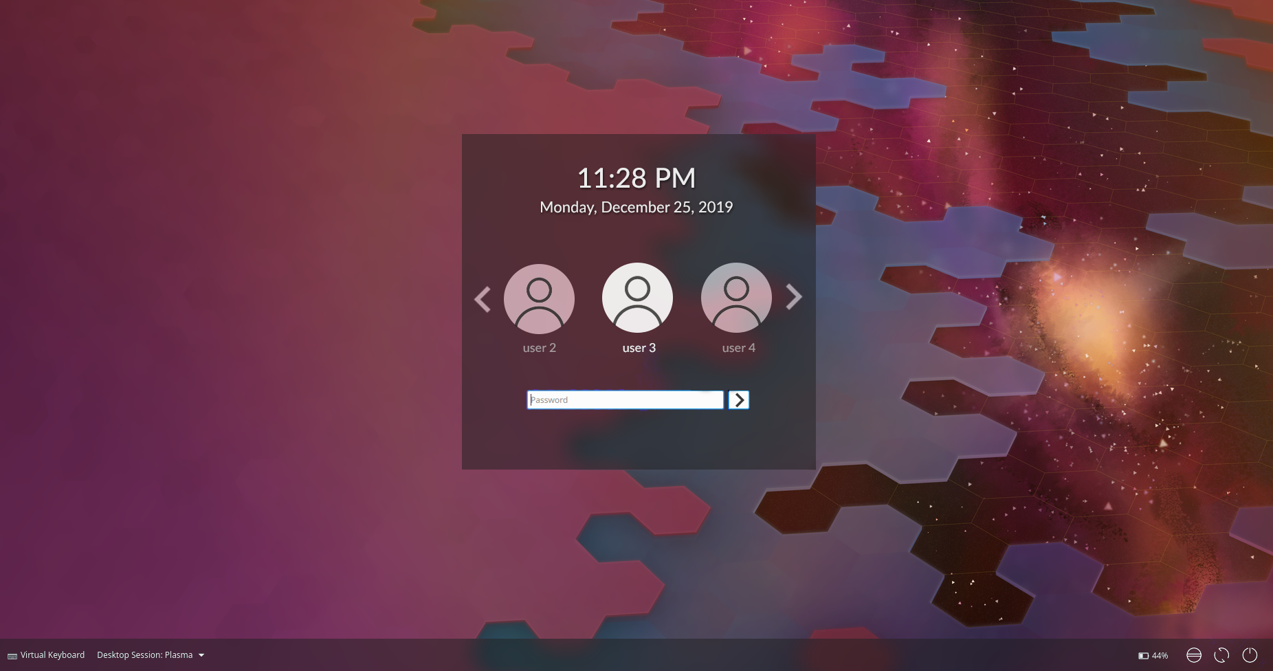
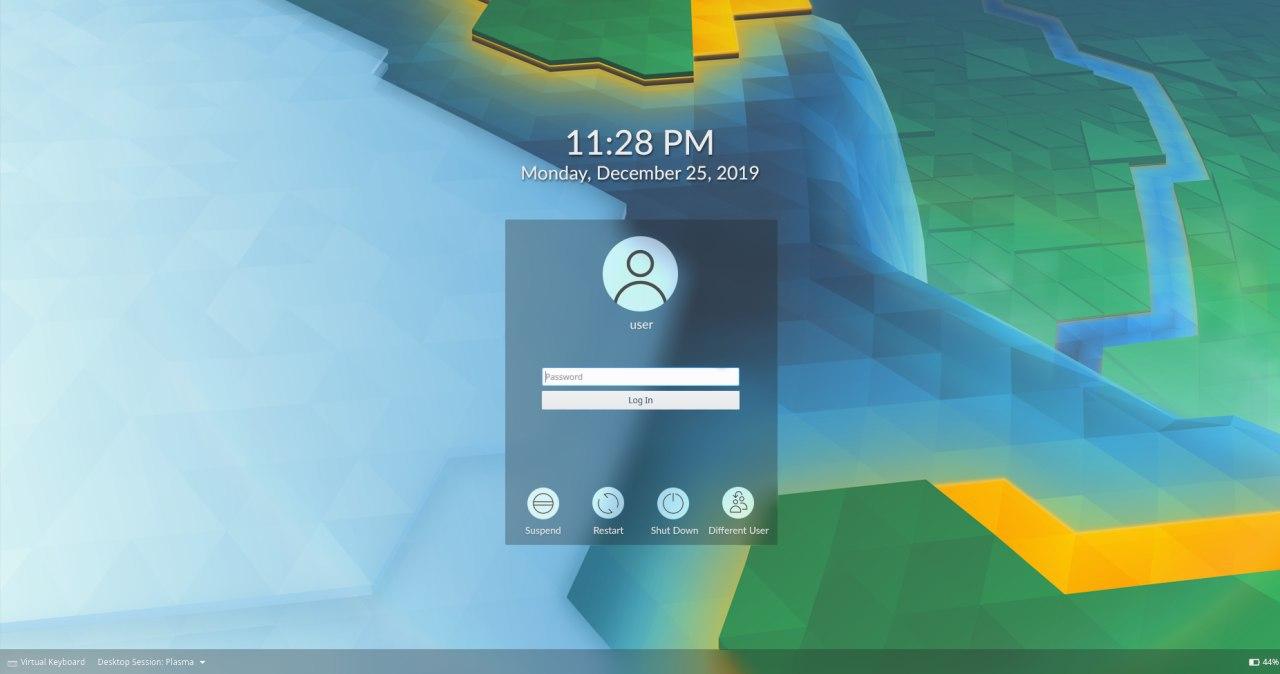
abetts added a comment to D18239: login screen with same behavior as lockscreen.
I agree with @ngraham here. I feel that it is not always wise to apply the same UX everywhere. It might feel right but there are user experiences that are common place for other systems and it could become distracting for the user to expect one thing and such thing behaves too much outside of that expectation.
Jan 13 2019
Jan 13 2019
abetts added a comment to T10325: 5.16 Login screen improvements.

Jan 12 2019
Jan 12 2019
Jan 8 2019
Jan 8 2019
abetts added a comment to D18019: [Digital Clock] Add ability to set a custom date format string.
Is there a way that the custom date setting can be in its own window pop up instead of building into the KCM and pushing down the control that's below this setting?
abetts added a comment to D18104: [kcmkwin/kwindecoration] Rework decorations buttons drag&drop tab.
Do you have a before and after? :D
abetts added a comment to D17975: [Notifications] Add padding to notifications.
abetts added a comment to D18078: [plasma-workspace-wallpapers] Improve wallpaper selection.
I like the selection so far. Just ping me when you need an official approval.
Jan 7 2019
Jan 7 2019
abetts added a comment to D17752: Remove full representation of analog clock.
I think part of the reason why this seems too big also if because it doesn't do much more than tell you what day it is. If it was able to integrate with a calendar application, it could show appointments. Something like this:
abetts added a comment to D18033: Use a better icon for the "Shoot" action.
(May I suggest a visual preference? What if the buttons were black by default? I feel that because of their color, they seem odd for a control on a video camera. https://dribbble.com/shots/5673516-Day-32-Made-with-Studio is an example of what I mean. The controls are less obvious to leave the user to focus on the image they see)
abetts added a comment to T10243: Some KDE applications could use better icons.
Kate and Kwrite seem very similar. Would adding a differentiator graphic help? For example,
abetts added a comment to D18018: [Digital Clock] Add ability to change first day of week.
How was this not an option ever?
abetts added a comment to D18034: Improve drawer headers.
In general these banner images were a good idea but their execution wasn't great. They take up a lot of space and the background are generally dark.
Jan 6 2019
Jan 6 2019
abetts added a comment to D18000: [effects/slidingpopups] Tweak effect to make animation smoother and more consistent.
Do you have a before and after gif or video?
Jan 4 2019
Jan 4 2019
abetts added a comment to T6942: Calendar application.
If you want, you can go to the KDE VDG Channel and request some design help as you go along. The app is shaping up nicely.
Jan 3 2019
Jan 3 2019
abetts added a comment to D17934: [Kickoff] Increase Kickoff information label readability.
abetts added a comment to D17934: [Kickoff] Increase Kickoff information label readability.
abetts added a comment to D17934: [Kickoff] Increase Kickoff information label readability.
abetts added a comment to D17934: [Kickoff] Increase Kickoff information label readability.

abetts added a comment to D17874: [dimdisplay] Effectively waits display to wake-up.

abetts added a comment to D17874: [dimdisplay] Effectively waits display to wake-up.
Can you pleas provide a video showing the annoying behavior? Just to make sense of it.
abetts added a comment to D17020: [Kickoff] Reenable hover to show system information.
+1
abetts added a comment to D17905: [frameworks] Do not use light font styles for headings (1/3).
I don't have a problem with the font as much as I have a problem with the spacing for the title labels. They seem to be super close to checkboxes, other labels and controls. There should be a clear separation. Adding a heavier font to the title label helps a lot but because of its weight and the closeness with the rest of the elements, it seems crammed.
abetts added a comment to D17935: [Clipboard] Use ellipsis in the search field label ('Search...' instead of 'Search').
+1
abetts added a comment to D17022: [Kickoff] Enable Esc to close Kickoff and Tab to switch to Search.
Love it! IDK how it wasn't implemented already!
abetts added a comment to T10258: Use correct search bars and use ellipsis whenever needed to follow the KDE HIG.
I support visual alignment!
abetts added a comment to D17906: [kirigami] Do not use light font styles for headings (2/3).
Goodness, I think this is all about taste. I am more on the side that it looks good. It visually prioritizes hierarchy with labels. @mart Does it just look bad for you or do you think this will cause issues somewhere else?
Jan 2 2019
Jan 2 2019
abetts added a comment to D17916: [Login and lock screens] Do not use light font styles for the sddm clock.
+1
abetts added a comment to D10083: [Look and Feel] Reverse the button order.
Dec 28 2018
Dec 28 2018
abetts added a comment to T10220: Improve the default selection of photographic wallpapers.
I like the idea and if we select wallpapers we must provide quality wallpapers that fit every screen well.
Dec 27 2018
Dec 27 2018
abetts added a comment to D17814: Add option to have close button on each tab.
The labels and checkboxes are not starting with a verb. I think that can be reworked.
abetts added a comment to D17814: Add option to have close button on each tab.
Screenshot?
abetts added a comment to D17747: Only show tab icon if the user has specifically chosen one.
+1
Dec 25 2018
Dec 25 2018
Dec 23 2018
Dec 23 2018
abetts added a comment to D17747: Only show tab icon if the user has specifically chosen one.
I have seen implementations like this one before and it makes it so that the tab expands and shrinks when the focus is on the tab because it needs to accommodate for the icon that appears and disappears. Is that the case with this patch?
Dec 22 2018
Dec 22 2018
abetts added a comment to T7927: Fonts “easy mode”.
Sorry guys, this request here does not seem to have good grounding. I agree with Nate. Can we re-evaluate? More than anything, I would need to see a clickable prototype of the proposed interaction with this wizard. I haven't seen anything yet.
Dec 21 2018
Dec 21 2018
abetts added a comment to D17706: Fix lock screen focus.
abetts
It is easy to reproduce when more than one monitor is connected, you must set the cursor on any monitor except the first one and block the screen with hot keys, after which you will notice that the focus of the password entry remains on the first screen.
This problem may be associated with the bug 395639.
Dec 20 2018
Dec 20 2018
abetts added a comment to D17706: Fix lock screen focus.
Can you show a video or gif of this behavior?
Dec 19 2018
Dec 19 2018
abetts added a comment to T10201: Window titlebars.
Could you maybe provide a video or gif of this behavior from the other OSs? Just for reference.
abetts added a comment to T9830: Application Menubar states and usability.
Dec 18 2018
Dec 18 2018
abetts added a comment to D17073: [Task Manager] Do not crop album art in tooltip.
Dec 15 2018
Dec 15 2018
abetts added a comment to D17607: Restore previous tabbar look.
Not sure, what seems to be the main issue?
abetts added a comment to D17609: KTextEditor: Add action for static word wrap.
+1
Dec 14 2018
Dec 14 2018
abetts added a comment to D17321: Change panel edit mode icon from from a hamburger icon to a configure icon.
Thanks Dave!
abetts added a comment to D17574: Remove period ( . ) character from the end.
+1
Dec 13 2018
Dec 13 2018
abetts added a comment to D17556: Make Status and Notification popup consistent with others..
In general, this patch makes it better. However, I feel that all the items are simply too close to the left edge. Can you add some padding or margin to the left? Maybe something like 5 px?
abetts added a comment to D17461: [KDirOperator] Don't squeeze Name column when there isn't enough horizontal space.
+1 for improving visuals
Dec 12 2018
Dec 12 2018
abetts added a comment to M144: New panel right click context menu.
+1
Dec 11 2018
Dec 11 2018
abetts added a comment to D17496: Change network/web color icons to consistent style.
+1
abetts added a comment to D17372: [componentchooser KCM] Make KIO browser option the fallback only and remove from the UI.
Can the section title be called something different instead of using the word "Component"?
Dec 10 2018
Dec 10 2018
abetts retitled D17423: Added statement about aiming for perfection from Added stetment about aiming for perfection to Added statement about aiming for perfection.
abetts added a comment to D17346: Support Bluetooth batteries.
Maybe not applicable to this patch, but would we consider making the battery color in the progress bar to be green? Green seems to be very standard to mean charge. We are using blue.
abetts added a comment to D17458: Add help button to KCMs where it was missing.
Thanks Dave!
abetts added a comment to D17469: Give applications-games and input-gaming more contrast with Breeze Dark.
It's looking good. I would say change the last tone to a tad lighter. The gray has too much black in it. I would probably move the hue to the yellow side.
Dec 9 2018
Dec 9 2018
abetts added a comment to D17459: SearchBar: Add Cancel button to stop long running tasks.
I would probably not make the button that big, but I think it is useful
abetts added a comment to D17321: Change panel edit mode icon from from a hamburger icon to a configure icon.
+1
Dec 7 2018
Dec 7 2018
abetts added a comment to D17420: [Device Notifier] Fix action button vertical alignment.
Love it! +1
abetts added a comment to D17418: SearchView: Harmonize text in searchPlaceCombo.
+1
abetts added a comment to T10165: Large category icons should all be colorful.
I would even go as far as changing the left column where the icons are to some other color too. However, I think this is sensible. It breaks monochrome glyphs that can be confused.
abetts added a comment to D17402: [Device Notifier] Disable the possibility to unmount the root partition.
If this patch deals with the UI, is it possible to align the eject button to the middle using the progress bar as the center?
Dec 4 2018
Dec 4 2018
abetts added a comment to D17354: [Digital clock plasmoid] Calendar settings page: port to QQC2 & Kirigami and improve layout.
Thank you!
abetts added a comment to D17360: Added "Transparent with light text" theme for Desktop Notes.
+1
abetts added a comment to D17354: [Digital clock plasmoid] Calendar settings page: port to QQC2 & Kirigami and improve layout.
Would you want to move the General section to the top and plugins second?
abetts added a comment to D17350: Add the missing api for multilevel KCMs to control the columns.
Instead of connection name, would it make sense to call it, network name instead?
Dec 3 2018
Dec 3 2018
Nov 29 2018
Nov 29 2018
abetts added a comment to D17192: use a Kirigami Heading for perfect consistency.
abetts added a comment to D17211: Port applet/containment configs to qqc2.
abetts added a comment to D17211: Port applet/containment configs to qqc2.
+1 on visuals
abetts added a comment to D17209: [effects/fadingpopups] Don't animate KDE Plasma splash screen.
What would this look like in practice? Before/after?
abetts added a comment to T9658: Rethink blur-by-default for Breeze SDDM login screen theme for Plasma 5.15.
abetts added a comment to T9658: Rethink blur-by-default for Breeze SDDM login screen theme for Plasma 5.15.
Will we ever be able to land this? :D
abetts added a comment to D17220: Improve symbolism for off and muted status icon.


Nov 28 2018
Nov 28 2018
abetts added a comment to D17192: use a Kirigami Heading for perfect consistency.
I don't really have an issue with the font alignment. I think where I am conflicted is the part where we want this text to have too many purposes. The label is big so as to mean that it is a page title. However, when we place this on a phone, the header text is huge. So the label is trying to be a page title and a breadcrumb. I think that we should rethink the size, at least. The alignment is great.
abetts added a comment to D17192: use a Kirigami Heading for perfect consistency.
+1
abetts added a comment to D17217: Implement free memory notifier.
Is having this feature an optional feature? Can it be turned off?
Nov 26 2018
Nov 26 2018
abetts added a comment to D17073: [Task Manager] Do not crop album art in tooltip.