Clean up hamburger menu and viewport and single-folder context menus
ClosedPublic

Authored by ngraham on Sep 6 2019, 4:10 PM.

Details

Summary

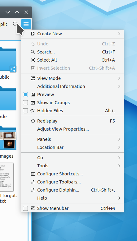
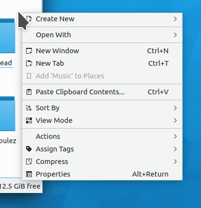
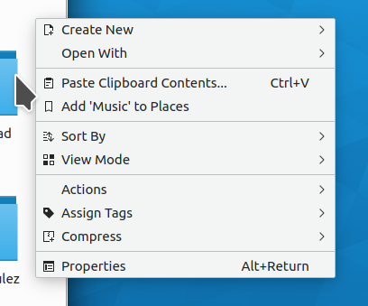
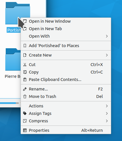
Dolphin's hamburger and context menus have grown organically over time,
becoming a bit messy and somewhat visually overwhelming. This makes them
harder to parse and more intimidating to use.

This patch cleans up the hamburger menu and viewport and single-folder context
menus to group items more logically, and remove items that aren't actually relevant
to the context.

The hamburger menu part of the patch is fairly significant, and draws from the
principle of only showing actions with a global scope that are not already accessible
from another visible method (e.g. via the default toolbar). In the end, it manages to be
shorter than the current hamburger menu with expose actions that are more relevant.

A visible method to display context-specific actions should be explored separately
(see https://bugs.kde.org/show_bug.cgi?id=411500).

Depends on D23945

Test Plan

Before, hamburger menu:


After, hamburger menu:

Before, viewport:


After, viewport:

Before, one folder selected:


After, one folder selected:

No change for the context menus shown when selecting a single item, multiple items, or multiple folders

Diff Detail

Repository
R318 Dolphin
Branch
clean-up-context-menu (branched from master)
Lint
No Linters Available
Unit
No Unit Test Coverage
Build Status
Buildable 16528
Build 16546: arc lint + arc unit
There are a very large number of changes, so older changes are hidden. Show Older Changes
ngraham updated this revision to Diff 65694.Sep 9 2019, 5:18 PM

Re-add "Create New" to single-item context menu, and add "New Tab" and "New Window" actions to hamburger menu

This revision is now accepted and ready to land.Sep 9 2019, 5:18 PM
ngraham retitled this revision from Clean up viewport and single-folder context menus to Clean up viewport and single-folder context menus and hamburger menu.Sep 9 2019, 5:20 PM
ngraham edited the summary of this revision. (Show Details)
ngraham edited the test plan for this revision. (Show Details)
ndavis added a comment.Sep 9 2019, 5:33 PM

Why is it that sometimes Create New is in its own section and sometimes it's grouped with Open With or New Tab/Window?

As for Add to Places, perhaps it should just be in its own section above the services section? It doesn't really go with anything else and I was never bothered by it being in its own section.

One of the reasons why I wanted to do this patch is because I think single-item sections are ugly and make the menu feel cramped and overwhelming, and the goal was to get rid of them as much as possible.

ndavis added a comment.Sep 9 2019, 7:21 PM

Why is it that sometimes Create New is in its own section and sometimes it's grouped with Open With or New Tab/Window?

As for Add to Places, perhaps it should just be in its own section above the services section? It doesn't really go with anything else and I was never bothered by it being in its own section.

One of the reasons why I wanted to do this patch is because I think single-item sections are ugly and make the menu feel cramped and overwhelming, and the goal was to get rid of them as much as possible.

Regardless of the location or what it's grouped with, it needs to be consistent in both ways. It almost doesn't even matter exactly where it is or what its grouped with as long as it doesn't change places for no discernible reason.

How about grouping Open With, Create New and Add to Places? Open in New Tab and Open in New Window can be in their own section.

While I agree that New Tab/New Window shouldn't be reachable only from the context menu, I'm a bit worried about the height of the control menu. With this patch applied, it is taking almost all the available height on my 1366x768 laptop screen.

Is there maybe some action that we could remove from the control menu? Maybe "Redisplay" ?

I agree with you and I'm all ears regarding things we could remove. Redisplay is definitely a prime candidate IMO.

I noticed recently in the ElementaryOS file manager that the refresh button is integrated into the URL navigator, on the right side. I wonder if we could do that too. That would make it still reachable (more so, in fact) despite not being in the default toolbar or the hamburger menu.

ndavis added a comment.EditedSep 10 2019, 12:24 AM

Why not just keep New Tab/Window in the Context menu? The hamburger is already a bit overfull, even if we remove Redisplay. The context menu isn't that long by comparison and it wouldn't be any longer than it is with a folder selected.

Why not just keep New Tab/Window in the Context menu? The hamburger is already a bit overfull, even if we remove Redisplay. The context menu isn't that long by comparison and it wouldn't be any longer than it is with a folder selected.

It's a HIG violation to have functionality available only via invisible UI (context menu and keyboard shortcuts), which is the case for the New Tab and New Window actions when the menubar isn't shown.

https://hig.kde.org/components/navigation/contextmenu.html#is-this-the-right-control

Fair enough.

elvisangelaccio added a comment.EditedSep 10 2019, 10:03 AM

And btw D22444 is going to add yet another action in the menu :D

While I agree that New Tab/New Window shouldn't be reachable only from the context menu, I'm a bit worried about the height of the control menu. With this patch applied, it is taking almost all the available height on my 1366x768 laptop screen.

Is there maybe some action that we could remove from the control menu? Maybe "Redisplay" ?

I agree with you and I'm all ears regarding things we could remove. Redisplay is definitely a prime candidate IMO.

I noticed recently in the ElementaryOS file manager that the refresh button is integrated into the URL navigator, on the right side. I wonder if we could do that too. That would make it still reachable (more so, in fact) despite not being in the default toolbar or the hamburger menu.

Yeah. Also "Redisplay" only makes sense on remote URLs or systems where we can't rely on inotify.

ngraham planned changes to this revision.Sep 11 2019, 4:12 PM

Will clean up the hamburger menu too and turn this into a more general "clean up menus" patch.

ngraham updated this revision to Diff 65858.Sep 11 2019, 4:32 PM

Mostly update the hamburger menu

This revision is now accepted and ready to land.Sep 11 2019, 4:32 PM
ngraham retitled this revision from Clean up viewport and single-folder context menus and hamburger menu to Clean up hamburger menu and viewport and single-folder context menus.Sep 11 2019, 4:38 PM
ngraham edited the summary of this revision. (Show Details)
ngraham edited the test plan for this revision. (Show Details)

Please rebase, thanks!

ngraham updated this revision to Diff 66014.Sep 13 2019, 9:06 PM

Bump dolphinui.rc version again

What about removing the "select all" & "invert selection" from the hamburger menu?
Advanced users may know the shortcuts already and normal users maybe would not have to work with such big amounts of files that they could not do it manually?

GB_2 added a subscriber: GB_2.Sep 14 2019, 7:49 AM

What about removing the "select all" & "invert selection" from the hamburger menu?
Advanced users may know the shortcuts already and normal users maybe would not have to work with such big amounts of files that they could not do it manually?

If it is not visible in another menu (it is not) we'll need to keep it so it is discoverable and people can learn it.

elvisangelaccio requested changes to this revision.Sep 14 2019, 1:45 PM
elvisangelaccio added inline comments.
src/dolphinui.rc
43 ↗(On Diff #66014)

Missing closing " character which makes dolphin crash on start.

This revision now requires changes to proceed.Sep 14 2019, 1:45 PM
ngraham updated this revision to Diff 66046.Sep 14 2019, 1:49 PM
  • Fix Error
  • Move "Show Panels" menu out of the view-specific section and into to the section with other global settings
ngraham edited the test plan for this revision. (Show Details)Sep 14 2019, 1:51 PM
ngraham marked an inline comment as done.Sep 14 2019, 1:54 PM

Could you please move the renaming of labels (e.g. "Hidden Files" to "Show Hidden Files") and the addition of icons to different commits? That would make this patch much easier to review.

src/dolphincontextmenu.cpp
227

Leftover?

src/dolphinmainwindow.cpp
1036

I'm not sure about this one, since it will be disabled most of the time. If you want to compare 2 files you have to select both of them and then you will probably use the right-click.

I'd actually keep the "Tools" menu, while I agree with the removal of the "Go" menu (since you can use most of its actions from the toolbar).

1047–1052

Hmm, I don't really see what we gain by shuffling "Help" and "Show Menubar" and removing the separator...

ngraham updated this revision to Diff 66052.Sep 14 2019, 2:32 PM
ngraham marked an inline comment as done.

Don't show Compare Files

src/dolphinmainwindow.cpp
1036

My thinking was that it would make sense not to show yet another submenu, especially since it would become a single-item group, with separators above and below it, which looks a bit ugly. The Hamburger menu is already a "curated" assortment of items.

1047–1052

There's no logical grouping of "Help" and "Show Menubar", so I didn't think it made sense to put them in a section together.

Also, removing the separator generally alleviates the "separator overload" effect that currently contributes to the the menu being too tall and visually overwhelming.

ngraham marked 4 inline comments as done.Sep 14 2019, 2:35 PM
ngraham updated this revision to Diff 66054.Sep 14 2019, 2:43 PM

Revert icon and text changes (now done in a separate patch)

ngraham updated this revision to Diff 66056.Sep 14 2019, 2:44 PM

Undo unintentional change

ngraham updated this revision to Diff 66057.Sep 14 2019, 2:45 PM

Undo another unintentional change

ngraham edited the summary of this revision. (Show Details)Sep 14 2019, 2:46 PM
ngraham edited the test plan for this revision. (Show Details)Sep 14 2019, 2:56 PM
GB_2 added a comment.EditedSep 14 2019, 3:51 PM

Would be nice if you could also made a KIO patch that changes the icon for "Open With" to system-run and the icon for "Actions" to view-more-symbolic.

GB_2 accepted this revision.Sep 14 2019, 3:59 PM

Looks great!

src/dolphinmainwindow.cpp
1000

...and also 'Recently Closed Tabs'

Or just "Add tabs-related entries"

Or just remove the comment :-)

1024

Why remove sort?

1047–1052

Fair enough :)

1057

Ah, I didn't think about Bookmarks. I guess it can go...

ngraham added inline comments.Sep 14 2019, 4:32 PM
src/dolphinmainwindow.cpp
1024

Same reason to remove the view mode chooser: Because it's in the default toolbar and the viewport context menu.

1057

Yeah I think its overkill for the simplified UI presentation in the hamburger menu.

ngraham updated this revision to Diff 66082.Sep 14 2019, 7:16 PM
ngraham marked 5 inline comments as done.

Remove uninformative, self-evident comments

elvisangelaccio accepted this revision.Sep 15 2019, 10:10 AM
This revision is now accepted and ready to land.Sep 15 2019, 10:10 AM
This revision was automatically updated to reflect the committed changes.
In D23757#531196, @GB_2 wrote:

Would be nice if you could also made a KIO patch that changes the icon for "Open With" to system-run and the icon for "Actions" to view-more-symbolic.

Your wish is my command: D23972: Add icons for "Open With" and "Actions" menus