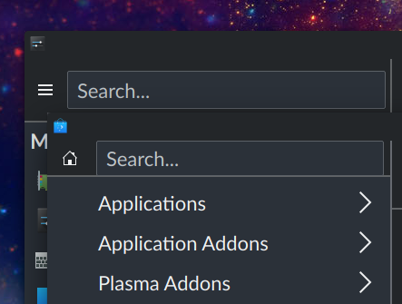
The category search field is too close to the right separator so this patch gives it a small right margin.
Details
Details

Diff Detail
Diff Detail
- Repository
- R124 System Settings
- Branch
- sidebarview-padding-nitpick (branched from master)
- Lint
No Linters Available - Unit
No Unit Test Coverage - Build Status
Buildable 14659 Build 14677: arc lint + arc unit
Comment Actions
This doesn't add up.
"searchLayout" fills the width with a smallSpacing all the way round.
The toolButton has no padding to the left.
Therefore actionTextField shouldn't have something to the right.
If something does needs fixing, it needs fixing somewhere else.
Comment Actions
Yeah it should have already been looking as desired pre-patch, I noticed the same. You're right, I'll try to find the right fix.
Comment Actions
I think the problem is the icon within the toolbutton is relatively small making it look like a bigger left margin
Comment Actions
That definitely plays a big role here perception-wise, but IMO we should just focus on the icon frame.
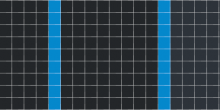
After zooming in and counting the pixels I think it's partly due to the separator stealing the width.
At 1.5 scaling that's 8 pixels between the icon frame and search field frame.
5 pixels between the search frame and separator + 2 pixels separator width, which leaves a pixel unaccounted for however.
Code does show separator is right anchored to parent.right.
Comment Actions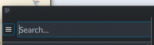

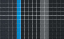
When anchors.margins is removed we see that the ToolButton still has 1px of its own margin around it, which might be that +1 that adds up to 8. The separator has on the other hand now even eaten into the search field's border.
I think the best solution would be if the separator was left anchored to parent.right. That's not working out however, but we could still compensate with a right margin.
Comment Actions
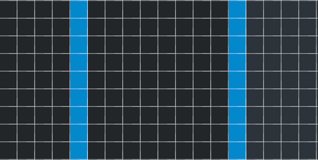
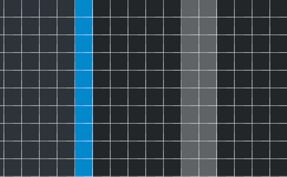
Two sane solutions I see, but which don't end up working:
- the vertical separator becomes invisible if left anchored to parent.right instead of right anchored
- the searchLayout RowLayout has too big of a right margin if right anchored to separator.left
While the proposed Layout.rightMargin is not an ideal solution, in these circumstances I think it's a legitimate way to compensate for the separator eating into the width.
Comment Actions
When anchors.margins is removed we see that the ToolButton still has 1px of its own margin around it
From what? Should they be there?
Comment Actions
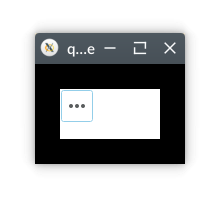
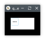
I believe it's inherent to the control. If I test with:
import QtQuick 2.12
import QtQuick.Controls 2.12 as QQC2

Rectangle {
    id: recty
    width: 150
    height: 100
    color: "black"

    Rectangle {
        id: tangly
        anchors.centerIn: recty
        width: 100
        height: 50
        color: "white"
    }

    QQC2.ToolButton {
        anchors.left: tangly.left
        anchors.top: tangly.top
        icon.name: "application-menu"
    }
}
I see that there are 1px margins to the left and to the top of the tool button.
Comment Actions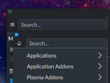
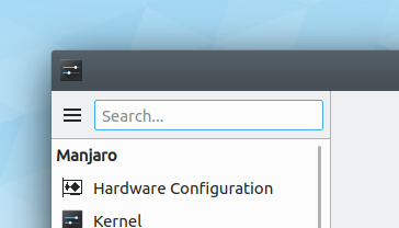
So Discover seems to have greater issues, but the added margin looks better than no added margin in system settings.
@davidedmundson I can't find a better solution..
Comment Actions
In general +1, let's not let this tiny UI improvement die.
However the implementation is not quite finished: Whenever you set a rightMargin to make something look better next to a scrollbar, you need to conditionalize that on it being a LTR language, and add a matching version for the leftMargin when using an RTL language, because in that case, the scrollbar goes on the other side of the view. Basically like this:
Layour.rightMargin: LayoutMirroring.enabled ? 0 : Kirigami.Units.smallSpacing / 2
Layout.leftMargin:  LayoutMirroring.enabled ? Kirigami.Units.smallSpacing / 2 : 0
Alternatively if the items are inside a Layout--as they are here--instead of using margins, you can add an Item to the layout with the width of the spacing you want, and RTL layouts will look fine automatically. This works because the direction of items in a Layout get automatically reversed for RTL languages, while the same is not true of manually-set margins.
Your choice; I think using an Item is a bit more elegant but I don't object to the alternative approach.
Comment Actions
@ngraham I forgot about RTL, my bad.
I ended up using the margins approach because adding an Item also added row layout's inherent spacing which ended up in too big of a margin.
And when compared with Discover, it turns out the margin needs to be only 1px, not 2px.
Comment Actions
Well it's all about making sure the top, bottom, and right paddings are identical. If Discover's search field also needs adjustment, that's fine.