Use a more conventional sidebar header apparance in desktop view
ClosedPublic

Authored by ngraham on May 15 2019, 7:14 PM.

Details

Summary

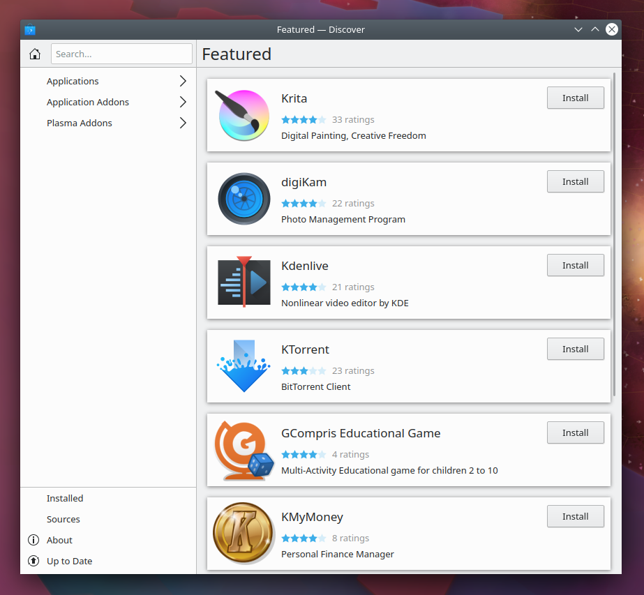
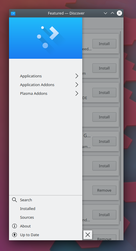
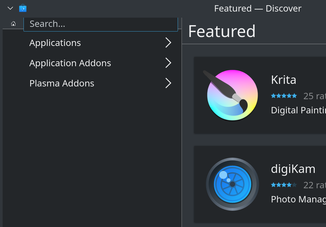
Discover uses the Kirigami.GlobalDrawer for its navigation sidebar. This component is
designed to be used for showing global actions and hiding when not in use, and displays
a big banner image on top. This banner concept is borrowed from Android, which has the
same kind of global drawers full of actions with banners on top. So the concept is
somewhat familiar on mobile. However on the desktop, this "sidebar with banner image on
top" UI is not common and feels out of place, giving Discover an odd default appearance
since the sidebar is permanently visible but doesn't look like other apps' sidebars.

This patch adjusts the sidebar appearance to look and feel more conventional in the
desktop view, keeping the banner version only for the mobile view.

Test Plan

Desktop view:


Mobile view:

(The extra space under the banner image is a pre-existing bug not introduced with this patch)

Now Discover's sidebar looks quite similar to System Settings' sidebar, which is very
visually appealing:

Diff Detail

Repository
R134 Discover Software Store
Branch
more-conventional-sidebar-header-appearance
Lint
No Linters Available
Unit
No Unit Test Coverage
Build Status
Buildable 11870
Build 11888: arc lint + arc unit
ngraham created this revision.May 15 2019, 7:14 PM
Restricted Application added a project: Plasma. · View Herald TranscriptMay 15 2019, 7:14 PM
Restricted Application added a subscriber: plasma-devel. · View Herald Transcript
ngraham requested review of this revision.May 15 2019, 7:14 PM
ngraham edited the test plan for this revision. (Show Details)May 15 2019, 7:17 PM
ngraham edited the summary of this revision. (Show Details)May 15 2019, 8:02 PM
ngraham added a reviewer: apol.
ndavis added a subscriber: ndavis.May 15 2019, 8:20 PM

I noticed that there is a difference between the padding around the search bar in SySe and Discover. Do you know why this is?

ngraham updated this revision to Diff 58150.May 15 2019, 8:35 PM

Fix margins

ngraham edited the test plan for this revision. (Show Details)May 15 2019, 8:36 PM

I noticed that there is a difference between the padding around the search bar in SySe and Discover. Do you know why this is?

Fixed in Discover. Any remaining divergence is now System Settings' fault. :)

filipf added a subscriber: filipf.May 15 2019, 8:45 PM

+1 from a visual POV

I noticed that there is a difference between the padding around the search bar in SySe and Discover. Do you know why this is?

See: https://phabricator.kde.org/D20972#459899

ndavis accepted this revision.May 15 2019, 9:36 PM

I think this is much better. I like the inclusion of a home button as well.

This revision is now accepted and ready to land.May 15 2019, 9:36 PM
apol accepted this revision.May 15 2019, 10:00 PM
This revision was automatically updated to reflect the committed changes.
zanny added a subscriber: zanny.EditedMay 19 2019, 11:39 PM

Testing out the beta release that includes this change has the search bar overflow the menu list with high (160, in the example) DPI settings:

It gets worse the higher the DPI (200) gets:

Looks like the home button isn't DPI aware and the row including the search bar size constrains to it.

That's exactly why manually setting the DPI isn't the correct way to enable high DPI mode. It only changes the fonts, so UI elements that aren't textual (like icon-only buttons, and icons in buttons) don't get scaled. You should use the scale factor slider in System Settings > Display and Monitor > Scale Display to enable high DPI mode. If there are bugs preventing this from working for you, please file them.

Thanks!