fix focus rectangle not visible in single album view mode
Details
Details
- Reviewers
ngraham - Group Reviewers
Elisa - Commits
- R255:797a8b8777e0: fix focus rectangle not visible in single album view mode
the focus rectangle is now properly shown
Diff Detail
Diff Detail
- Repository
- R255 Elisa
- Branch
- fixFocusRectangle
- Lint
No Linters Available - Unit
No Unit Test Coverage - Build Status
Buildable 11664 Build 11682: arc lint + arc unit


Comment Actions
This works, but to be honest I really dislike this focus rectangle in every view where it appears in Elisa. I don't think it matches Elisa's visual style at all. See how the blue rectangle touches the vertical line on the left, but it's a few pixels away from the line on the right? And it also isn't actually framing anything since Elisa's views don't use gray frames. So it appears "out of the blue", so to speak.
I feel like a cleaner focus indication style for a modern app like Elisa is to highlight the particular control or list itemthat currently has focus, rather than drawing a colored frame around an entire view. For example in your screenshots, instead of drawing a blue frame to indicate that the view has focus, I would make the song highlight blue rather than gray. This actually communicates more information: not only does it tell you that the view has focus, but you also clearly see which exact element within the view has focus.
Comment Actions
- use a rectangle around the current item with focus in view selector
- use rectangle borders to show the active focus in most elements
mainly use very thin rectangles around focused elements
Comment Actions
This is functionally much better! Now I can tell where the keyboard focus is. Visually I think it's a small improvement but we can do even better for the list and grid items and also be more consistent with how other apps generally handle this.
For lists, the selected item should have a background rectangle rather than an outline. When the item is both selected and focused, the background rectangle's color is the theme's highlight color. When the item is selected but not focused, its color should change to be the hover color. Here's an example of how this already looks in the file open/save dialog:
For grids, the currently selected grid item can have a background rectangle as described above for list items, or if this would be kind of ugly, instead of a background rectangle you can add a highlight around the grid item itself, like how System Settings' new KCMs do it:
As with list items, the selection color should still change when something is selected, but not focused.
Comment Actions
- emulate focus beahvior of list view as shown in feedback
- fix views displaying tracks to have the same focus logic than playlist
- fix keyboard focus issues whith NavigationActionBar and tab navigation
- fix focus issues in ListView of single tracks
- fix qml warning in FrequentlyPlayedTracks and RecentlyPlayedTracks views
- fix small differences between list based views
fix many issues with focus handling, many more to come
Comment Actions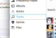
Humongous improvement so far! One thing that sticks out is that the left-most sidebar list still needs the new style for selected categories so that it matches other list-style items:

Comment Actions
Thanks for your review.
When I saw it, I was already working on the left most sidebar. I am hesitant to keep the current design with only the text and icon used to indicate state of an entry. I find it simpler but still easy to use. At the same time, it could break consistency (even though it is not music content but application UI state).
Comment Actions
I think the leftmost sidebar list items with text and icons are just fine; no need for a fundamental change there. :) All I think needs to happen is that the selected list item should be indicated by giving it a blue or gray background like all other list items have, rather than changing its text color or drawing a frame around it.
Comment Actions
- emulate focus beahvior of list view as shown in feedback
- fix views displaying tracks to have the same focus logic than playlist
- fix keyboard focus issues whith NavigationActionBar and tab navigation
- fix focus issues in ListView of single tracks
- fix qml warning in FrequentlyPlayedTracks and RecentlyPlayedTracks views
- fix small differences between list based views
- Elisa sidebar with colored backgrounds
- improve focus handling of view selector list
- solve some keyboard focus issues
- fix tab focus handling in some list views (playlist and album view)
- for consistency, put the same behavior for generic grid views
- add mostly the same focus behavior to file browser
I am done (except for handling review comments).
Some stuff could be improved in file browser but this is for a later review.
Comment Actions
Perfect!!!! The code looks good and the behavior is now excellent. I can clearly see what has focus and navigating the whole app with the keyboard is a breeze. It looks great too. I'm not totally sold on having all the backgrounds animate their opacity and color (we just got rid of that in QML comboboxes in fact), and it feels like something that should be in the style rather than hardcoded in the app. However that's a really minor aesthetic jusgment call and we can think about it later (or not). Huge +1 for landing this. Great work!