An icon for D19011
Details
Details
- Reviewers
ndavis ngraham - Group Reviewers
VDG - Commits
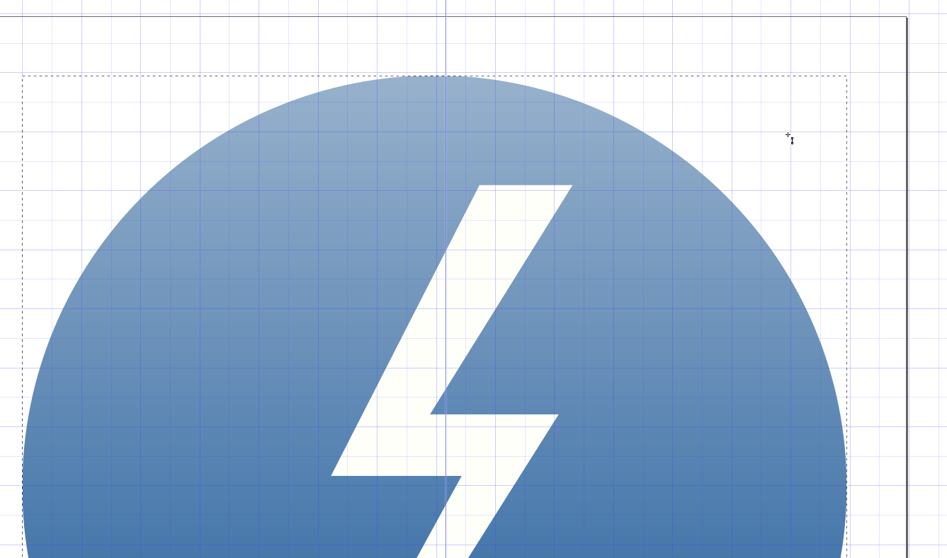
- R266:a6a153629ecc: Add an icon for Thunderbolt KCM
PNG version:

Diff Detail
Diff Detail
- Repository
- R266 Breeze Icons
- Branch
- master
- Lint
No Linters Available - Unit
No Unit Test Coverage - Build Status
Buildable 11023 Build 11041: arc lint + arc unit
Comment Actions
Thanks! Generally we use colorful icons for KCMs. I think this could use a bit more pizazz. :) Maybe make it yellow, and/or put it on top of a circular colored background or something?
Comment Actions
Ooh, I like that! Maybe make the thunderbolt a bit smaller inside the circle though?
Also, the circle itself is slightly larger than other circle-background KCM icons and needs to be a tiny bit smaller. You can use preferences-desktop-font as a model for how big the circle should be.
In general here are the colorful icon design guidelines: https://hig.kde.org/style/icon.html#colorful-icon-style
Comment Actions
Even better! I think that gradient ends up a bit too light on top though. Let's make it a bit more subtle.
Comment Actions
A few problems:
- That circle has a diameter of 27.9px instead of 28px
- There is no copy of the icon in icons-dark/preferences/32/
- The top of the gradient is transparent, which leads to issues like this:

The lightning bolt is not aligned to the pixel grid, but it's really not that bad at 100% size. TBH, I don't think it's worth the effort required to align it.
Comment Actions
Actually, one last thing. Can you save it as a plain SVG so that it isn't filled with Inkscape metadata?
Comment Actions
Sorry for coming this late into the conversation. I was wondering if the spear in the bolt can be changed to be horizontal? It would be more visually consistent with the angle that the lightning bold is. The back of the arrow |>, that needs to be horizontal.
Comment Actions
Initially, that was repainted official designation of Thunderbolt connectors:
https://upload.wikimedia.org/wikipedia/commons/a/a8/Thunderbolt_Connertor.jpg
Thunderbolt official logo:
https://upload.wikimedia.org/wikipedia/commons/6/67/Thunderbolt.svg