BUG: 406121
Needed for the upcoming do not disturb mode and overhauled notifcations.
Details
Details
- Reviewers
ngraham ndavis - Group Reviewers
Plasma VDG - Commits
- R266:47af5254b039: Add "notifications" and "notifications-disabled" icons
Search for "notifications" in Cuttlefish.
Diff Detail
Diff Detail
- Repository
- R266 Breeze Icons
- Branch
- add-notifications-and-notifications-disabled-icons (branched from master)
- Lint
No Linters Available - Unit
No Unit Test Coverage - Build Status
Buildable 10398 Build 10416: arc lint + arc unit
Comment Actions
+1 in general. However the fact that this black version doesn't match the outline/dimensions of the colored version (preferences-desktop-notification-bell) is triggering my OCD. :) Do you think you could match the dimensions of that icon?
Comment Actions
Is that even allowed/possible with this 16x16 resolution?
The padding rules of this resolution don't allow it to be higher.
Comment Actions
The line that goes across almost completely removes the bell's pendulum to the right. Maybe move the pendulum closer to the center so that even when there is that red strike line, the user can still make out that it is a notification bell
Comment Actions

Hmm, well the big issue I see is that the bottom of the colored version flares out much more than the bottom of this one does:
If that's possible to change within the 16x16 margins, I'll accept it.
Also, could we create a 22x22 version too?
Comment Actions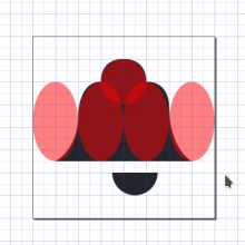
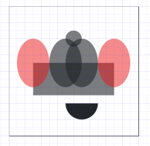
The proportions aren't quite right.

This is one way to make a perfectly smooth bell. Subtract the red shapes from the black shapes.
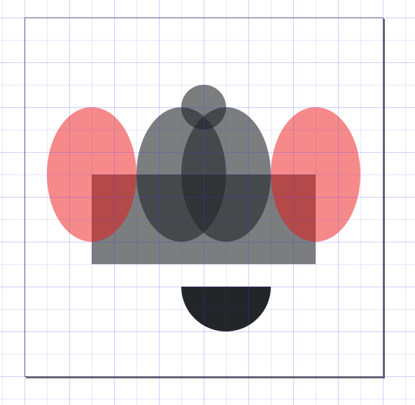
the result is this:
Comment Actions
How can you efficiently do that without having to realign everything to the new grid manually?
Comment Actions
You'll have to create it from scratch again, using the same method you used to create the 16px version. If you use the method that I just showed you, it'll be much easier than drawing it, but you still need to figure out how to get proportions that look right.
Comment Actions
Diagonal or round shapes are not required to be pixel grid aligned. Actually, it is not even possible, as there is always some antialiasing. It even helps to make round shapes a little bit bit larger than the pixel grid, so some of the corner/edge pixels are solid color.
Comment Actions
I'm aware, but that's not the problem. If you look at the left side of the bell and the right side, the right side is wider. Maybe it's not that visible at 100%/96 DPI, but we should try to have resizable and reusable shapes when possible.